
Most Popular Movies 2006-2016
October 12, 2018 - All

Introduction:
From the year 2006 to 2016, what genre of movie was the most popular? which director made the best box office performances? what kind of films were highest rated by movie buffs and critics? Based on the dataset of 1000 highest ranked movies on IMDB, I’ve created a brief dashboard that is able to tell you all the answers and give you a quick look of the movie industry from the last decade.
Inspiration:
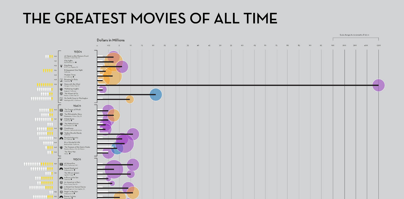
I’ve always been passionate about the pop culture especially the movies, so from the very beginning I’ve decided to find a dataset that was related to the entertainment industry. When it came to how to interpret the data, Professor Sula suggested I could analyze the data from based on genre or cast. As for how to visually deliver the data, the visualization of the 100 greatest movies really inspired me a lot. It’s an infographic that that includes: title of Movie, year it was made, oscar nominations and wins, budget, gross, IMDB score, genre, filming location, setting of film, and production studio. The movies are ordered by release date, on the left features oscar wins and nominations. The bar graph represents budget in white and gross in black. The circle size is based on IMDB score and the color refers to genre.
Materials:
I found my dataset “IMDB data from 2006 to 2016” from Kaggle.
It is a data set of 1,000 most popular movies on IMDB from 2006 to 2016. The data fields included are:
Title, Genre, Description, Director, Actors, Year, Runtime, Rating, Votes, Revenue, Metascrore
Other tools I’ve used are:
OpenRefine and
Tableau Public.
Goals:
I wanted to analyze the data from mainly two aspects: genre and director. I hope the infographics could illustrate the most popular genre and the most successful director, as well as their relationship with revenue, metascore and the count of the movies.
Methods, Results and Interpretation:
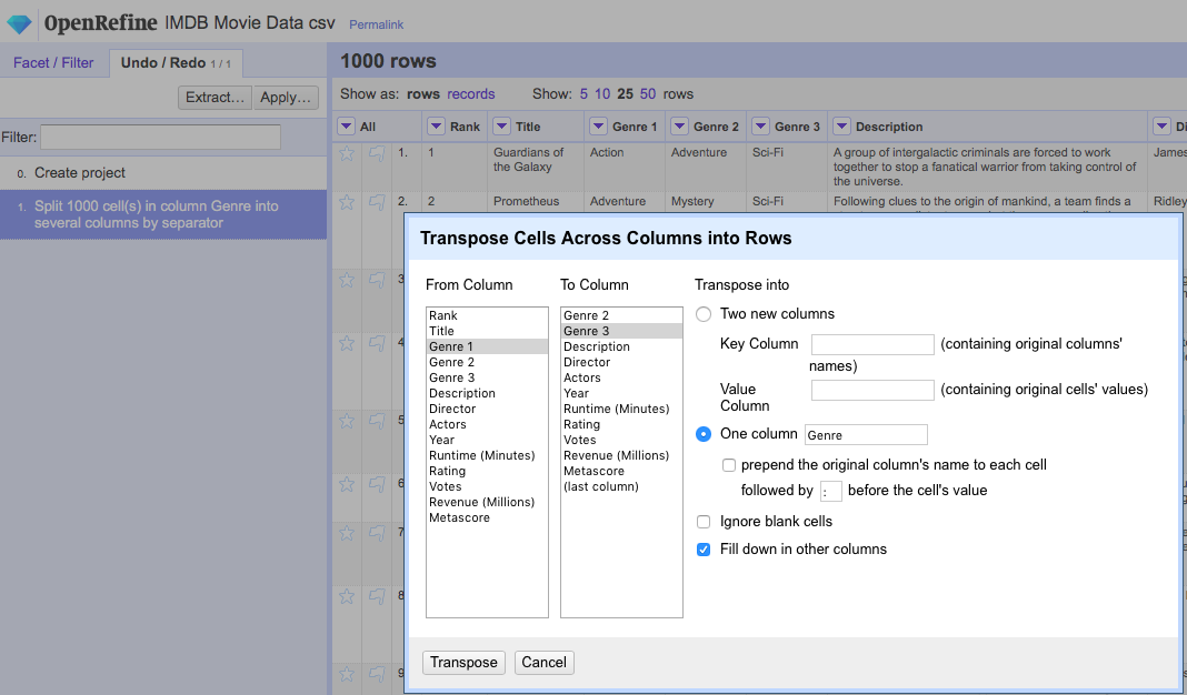
The first challenge I’ve come cross was to split and transpose columns. In the original dataset, each movie has more than one genre listed in one column. To analyze the movies by their genres, I needed to split each genre into a individual column and then transpose those columns into a same column again but in different rows. I was able to this with OpenRefine.
To present more information in one infographic, I was trying to do the butterfly chart on Tableau. However, due to the limitation of “dual axis” on Tableau, I could only present two measures on each butterfly chart. I had to add another set of “dual axis” on one side of my butterfly chart to provide more information.
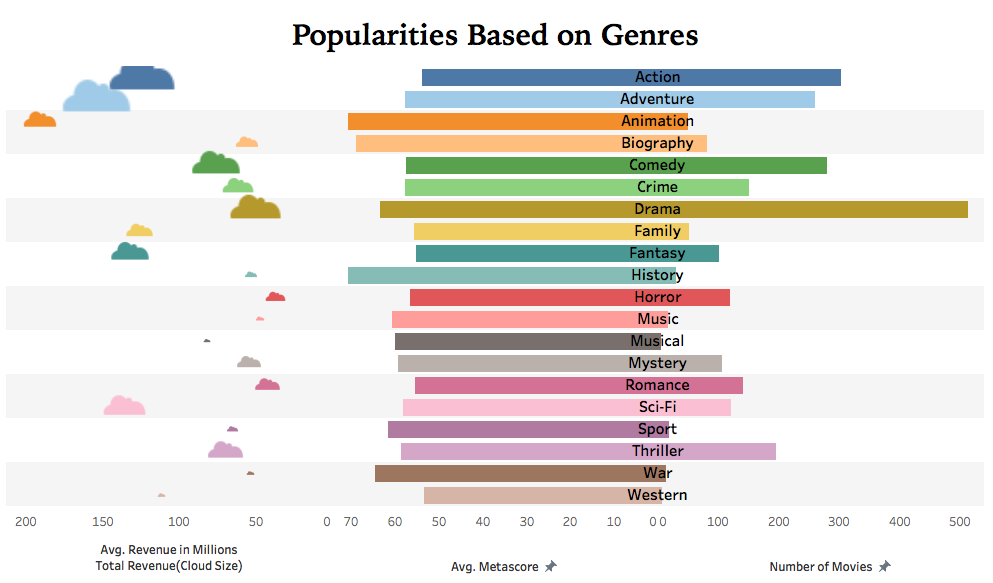
I also tried to put more measures on each side of the dimension, in order of which I had to accept the huge gap between the measures on each side. Because Tableau Public won’t allow size changes of individual columns(at least that was the fate for me the past weekend-_- ).
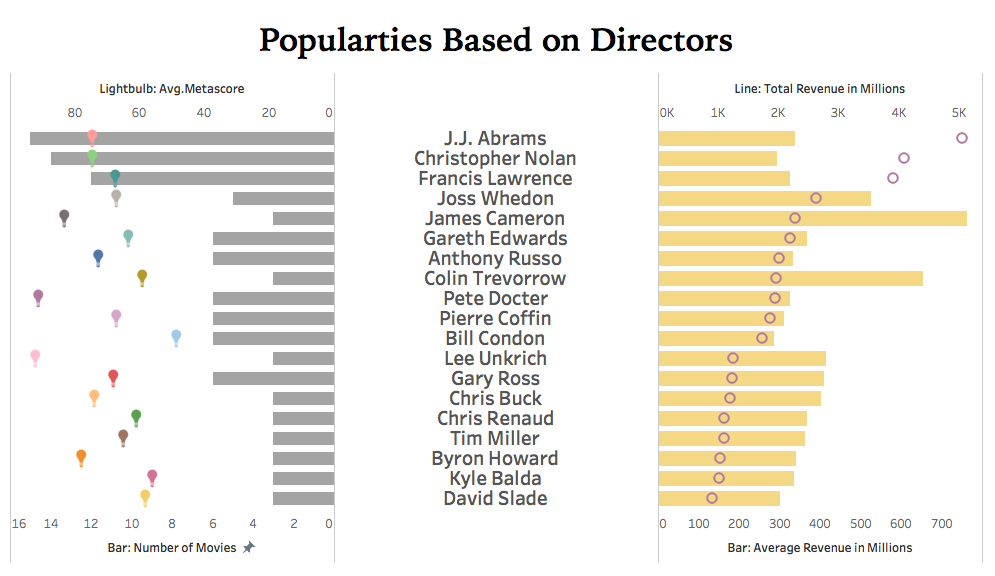
Arranging the sheets and texts on dashboards was also a long series of experiment, failure and experiment again, but fortunately I finally got the result I wanted.
The link to my final dashboard is :
https://public.tableau.com/profile/milo8469#!/vizhome/Lab2_174/Dashboard1?publish=yes
Reflection:
I really enjoyed doing this project. I have learned a lot about the different skills on Tableau and OpenRefine as well as how to deliver the most efficient information, both logically and visually. However, as much as I love the flexibility of being able to choose our own dataset, and the dataset I’ve chosen, I think my choice was a little bit too simple, which has limited my exploration on Tableau. Also, I didn’t involve the time-oriented measure in my infographic. If I had more time and had learnt more about Tableau or other tools, I’d love to add the time measure to my visualization.
The post Most Popular Movies 2006-2016 appeared first on Information Visualization.