New York City Leading Causes of Death 2007–2014
October 12, 2018 - All
Introduction
Living in New York City, a cultural melting pot, I always feel unsafe when walking on a street. Because as far as I know, New York is the notorious city where the crime rate is always high in the country. Therefore, I especially would like to find the data which is telling the crime rate or related death rate. After a few days of searching, I finally found a dataset that really attracted my attention—New York City Leading Causes of Death. Interestingly, according to the dataset, crimes are maybe just a part of the causes of death. The main causes of death are still diseases. Therefore, based on the dataset, I would like to understand:
- What disease causes the majority of deaths?
- What is the trend of the leading causes of deaths?
- Do the deaths in the same leading cause differ among the race ethnicities?
Inspiration
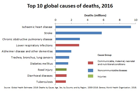
After I selected the dataset, I used google search to look at the related visualization about leading causes of death. The following visualization is what I found on the World Health Organization website. From this visualization of causes of deaths, I think bar charts may be the best way to display the comparison of the deaths of each cause. Besides, we can also know what disease is the biggest killer by the order of amount of deaths from the bar chart.
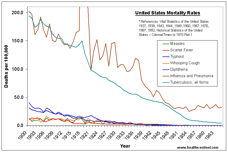
I was also inspired by the following visualization, which indicates the mortality rates in the US. With line charts, it is transparent to see what is the trend of the diseases over time. In addition, with the different color code of each disease in the line chart, we can easily make the comparison among the diseases across years.
Materials
- NYC Open Data: A website where I could find any kind of open data.
- Microsoft Excel: A spreadsheet that I used for cleaning the dataset.
- Tableau Public: A software that allows me to make any kind of visualization with datasets.
Methods
- Cleaned the data by Microsoft Excel
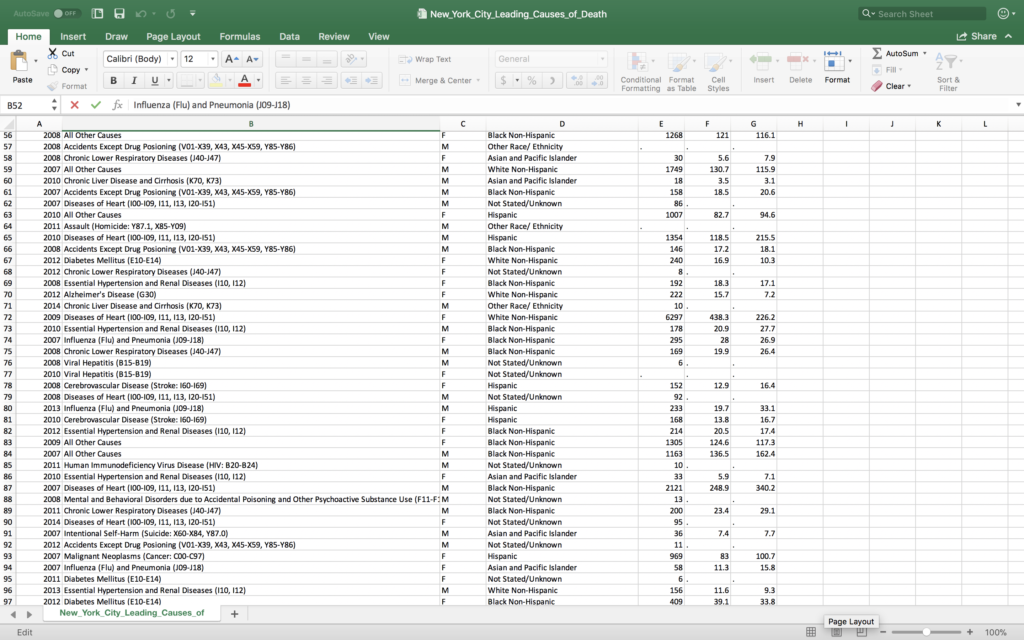
Once I downloaded the dataset spreadsheet, New York City Leading Causes of Death, from NYC Open Data, I first tried to remove some unnecessary information that seems unhelpful and meaningless for the project by using the finding function (control + F) in Microsoft Excel. For example, there was some information like E10-E14 in parentheses next to the name of leading cause, which I think was not very important within the dataset.
2. Visualized the data by Tableau Public
After deciding using the dataset, I began to look at some visualization design example about causes of death by using google search, hoping to get some inspirations. Then, I found the two charts as mentioned above, so I decided to use bar charts and line charts to fulfill the visualization and answer my three questions. However, I faced some problems when using Tableau. For instance, the data type of death rate in Tableau is strings, not numbers, so it cannot succeed to display the ideal visualization. Therefore, I had to first change all the data that should be number type of data to measures.
Results and interpretation
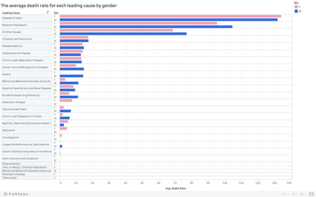
The first visualization is to answer the question—what disease causes the majority of deaths. The leading causes are listed out in rows and the average death rate is in the column section. Red and blue are also used to differentiate the average death rate by gender. Thus, we can realize that diseases of heart are the most serious leading causes of deaths, either in male or female.
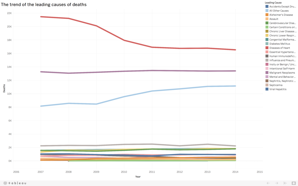
The second is about the trend of the leading causes of deaths. I put deaths in row section, so we can see the variation of deaths in the different year. Also, from this visualization, we can know that the diseases of heart, rendered by red, are gradually mitigated and the deaths in 2014 are much lower than in 2007.
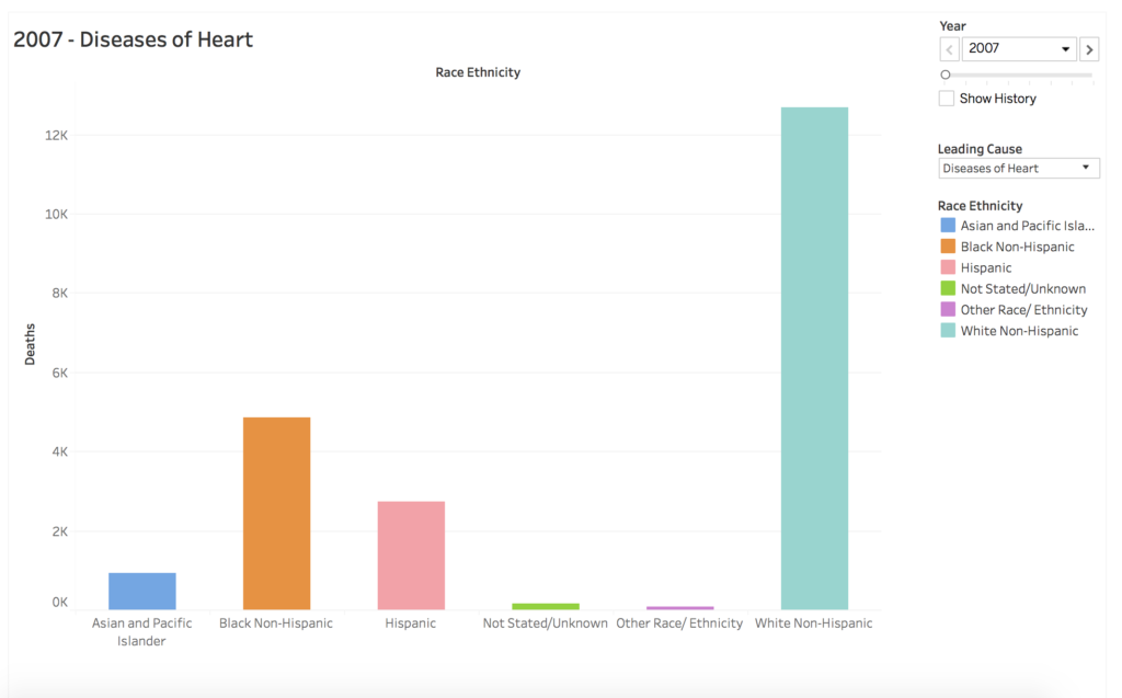
The last one is to reflect whether the number of deaths in each leading cause may differ with different race-ethnicity. I set the year as the page, leading cause as the filter, and different colors to distinguish the race-ethnicity. In terms of diseases of heart in 2007, the visualization indicates that the deaths of white non-Hispanic were farther higher than other race ethnicities.
Reflection
When I tried to interpret the dataset itself, I found I could not totally understand the meaning of data itself. For example, there is a section about the age-adjusted death rate, but there is no data about age and no measurement is indicated in the data section. All I saw is just a pure number with decimals. Therefore, I didn’t use this section of the dataset for the project. Furthermore, I faced a lot of challenges when using Tableau, such as changing the bar colors, altering the measures…etc, so I spent much time understanding the software. Also, I found I still could not determine which visualization is the best way for the dataset, but fortunately, Tableau can automatically visualize the data once we set up the rows and columns, so it is not a big problem now. Hope in the future, I can be more familiar with types of visualization.
The post New York City Leading Causes of Death 2007–2014 appeared first on Information Visualization.