Defacement Crime in New York City (Year 2014 to 2018)
October 12, 2018 - All
Introduction
The Idea
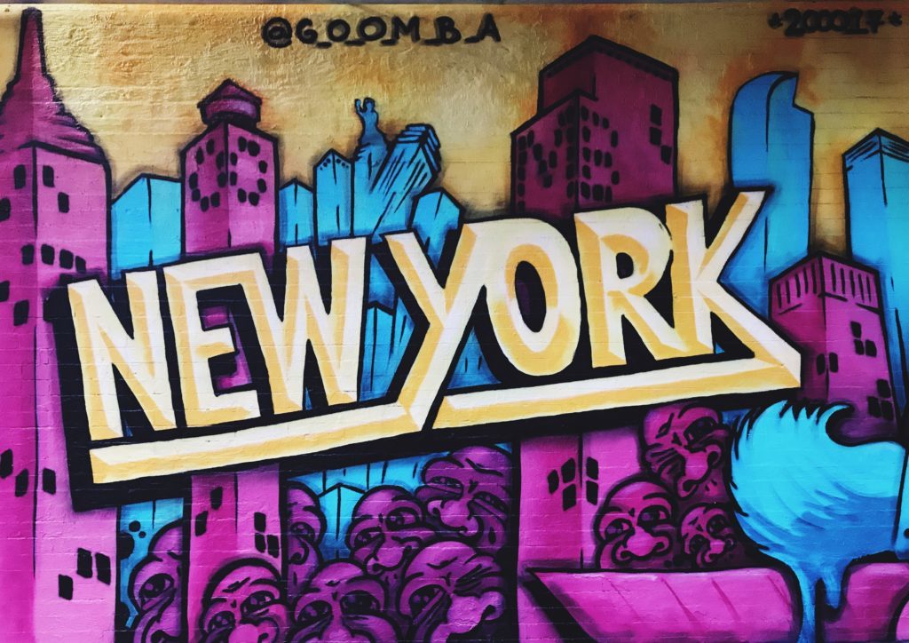
When I first came to New York from India in 2017, I noticed several graffitied buildings throughout the city. I had never seen anything quite like that before, and I had several questions racing through my mind – “Who would do this?”, “Why would they want to deface someone’s property?”, “How does the police deal with this situation?”.
A year later, while working on searching for datasets for the Information Visualization Lab, I came across ‘Encroachments and Defacements’ dataset hosted on ‘NYC OpenData’. I was immediately interested in visualizing various aspects of defacement crimes in New York City over time and hence selected this dataset for my lab.

The Inspiration
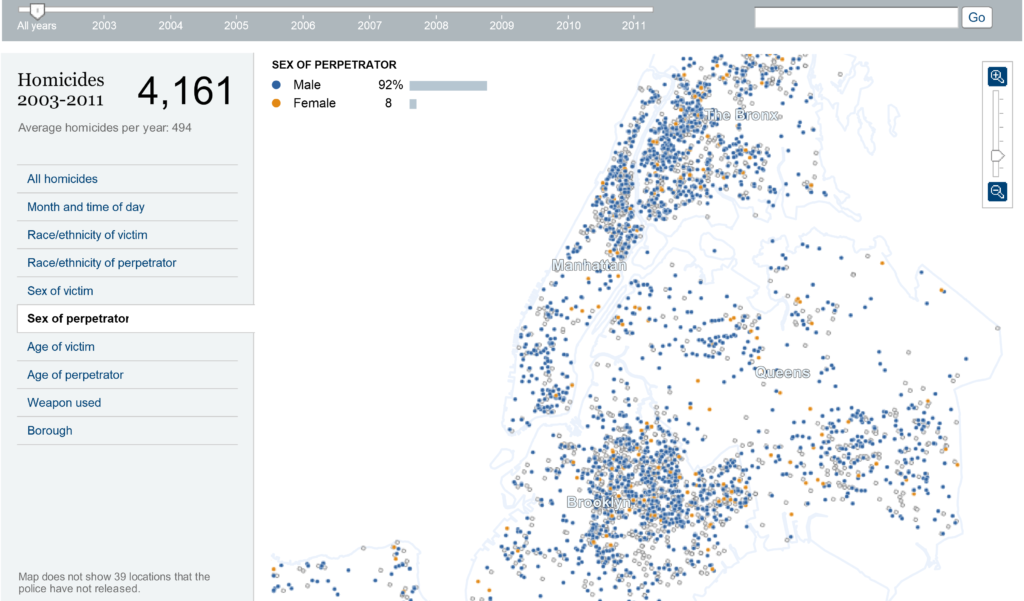
Since my dataset was that of crime reports, I began searching for crime data visualization examples. I found a great New York Times’ article (works only on Internet Explorer), which displayed visualizations of homicides in New York City between the years 2003 and 2011. A great feature for users was that the visualization displayed the crime data in the form of a timeline, where the year could be selected to see the crimes committed in that timeframe. Users could also see the data for all years at once, which was great. Another thing I really found interesting about this visualization was the fact that I could see the crime for each of New York City’s boroughs. They had used different shades of blue to represent the various boroughs, but one thing I didn’t like was the fact that the shades of blue were too similar to easily differentiate between them. I had to look very carefully to make out the difference.
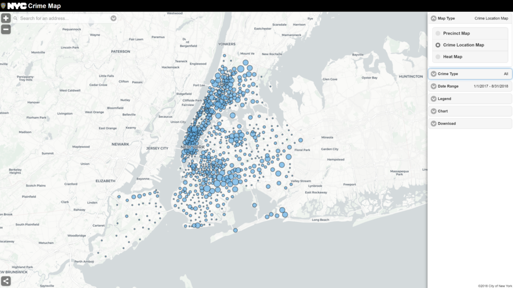
Another example that drove my design decisions was an NYC.gov website that displayed various crime maps. It had many filters based on ‘Crime Type’ and ‘Date Range’ which was great for users that might want to isolate the data. The markers on the map varied in size based on the number of crimes in a neighborhood, and they helped effectively describe the count visually for users.
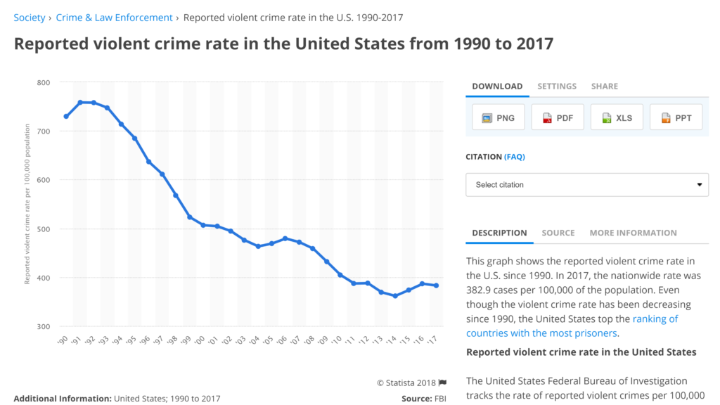
Finally, I also found a series of visualizations very interesting from Statista.com, which had made use of bar and line charts to depict the timeline of various kinds of crimes in the US. I thought that it was an effective approach for highlighting the rise or fall of crimes from year to year for users. This would also enable users to compare data side by side quickly and easily.
Materials
Tools –
Microsoft Excel – A spreadsheet software by Microsoft, part of the MS Office suite.
OpenRefine – A tool for working with messy data, which helps in cleaning it up quickly and effectively.
Tableau Public – A free to use data visualization software, which has many visualization techniques built into it.
Dataset –
The dataset I used for my lab is ‘Encroachments and Defacements’, which I found while browsing through datasets on NYC OpenData.
Process
Cleaning up the data
After I had selected the dataset, I started off with cleaning up the data to make it usable and ready for analysis. I used the OpenRefine tool to upload the CSV dataset (obtained from NYC OpenData) and made improvements to its raw form. Many of the dates were in different formats and hence I had to bring uniformity to it. Even the datatype needed to be transformed from ‘text’ to ‘date’. I also had to add a facet for getting the data only for ‘Defacement’ crimes, as the set also included data for ‘Abandonment’, ‘Encroachment’ and ‘ATM‘, which I didn’t include in the scope of this project. I also transformed many of the number cells’ datatype from ‘text’ to ‘number’.
Transferring the data into Tableau
After the data was clean and ready for analysis, I exported the data from OpenRefine as an Excel file for importing into Tableau. However, I encountered an error in the OpenRefine console and, therefore, had to export as a CSV instead of Excel. The workaround was to open the refined CSV in Microsoft Excel and then use its ‘export’ feature to convert it to Excel format. I was, hence, finally able to import the data into Tableau.
Analyzing the data + Creating Visualizations
After loading the data into Tableau, I first started off by trying to create a visualization for the number of reported defacement crimes per year, for each borough. I chose the line chart visualization since it is great for showcasing time series data and immediately, the difference in the number of reported crimes between boroughs was evident. However, I noticed that the line chart had values for the year 2018 as well (since the data for 2018 was present in the dataset). But since 2018 is the current year and still in progress, the data for this year wasn’t complete. It, hence, did not make sense to include this year, and I added an exclusion for it.
It was also important to understand how much time the police took to resolve these reported issues. To understand this for each borough and each year, I had to create a calculated field that would be the difference between the initial crime report date and the closing date columns. This difference would give me the resolution time as it would give the number of days between when the crime was reported and when the case was closed. After creating this calculated field, I added the average function on these values for each year per borough and put it against year on the x-axis to form a line chart. Yet again, I selected the line chart as it is very effective for visualizing and comparing time series data. As opposed to the previous visualization, I did not exclude the year 2018 in this case, as an average value will not vary significantly for the rest of the year.
Finally, I was most excited about the geo-data that was available in the dataset, and I proceeded with creating a bubble map visualization of the defacement crimes. I used the latitudes and longitude coordinates to plot the points on the map for each crime report. I color-coded the points using an accessible color palette on the map for each borough, to make it easy to understand the difference in their borders for all users. Another great aspect was that the size of the points was bigger for more crime reports in the same neighborhood over the years, which could help users understand the magnitude of crimes in a region. I added filters for the year so that users could isolate the data for each year as well.
Results
Please access tableau project – Defacement Crime in NYC (Year 2014 to 2018)
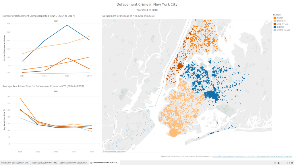
From this visualization, I hope to make viewers aware of how defacement crime has changed over the years, and how efficiently the police is taking care of these problems. I also hope to make users understand the difference in the crime rate and resolution time upon moving from borough to borough.
Visualization 1: Number of Defacement Crimes Reported in NYC
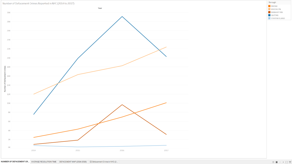
It is interesting to see how the Bronx and Brooklyn have steadily increasing defacement crime rates since 2014. Best effort observed is in the Bronx, the average resolution time of which, dropped to less than half of what was observed in 2014.
The highest rate is observed in Queens in 2016, which is significantly higher than all other boroughs in that year, but it steeply drops below that of Brooklyn in 2017.
Manhattan also peaks above the Bronx in 2016 but is still on the lower side overall. Manhattan also sees a trend similar to Queens, with the peak in 2016 and a steep drop in 2017.
Brooklyn emerges as the top defacement target in 2017, closely followed by the Queens. Next in line in 2017 are Bronx, Manhattan and Staten Island. Staten Island has the lowest defacement rate and has maintained it quite steadily between 2013 and 2017.
Visualization 2: Average Resolution Time for Defacement Crimes in NYC
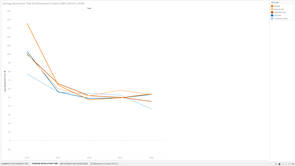
The police have been making a solid effort in lowering the resolution time for defacement crimes in New York City.
The Bronx and Brooklyn saw their best year in terms of resolution time in 2016, while Manhattan and Staten Island are currently (2018) in their best year.
Brooklyn has been seeing regular ups and downs in its average resolution time between 2013 and 2018, however, currently, it is extremely close to its best year in 2016.
In 2018, Brooklyn, Queens and the Bronx even out on their resolution times, with Manhattan better off by around 10 days, and Staten Island, emerging the best by around 10 days lower than Manhattan.
Visualizations 3: Defacement Crime Map of NYC
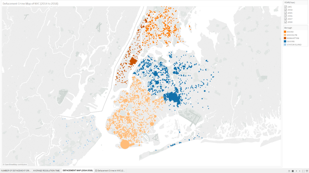
It is very interesting to see how the crimes are spread across the city and its boroughs. Certain neighborhoods that are worst affected over the years can easily be identified by looking at the size of the marker. For instance, West, 15th Street in Brooklyn is the worst affected overall with 3360 defacement reports over the years. 91 Avenue in Queens is next in the worst affected neighborhoods with 1350 crime reports, which is still significantly lower than Brooklyn.
Close to JFK Airport, streets 113 through 130 in Queens seem quite badly affected with several markers spread across.
Manhattan’s Upper East Side seems to be its worst affected part with a dense scatter of defacement crime markers.
The Bronx and Brooklyn are overall quite evenly affected throughout. Staten Island emerges as the cleanest borough with scarcely scattered markers.
Reflection & Future Directions
Learning Tableau has been a great journey so far, and I was amazed at the ability of the tool to create beautiful visualizations out of raw data. I also loved the fact that there was a color-blind friendly palette to make visualizations more accessible.
I also learned that data can be messy, and the cleanup process is not always a one-time activity. A need to further clean up the data can crop up any time during the analysis and visualization phases as well. For instance, I noticed bad data for the year 2013 during the visualization phase. While it was easy to exclude it from the visualization in the line charts, it could not be done in case of the map visualization. I had opted to show the year filter for users and Tableau did not allow me to hide the year ‘2013’ from the list, even though it let me exclude the data from the visualization. This was making it confusing, as there was no data for 2013 to be visualized, but the filter still showed the year 2013. I, therefore, had to clean up the excel sheet (remove bad data for 2013) and refresh the dataset into Tableau.
While searching for crime data on the NYC OpenData website, I found several datasets for various other crimes, and I feel it would be great to explore those for any future projects. I would also like to try and look for other sources that help me find data for the entire United States of America, and it would be extremely interesting to see how the other states are doing compared to New York.
References
- Few, “Effectively Communicating Numbers: Selecting the Best Means and Manner of Display”
- From Data to Viz – Line Charts
- From Data to Viz – Bubble Map
The post Defacement Crime in New York City (Year 2014 to 2018) appeared first on Information Visualization.