Disease mapping: a historical perspective
September 14, 2018 - All
 Timeline link: https://goo.gl/TBDJuy
Introduction
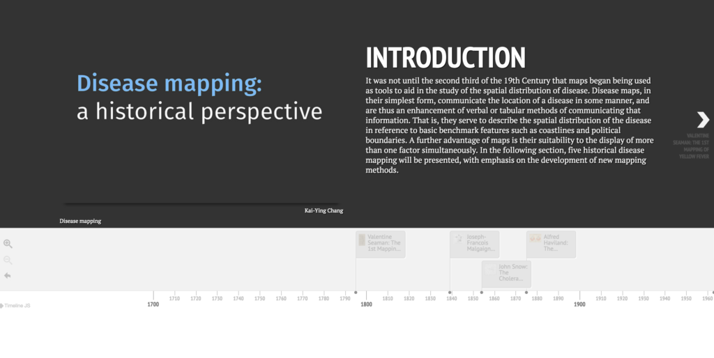
Maps, the subsection of visualization types, are powerful and intuitive for people to look at spatial patterns and geographic data. There are many variations on map types and each variation has its own strengths. For this project, I would like to see how maps could help to communicate the information of the geographical extent of the ravages of the disease and to discover the local conditions that might influence its degree of fatality. I used TimelineJS to show the most profound historical representatives and their disease mapping from 1795 to 1963; simultaneously, we could also see the development of mapping methods in disease mapping.
Materials
I used TimelineJS, an open-source tool, to build the visually interactive timeline, collecting the datasets about disease mapping from the website-http://www.datavis.ca/milestones/, and referencing and gathering other related literature and images on the Internet.
Methods
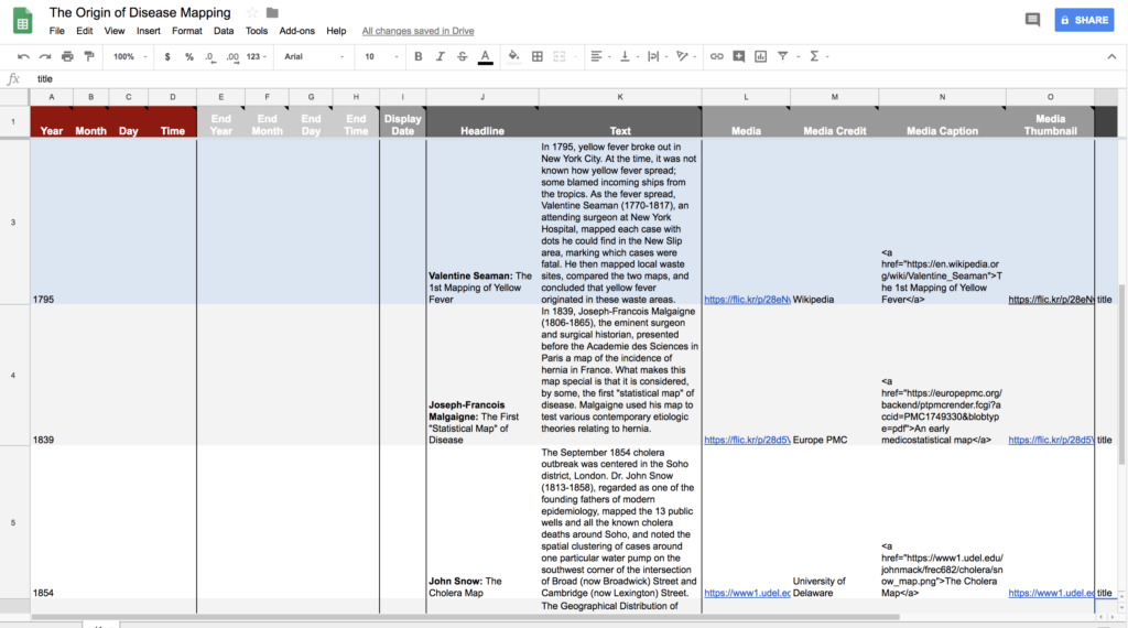
After researching the resources about the history of disease mapping, I selected five iconic representatives and their mapping as the important historical records and events on the timeline starting from 1795 to 1963. Then, I filled the Google Sheet template, provided on TimelineJS, with content and images of these five representatives that I gathered from the Internet.

Figure 1: Google Sheets Template
Reflection
When I researched the history of disease mapping, I realized maps are really helpful to present data in position, extent, and distance. Visualization with maps, we can see the spatial distribution and other meanings that can be further uncovered. Also, I think TimelineJS is a useful and great tool that we can use it to quickly present what we would like to do on a timeline. Although I don’t fully understand some columns on the Google Sheets Template (ex. group), it is still easy to learn and use.
For me, the biggest challenging of this project was to look for data and collect those associated images. Once my topic was decided, I took most of the time to look for data and then spent another time to find the images of these disease mapping. It was really frustrating when I could not find the related images for the representatives on the timeline. Fortunately, in the end, I still find the images, hoping next time I could improve my resource-searching skill. For the future direction, I hope I could interpret and uncover the meanings of these maps by myself once I have more knowledge of visualization.
The post Disease mapping: a historical perspective appeared first on Information Visualization.