A History of Chords Diagrams
September 12, 2018 - All
Introduction:
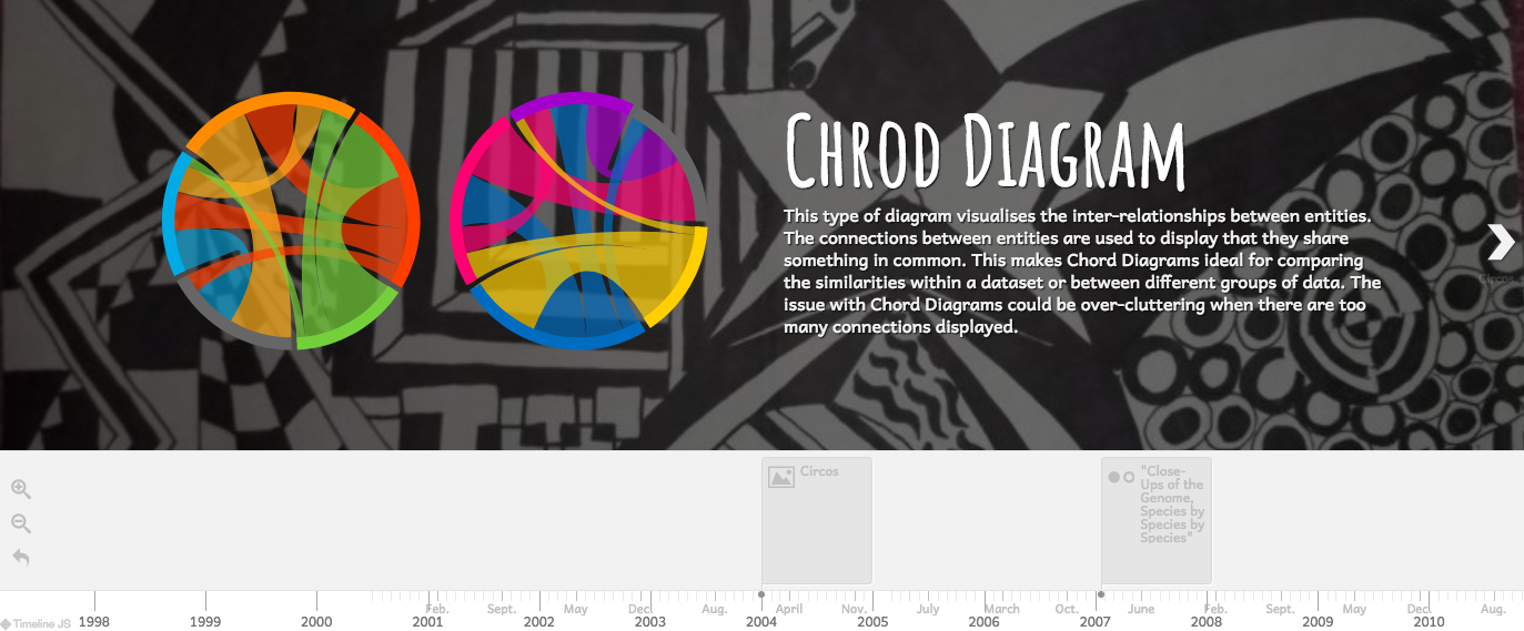
Chord diagram is a relatively new form of information visualizations. It is a type of diagram that visualizes the inter-relationships between entities. The connections between entities are used to display that they share something in common. This makes Chord Diagrams ideal for comparing the similarities within a dataset or between different groups of data.
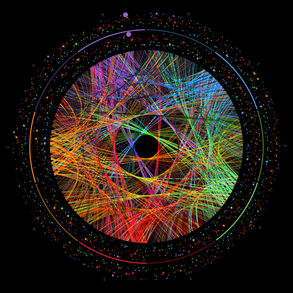
 Pi Art by Martin Krzywinski
Nodes are arranged along a circle, with the relationships between points connected to each other either through the use of arcs or curves. Values are assigned to each connection, which is represented proportionally by the size of each arc. Color can be used to group the data into different categories, which aids in making comparisons and distinguishing groups. The issue with Chord Diagrams could be over-cluttering when there are too many connections displayed.
Initially it was mainly designed for displaying genomic data, now it can be used to visualize customer flow in the auto industry, volume of courier shipments, database schemas, and presidential debates.
Material:
- TimelineJS: Open-source tool used to build the interactive timeline.
- Google Spreadsheet: Online cloud spreadsheet used to create and edit information and transform into the timeline
- Wikipedia: Online encyclopedia used for research for the timeline
- Google Images: Online resource to find images for the timeline
References:
- https://archive.nytimes.com/www.nytimes.com/imagepages/2007/01/22/science/20070123_SCI_ILLO.html
- https://www.popsci.com/article/science/youve-never-seen-pi-0
- http://www.sarahclawrence.com/living-infographic-streets-alive-9-24-17/#nonribbonchord
- https://blog.wikimedia.org/2011/10/06/a-thousand-fibers-connect-us-wikiviz-winner-visualize-wikipedias-global-reach/
- http://circos.ca/
Methods:
The research was the most challenging and satisfying part. After deciding the topic on the chord diagrams, the first thing I did was to Google “chord diagram”. It is a relatively new form of visualization, thus there’s not much information about it. So my digging started with its Wikipedia page. Two events were mentioned, one of which was an article published on New York Times in 2007. By reading that article I found out the scientist named Martin Krzywinski was the one who created the chord diagram. From there, he led me to more information I needed.
Making the timeline by using TimelineJS and Google Sheets was smooth. Instructions were given clearly on the TimelineJS website.
Results & Interpretation:
Chord diagram is a very informative and aesthetic way to visualize the inter-relationships between entities, but meanwhile it could be a little overwhelming to comprehend. I think chord diagram is more of a “picky” diagram that is meant for a more complex dataset, and that requires more professional effort and a more sophisticated audience.
- Timeline: https://cdn.knightlab.com/libs/timeline3/latest/embed/index.html?source=1K_KWIJ6T_7OZ_tf0CgbagcjQJLdNOQFOlRLkVanOD7k&font=Amatic-Andika&lang=en&initial_zoom=6&height=590
- Spreadsheet: https://docs.google.com/spreadsheets/d/1K_KWIJ6T_7OZ_tf0CgbagcjQJLdNOQFOlRLkVanOD7k/edit#gid=0
Reflection & Future Direction:
I think chord diagram is a great example of how art and info graphic can be combined and benefit each other. I’m also really impressed by how information visualization can become an interactive project to engage the local community. I’m hoping to learn more about this diagram and how it will be further used in various fields.
Note: The time of the non-ribbon chord diagram was made up. Because I couldn’t really find when it was first used and also I needed that slide to be shown after the “Pi Art” slide.
The post A History of Chords Diagrams appeared first on Information Visualization.
