
The Frick Collection: Usability Research on In-Gallery Devices
August 16, 2018 - All
By Alanood Al-Thani, Katie Curran and Shannon Mish

The Frick Collection is a staple of New York’s Fifth Avenue museums, it was founded in 1919 and holds a rich collection of old master paintings, and European decorative arts. Unlike some of the white-cube museums around the City, The Frick Collection looks like a home. The museum walls lack labels and room names. The museum’s lack of signage is one of the ways it tries to keep the spirit of the original building, a home for the museum founder and the wealthy industrialist Henry Clay Frick, alive.
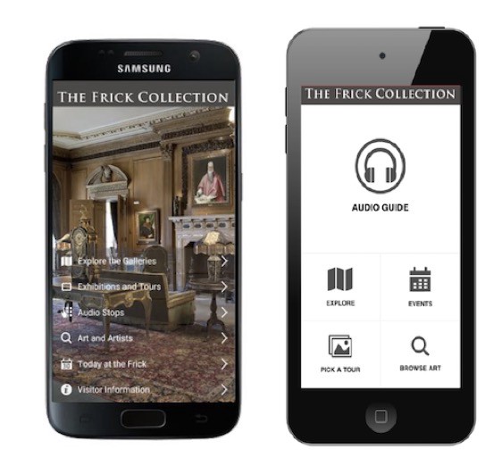
The lack of wall-text and information is a hurdle the museum has tried to overcome through the use of their downloadable app and its current audioguide, which is provided by Acoustiguide.
The museum is hoping to develop their current audioguide into a new loan device that is more in-line to its downloadable app.
There are two main features the museum’s future loanable-device and the existing downloadable app offer, and that is the map and object information. As part of our usability research into the museum’s current and future in-gallery digital offerings, we tested two main features by asking museum visitors to do two simple tasks:
First, we tested the map feature by asking users to locate the Living Hall.
Second, we tested the content on each device by asking users to pick an artwork of their choosing and use the device to gain information about the piece. We then asked users to switch devices and repeat the second task.
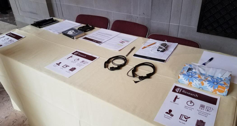
Testing Methods:
As part of our research, we tested The Frick Collection devices with seven museum visitors using both devices. Users were recruited at the museum and screened to ensure this is their first visit to the museum and they haven’t used the downloadable app prior to the visit. This was to ensure that users were not using their prior experience at the museum or their experience using the downloadable app to assist them in completing the tasks. Users were given one primary device to complete both tasks then users were asked to repeat the second task using an alternate device. Hence, all users were provided with the opportunity to try both devices.
Throughout the task, users were encouraged to talk aloud and their thoughts were recorded and assessed. The screens used during the test were recorded and further quantitative data including duration and number of clicks were extracted. Moreover, after every task, users were asked about what they thought and their reactions and opinions were recorded through writing and audio recordings. Finally, users were asked to fill a post-test questionnaire.
Results:
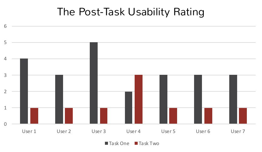
Overall, experiences with the devices differed from user to user, however, many similarities were observed:
● Most users had difficulty with Task 1 because they had trouble using the map, and figuring out where they were in-relation to the Living Hall. Therefore, most users did not know how to start the task. Many of the users commented that the map isn’t like a familiar interface, Google Maps, and one user insightfully said:
“Your reference point is, I think, Google Maps, because that is what everyone else is using but this doesn’t act like Google Maps, so you are creating a new metaphor while the whole world has already adopted that metaphor.”
● Some users using the downloadable app or loan device misunderstood or were unfamiliar with the icons used. On the homepage, users found the “Explore” icon to be particularly confusing. Additionally, on the object page, users were unable to locate certain buttons and mistook some. Users found the “i” icon for app information instead of object information; instead users clicked on the static page description “Artwork Details” for further information.
● Even though the loanable devices used (iPod) had a larger screen then the current audioguide, users still found the text, images and map to be too small.
Overall, most users said they did not have a preference between the two, but would ultimately choose the loanable device even though the downloadable app has additional features including favoriting and sharing images. It’s important to note, the museum does not allow photography, and they see the sharing and saving of images on the currently published app as a way to provide the experience of sharing one’s visit with friends a good alternative to taking their own photography.
To find the app go to: https://www.frick.org/interact/app
Three main recommendations were suggested:
Recommendation A: Users loved access to The Frick Collection’s content but wanted clarified signifiers (arrows, icons, boxes, hyperlinks and anything else that showed that something was clickable) through straightforward text, icons and buttons to help them quickly understand the functions of the app.
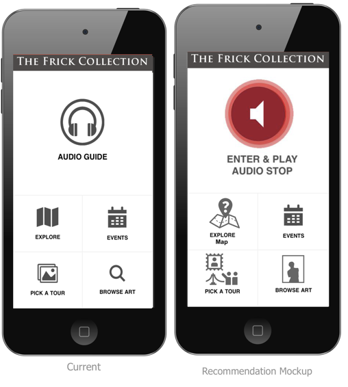

Recommendation B: Include interactive imagery: It is suggested to include imagery and icons that are clear, ensure pinch-zoom & auto-rotation functions are supported, font size flexibility is also ensured to better mimic familiar and popular mobile features.
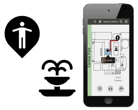
Recommendation C: The map was seen to be a bit static so it is recommended to include interactive map features such as a “You Are Here” icon, responsive directions and permanent landmarks such Garden Court or Central Park to help visitors orient themselves. Both visitors and The Frick Collection recognize this is a necessary feature for the app and so the institution is on the right track on this point. The only hurdle left is to find and hone the necessary technology needed.
Conclusion:
As you can see below, the changes to the interfaces are minimal but ensures that The Frick Collection can provide content in a clear and interactive way. The Frick Collection was found to be very close to a perfect final product and so only a few recommendations were made.
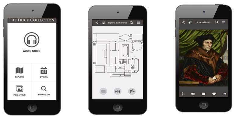
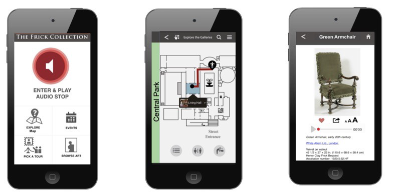
The test highlighted that users who participated in the Usability Test of by using both the downloadable app and loan devices thoroughly enjoyed using each interface. Users enjoyed having absolute power over their consumption of information, along with the features each device provided them. Specifically, users enjoyed being able to read about each piece, seemed pleasantly surprised by the fact that there was an audio guide function, and found using either interface as enjoyable as a scavenger hunt.
Even though, the findings presented in this report did lead to three key recommendations, the Frick Collection’s future loanable device and current downloadable application already provide a great offering for visitors.
Author Bio: The authors of this article and report are Alanood Al-Thani, Katherine Curran, and Shannon Mish. They are all graduate students in the Museums and Digital Culture program at Pratt Institute.
The Frick Collection: Usability Research on In-Gallery Devices was originally published in Museums and Digital Culture – Pratt Institute on Medium, where people are continuing the conversation by highlighting and responding to this story.