Rollercoasters around the world
August 2, 2018 - All
Summer is rollercoaster season. My friends and I have made a tradition of visiting theme parks every summer, so when I found a massive database of rollercoasters around the world at RCDB.com, I knew this was something I would be interested in doing and a topic where I knew I would be able to find a user testing audience for.
RCDB is a database in the most straightforward sense. It’s a site full of user-submitted information, placed into a database and each page is generated from there. While it does provide very comprehensive data on rollercoasters, it’s not necessarily a site built for exploration or discovery. I wanted to take the data from the site and build interactive visualizations that would encourage users to explore what’s out there and find a theme park they might want to visit. I also wanted to explore the data to possibly look for overall trends in rollercoasters.
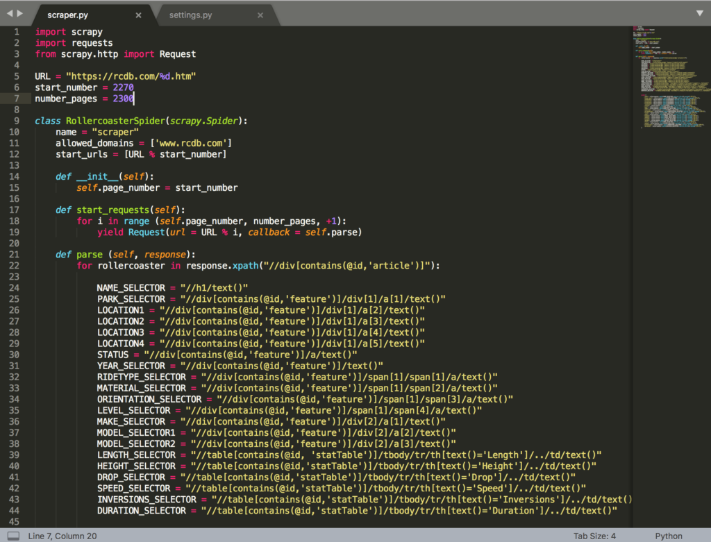
After my previous experience scraping data using BeautifulSoup for the network data lab, I was fairly confident that I would be able to get all the information I needed from the RCDB, especially since the coding behind the RCDB was much more straightforward and consistent. In the network lab, I had looked at using Scrapy instead of BeautifulSoup, but in the end thought that it might have been overkill for a small scale scrape where there would be inconsistencies in the HTML that I had to address manually anyway. For this project, I fully embraced Scrapy and it turned out to be a relatively painless process. Once I figured out Xpath and learned that I could find the Xpath of any web element using Chrome developer tools, it was really smooth sailing. I had spent hours wrangling scraped data and adjusting Python code in my first experience with scraping, so this experience felt like a breeze. Once I wrote scraper that worked, I left it to slowly crawl the 16,000+ pages of the RCDB over the course of several hours. While the RCDB didn’t have many restrictions based on the contents of their robots.txt, I left generous delays between requests anyway.

If someone was just starting out with Scrapy, these are the resources I found most useful for my project:
- Guide to using Scrapy from DigitalOcean – A good base tutorial. I also using the DigitalOcean BeautifulSoup guide as my starting point in the network lab.
- Web Scraping in Python Using Scrapy – Another guide I liked that gives a more end-to-end look at using Scrapy.
- Xpath for Scrapy – Understanding Xpath, which really opens up a lot of possibilities with Scrapy.
- Using Chrome Developer Tools to find Xpath – I found I still needed to make some small adjustments to the Chrome generated Xpath, but it saved me a huge amount of time to be able to copy and paste from this tool.
- Scrapy documentation and tutorial – I found this to be helpful information, but not necessarily the best guide if you just want to get up and running quickly.
- How to scrape politely – Scraping isn’t always welcomed with open arms, so it’s good to have an idea of how to scrape responsibly–and especially so you don’t get banned with an incomplete dataset.
Only about 4700 of the records I scraped pertained to my project, but I was able to quickly clean that up in OpenRefine. What I ended up spending a huge amount of time doing was cleaning up all the corrupted characters that resulted from scraping information in other languages. I had to adjust countless Vietnamese, Hungarian, French, Turkish, and other results. I prioritized fixing location data and theme park names over rollercoaster names since I wanted to be able to make use of geographic data. The data from China and Japan often had the names of rollercoasters in both English and their respective native language, separated by a “/”. I opted to completely cut out the non-English version of the name, as it all ended up as corrupted characters anyway. I also normalized the opening dates for all the rollercoasters. While many (but not all) of them included specific month and date information, I cut it out and just used years for all of them. I didn’t think I would need to go so granular in looking at time information and was more interested in trends over years.
Before I even had my data in a useable form, I did a kind of preliminary round of user-testing. I asked people who I knew were rollercoaster fans what kind of information they would be interested in based on a loose description of what kind of data I would have available. I got a lot of predictable feedback: people would be interested in finding the fastest rides, or the most extreme. I also heard a lot regarding the experience of the theme park itself, such as ride wait times or repair and incident occurrences. Unfortunately, I didn’t have any information regarding those aspects of the experience. But it was helpful to have a frame of reference when I sat down to make my visualizations. It seemed like users were primarily interested in finding out about specific rides, rather than getting an overall picture of rides globally,
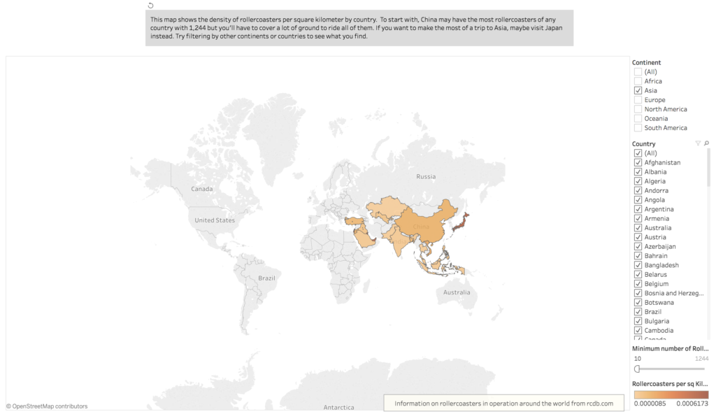
I used Tableau and ended up making two main ways to experience the rollercoaster data, and then two secondary ones. My first was a map showing the density of rollercoasters per sq km in countries around the world. I had experience making a choropleth map in Carto, and I tried applying some of those principles to Tableau map making. I had initially hoped to be able to overlay a dot map with the choropleth map, but it didn’t work out. Tableau was able to recognize some of the city names in my dataset, but it returned errors on over a thousand of them. I also wasn’t able to get an accurate calculation just by loading my rollercoaster list dataset into Tableau and creating a ratio between rollercoasters and land area. I ended up creating a file that specifically contained the number of rollercoasters in a given country and using that to make my calculations. Any attempts to connect the rollercoaster list data would confuse Tableau and skew my numbers in a huge way. For example, the number of currently operating rollercoasters in China is 1,244 but after loading the list into Tableau and making a data connection, the number would explode to over 1.5 million. I opted just to use the list data in a complete separate project file.
I also found that it was difficult to show the information on a large scale on the map. Singapore has one of the highest rollercoaster to land area densities, specifically because it’s such a geographically small country. And because it’s such a small country, it’s not even visible on the map when viewed on a world scale. These kinds of data points caused almost every other country to read as the same density, i.e. the same color. I found that limiting the data to countries with 10 or more rollercoasters helped to reveal density differences, and further filtering by continent would show even more difference. I set the map to show only Asia initially to encourage users to uncheck it and explore other regions.
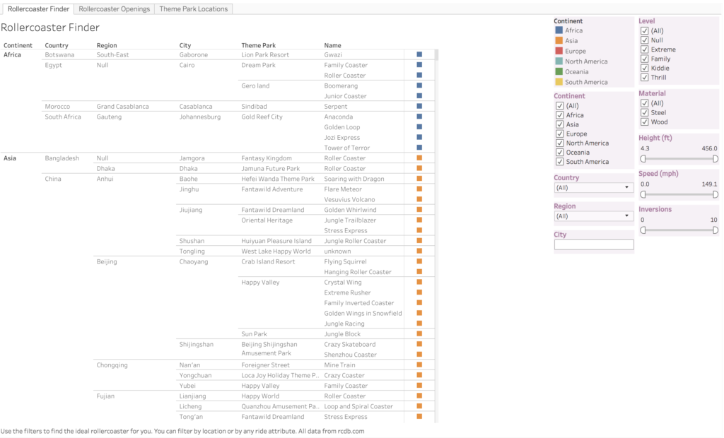
My second main visualization was just a straightforward text chart of all the rollercoasters in my data, along with filters that a user can adjust to find a rollercoaster they might want to ride. I made this more as a discover tool than as an actual styled visualization. It was something that I thought the RCDB was lacking–a quick updating search that could be adjusted on the fly, rather than a static database search and filter.
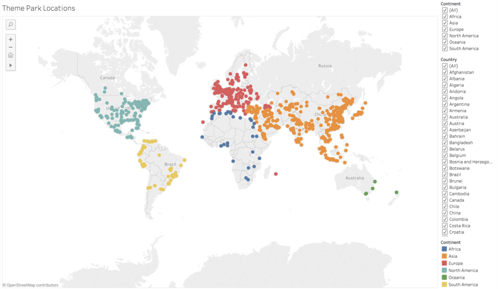
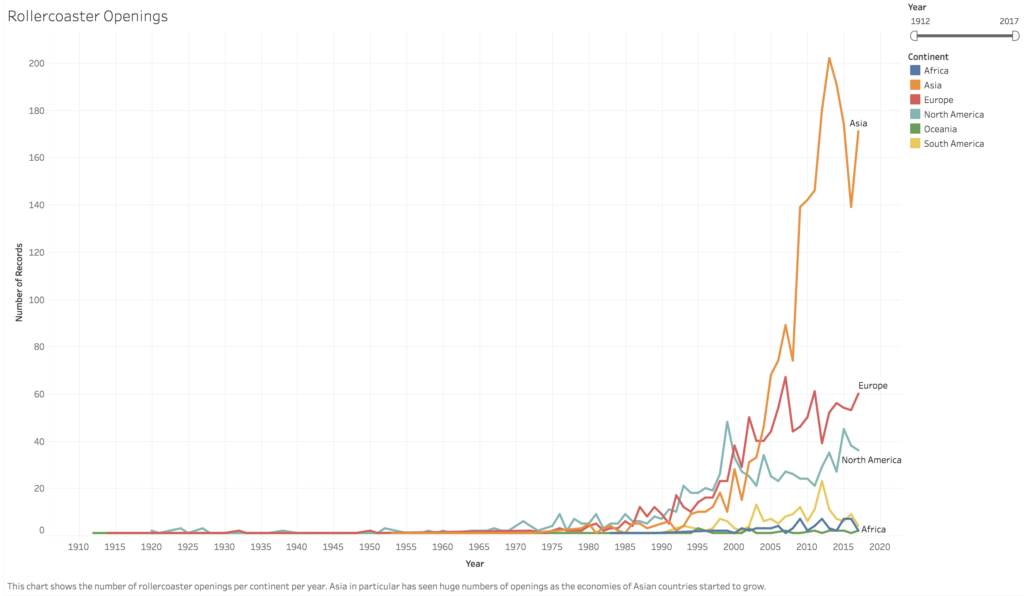
Finally, my two smaller visualizations were a line graph that shows rollercoaster openings over the years and a dot map of theme parks across the world. These aren’t really tools for a user, as much as points of interest. The dot map in particular is problematic. As I mentioned earlier, Tableau was unable to recognize over 1000 of the cities listed in my dataset. The dot map is a very inaccurate representation of theme parks, since it excludes over a quarter of the data. I included it here more as an example of something to further refine and work on, rather than as something that’s a finished product.
In my second round of user testing, I showed users my choropleth map and my rollercoaster finder chart. Right off the bat, I noticed that the usability of Tableau was limited by the computer’s resources. Two of my participants were using older Windows machines in an office setting and had a hard time getting everything to load quickly or be responsive enough. One of them wasn’t even able to load the finder chart and I had to set in and let her use my laptop. All three participants found the choropleth map to be difficult to navigate and use. There was lag when they tried to load different regions or drag the map to different areas. One of the users wished there could be more detail in the map, to be able to drill down or see specific points and rollercoasters.
All three users liked the chart and were able to use it to find a ride they were interested in. One user would’ve liked to be able to take that and link it to geographical data. I also had the users visit the RCDB and asked them to compare the experiences of using the site and my visualization. Everyone agreed that the RCDB was more geared to finding a specific piece of information, rather than to be used as a discovery tool.
I noticed that all users took some time to notice the filters on the right of the finder chart. I went back and subtly shaded them in a color not used elsewhere in the chart in order to create some contrast and hopefully draw attention to them more quickly.
There are tons of future directions I would be interested in taking this data. I would love to be able to make a more comprehensive and user-friendly map. I think it would require more time and ability with Tableau, or maybe even shifting to Carto, though the data size limitations in Carto would probably be difficult to work around. It would also take a lot of time to find the latitude and longitude of each theme park, since neither software is adept at mapping information without that data. One user suggested the ability to compare rollercoasters side-by-side, similar to tools found in online shopping sites, which would be a good supplement to the rollercoaster finder chart.
The line graph of rollercoaster openings by year is a pretty simple chart. I would be intersted in adding other dimensions to it, such as comparing it to population or GDP growth. In Asia especially, the boom in rollercoasters seems to align with the rise of economies in Asia but it would be really interesting to see if that’s confirmed in data. I was able to find GDP growth information from the World Bank, but would need more time to transpose the data into a useable form in R and then make the appropriate connections and comparisons in Tableau.
Overall, I think this project turned out to be more of a process exploration than a delivery of a final product. I learned a lot about web scraping and I got a lot of good feedback and ideas for extensions of my work through user testing, both really useful experiences for future visualization projects. I would be definitely be interested in continuing to work with my data and finding better executions for my ideas on presenting it to users, but for now I have a useable tool to start planning for next summer.
The post Rollercoasters around the world appeared first on Information Visualization.