Wildfire Risk Zones Throughout California
July 24, 2018 - All
Introduction
Depending on rain levels each year, fire season in California has the ability to ravage certain areas, stretching from backcountry to populated areas. Wildfires are expected; they clear away dead vegetation and weak trees creating space and opportunity for new and stronger growth. At the same time, if uncontrolled, they have the potential to wipe out entire communities and livelihoods. I wanted to show the areas affected and the degree to which they were affected. I selected a dataset as a shapefile from CalPoly’s site.
References
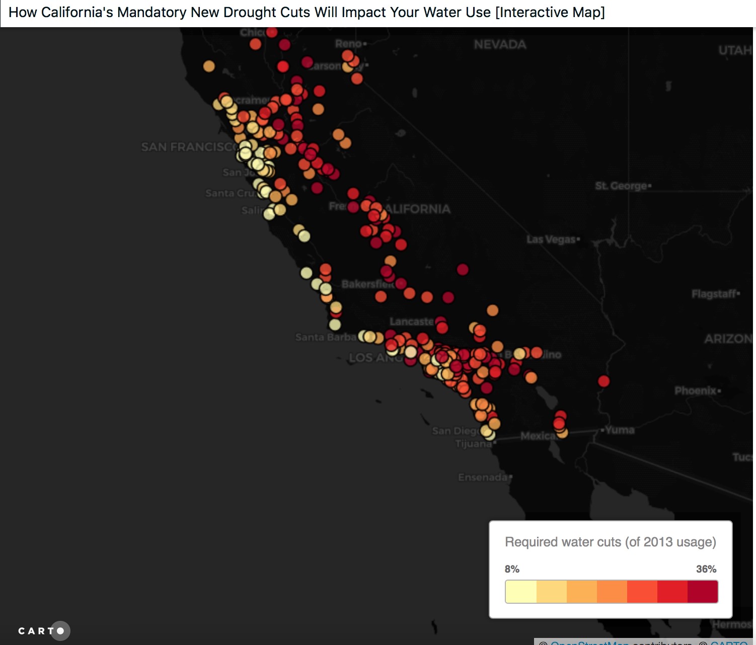
I referenced Carto’s gallery to see a variety of visuals. One that stood out to me was:
California Water Restrictions – This map depicts how the water restrictions throughout California would impact CA residents as a response to the drought 2013. It has a chloropleth legend and provides pop ups over each city with how much water use has been cut, what the restriction rate is, and how much more need to go to meet this cut off. I liked that overlayed the data on a subdued map of California in black and grey and the pop ups allow the information to be accessible as needed without cluttering the map as there are very dense sections.
Layout
This data visualization depicts the fire hazard risk zones throughout California as a chloropleth map. It is layered over California counties dataset shown in light grey separated by a white border. This allows the viewer to place the location of the fires through this overview more specifically. The hazard zones were defined by a legend in the upper left of the map as pictured above. The fire hazard risk ranges from medium, high to very high. When creating the legend, I initially published it with a chloropleth legend showing 5 colors. After publishing it, I saw I could customize the legend to note each color’s meaning specifically but it wouldn’t allow me to make the switch, removing the legend entirely each time I selected a custom option. I’m not sure if this is because of a loading lag, or a publishing issue. The final version no longer has a legend which creates confusion as the map loses all context.
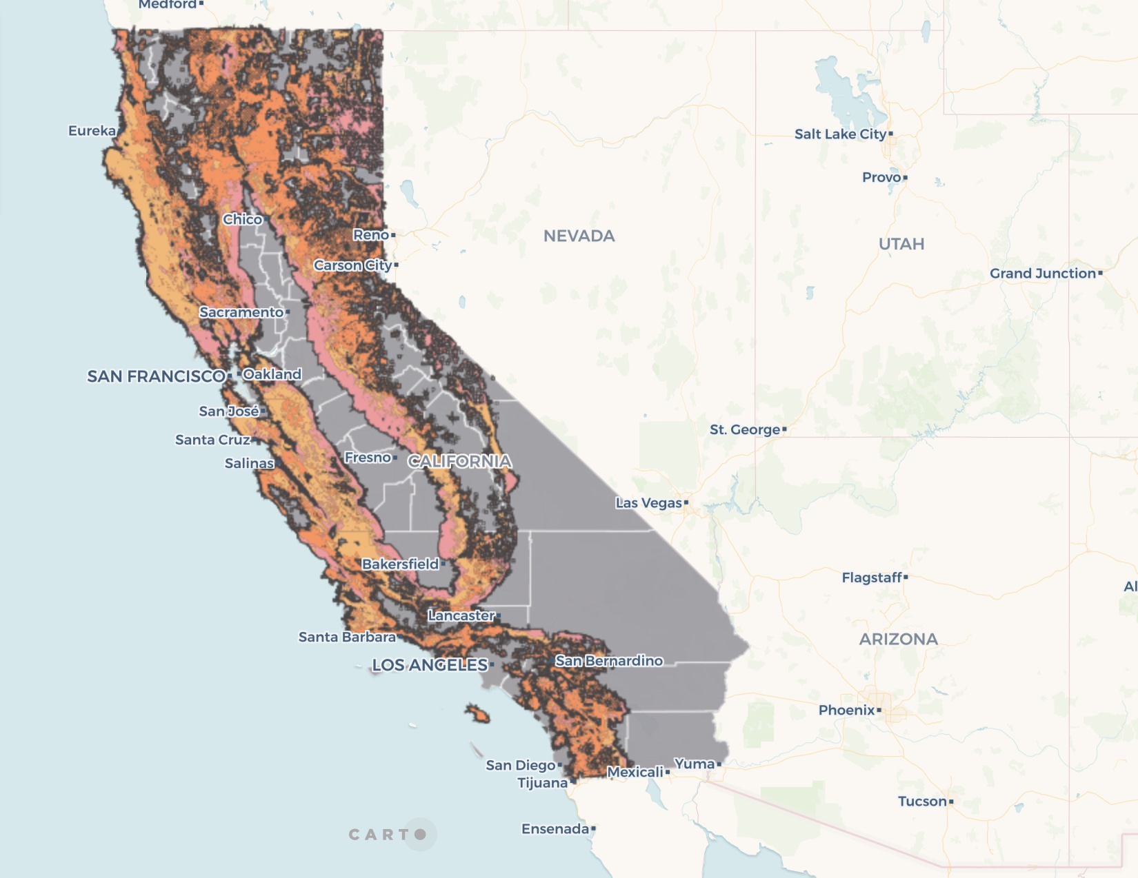
The dark grey underneath the fire hazard zones depicts the SRA or State Responsibility Area which are areas California state has a duty to ‘prevent and suppress’ wildfires as defined by AMPRS. I utilized the SRA data to show the tightly knit borders almost exact to each fire zone. I adjusted the weight of the stroke to bleed out a bit more so it wasn’t lost under the orange gradient and kept it a darker grey than the county boxes to keep a minimal palette. I also wanted to find a way to layer SRA as its own visible layer but wasn’t able to do so in the original file as “haz class” was created. Instead, I re-uploaded the same file and styled SRA only – trying to depict it as a transparent layer or as a border by changing stroke size. Decided to keep the fill transparent and use a heavier, opaque stroke to depict borders instead since it’s layered exactly with the hazard areas.
Hindsight
Solve why legends won’t stick for this data vis! Without them, this map makes no sense. Additionally, I would have liked to add a more dynamic and pertinent element to this map highlighting the impact of these wildfires on the residents in those areas. Potential comparisons were hiking trails in California, major roadways or natural recreational areas like hot springs for example: Harbin Hot Springs was a popular hot spring destination lost a few years back and I was curious about what other special places may be at risk. National or state parks were another option. Unfortunately, I had trouble finding the necessary data to layer the data for an analysis as none had the necessary lat/long variables. I would test the pop-up features more with the data that I do have, possibly removing the SRA layer entirely as it feels cluttered given that it overlays almost exactly each risk zone and instead notating where the boundaries are as a pop-up, customizing them and simplifying the map.
The post Wildfire Risk Zones Throughout California appeared first on Information Visualization.