What drives users to delve deeper into The Met’s vast online collection?
July 20, 2018 - All
Reported by students at the Pratt School of Information. Chinos Maduagwu, Jamie Raymond, Jill Hackett, Xiaxin Chen. This project was done as part of the course: Usability: Theory and Practice.
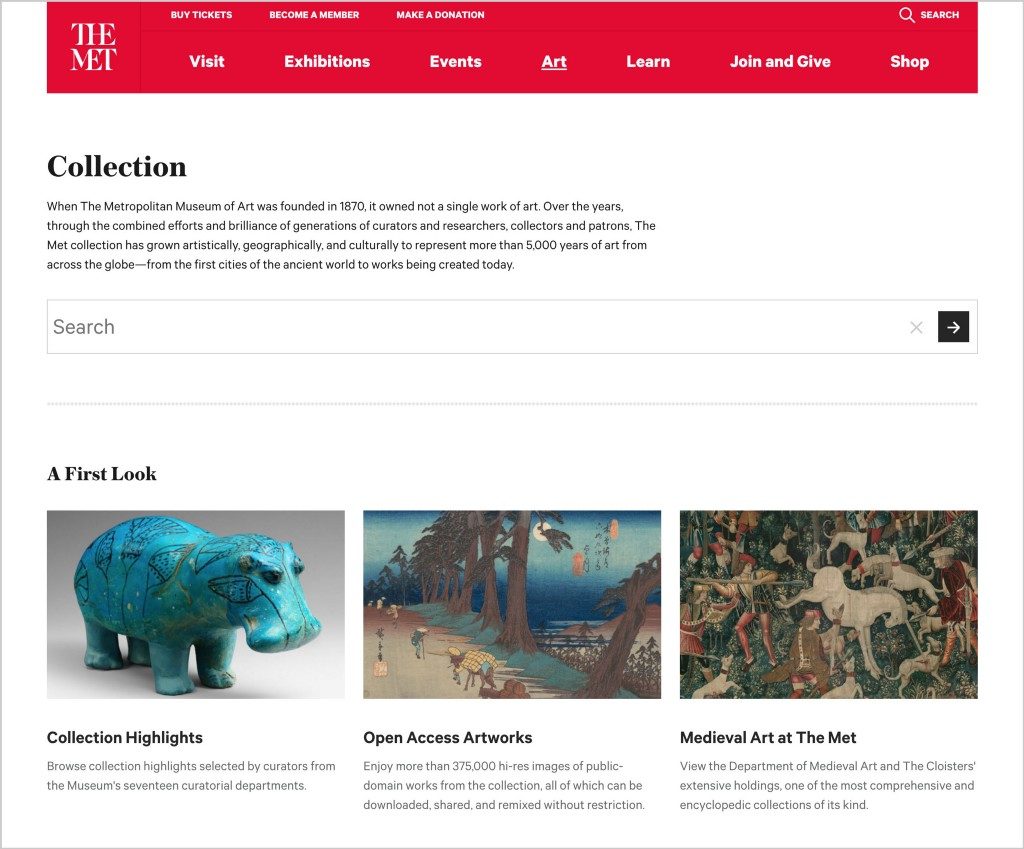
Located in Central Park, The Metropolitan Museum of Art in New York City houses art from around the world spanning over 5,000 years. The museum consists of three sites including The Met Fifth Avenue, The Met Breuer, and The Met Cloisters. In 2017 the museum welcomed 7 million visitors, with a total of 31 million visits to the website, 35% of which were international.
A team of four usability researchers, Chinos Madugwu, Jamie Raymond, Jill Hackett, Xiaxin Chen, from Pratt Institute School of Information wanted to understand how two target user groups are interacting with the online collection on The Met website. The team conducted a series of eight in-person user tests, which evaluated two target user groups interacting with the online collection on The Met website.

Introduction
Participants from this study included students and freelance artists, known as Casual Browsers, and art educators and professional researchers, known as Researchers. The team from predefined a scenario and a set of navigation-based tasks for these two user groups to complete. These tests were recorded using screen capture software, which was then analyzed to develop a series of findings and recommendations intended to encourage interaction with The Met collection.
Methodology
In order to better understand user behavior in relationship to the collection, this investigation relied heavily on asking users why they selected objects from The Met collection, as well as inquiring into expectations for each page and whether their expectations were met. This revealed key locations in the interface where user’s felt notably satisfied or notably confused, which lead to key findings and recommendations.
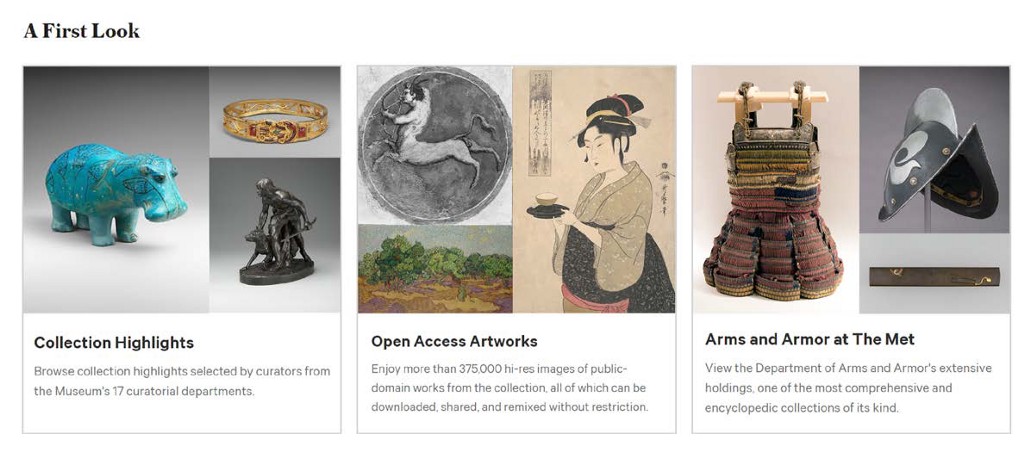
Each test was administered by at least one member of the team, sometimes two in order to assist with note-taking and analysis. The tools used to record findings included the screen capture programs Silverback (Mac) and Flashback Express (Windows), as well as note-taking by hand or tablet. Users were instructed to begin navigation from The Met Pinterest board in order to start the test from an object page that has initially interested the participant, which represents the starting point for 70% of users on The Met website.
The structure of the user test for The Met website was designed to discover what motivates users to engage with The Met online collection of historical works. The research team sought to find answers for the following questions:
1. What drives users deeper into the collection?
2. What information on the page gets the most attention?
3. What information are users looking for, and are they able to find it?
4. What kinds of links on the page are getting the most attention? What do people expect to see?
5. What intrigued them to the website in the first place, and how does that influence their browsing?
According to previous a report analysis, 66% of visitors to the website do so using a desktop. This study analyzes navigation on desktop platform.
Tasks List
[TASK 1] THE OBJECT PAGE (FROM PINTEREST)
- The participant selects an item they like.
- The participant clicks through to The Met object page.
[TASK 2] BROWSE (FROM OBJECT PAGE)
- The participant is asked to find another object they would like to learn about.
- The participant selects another object.
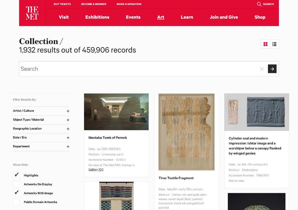
[TASK 3] SEARCH (FROM COLLECTION PAGE)
- The participant is guided to the Art > Collection page.
- The participant runs a search for something that interests them.
[TASK 4] EXPLORATION (FREE FORM)
- The participant is asked to find an object they would use for their next project.
Measurement Criteria
Following the collection of data from a total of 8 user testing sessions, the team was able to collectively pinpoint key findings and recommendations to encourage engagement with The Met collection. These findings come from an analysis of each task guided by the following questions:
What information is the participant looking for?
Did they find it?
What information distracted them from exploring further into the collection?
What attracted them to the object in the first place?
What made them click on it?
What did they like about this page?
What didn’t they like about this page?
Did they mention if anything was missing?
Did they have any desires for this page?
Findings & Recommendations
The focus of this study was to learn what motivated participants to interact with objects in the collection, what information they hoped to find (and whether they were able to find it), and what methods Browsers and Researchers used to navigate the collection.
This study revealed three key findings, each inspiring a series of recommendations in order to promote user engagement with The Met collection based on users’ natural behaviors.
Finding #1
Users navigate the collection via object images
Given the importance of object images to attract users deeper into The Met collection, the first recommendations was intended to emphasize object images at every opportunity in order to better promote visual navigation.
Recommendations
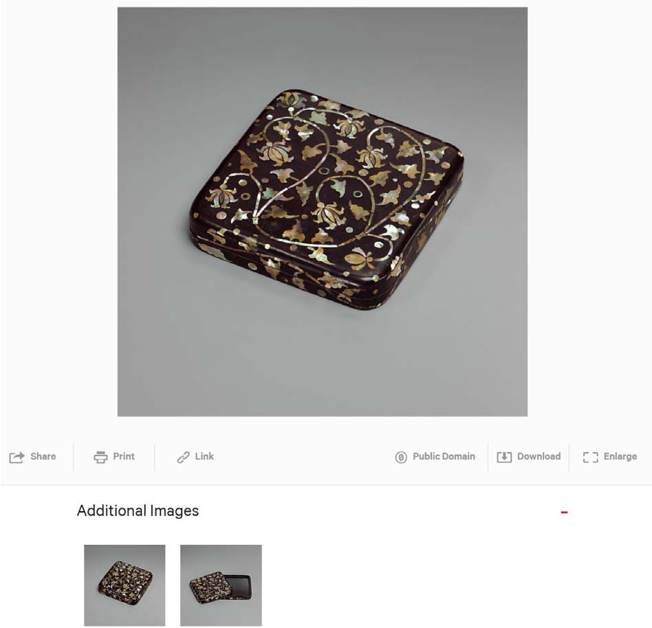
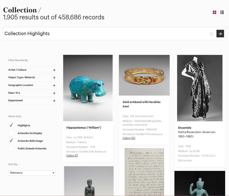
1A. Expand the Additional Images heading by default.
Most participants cited the desire for additional images as a reason for navigating to an object page.
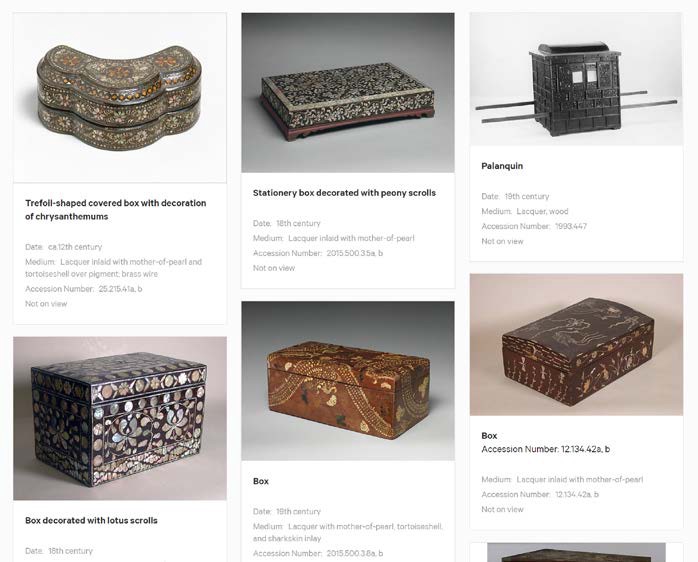
1B. Enlarge the thumbnails in the Related Objects section
Enlarge the thumbnail size in the Related Objects section in order to ease the browsing experience.
1C. Enlarge the thumbnails on the All Results search tab
This would increase ease of use and interaction between user and interface as some images were a little bit smaller in size.
Finding #2 Users seek to understand an object’s context
When selecting objects to learn about in The Met collection, many participants shared personal stories explaining why they were inspired to learn more about an object.
“I happen to like this extra large white space in ink drawings, and my dad did one very much like that, actually.” — Researcher
Recommendations
2A. Organize the Related Objects as a timeline
The team recommended organizing the Recommended Objects section as a timeline, featuring the currently selected work in relationship to works from neighboring decades. Our user research revealed this helps users navigate the collection.This places the artwork in context with surrounding works, catering to the Researcher’s enjoyment of navigating via the Timeline of Art History and increasing the chance that a Browser will spot a visual trend in their selected era.
2B. Hyperlink key categories to search results
Hyperlink categories, such as artist’s names, to search results. Participants were observed hovering their cursor over items in the general information located under the work’s title to see if they could navigate to more works by the same artist or from the same time period.
Finding #3 Users begin their search with a broad scope and progressively narrow their focus.
When asked to “search for an object that you would actually use for your next project,” many Researchers and Browsers hesitated when faced with the task.
“Having categories is really useful to me. One of my main issues is I usually don’t know where to start.” — Browser
Recommendations
3A. Clarify that the Collections page is a list of broad recommended searches for the Collection
Users landing on collection page were not to clear as to what the page actually was. Using thumbnails with multiple images will help the user visualize what the results of clicking on the link will be.
3B. Clarify the behavior of search categories
Clarify the relationship between the Collection topic link and the given search results. We suggested this comes in two parts, first by pinning the featured objects to the top of the search results and secondly, populating the search bar with the topic’s search phrase.
Conclusion
Visitors from all over the globe visit The Metropolitan Museum of Art, and in 2017 there were 31 million visits to the website, 35% of which were international. The online collection is popular among visitors and drew 10.4 million visitors. The Met and other museum institutions can take advantage of users interest in viewing the collection online by understanding who their users are and providing them with enough visual resources to help them dig deeper into the collection.
Results prove there is opportunity for online visitors to become more engaged with the online collection. User tests show that users are drawn to navigate via images and will dive deeper into the collection if provided with recommendations that match the context of their curiosity. Incorporating larger images and providing recommendations based on the history of relevant items can ensure attention is being drawn towards works in the online collection.
References
About The Met. Retrieved from https://www.metmuseum.org/about-the-met.
Met Museum Welcomes 7 Million Visitors. Retrieved from https://www.metmuseum.org/press/news/2017/2017-annual-attendance.
Usability Testing. Retrieved from https://www.usability.gov/how-to-and-tools/methods/usability-testing.html.
What drives users to delve deeper into The Met’s vast online collection? was originally published in Museums and Digital Culture – Pratt Institute on Medium, where people are continuing the conversation by highlighting and responding to this story.