Maps of Florida
July 3, 2018 - All

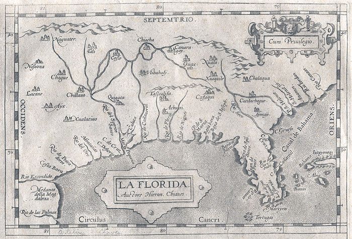
Florida has a signature silhouette that most Americans can identify in a single glance, but it turns out that this hasn’t always been the case. Mapping a large peninsula like Florida required a massive human effort, both technologically and politically, and it’s only recently that we’ve come to understand the state’s unique shape. My “Maps of Florida” timeline spans a 500 year history of Florida’s maps, which uses Florida’s signature shape to demonstrate the fluctuating accuracy of maps since the 1500s.
“Florida” first appeared on maps in the early 1500s, named by Ponce de Leon for the Easter season when he discovered the peninsula. Very early Florida maps detailed the contours of the state, emphasizing the shape of bays and known islands where ships could set anchor. Little was known about the interior of Florida’s landscape, though maps in the 1600s began to outline rivers and large landmarks such as lakes and Spanish forts. Political boundaries also varied across maps, particularly as Spain, England, and the Netherlands competed for routes and resources in this area. This brought about the rise of pirates in the 17th and 18th centuries, who made their living with the help of maps containing trade secrets such as ship routes, shipwrecks, and hidden Spanish gold on the coastline. All of these early maps were highly inaccurate by today’s standards, but many sufficed to navigate the Gulf area by ship.
It wasn’t until the 1800s that Florida’s modern silhouette began to take shape. Spain ceded Florida to the U.S. in 1821, and with it came defined borders and detailed maps of the territory’s interior. Maps from this time period included detailed and accurate information for cities, including roads, train lines, lots, and even post offices, but the macroview of Florida was sill distorted, sometimes placing bodies of water as large as Lake Okeechobee on the wrong side of the state. This all changed during World War II, when Florida became a ideal location for aeronautical drills due to the flat landscape and long daylight hours. During WWII, the air force produced highly detailed and accurate maps of florida for their use, and these maps were considered classified information. After the end of WWII, the maps were released for public use, which were then adopted for tourism, such as marking fishing routes and camping sites. Florida’s most accurate maps come from the 21st century thanks to satellite imagery. Today’s maps not only chart static information like Florida’s shape, counties, and lake regions, but also live information such as weather patterns and wildfires. Examples of these interactive maps can be explored on NOAA’s website.
The “Maps of Florida” timeline was created using Timeline JS. The history of Florida’s maps for this timeline was constructed from the University of Florida’s map collection, as well as a Tampa Bay Times review of a NASA exhibition, Florida Verve’s history of the state’s discovery, CoinWeek’s feature on Florida treasure hunting, NOAA’s website, and Florida Memory’s map collections. While the timeline itself only features six selected maps, all of these resources have tons of maps to explore as well as artwork and photographs from the different time periods.
This timeline could be further expanded by exploring not only the state’s changing shape but the specific technology used for mapping. While information about the maps themselves is plentiful, it turned out to be more difficult to find resources that explained how early maps were created. Due to the lopsided nature of that branch of research, I chose to focus this project on the visualization of Florida rather than the technology used to measure it. So far as Timline JS is concerned, I found the tool easy to use with nice results. Since my project covers 500 years of history, I appreciated the ability to zoom out on the timeline so that viewers could see the slides in the bottom graph. Because my project depends on being able to clearly see the shape of Florida, I also liked being able to make the timeline larger overall. However, I wish that Timeline JS had a lightbox capability so that viewers could zoom in on the details of maps and explore the images more thoroughly.
Overall, this project was enjoyable and educational. Being from Florida, I had always known that early maps of Florida varied wildly, but I didn’t know that so much of mapmaking was based in politics, as well as specific use cases such as ship routes or wildfire monitoring. I also hadn’t realized how recent Florida’s wellknown shape really is. The more you know!
The post Maps of Florida appeared first on Information Visualization.