The Flu and Influenza Vaccines in the United States
May 7, 2018 - All
Introduction
Recent reports have suggested that the 2017-2018 flu season may have been the one of the deadliest. This assertion, however, is misleading. This flu season may have had periods of severity that were higher than previous seasons, but it’s too soon to tell whether, overall, how severe it was. And we’re not out of the woods yet. There are reports of a second wave of the virus.
Despite having a robust immunization program, the United States still undergoes a flu season panic every year. One reason for this is that the influenza virus is a mutating virus which adapts to environmental constraints making it hard to predict which strains of the virus will be dominant and how to formulate the vaccine so that it protects the largest amount of people. Each year, the World Health Organization releases its recommendation for the composition of the influenza vaccine based on what it believes will be the dominant strains.
This visualization attempts to look at trends in the flu season from the Centers of Disease Control and Prevention (CDC) and how the United States has allocated resources with which to tackle this ever-adapting virus.
Inspiration
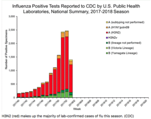
A visualization like this one from the Atlantic is highly misleading:

It doesn’t take into account an increase in population size, nor does it account for the rise in number of people seeking treatment for illnesses. Reports of influenza-like illnesses (ILI) is based on voluntary reporting from certain health care providers. The number of cases is based out of the total number of patients the provider has seen. The chart doesn’t show that there are more providers who are reporting their patients, the rise in the number of people who are seeking treatment, the number of people relative to the population who are not seeking treatment, or the rise of the population. All of these factors can impact the gross number of people with confirmed cases of influenza.
In the data that I downloaded from the CDC, the number of cases of reported ILI’s is provided as a percentage of total patients and is both weighted and unweighted. The weighted percentage takes into account the weight assigned to each state in order to normalize the data. The raw number of patients can be skewed by a couple of factors, such as access to providers, number of children, number of elderly people, which can all skew the data.
Here is an article by Popular Science which does a great job of explaining why the numbers collected by the CDC aren’t the best indications of severity.
I was inspired by this interactive visualization from the UN OCHA of the humanitarian operational presence and capacity in Afghanistan:
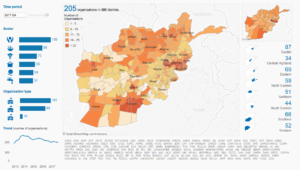
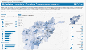
This visualization is able to show a lot of information without being too overwhelming. The focal points are bolded and simplistic while more a nuanced analysis is possible through interactivity. Interactivity also allows for the user to filter the information based on the region or the year. This visualization is actually to visualizations that are tabbed. While there is something lost from toggling back and forth, I don’t think that it is detrimental and is appropriate for the audience that this visualization targets.
I was also inspired by the World Health Organization’s dashboard of visualizations around the cholera outbreak in Yemen:
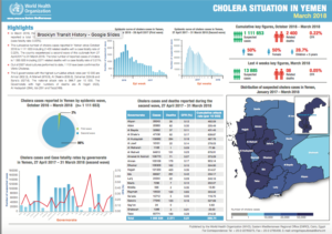
The incorporation of text and visualizations. Text can be tricky to incorporate, especially when it is in a small font, but I felt that this dashboard did a pretty decent job of using size to demonstrate importance. It is also at a high enough resolution that zooming into specific areas of the dashboard does not distort or reduce the clarity of the text or images.
Materials
I used four primary sources of data for my visualization from the Centers for Disease Control and Prevention (CDC) webite:
- CDC Flu Season summaries
- CDC Influenza Vaccine Does Distribution archive
- CDC Presidential Budget Requests, 2006-2019
- FluView: National, Regional, and State Level Outpatient Illness and Viral Surveillance which is partnership with the World Health Organizaton’s flu surveillance initiatives
I used Tableau Public to create a dashboard of my visualizations.
Methods
Flu Season Summaries
I combed through the flu season summaries in order to extract information on the past flu seasons, but the language and variables included in the report were inconsistent. However, it did give me a good idea about how the flu season was measured and indicators that were of high priority, such as how many children and the elderly were affected.
Budget
I went through every CDC budget request report pdf from 2006-2019 and located the section on immunizations. Sometimes the influenza season and vaccinations were highlighted, but sometimes they were not. I mainly drew data from the tables included in the report about requested, approved, and enacted budget amounts allocated towards Section 317, the Immunization Program, which was enacted in 1962. I was able to find budget amounts for Section 317 starting from 1991. From what I could find, starting in 2004 part of the Section 317 budget was allocated towards an Influenza Planning and Response Budget for combined seasonal and pandemic flu outbreaks. The Affordable Care Act, which passed in 2010, provided an additional funding body for Section 317 called the Prevention and Public Health Fund (PPHF), which has helped to keep the overall Section 317 budget relatively stable. In budget reports post the passing of ACA, the budget amounts have been normalized based on the new budget structure. From these later reports, I took the enacted budget amounts for Section 317 and for the Influenza Planning and Response budgets, which often differed from the approved amount, and entered these amounts into a spreadsheet with the corresponding fiscal year.
Budget Visualization
The visualization compares the budgets of Section 317 (the Immunization program) and the Influenza Planning and Response budget within Section 317 per fiscal year. The colors chosen were orange and orange-red to demonstrate that the budget amounts are based on the same line item. The choice of an area graph also underscores this connection and demonstrates a part-to-whole relationship. Not every fiscal year is shown on the x-axis in order to reduce clutter. The most recent downward trend between fiscal years 2017 and 2019 is a short time period to make any predictions with confidence, but I think that the trend shows clearly enough to be indicative.
Influenza-Like Illness (ILI)
After much searching, I was able to find a data dashboard on the CDC website with reported ILI, influenza-like illness, which is defined as patients who present with a fever, dry cough, and aches. The ILLNet data is a network of enrolled state and local health departments which was started during the 1997-1998 season and reports on outpatient data. The number of enrolled health departments continues to grow which contributes to the increase of the raw number of reported ILI. Reported ILI cases are not confirmed influenza cases and confirming collected influenza specimens takes time and is not a consistent process per year nor per health provider. However, the CDC uses the amount of ILI cases to demonstrate severity of a flu season and, while it is not explicitly stated, the increased likelihood of the spread of the influenza virus. As mentioned previously, it takes a bit of data literacy to really understand what ILI data actually shows. Each region and state of the United States is given a different weight when calculating ILI. Factors include number of pediatric health facilities, and overall number of reporting facilities per region or state. A disclaimer that accompanies the ILINet data is that “…it is not appropriate to compare the magnitude of the percent of visits due to ILI between regions and seasons.” A national baseline of ILI cases wasn’t established until the 2007-2008 flu season.
The ILLNet data is presented by number of overall patients and number of ILI cases over each week per year. To illustrate the basic time frame of a flu season, I took the weighted percentage of ILI per week and created a visualization. This visualization shows where a the majority of flu season begin and end and outliers can be identified.
To create a point of comparison between flu seasons, I took the national number of overall reported patients per week and combined them to get a yearly total of number of reported patients. I did the same with the number of ILI cases reported. I then calculated the percent of ILI per year. This yields an unweighted percentage, which is not ideal for comparison, but is slightly ameliorated by the fact that it is national counts and not regional counts. I used the percent of ILI cases per year to create a visualization which shows a trend of an increase in percent ILI cases.
Influenza-Like Illness (ILI) Visualizations
Two visualizations were created out of the ILLNet data set: “Measuring the flu season” and ‘Reported cases of ILI.” The year was set as a filter and assigned a color. The percent of weighted ILI cases was represented on the y-axis and the week (0-52/53) was represented on the x-axis. A bar graph was chosen to show the clustering of ILI cases around specific weeks. This shows the general pattern of the flu season which typically starts around week 40 and ends around week 15 of the following year. The length of the flu season varies and this was a hard concept to understand via text on the CDC website. This visualization attempts to simplify that explanation and show the typical illness peaks in a flu season.
The ”Reported cases of ILI” visualization is meant to be a simple line graph with a trend line to illustrate the trend of more cases per year. The data is normalized as much as possible by taking the percent of ILI cases from the total number of reported patients. The red color is meant to be striking, but not alarming. It also fits within the color scheme of the CDC budget visualization. Distinctions between shades of red are more easily seen by eye receptors which is why this color palette was chosen.
Doses Distributed
Influenza vaccinations are manufactured by private companies. The WHO submits a recommendationfor the formulation of the influenza vaccine which the CDC approves for manufacture in the United States. The FDA then enacts a safety protocol which monitors the production of the vaccine. The exact amount, formulation, and vaccine administration type (nasal, shot, egg, no egg, etc) is available by direct request to the private companies. It is expected that doses distributed to health facilities would increase as the population increases. I also looked through news reports and health journals for reports of vaccine shortages. A report of a shortage became an annotation on the doses distributed visualization. One of the peaks of doses distributed was during the 2009-2010 influenza pandemic in which a new batch of vaccines had to made to address the unexpected dominant H1N1 strain of the virus.
Doses Distributed Visualization
The real value of this simple line graph is in the representation of the increasing number of reported shortages of the influenza vaccine. The pink/purple color was chosen to remain consistent to the color palette. The visualization was placed next to the “Measuring the flu season” visualization in order to create a point of comparison. A more direct comparison of the budget and doses distributed was not possible because of mismatching denominators (fiscal years versus flu season).
User Experience Testing
A proto-type of the visualization was distributed to two groups: two medical librarians and four members of the general public within the millennial age range.
These questions accompanied the visualization:
- What would you say is the main point of this visualization?
- What did you learn, if anything, from this visualization?
- What did you like best about this visualization?
- What did you most dislike about this visualization?
- Who do you think is the target audience for this visualization?
- If you had one suggestion for the creator, what would it be?
Respondents emailed me their answers.
Results
UX Testing Results
Four out of the seven users responded to the survey, two medical librarians (MedL1, MedL2) and two millennials (Mil1, Mil2).
The respondents all felt that the graphs were informative and two respondents (MedL2, Mil1) specifically said that the colors were nice.
Three respondents (MedL1, Mil1, Mil2) said that they learned about the 2009 flu pandemic and were interested in learning more.
Only one respondent (Mil2) said that the main point of the visualization was to show the disparity between the CDC budget and the rise in illnesses. This indicates that a more clear narrative needs to be established in the dashboard.
The main criticism of the graph was the the visualizations were too close together which made the dashboard seem busy and confusing. One respondent (Mil2) said that the stacking of the flu seasons in “Measuring the flu season” was busy and confusing.
Based on the UX feedback, I tried to space out the visualizations more. I also tried to create visual hierarchy by making the top visualizations in a smaller font and the bottom visualizations in a larger font to illustrate greater importance. I shortened and specified my captions and headings. The final dashboard is shown below.
Dashboard Results
Discussion
When first learning about the flu and looking at the CDC website, I was confused about what the length of a “flu season” was. The seasons are primarily measured and judged based on past seasons without an established baseline. The visualization “Measuring the flu season” helps to clarify the duration of a flu season based on the number of illnesses (ILI) per week out of the year. The clustering the ILI per year indicated trends of “typical” times of severity and when the season begins or ends. The visualization also shows the outliers, like the 2009-2010 season.
There were three significant developments in the budget during the time analyzed. The first was the mandate in 2008 that all children, ages 6 months to 18, should receive the influenza vaccine. This mandate lead to a significant increase of the Section 317 budget. The second major development was the passing of the Affordable Care Act. After the ACA was passed in 2010, the budget for Section 317 was derived from 3 different sources. This has helped to maintain a relatively stable budget and even an increasing budget for Influenza Response and Preparedness. However, the overall budget for Section 317 is declining. After the 2016 election, there was a sharp decline in the Section 317 budget and the potential repeal of the ACA could severely impact the CDC’s budget. The other visualizations indicate an increase in the amount of people presenting with ILI as well as an increased possibility of vaccination shortages. A decline in the CDC’s immunizations budget is very worrisome.
The fu and other communicable diseases, such as Zika and Ebola, have risen to greater prominence in the public conscious. But it takes a large amount of data literacy to really understand what’s going on. Based on my exploration and utilization of the CDC’s datasets, data collection initiatives are highly dependent on budget and administrative initiatives which all fluctuate based on political and partisan changes rather than actual scientific inquiry or need.
Further Directions
Because of the lack of data collection by the CDC on illnesses and the lack of consistency on the data that is collected, mainly due to governmental administration changes, normalizing the data and reaching firm conclusions proved difficult. For this reason, my visualization tended to try to illustrate as much information as possible to give the widest possible picture. There are more visualizations that I would have liked to include, such as a comparison of dominant strains of the virus compared to rate of reported illness. However, the dashboard, I feel, is overcrowded as is.
Further normalization of the data sets and joins between them in order to create more levels of direct comparison may reduce the clutter of the visualization and illustrate more interesting comparisons.
My captions tried to create a data literacy learning curve in order to educate viewers on the virus, but this may have created more confusion than clarity.
One of the consequences of looking at immunization data was that I became aware of the drastic cuts to HIV/AIDS immunizations. A future visualization on this immunization program could be an interesting project.
The post The Flu and Influenza Vaccines in the United States appeared first on Information Visualization.