
Visualizing the World Tourism Data
May 1, 2018 - All
Introduction
This project is to visualize the world tourism dataset from World Tourism Organization, including arrivals of non-resident tourists/visitors, departures and tourism expenditure in the country and in other countries. I intended to use maps and charts to provide visual comparison between countries. With the consideration of the project goals and application features, Tableau Public was chosen as the major visualization tool for the project.
Dataset
I obtained the dataset from UNdata which is a data access system to United Nations databases. The dataset was posted and updated by World Tourism Organization in 2016, which includes the latest available statistics on “arrivals & departure of non-resident tourists/visitors” and “tourism expenditure” across the world during 1995-2014. Each country has the data of:
- Inbound tourism
- Arrivals of non-resident tourists/visitors-thousands
- Tourism expenditure in the country (credit) – US$ million
- Outbound tourism
- Departures – trip abroad by resident tourists/visitors – thousands
- Tourism expenditure in other countries (debit) – US$ million

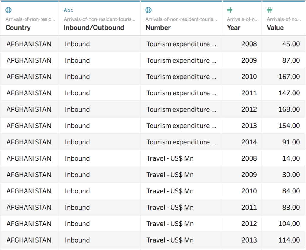
To prepare the dataset for Tableau Public, I first used Excel to clean the dataset by deleting the irrelevant data and add two columns for country name and inbound/outbound.

Then I used OpenRefine to transpose the data so each value of each year is an individual row and saved the file as a csv file. Now the data is ready to be imported to Tableau Public to create visualizations.
Method
1.Creating maps to visualize the arrivals/departures/expenditures
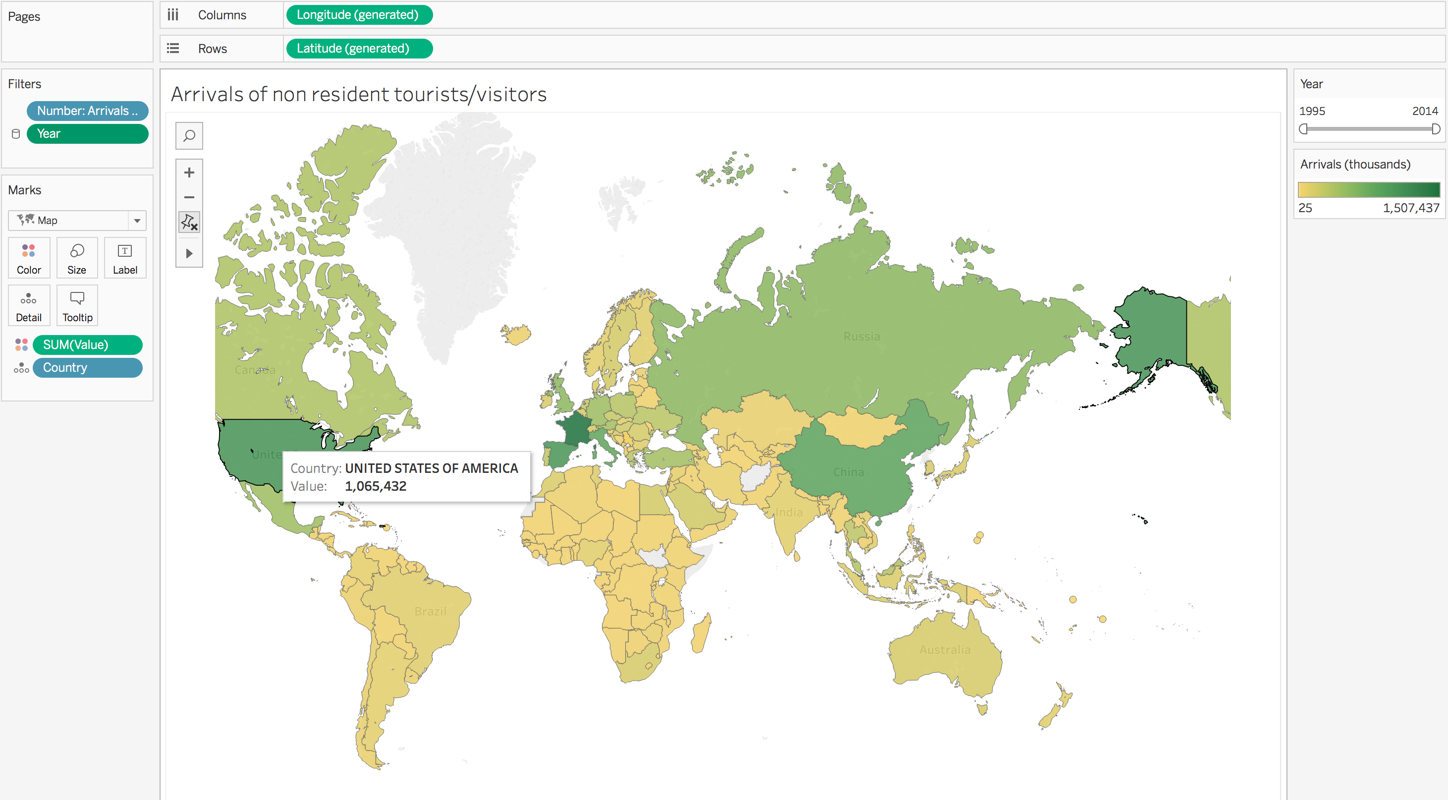
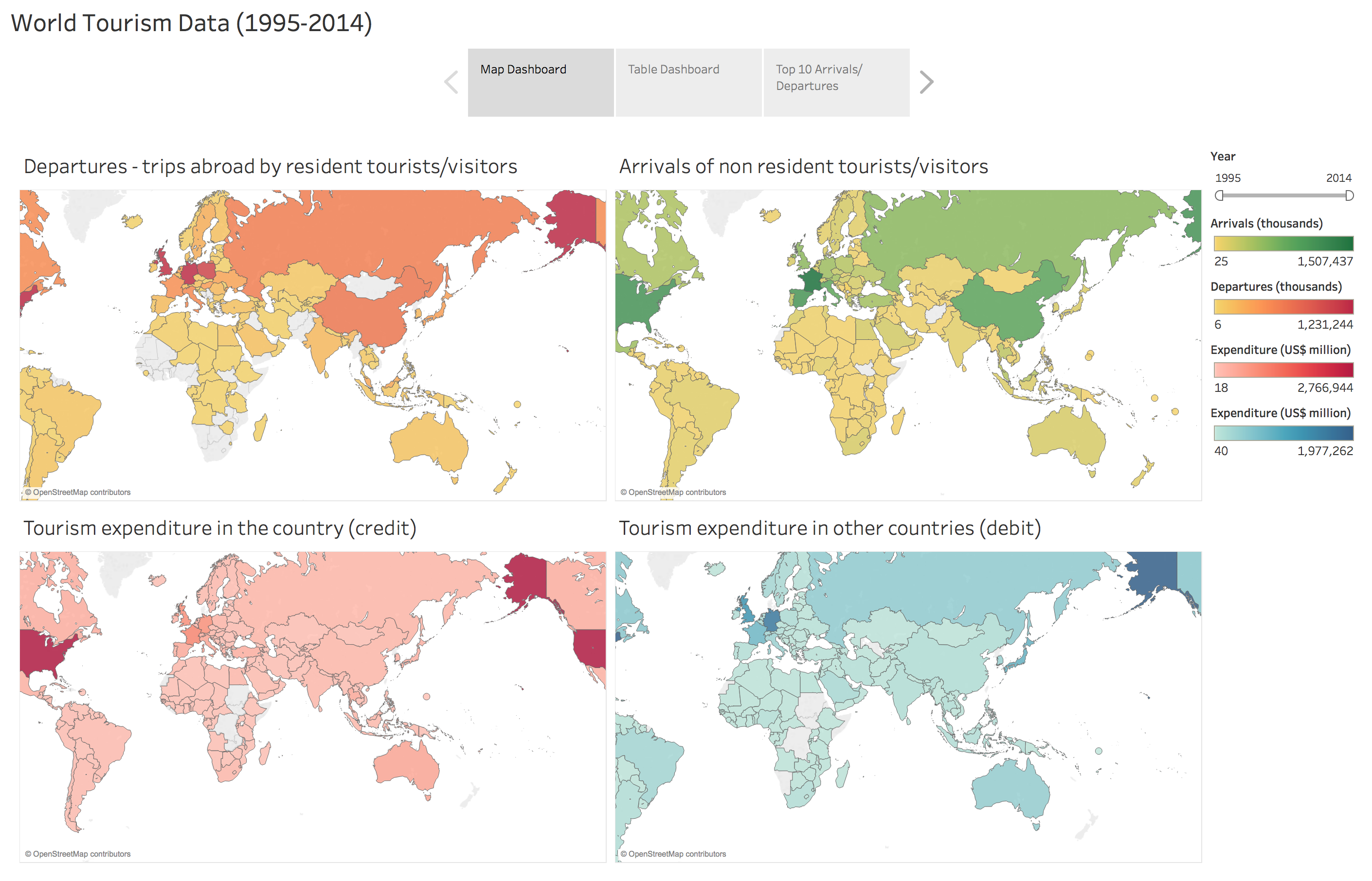
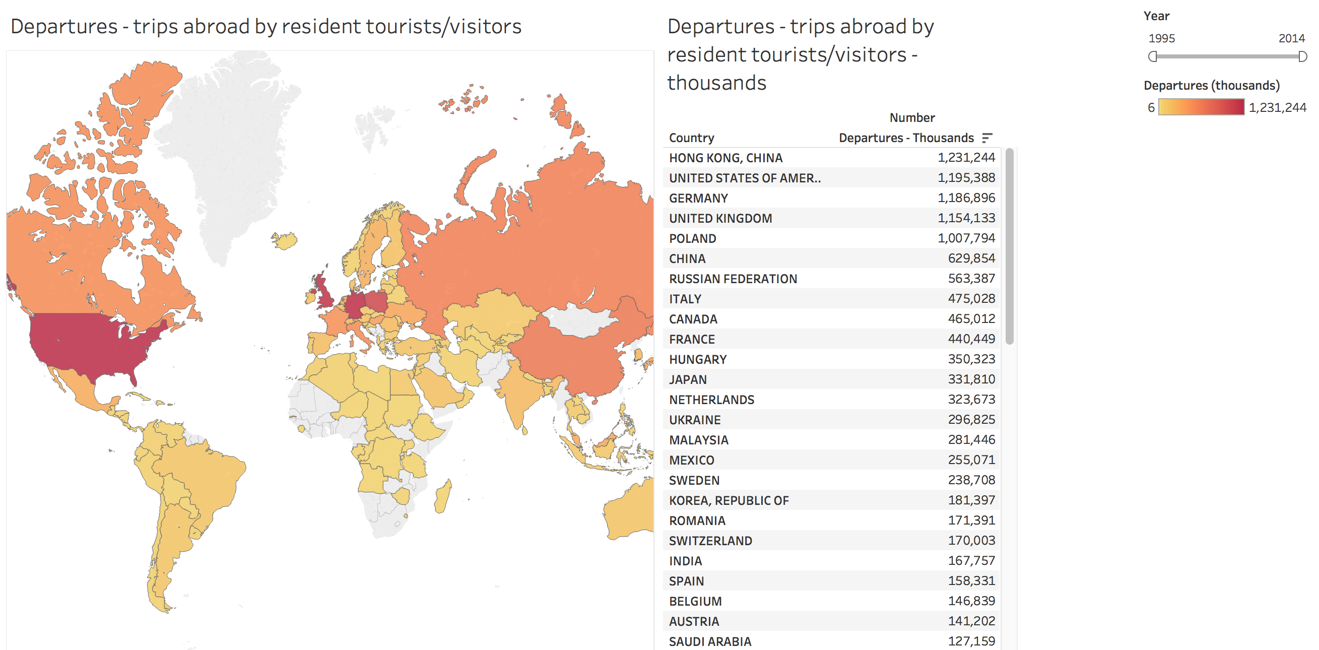
After importing the csv file of the dataset to Tableau Public, I created the map with longitude and latitude data and added the value of arrivals/departures/expenditures in the country/ expenditures in the other countries to create four different maps for each topic. I used color to demonstrate the difference of value, so the audience can identify the highest or lowest value instantly by viewing the map.
Since the dataset has the value of each countries from 1995 to 2014, I added a filter of year for users to adjust the years they desire to see. The value and color on the map will change based on the change of years. I also added labels to the map. By hovering each country, users will be able to see the country name and the value around each topic.
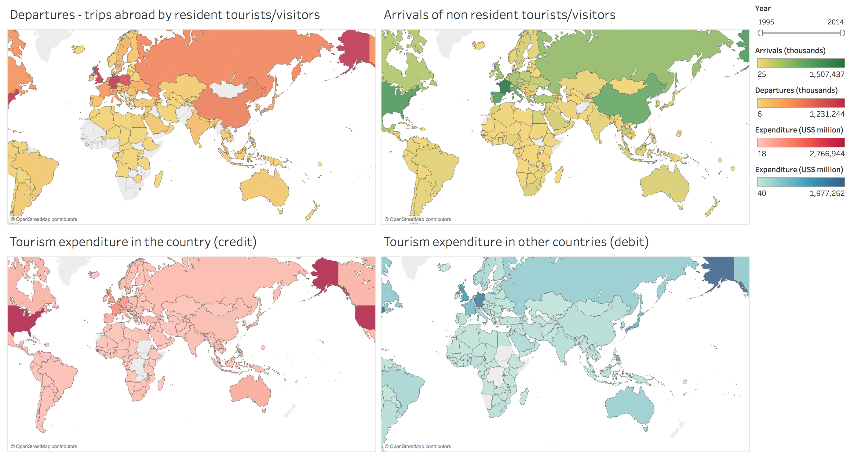
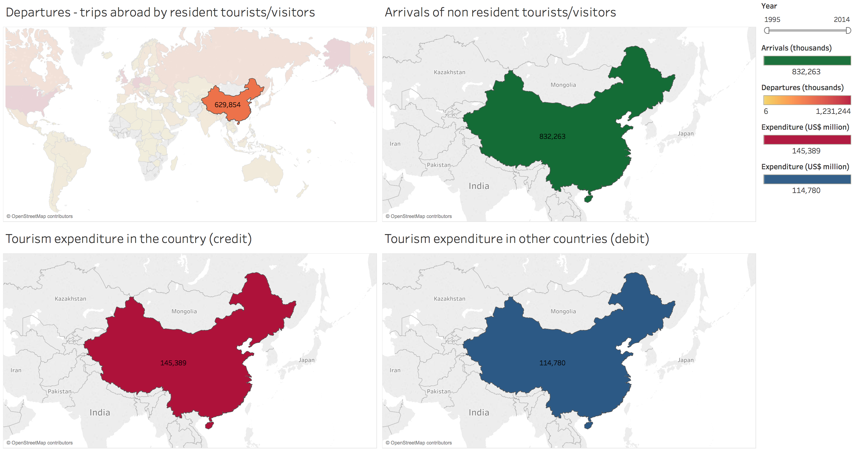
By following the same method, I created four maps for different topics. I further group them in a dashboard so users can view the map simultaneously, which is more convenient for comparing and building connections between countries or values. The year filter is kept on the dashboard which are applied to all values in four maps at the same time.
2.Creating tables to display the data and ranking of arrivals/departures/expenditures
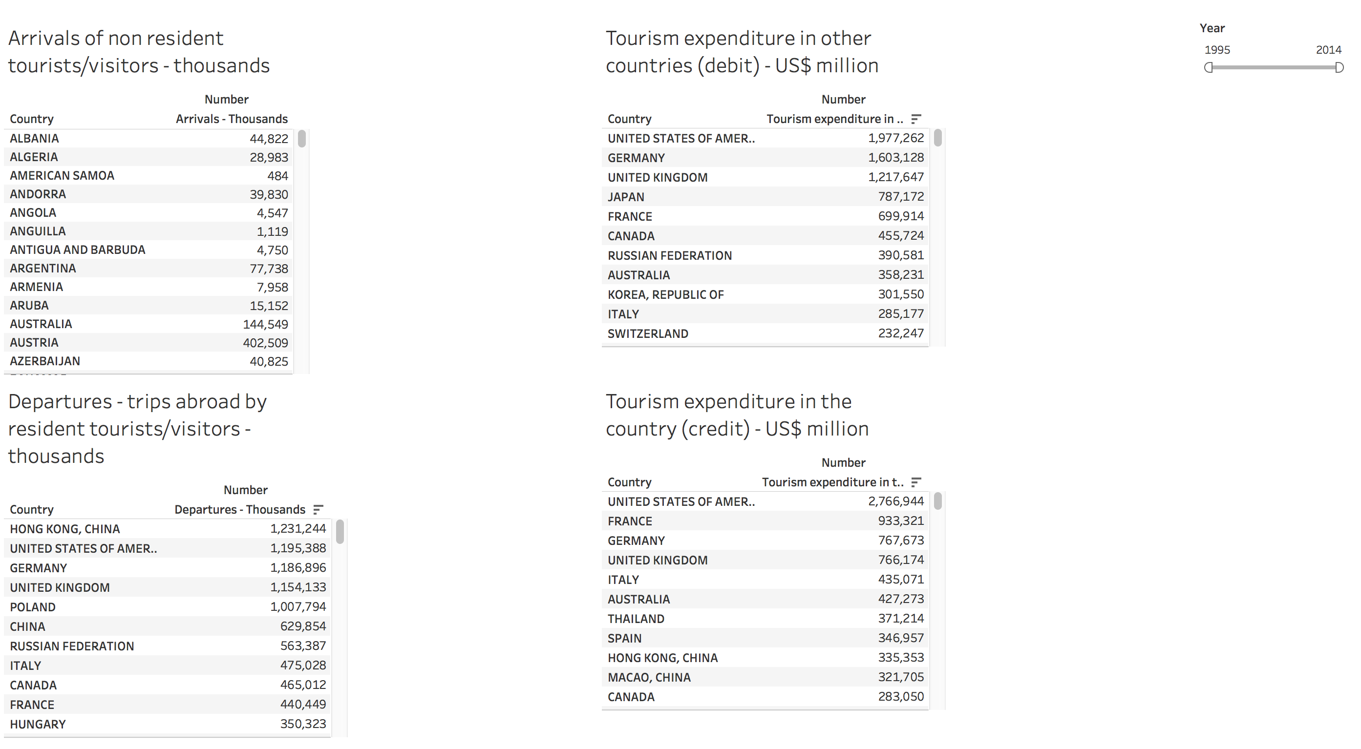
Although it is very visual to show the value on the map, it’s still difficult to compare the value precisely or see the ranking. Therefore, I created four tables as the supplement to the map, which can be used to compare the value more precisely and check the ranking of country around each topic. The result is much clearer to show which countries have the highest or lowest value of arrivals/departures/expenditures. It is also meaningful for the small areas which may have high value while hard to spot on the map because of the size of their national territorial area, such as some European countries.
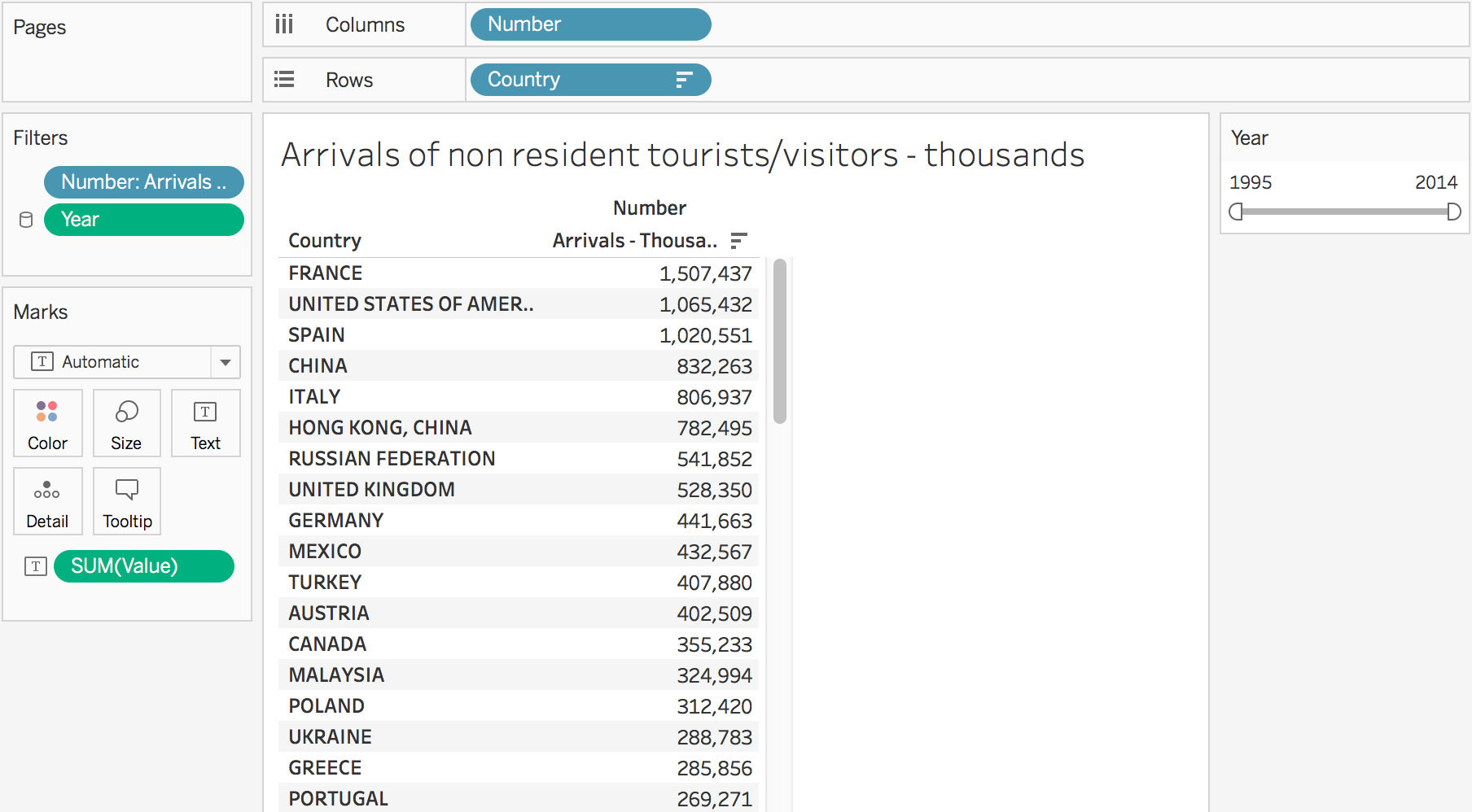
By following the dashboard layout of maps, the tables are also grouped together and sharing a year filter. Users can choose to sort the data from high to low or from low to high.
3.Creating line charts to display the trends of top 10 countries over the years
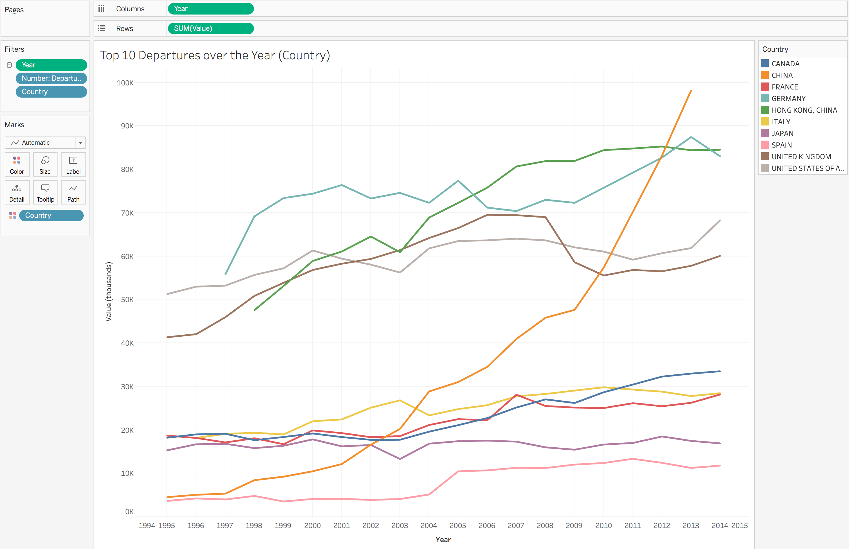
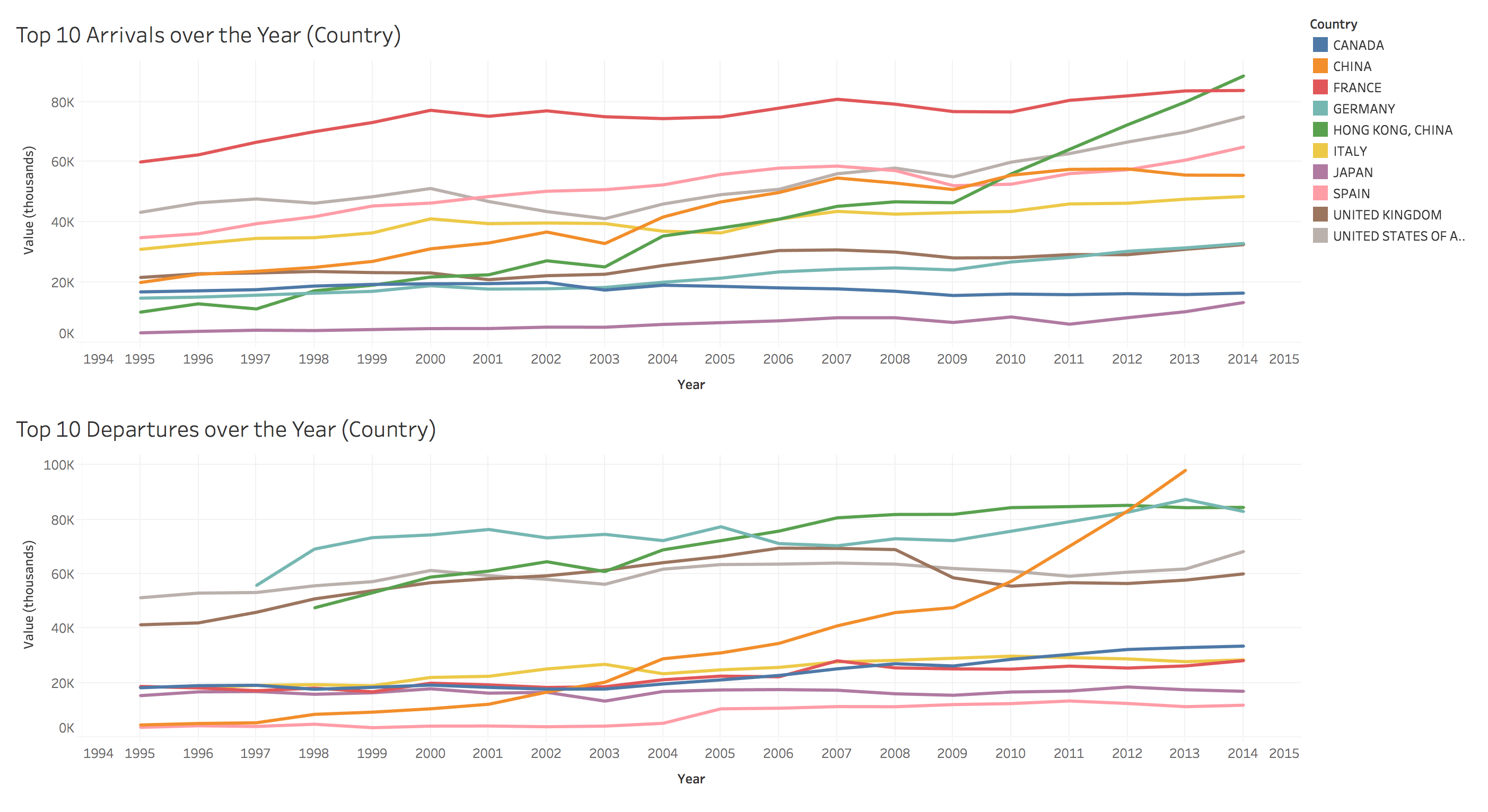
The maps and tables are great visualizations for comparing value horizontally among countries, while not an ideal way to compare vertically by years. Therefore, I decided to create two line charts to demonstrate the trends of the top 10 countries have the most departure/arrivals, so users can see how the number evolve over the years.
I grouped the two line charts together on a dashboard so users can easily compare the data.
4.Creating story board to include all dashboards
The final result is a story board which includes the three dashboards (maps, tables, line charts) where users can use the taps to easily switch between topics and different kinds of visualization.
User Research Method
After creating the story board, I started planning a user research to test how users respond to the visualizations and look for insights and recommendations for future improvements.
I prepared 6 questions to ask during user testing with the goal of understanding whether the visualizations are intuitive for users to read:
- Tell me what you learn from each chart.
- What surprise you the most?
- How easy was the visualization to read? Why? (0-5, 0=very difficult, 5= very easy)
- What did you like about the visualization?
- What frustrated you most about reading the visualization?
- If you had a magic wand, how would you improve it?
The target audience of the visualizations are people who are interested in reading data visualization while not necessarily from the tourism major. Therefore, I recruited four students from School of Information at Pratt Institute to participate the user testing sessions, because the students use and process data a lot in their daily lives and match the characteristics of the target audience of these visualizations.
I asked them to browse and interact with the story board first, and then answer the 6 questions I prepared to understand whether they like the visualizations and how I can improve them. I also observed their actions and reactions by their side while they are playing around with the visualization to gain more insights.
User Research Insights
1.Users can easily understand the meaning of each visualization.
Based on the user testing sessions, all four participants were able to understand the visualizations instantly.
2.Users prefer the maps and line charts to the tables.
Users are particularly like the design of the maps. They like the color, the features of seeing the labels by hovering over the countries, and the year filter. In contrast, they thought there is too much text on the tables which are less attractive for them to read.
To improve the table, users suggest adding a search box to the tables to allow users search for particular countries. Because the current chart has hundreds of countries and there is no an easy way for users to find the countries they want to see. Some users also suggested putting the map and tables side by side since the tables are supplements to the map.
3.Users identified the most insights from the line charts.
Surprisingly, although users seem to like the map the most, the major insights they described are from the line charts. For example, many users are surprised by the fact that France is the country has the most arrivals before 2014 (surpassed by Hong Kong, China in 2014).
4.Users want to see some descriptions or explanations next to the visualization.
Although the visualization is easy to understand and users prefer to read visualization over text, some users mentioned they hope there are some annotations beside the charts, so they can get to the major insights quickly. Currently, it still takes time for users to get used to the visualization, so it will be helpful to provide some guidance for them if possible.
Future Directions
1.Add descriptions and explanations to the story board and highlight the key points.
As mentioned before, users look forward to seeing some explanations besides the visualization. Therefore, to improve it, I will add some description on each dashboard to talk about the major insights or instructions to guide users how to use and expect from the visualization. It will be also helpful to talk about some background information to provide context for users.
Besides, I will also add some annotations to the important points. For example, annotating the point of Year-2019, Country-China on the line chart: “The number of departures in China started increasing dramatically in 2009 and became the highest since 2012.”
2.Match the tables with maps by topic instead of separating them.
Since most users don’t like the tables standing along, while the data in the table will assist users to make the comparison between countries, a good solution will be putting the maps and tables side by side. Therefore, users can still enjoy the visualization of the map, while also will be able to use the data in the table.
3.Connecting the four maps.
When users were browsing the map dashboards, I found they tend to check the four kinds of data of one country at the same time. To satisfy that need, I enabled the filter feature of the maps, so when users click one country on one map, the other three maps will also show the same countries automatically. It will be much more convenient for users to learn more about specific countries.
References:
- UNData: http://data.un.org/Default.aspx
- Dataset: http://data.un.org/DocumentData.aspx?q=tourism&id=375
The post Visualizing the World Tourism Data appeared first on Information Visualization.