Hawaii 2017 Visitor Map
May 1, 2018 - All
Introduction
Hawaii is a tourist-based economy, relying heavily on visitor expenditure and investments. The Department of Business, Economic Development and Tourism began collecting visitor statistics through the Hawaiian Tourism Authority since 1990s.
The data collected has expanded throughout the years. From what started as an overall visitor count has now stretched to varied areas such as the different purposes of visit, satisfaction rate, expenditures and airline seat capacities. This information is used by the HTA to shell out marketing reports and predictions. These reports include Romance, LGBT, Sports, Business, Cruises, Market Outlook etc.
All this information has been compared to data of the previous years to benchmark and track the progression of visitor statistics. This has helped the government identify the most engaged visitor/investor profiles, and efficiently position Hawaii to generate the highest yields of engagement and reach.
The Hawaiian government is not the only one who benefits from this. Since most businesses on the islands are tourist-centered, this data subsequently benefits local businesses in relation to their marketing strategies.
Objective
The objective of this project was to create a flow map on Tableau to illustrate the movement of tourists from their hometown (US states or international countries) to the Hawaiian Islands.
Methodology:
Data was gathered from the Hawaii Tourism Authority website for the months of 2017. Trial and error took place before achieving the final outcome. Workbooks of different flow maps were investigated and copied, as the visitor data was continuously re-arranged.
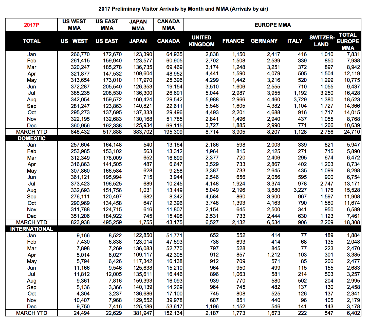
The original countries data table had countries listed across columns, while the months and corresponding visitor counts were coded into rows.
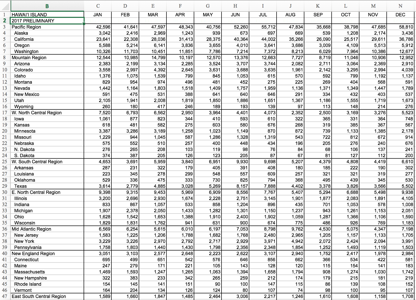
The original table by US states had the states listed under one column, while months were spread out in rows.
The two data sets were manually aggregated into one worksheet. The initial plan was to represent the point of origin for each line with the January 2017 count of visitors. The end-point would then represent the total count as of December 2017. However, this plan did not work out, as it became clearer that the relevant data would be to either represent the visitor count for each month, or the entire count of the year.
To represent visitor counts by month in a flow map would be to set a certain latitude and longitude (like a storm map) for every month. It was not do-able, since the data sets did not have corresponding geolocations for each month.
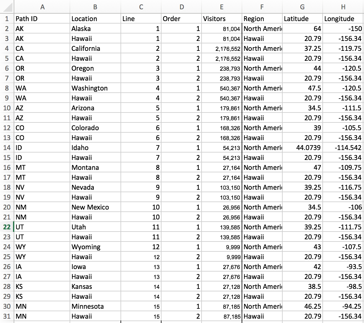
It was then decided to use the total number of visitors per year. For the data to work, there had to be a few required fields such as Path ID, Location, Line and Order.
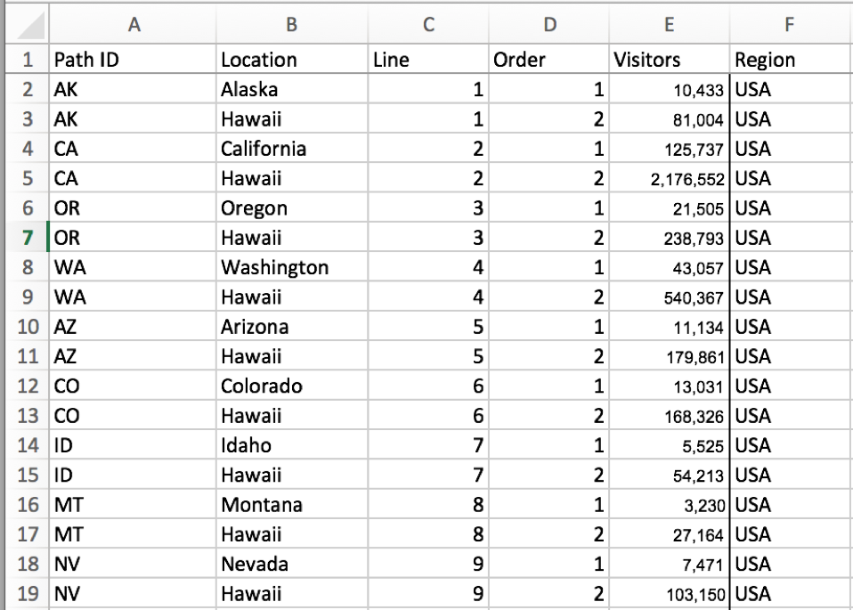
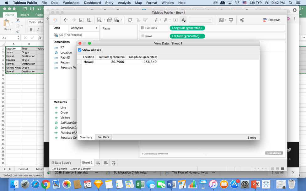
The HTA did not specify any longitude or latitude data. Initially it was not a problem, as Tableau was able to recognize the locations based on the mentioned states or countries. It was then realized that Tableau can only recognize and plot one type of geolocation (City, State, Country, Region, etc.) per map. If there was one country and a state measure, it would not be able to plot a flow map without longitude and latitude data.
The proposed solution was to build a double axis map to rectify this and properly merge the country and state data. Once tried, it did not work. After many more attempts, it was clear that Tableau could not read two different geo locations even on a double axis map. The next step was to manually collect all the geographic location data for each state and country in the data set.
Tableau assigns its own approximate longitude and latitudes for each location. Data was pulled from Tableau and then entered in the spreadsheet.
Results:
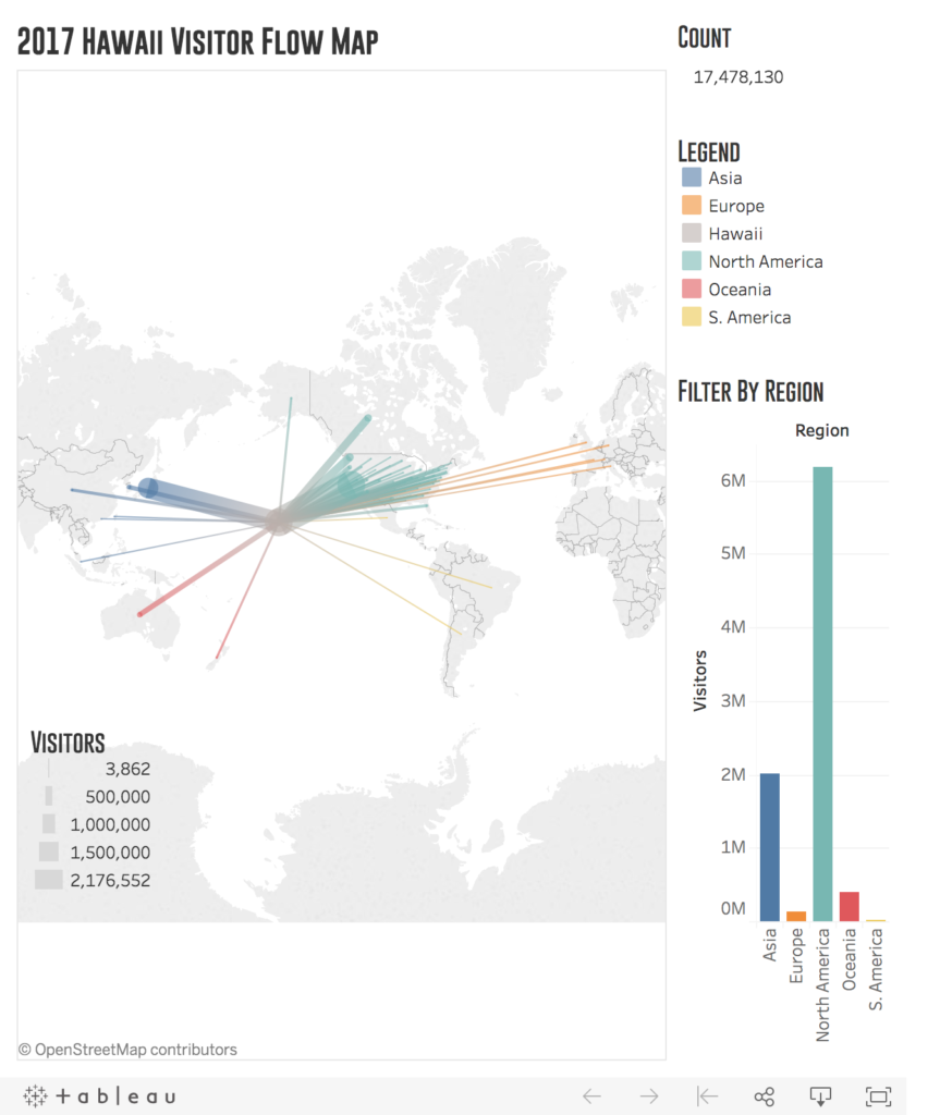
Link: https://public.tableau.com/views/MaybetheFinalDraft/Dashboard1?:embed=y&:display_count=no
In this visualization, the total number of tourists of 2017 are represented. Each line, from each location directed towards Hawaii, represents a directional flow. The line widths are proportional to the volume of visitors. The thicker the line, the higher the number of total visitors in 2017.
The color legend identifies the different regions the countries/states belong to. The colors were chosen to be roughly 50% opaque to see, even vaguely, the overlap of flow lines. As the lines move closer to the islands, the more it blends with the grey color assigned for Hawaii.
As the users click on the chart lines to filter their views, the map visualization and count on the top-right change accordingly. The count is updated in real-time, depending on how the user chooses to view the data.
The result is a simple, clean and straightforward way for users to see the visitor count by location.
User Testing:
As previously stated, this visualization benefits both the economy on a macro and micro-level. Three users, living and working in Hawaii, were selected from different economic sectors to test the flow map. The testing was done remotely through facetime, text and a phone call. The Tableau link was shared with the users, and they were encouraged to think/write out loud while completing the tasks.
Users were given an introduction script thanking them for their time, followed by guidelines on how to go about the evaluation.
“Good Day thank you for agreeing to participate in this study. You will be given two tasks to complete, without any given time constraints. It would be of great help if you could think aloud/write your thoughts while performing these tasks. This can include describing to me your thoughts when navigating the interface. Or, it can be as simple as why you choose to click a certain area, and what you expect out of it. Again, you may leave or stop the test at any time you wish. This is not a test of your knowledge. This is for me to test how easy it is to use and understand this interface.”
The two tasks were as follows:
- What country/state brought in the most number of visitors in 2017?
- How many visitors did South America bring in total, and what country in that region bring in the least?
After the evaluation, users were asked some post-test questions to describe their overall experiences.
Target Users:
For the user selection process, the initial requirement was that the users live and work in Hawaii. Potential users were asked if Hawaii tourism data affected/helped their jobs in any way. If yes, they were qualified to test the visualization. It was important to make sure the data was meaningful to those who tested it.
The selected three users comprised of an event coordinator, an Uber driver, and an entrepreneur.
User 1, the program/event coordinator, works for a non-profit called March of Dimes (Honolulu Chapter). She also works closely with the CEO in putting together the layout for the non-profit’s annual report and all the marketing paraphernalia such as brochures. HTA visitor data is useful to her when she can relate aspects in her marketing reports to tourist trends. The data also comes in handy when they are seeking donations or producing marketing materials. They translate their brochures, pamphlets etc. based on the visitor statistics.
User 2, the Uber driver, stated that Hawaii tourism data is useful for him when forecasting ahead and planning his work hours. Since drivers can choose when they want to work, tourism data can help him identify when and from where to expect the bulk of his clients. If he could look at the numbers per month and compare against events and cultural traditions of the different countries, he can best gage the most in demand seasons, dates, and hours. For example, Hawaii is a very popular destination for weddings among the Japanese in June. There is a common term prevalent in Japanese pop culture called the “June Bride.” It has historical origins, as June is the month of rain-which symbolizes fertility. Traditionally, getting pregnant during this month would not affect a woman’s work in the rice fields. Knowing this, the user can forecast the influx of clientele in June, and situate himself in the areas of the more popular wedding venues that the Japanese tourists like, such as The Hawaii Monarch Hotel.
User 3 has a full-time job in sales. He is currently developing a side-business and producing Hawaii-themed mobile phone cases. His target market consists of both locals and tourists. He asserts that visitor data is important, as he can customize designs based on the style trends of the countries who bring in the most visitors.
Evaluation Results
All three users successfully completed the two tasks assigned to them. The general comments were that the visualization was easy to use and understandable. They claimed they would use this visualization to back up their marketing/sales strategies.
When asked if they would change anything about the visualization, User 2 expressed that he wished the visualization could show the counts of tourists from each location by months, and compare it to previous years of data. User 1 pointed out that she wished the word “Count” on the top right of the visualization had a bigger font. User 3 commented on the colors of the visualization, stating that the North America region should be green and that the purple and blue colors look the same.
Future Directions/Thoughts
I was happy with the outcome of the visualization, as my three users successfully completed the tasks and stated that they would use it again.
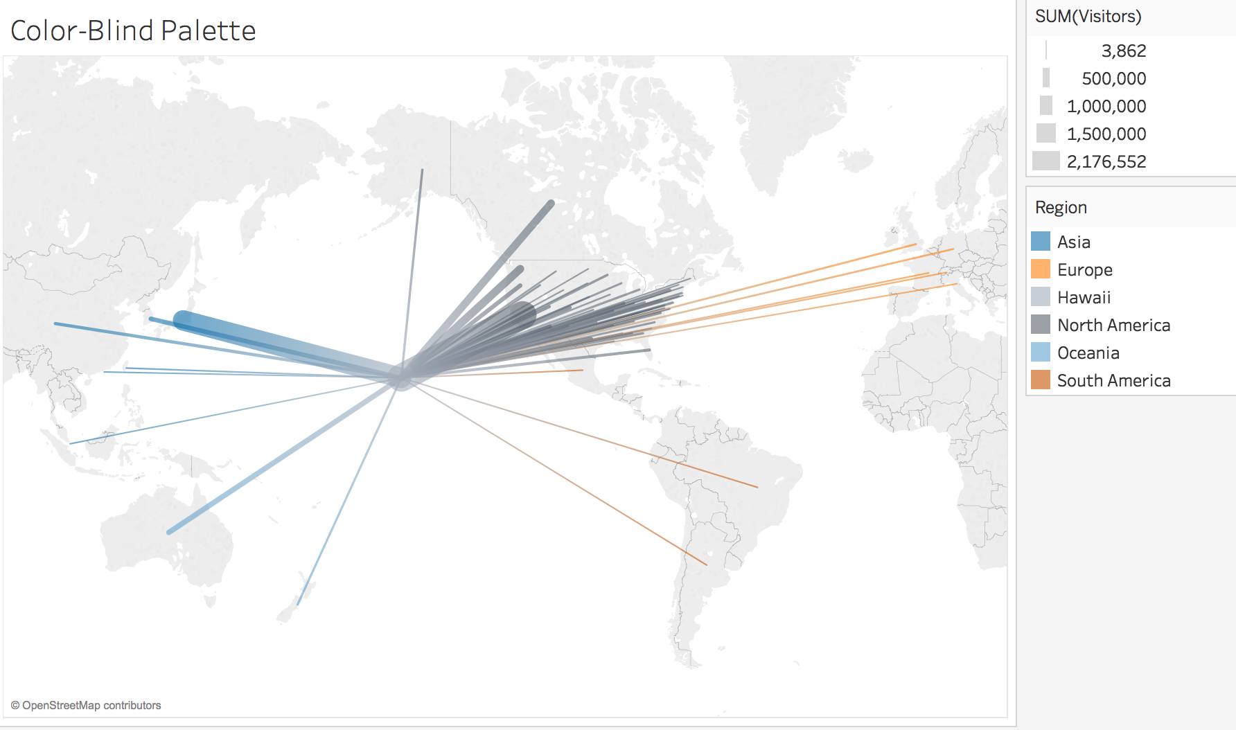
The most important factor I would like to change about my visualization is based on User 3’s comments. What he said about the colors confused me at first, as North America for me is already the color green. When I asked him to walk me through the colors on the map, he also added that he was color blind. I realized that I forgot to consider one of the most important factors for design-accessibility. I should have used a color-safe palette instead of worrying how to make it look pretty. Tableau has a color-blind palette easily available for use in their platform. Next time I will be aware of this, and choose colors that are inclusive.
Experimenting on the color-blind palette was also insightful. Due to the opacity and gradual blending of the lines, the discrepancies between colors was hard to see. This could be remedied by changing the opacity levels of the lines, and choosing more contrasting colors outside of the Tableau Color-Blind palette.
Due to the data constraints, I was not able to show the progression over the months on this flow map. If I had more time, I would also have included another visualization to depict the influx of tourists per month, with a tool to compare it to the previous year.
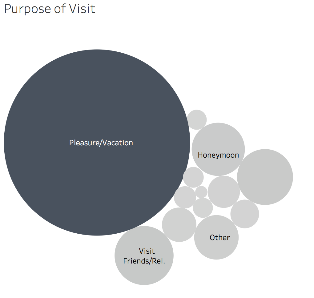
I would also add a complementary dashboard for other useful information that local businesses can benefit from such as the purpose of visit. I made a small visualization on the different purposes of visit for the entire visitor count of 2017. However, upon trying to incorporate it on the map, it did not work well. The visualization already had different colors representing regions, and to add another graph that made use of more colors that were completely off-tangent to the map’s original color-legend was not befitting. It would be best to place this on a completely new dashboard.
The post Hawaii 2017 Visitor Map appeared first on Information Visualization.
