
Network Visualization and Analysis for the Domestic Airlines
April 15, 2018 - All
Introduction
Sometimes it might be more helpful to visualize the data by revealing their patterns and trends. Gephi is a great tool for exploring and visualizing large network graphs. In this lab, Gephi was used to create a visualization graph that could analysis the data of the domestic airlines by highlighting the travelling paths and frequencies of the airlines. Each airport will be represented by nodes and are connected as links, and an infrastructure network graph will be generated in the end of the session.
Method
The dataset of the domestic airline was acquired from the Github website and was downloaded as GraphML format. This zipped file can be open directly in Gephi and is ready to use. The data has 235 airlines (nodes) with 2101 connections (edges) between them. It included the abbreviation of the airports with the longitudinal and latitudinal magnitude.
The dataset was imported directly to the Gephi software. The edges were first adjusted to the narrowest so that they could be seen separated instead of clumping together. It was further adjusted by setting the “repulsion strength” to 10000 so that the nodes would be further apart with each other and made it more presentable.

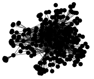
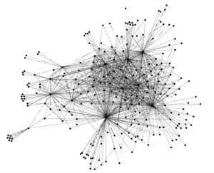
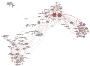
In the beginning, I was thinking to represent the number of connections by the color of the nodes. The idea was inspired by the network graph made with Python. In this graph, the more the connections, the darker the color of the node.
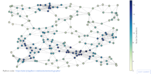
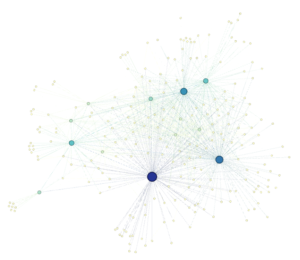
In my graph, I adjusted the color of the node base on their weight by choosing “Degree” as a rank parameter. The darker the blue, the more connections it represented, and vice versa.
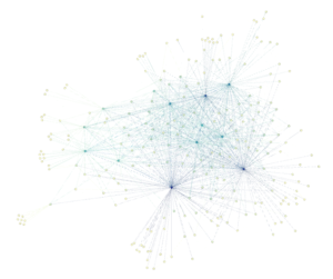
In order to facilitate the visual comparison, it would be better to show the size of the nodes based on their degree, and the thickness of the edges based on their weight. A similar example of the Facebook network graph that showed the personal network and member groups was used as reference. The bigger and darker the node, the more the degree it weighted.
To do this, the average path length for the network for all possible pairs of nodes were calculated by running the average path length. Three values were created: betweenness centrality, closeness centrality, and eccentricity. The weight of the nodes was adjusted according to “betweenness centrality”. When the nodes had a higher number, it had a higher betweenness centrality. Now the degree of a node represented the number of relation it had, and the node size was display per degree. The bigger node, the more it was linking to other states. And for the edges, it was displayed based on its weight. The more frequent the connection between the two states, the thicker the edge. However, since the frequency varied between only 1 and 2, the display was not obvious. I had tried to adjust the thickness of the edges, however, it would decrease the capacity of the network graph. And since the frequency of the flight did not matter in this graph as there was only 2 value in the dataset, the thickness of the edges was not in consideration.
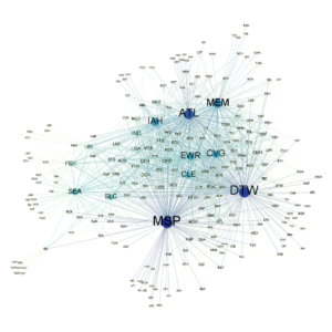
As the dataset did not have the labels for the abbreviations of the airports, I have renamed the labels and displayed them with the notes to make the nodes more meaningful.
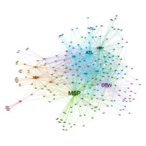
On the other hand, I would also like to detect and study communities of the network so that I could know which airport was more frequently connected to the other. This was inspired by the example of the Network of Thrones. In the graph, different color represented different community, the size of a nodes corresponded to its PageRank value, and the thickness of the edges represented its weight.
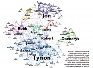
I created the colorize clusters by running the “Modularity” and colorized the communities. Now the graph showed which airport was more frequently connected to the other. When they have the same color, it means that the airport has a closer connection with each other. And at the same time, the size of the nodes can also represent the weight of the airport.
Discussion
In the original dataset, the airline companies were not included, and therefore, I could not show which route belongs to which company. If this dataset is included, it will create a more interesting network graph to illustrate the connection of each airport and which airline company travels more route.
The post Network Visualization and Analysis for the Domestic Airlines appeared first on Information Visualization.