Mapping the social structure of dolphins using Gephi
April 14, 2018 - All
Introduction
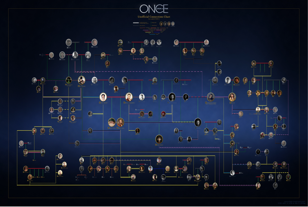
My original idea to test the network graphing tool, Gephi, was to create a family map using the notoriously complicated cast of the ABC show, Once Upon a Time. However, that dream was quickly crushed when I failed to find a fan-made data set of the cast members, and now I am considering making one myself. As an alternative, I found a dataset of a dolphin social network from a report from Behavioral Ecology and Sociologyto test the social network building of this tool.
Inspiration
As I said, my first inspiration for this project came from all of the fan-made attempts at creating a family tree to map the intricate couplings found in the show Once Upon a Time (see Figure 1).

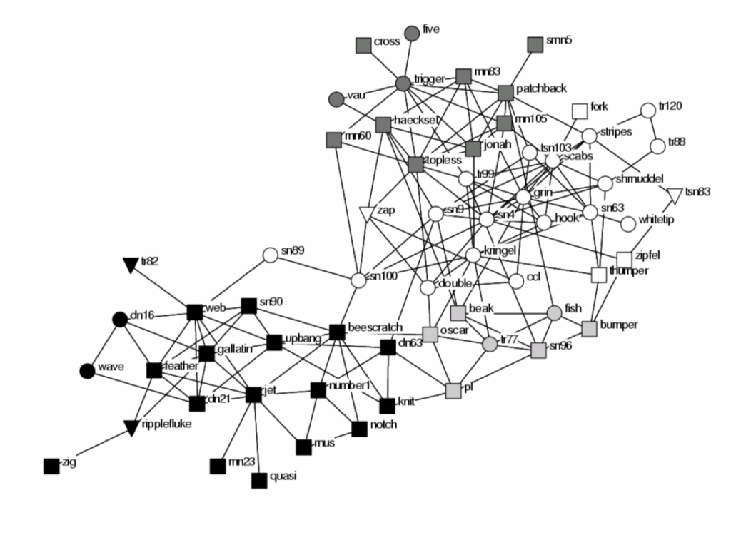
Since the datasets for this group was not readily available, I made use of another social group, namely, a group of dolphins. This article published with this dataset included several graphs to highlight different dimensions of the dolphins’ social structure. The first chart (see Figure 2), emphasizes the gender of the dolphins, shows the many connections they have, and also illustrates different social groups with the use of shading.

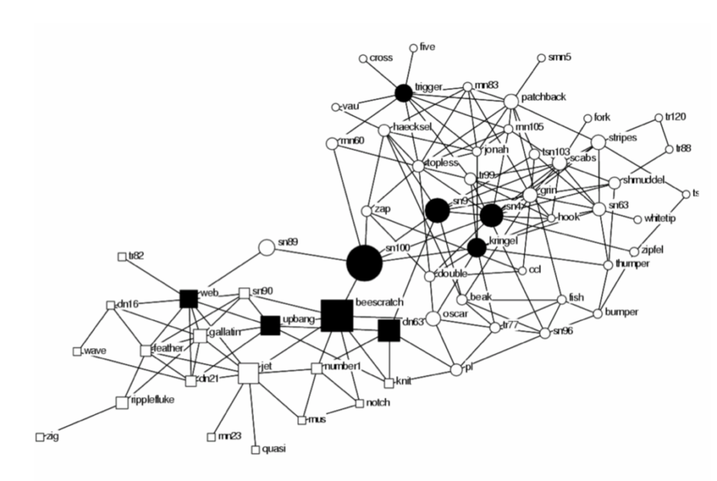
Figure 2, First graph used in the article, with the caption, “Communities and sub-communities identified in the dolphin social network using the betweenness-based algorithm of Girvan and Newman (2002). Vertex colour indicates community membership: black and non-black vertices represent the principle division into two communities. Shades of grey represent sub-communities. Females are represented with circles, males are squares and individuals with unknown gender with triangles.”The second graph included in the report did more to illustrate the connectiveness of individuals using larger icons to represent individuals with a greater number of social connections.

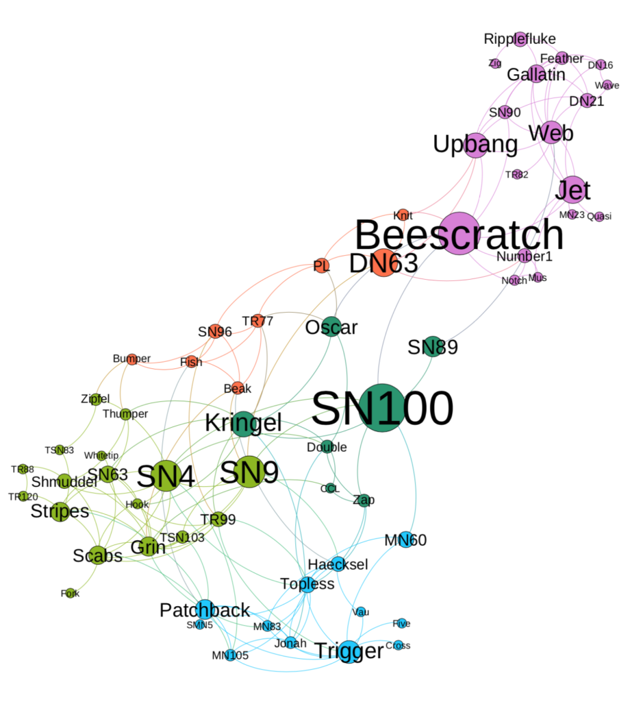
For my final graph, I wanted to create a combination of the two graphs and show the different communities while also emphasizing the more connected individuals in the group.
Materials
The dataset used for this project was found in a list of social networks (http://www-personal.umich.edu/%7Emejn/netdata/) and is part of an article called, “Identifying the role that individual animals play in their social network.” The dataset was downloaded as a GML file. To process the data and create the visualization, I used the visualization tool, Gephi.
Methods
The dataset was first downloaded as an GML and uploaded to Gephi. No editing was required of the original data before uploading or after. After uploading the data, the layout was switched to Force Atlas to organize the nodes and the repulsion strength set to 10,000 to see how the nodes were organized. I realized that the repulsion rate was higher than necessary at 10,000 and switched it to 1000 so that the nodes would not be as spread out. Next, I turned on the labels and adjusted the size so that I could see how the nodes were organized and compare to original layout from the dolphin article. I also gave the nodes a size of 50 so that I could better see them while adjusting their color.
The next step was the run a few statistics to gather more data and further organize the nodes. I first ran an algorithm to learn the average path length which generated four new columns in my node’s data area: eccentricity, harmonic closeness centrality, and betweenness centrality. Since my first dolphin graph ranked individuals by their level of betweenness (see Figure 3), this seemed like a necessary measure for my own graph. I next adjusted the size of each node by betweenness centrality so that nodes with a higher betweenness value would be larger and opposite for lower values with a range of 50 to 10. To further emphasize this difference in size between nodes, I next adjusted the label size by node size.
The next step was to create the different social groups (see Figure 2). I ran the modularity with a resolution of 1.0 which added a modularity column to my node data. I was then able to colorize my nodes by modularity which organized my nodes into five social groups.
With the groups identified and the level of connectedness emphasized, the next step was to prepare the graph for final presentation. I switched to preview mode where I set the preset default to Default Curved. I also adjusted the options to show the labels and changed the label size from 12 to 10. Some of the labels were still covering each other, so I went back to the Overview mode and moved nodes around accordingly until none of the nodes were being covered anymore. The final step was then to save my work as a PDF file.
Results
The final result is a hybrid of the two dolphin maps showing the different social groups within the overlapping unit while also emphasizing the different levels of betweenness by using variations of size.

Discussion
I like that the map is a combination of the two key elements of the previous graphs and has a modern look to it. There’s also more emphasis on the names of the dolphins which was a memorable element while creating the visualization.
With a little more experimenting, I would have liked to lower the number of modularity groups created from five groups to four, as seen in the original graph (see Figure 2). On a similar note, the colors chosen were selected randomly by Gephi and may not have been the ideal choice for people who experience color blindness or for publications that may only work in grayscale, as was probably the case for the original two dolphin graphs (see Figures 2 and 3).
Using what I learned from this lab, I feel better prepared to create my own visualization should I made a dataset for my originally proposed project, the characters of Once Upon a Time. The modularity aspect could be interesting for distinguishing the different family units on the show and the betweenness centrality would show who is the centering characters in the story. It may be helpful however to have an option to incorporate images, such as character’s faces, and even brief descriptions which was not an element of this tool that I was able to experiment with on this sample and something I would be interesting in being able to use in the future.
References
Once Upon a Time graph: http://www.bad-mushroom.com/once-upon-a-time-connections/#jp-carousel-324
D. Lusseau, K, Schneider, O.J. Boisseau, P. Hasse, E. Slooten, and S.M. Dawson, Behavioral Ecology and Sociobiology 54, 396-405 (2003). https://arxiv.org/pdf/q-bio/0403029.pdf
The post Mapping the social structure of dolphins using Gephi appeared first on Information Visualization.