Info Vis Lab 3: Carto
April 12, 2018 - All
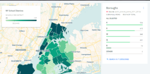
This lab was my first experience using Carto. I initially wanted to use this data from Peace Research Institute Oslo. Every time I tried to upload it, however, I encountered a “data has too many rows” error message, despite it only having 1900+ rows. I eventually conceded defeat and switched to data from NYC Planning and NYC Open Data, which was uploaded with no problems. I combined this data to make the visualization “NY School Districts,” which uses the school district boundaries and the locations of NYC schools to map the density of schools per district.
I used three different visualizations as either inspiration for my design or as a reference for what not to do. The first example is the “Block by Block,” a visualization by Bklynr that displays the age of every building in the borough. While this map is extensively detailed, it can get rather overwhelming when zoomed out too far. You also can’t zoom in too far, meaning that many buildings are hard to tell apart. While I like that the user can select a building to keep its address and date static, there’s not much more to do with the visualization. Ultimately, I felt like this visualization was a warning against making a map with too many single points on it. The second visualization I looked at was a similar map by Waag that shows the construction date of every single building in the Netherlands. Their visualization also suffered from the clutter that is prevalent in Brklynr’s map, but since the map background is black and the region is so large, it’s not as much of a problem. The cities stand out against the mostly dark suburban and rural areas, creating an overall impression that the Bklynr map lacks. The third map is DarkHorse Analytics’ “Breathing City” visualization. This visualization only shows Manhattan, and shows a time-lapse of people’s home/work schedules. This map also uses a black background, which helps the colors pop out. Nevertheless, the inability to pause or manually control the time-lapse means it can take several watches to grasp the overall trend.
I uploaded both datasets to Carto and created two separate layers. The district data was the primary layer, with the school location data overlaid. I created an analysis layer that displays the density of schools per district. While the school location layer was displayed, the resulting 1600 data points made the map overly cluttered. I tried to change the colors to see if this would make the map less overpowering, but it was still impossible to understand. By removing the school location layer, the clutter was fixed. The districts themselves were enough to display the density. I added a clickable text box to each district that displayed the school district number and the actual school count. This allowed users to see the number of schools without having to try and count all the points. I also added a key that shows the color spectrum for the density. I edited the color spectrum to a dark-light green so that New York City would stand out from the surrounding area. Finally, I added a widget that allows the user to see the data by borough, with the non-selected areas being grayed out. The borough widget also displays the total school count by borough.
I had several issues with Carto while working on this map. The initial attempts to upload the conflict dataset were frustrating and discouraging. The error message was unhelpful, and the actual issue with the dataset was unclear. My second choice was actually police precinct data, but that zip file refused to be imported to Carto as well (despite seeing it done effortlessly by others in class). Once I got the data uploaded, however, the process became much smoother. The way the datasets are supposed to be linked was somewhat confusing, since there are nine different choices, and the animations that accompany them don’t do much to improve the comprehension. The interface of Carto is very clean, and the separation of layers makes it easy to know which data you’re working with at the moment. I felt like the widgets are useful, but their display properties are annoyingly limited. I wanted to edit the Borough widget so that each borough’s name was completely spelled out instead of being represented by letters, as it is in the data set (see Picture 1).

Picture 1
While users familiar with New York City will know which boroughs are which, others will have to try and use the process of elimination to figure out which boroughs correspond to which letters: “K” is Brooklyn, “X” is the Bronx, “M” is Manhattan, “Q” is Queens, and for some reason “R” is Staten Island. There is also an “Other” category that is for data points that don’t have location information, which cannot be hidden on the widget. Carto doesn’t allow you to edit the widget display outside of the title. Carto does allow you to edit your data after it has been uploaded, but there’s no way to bulk change the values. This means that in order to fix this issue I’d have to edit the original data directly and then re-upload it. There was also a strange feature regarding the map key; the title of the map key is linked to the title of the visualization, so changing one changes the other. Ultimately, however, I’m quite pleased with the final map. Carto has a crisp interface and changes that you make are easy to follow (and undo if necessary). In the future, I’d like to try and get the conflict data working so that I can see what a global visualization looks like.
Visualization Examples
https://www.bklynr.com/block-by-block-brooklyns-past-and-present/
http://code.waag.org/buildings/#52.446,5.6113,9
https://www.darkhorseanalytics.com/blog/breathing-city
Data Sources
https://data.cityofnewyork.us/Education/School-Point-Locations/jfju-ynrr
https://www1.nyc.gov/site/planning/data-maps/open-data/districts-download-metadata.page
The post Info Vis Lab 3: Carto appeared first on Information Visualization.