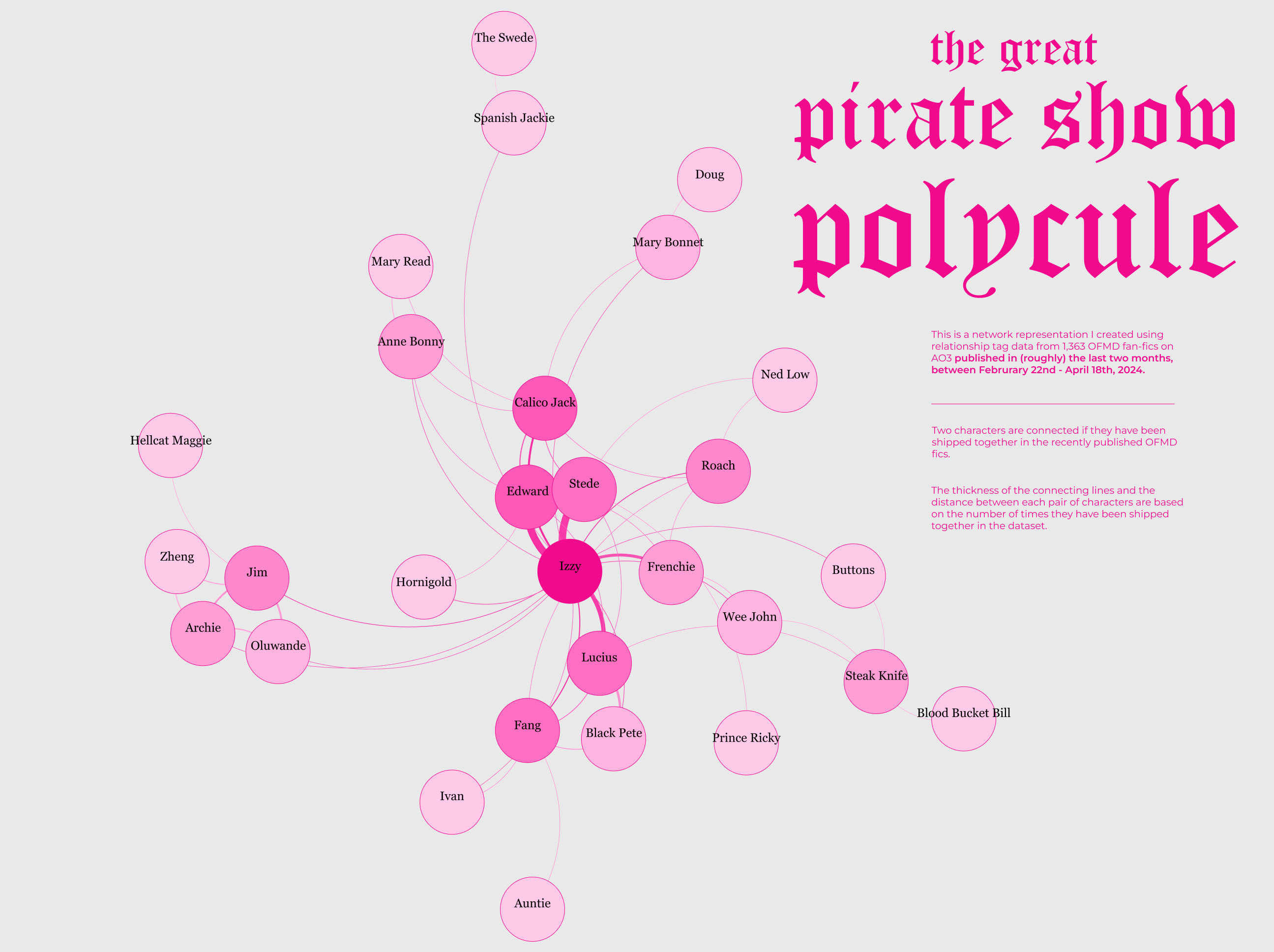
Project Description
In this project, I created a network visualization of relationships between fictional characters using fanfiction data from Archive of Our Own (AO3) for HBO Max’s pirate-themed TV show “Our Flag Means Death”
Data Source: Archive of Our Own
Tools: Gephi, R, Figma, Browse AI
The World of Fanfiction
Archive of Our Own(AO3) operates as an open repository of fanfiction, maintained by a community of volunteers who ensure that it remains a free space for sharing creative works without commercial interference. For this visualization, I pulled data on the recent 1,363 fanfiction entries posted from February 22nd to April 17th, 2024, focusing exclusively on works created under the fictional world of “Our Flag Means Death.”
‘Shipping’: AO3 is a treasure trove of fan-created stories where characters from virtually any narrative universe can be reimagined in new relationships, commonly referred to as ‘shipping’, which involves fans pairing characters in romantic or platonic relationships.
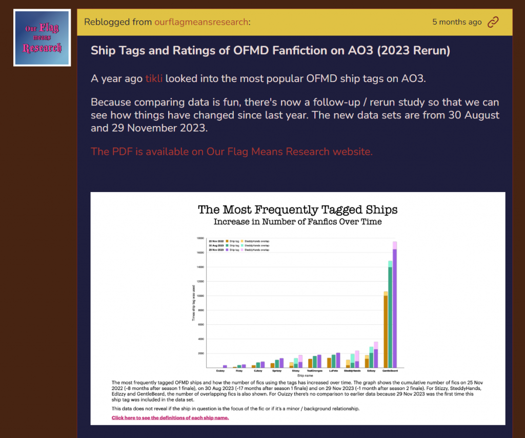
Visualizing Fanfiction data is not a new practice. My project draws on some previous works done by fandom researchers in the past, including Tikli‘s data analysis on the popularity of relationship tags on AO3 published on OurFlagMeansResearch and Exploration: Ao3 Tag Analysis by Yvonne Gonzales.
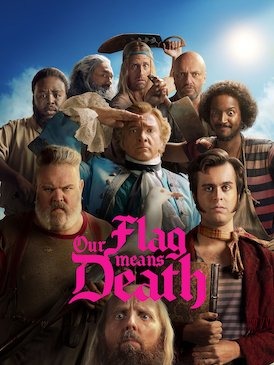
Our Flag Means Death
Our Flag Means Death is an American period romantic comedy television series created by David Jenkins. Set in the early 18th century during the Golden Age of Piracy, the series follows the misadventures of gentleman-turned-pirate Stede Bonnet (Rhys Darby) and his crew aboard the Revenge as they try to make a name for themselves as pirates and cross paths with famed pirate captain Blackbeard (Taika Waititi).
For this particular project, my goal was to map out these relationships for characters from the HBO Max’s pirate-themed TV show “Our Flag Means Death,” a series that makes a rich subject for a network visualization because of its rich fanfiction content and the show being an ensemble show featuring an array of well-developed and well-loved characters that fandom writers like to ship together in many different ways.
Dataset
Using a combination of the Browse AI tool and manual logging, I was able to collect the information from all the fanfiction published on Archive of Our Own from Februrary 22nd to April 18th, 2024.
Tag Data
one of the key data from this data set is the tag information on each fanfiction. To classify its content Archive Of Our Own uses a system called “tagging”. To cite the AO3 FAQ: “A tag is a keyword or phrase that you add to your works to make them easier to find.“ Tags also have the, at least as important purpose, of helping readers avoid content they don’t want to read.
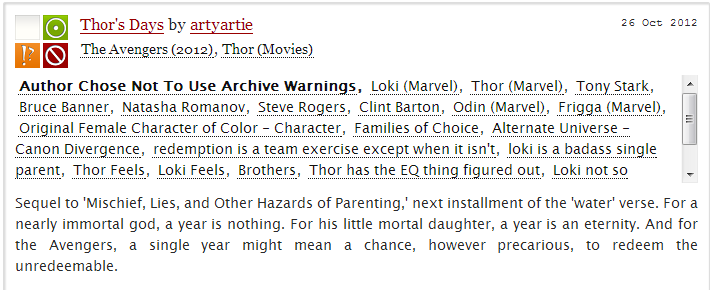
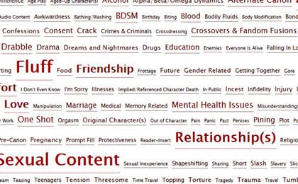
Relationship tags: For each fanfiction, it is standard practice for the writers to tag their story with relevant relationship tags so the readers know what they are reading. Among these tags are bilateral relationship tags (indicating romantic pairings), multilateral relationship tags (showing relationships involving more than two characters), and friendship tags for platonic relationships.
Example of a bilateral relatinship tag:
This indicates that Agatha Christie and Virginia Woolf appear as a romantic couple in this story.

Example of a multilateral relationship tag:
This indicates that these three appear as a throuple in the story.

Example of a friendship tag:
This indicates that Lady Macbeth and Lady Macduff have a friendship or a platonic relationship in this story.

Using the web scrapper, I was able to gather all the tags from each fanfiction published between the selected period and then selected the romantic relationship tags in Google Sheet.
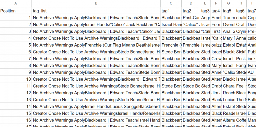
Making the Network
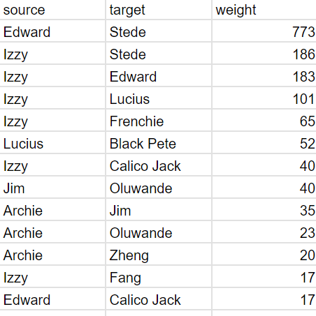
First, I sorted through the relationship tags and re-organized them into an edge table.
Each character pair that gets romatically shipped in a fanfiction creates a link or ‘edge’ in my network between the characters involved, while each character is represented as a ‘node’ within the network.
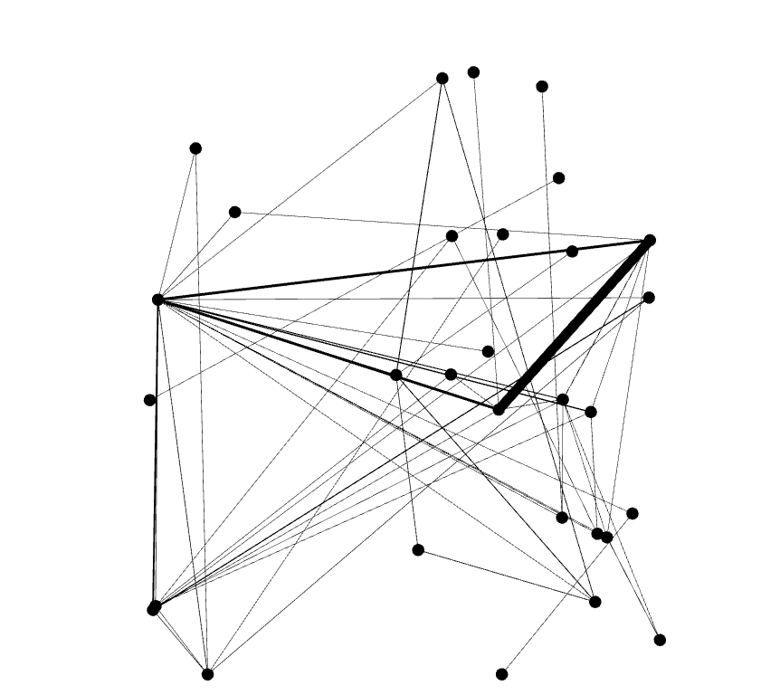
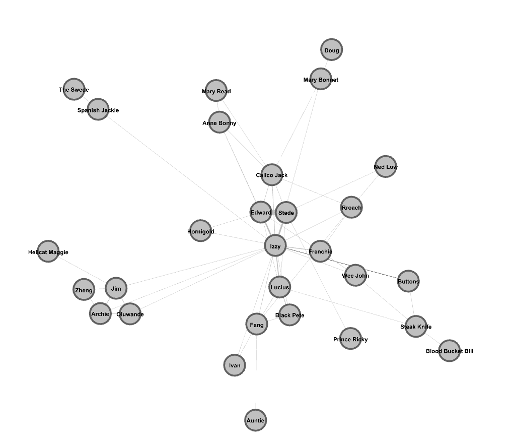
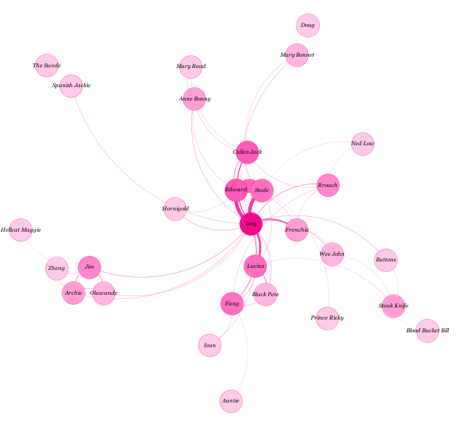
Using Gephi, an open-source network analysis tool, I created a visualization that maps out how characters from “Our Flag Means Death” are romantically linked or ‘shipped’ in the fanfictions I gathered.
Corrections + Modifications: sharing the first draft on Twitter
I published my initial visualization to the fandom circle on Twitter. This sparred a dialogue between my intended audiences and myself, and I was able to make some corrections and supplement my presentation with more informative details.
Providing detailed information with other visualization formats:
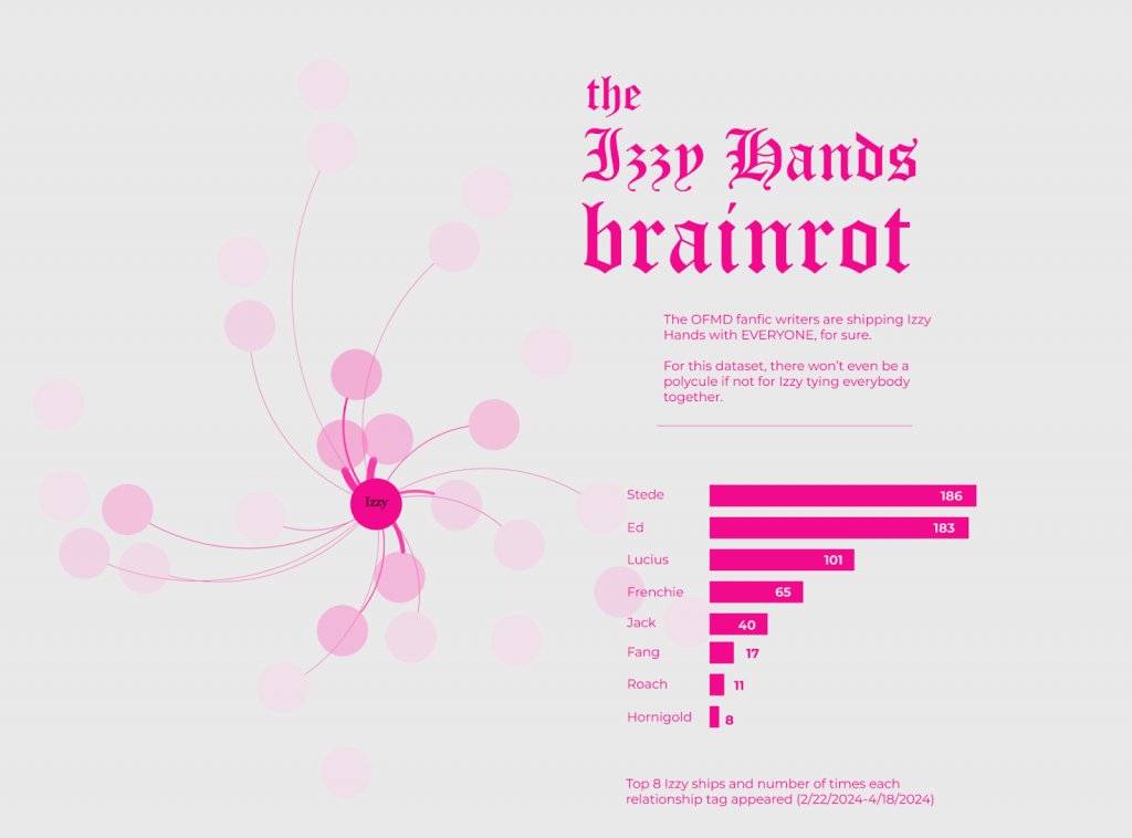
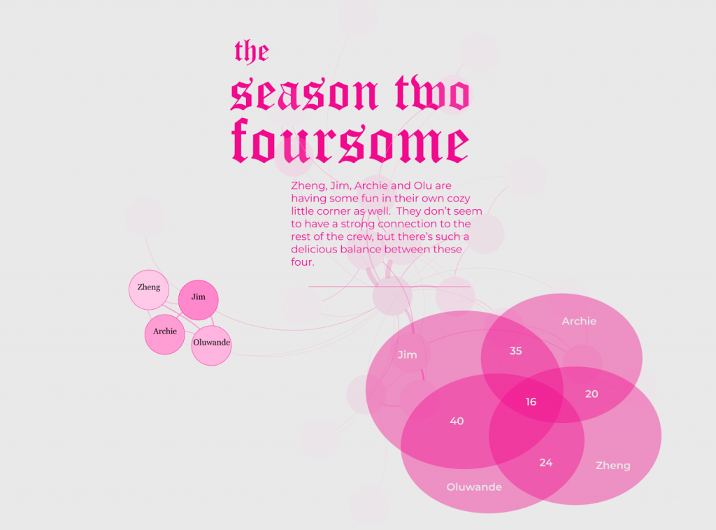
I initially published the first graph of the overall network, and with some quick responses and initial reactions I quickly realized the need to un-pack the information by creating more detailed slides for my findings, and to supplement my network with bar charts and labels of exact figures.
the overall network:
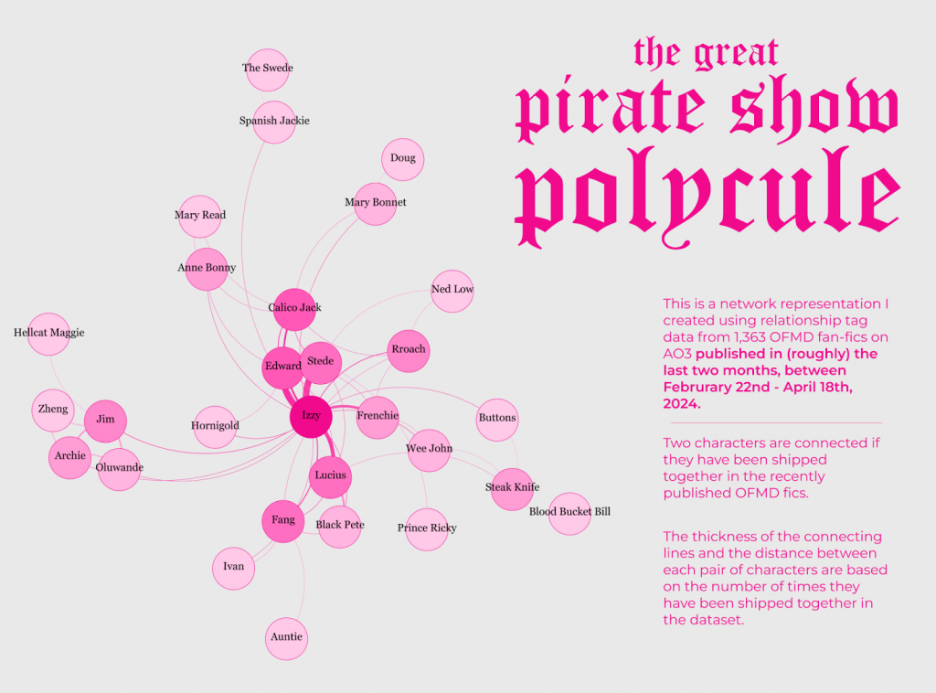
This is because my intended audience (the fandom writer themseleves) would like to know exactly how many stories are counted on each edge, and they have a competitive mindset about it. The network graph as a representation is not detailed or clear enough to show the data at such a granular level, and if it gets more complex it would be even harder to read. So, the network representation is, I find, a good way to represent the general shape of an ecosystem and make more tangible the biggest most obvious dynamics in a system, but in order to give my audience the information they REALLY crave to see, a network is not enough.
In response to this, I added colomn charts and venn diagrams to show the data and findings in more detail.
Using explanatory text and figures to minimize mis-interpretation:
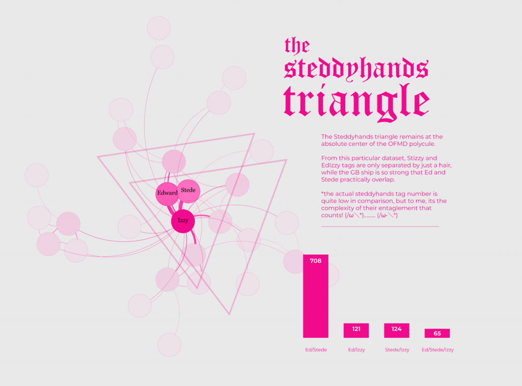
Another challenge I found was that the network is misleading when it comes to multi-lateral relationships. As you can see, there is a triangular relationship at the center of this network. Within a few minutes of publishing the visualization, a Twitter user already quoted on the graph and used it as evidence that the fandom largely favors the ‘throuple’ between the three characters in the center. However, when we look at the data a bit more closely, its easy to find the multi-lateral relationship is quite niche: the triangular relationship is formed by a large number of stories written about the bi-lateral pairings of two of the three central characters.
To best circumvent misinterpretation, I used explanatory text and supplementary charts to show what the data is really saying.
Making corrections with the data:
A few Twitter users quickly pointed out that there were several missing edges between a few niche pairings as they have seen or personally published fanfiction with the pairings in the past few months but do not see the network reflecting those data points as edges. I realized that my initial data gathering might have produced some errors, namely the web scrapper skipped several tags when it was extracting information from the webpage for every fanfiction.
I was able to correct the mistakes and repeated the process to re-make the network with the right data.
You can view the final visualization as a Figma Prototype
Leave a Reply