History of Scatterplots: A Timeline
September 11, 2018 - All
Introduction
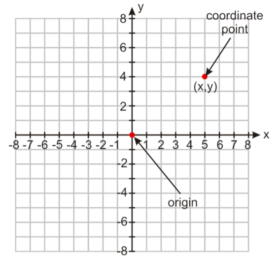
For this lab report I chose to focus on the important historical events related to the creation of the modern day scatterplot. I was interested in this data visualization specifically, because it is one that I encounter frequently in my academic career. Most of the research studies that employ statistics often use scatterplots to demonstrate the correlations, or relationships between two or more variables. These visualizations are particularly useful because they make understanding data trends quick and easy. Before going into more detail about the timeline and how I created it, what is a scatterplot? A scatterplot is a diagram that utilizes a Cartesian coordinate plane (Figure 1) to demonstrate the values of two or more variables in a data set.
 Figure 1. Cartesian coordinate plane
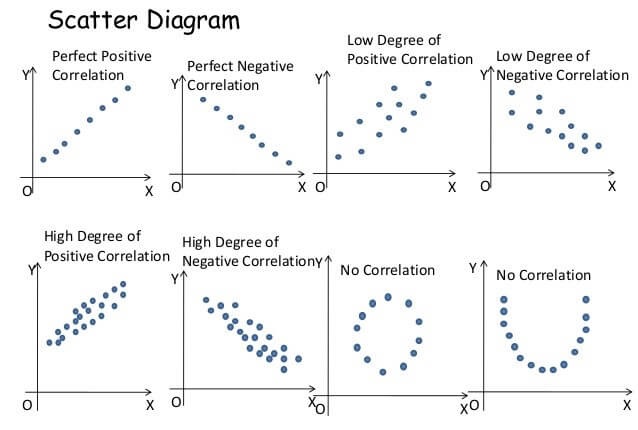
Examples of scatterplots and the kinds of relationships they represent can be found in Figure 2.
 Figure 2. Types of correlations that can be represented using a scatterplot
Timeline Materials
To begin this project I did an exploratory search on Google using the search terms “scatterplots” and “history of scatterplots”. These searches led me to the following reference materials:
Chen, C. H., Härdle, W. K., & Unwin, A. (Eds.). (2007). Handbook of data visualization. Berlin, Germany: Springer.
Friendly, M., & Denis, D. (1983). The early origins and development of the scatterplot. Journal of the History of the Behavioral Sciences, 41(2), 103–130.
D Kopf. (2018, March 31). A brief history of the scatter plot—data visualization’s greatest invention
[blog post]. Retrieved from http://www.spring.org.uk/the1sttransport
Wainer, H. (2004). Nobody’s perfect. Visual Revelations, 17(2), 51-54.
To create the scatterplot timeline I used the following materials:
- Timeline JS: An open-source tool that builds generates timelines and was developed by Northwestern University’s Knight Lab.
- Google Sheets: An online spreadsheet that all of the timeline information and images go into before being converted into the timeline format.
- Google Images: An image search engine used to find relevant images for the timeline.
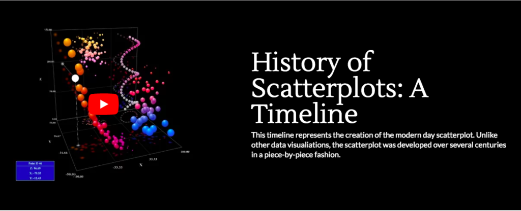
- Youtube: A video hosting platform that was used to include a video of a 3D scatterplot in the title slide of the timeline.
Creating the Timeline
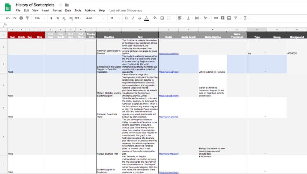
After gathering my reference materials and identifying specific historical points to represent I added that information and relevant image/video URLs into this Google Sheet (Figure 3).
 Figure 3. History of Scatterplots spreadsheet
Once the spreadsheet was complete I uploaded the spreadsheet URL into the Timeline JS generator which resulted in this timeline. The timeline included a title slide and five historical points:
- Title: The title slide included a video of a 3D scatterplot and a short introduction of the timeline.
- 1600: The creation of the Cartesian Coordinate Plane is the first point, because it is the base which scatterplots are built upon. This point in the timeline includes information about and an image of the Cartesian plane and how it relates to the scatterplot.
- 1686: Edmund Halley’s bivariate plot and his theoretical curve of barometric pressure and altitude data was published. This is thought to be the first instance of a bivariate plot on a Cartesian plane. This timeline point includes an image of Halley’s theoretical curve.
- 1833: The modern scatterplot appeared for the first time in a study on the orbits of double stars by English scientist John Frederick W. Herschel. This visualization is believed to be the first published instance of individual data points being plotted on a Cartesian plan. At this point in the timeline I have included an image of John Herschel.
- 1886: Francis Galton’s usage of a scatterplot helped popularize the visualization with the scientific community. This timeline point includes more information about Galton’s use of scatterplots and an image of his smoothed correlation diagram for the data on heights of parents and children.
- 1906: In previous years the scatterplot was commonly referred to as a ‘scatter diagram’; Karl Pearson, a well-known mathematician, is credited with describing the visualization as a scatterplot. This timeline point includes this information as well as a picture of Pearson.
Reflections and Future Directions
Through this project I was surprised to find that there was relatively little confirmed information about the history and development of the scatterplot. There is not definitive creator of the scatterplot and there are very few interesting or significant historical points related to it. For me, the scatterplot itself wasn’t very interesting, but the things statisticians like Galton and Pearson did with the scatterplot was. If I were to do this assignment again, I would definitely choose a different topic that gave me more historical points to work with. All in all, I really liked using the Timeline JS tool because it was very simple and straightforward.
The post History of Scatterplots: A Timeline appeared first on Information Visualization.
