Understanding who we are: milestones in demographic data throughout history
September 11, 2018 - All
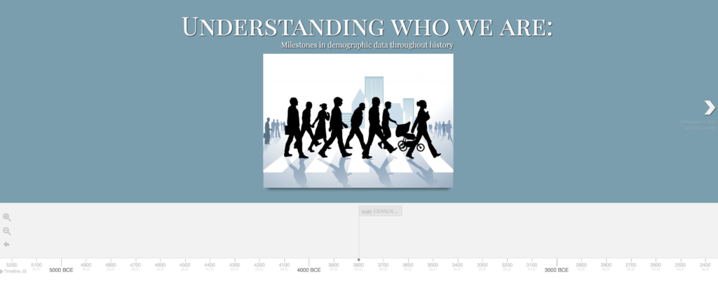
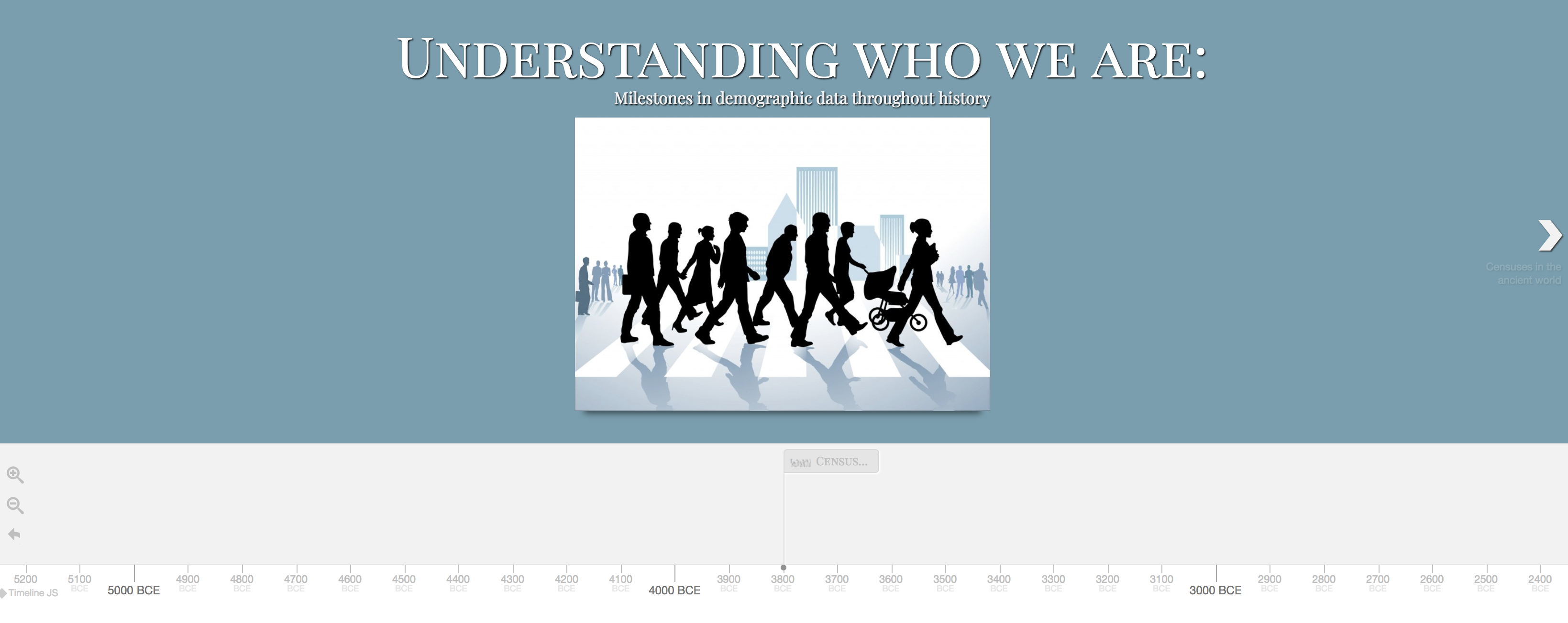 [Figure 1: Title slide of Timeline JS project]
Introduction
Demography, or the study of quantitative data about characteristics of human populations, has been a field of study since ancient, pre-Roman times. The analysis of population data can tell us a great deal about changes like migration patterns, overpopulation risks, fertility rates, and more. This data then helps inform policies and societal structures that we can use to change undesirable states. This project seeks to illuminate the major milestones in the field of demography throughout history, using a timeline visualization.
Timelines are by nature linear constructs that metaphorically follow the path of time. The sophistication level of visual literacy required to understand a timeline is fairly low, as we are presented with the concept of time moving in one linear direction from an early age. For this reason, I have created a timeline using TimelineJS.
Materials
- TimelineJS: a free and open source timeline tool developed by Knight Lab out of Northwestern University. Per their website, it “enables anyone to build visually rich, interactive timelines … using nothing more than a Google spreadsheet.”
- Google Sheets: part of the Google Drive, Sheets is a free, online spreadsheet program similar to Microsoft Excel in functionality
- Wikipedia for data and image collection.
- Imgur, for free image hosting where appropriate.
Methods
The development of this project spanned five steps:
- Goal
After learning about the history of information visualization in my coursework, I was interested to learn more about demographic data in particular. When did the study of population characteristics begin, and how did it evolve throughout history to become the nuanced field of study that it is today?
- Data Collection
To answer the question above, I searched for landmark use cases (or milestones) of demographic data. My definition of “landmark uses” were ones that (a) uncovered previously unknown patterns or (b) contained groundbreaking visualizations as compared to predecessors. I primarily used open source data from Wikipedia, searching on keywords like “demography,” “historical demography,” “population statistics,” and used these articles’ contextual links to uncover data.
- Media Sourcing
Having identified the milestones, I then sought multimedia to make the entries visually compelling and meaningful. My priority was to find images of the publications or visualizations themselves, in order to help the user understand the progressively sophisticated ways in which demographic data has been represented over time.
Media links require active and valid URL’s for entry into the TimelineJS Google Sheet, which proved to be difficult in some cases. Using Wikipedia as a central media source, I found that many images are hosted on a different site and displayed as thumbnails in Wikipedia articles. In these cases, I would click on the image, follow it to the original site, and copy the image address.
In other cases, the link to original content was broken, and I had to find the image through a Google Image search. However, I soon found that I couldn’t always use the “Copy Image Address” command from a Google Image result, as that would result in an invalid URL link. By using the Developer Tools function in Chrome, and was able to inspect the image on the webpage and find its original location.
Lastly, I encountered some issues with sourcing media for the 2018 milestone which highlights the birth of web-based interactive visualizations. TimelineJS’s Help section notes that the Media column does not support HTML web addresses. My workaround was to screenshot the site, upload the image to Imgur, and use that image link as my media source. I then embedded HTML language in the Paragraph column of the Google Sheet to hyperlink to the site itself.
- Google Sheet Creation
With all media and data compiled, the next step was to fill out the Google Sheet template provided by TimelineJS. A sample screenshot of the Google Sheet template with some of the timeline data is below.
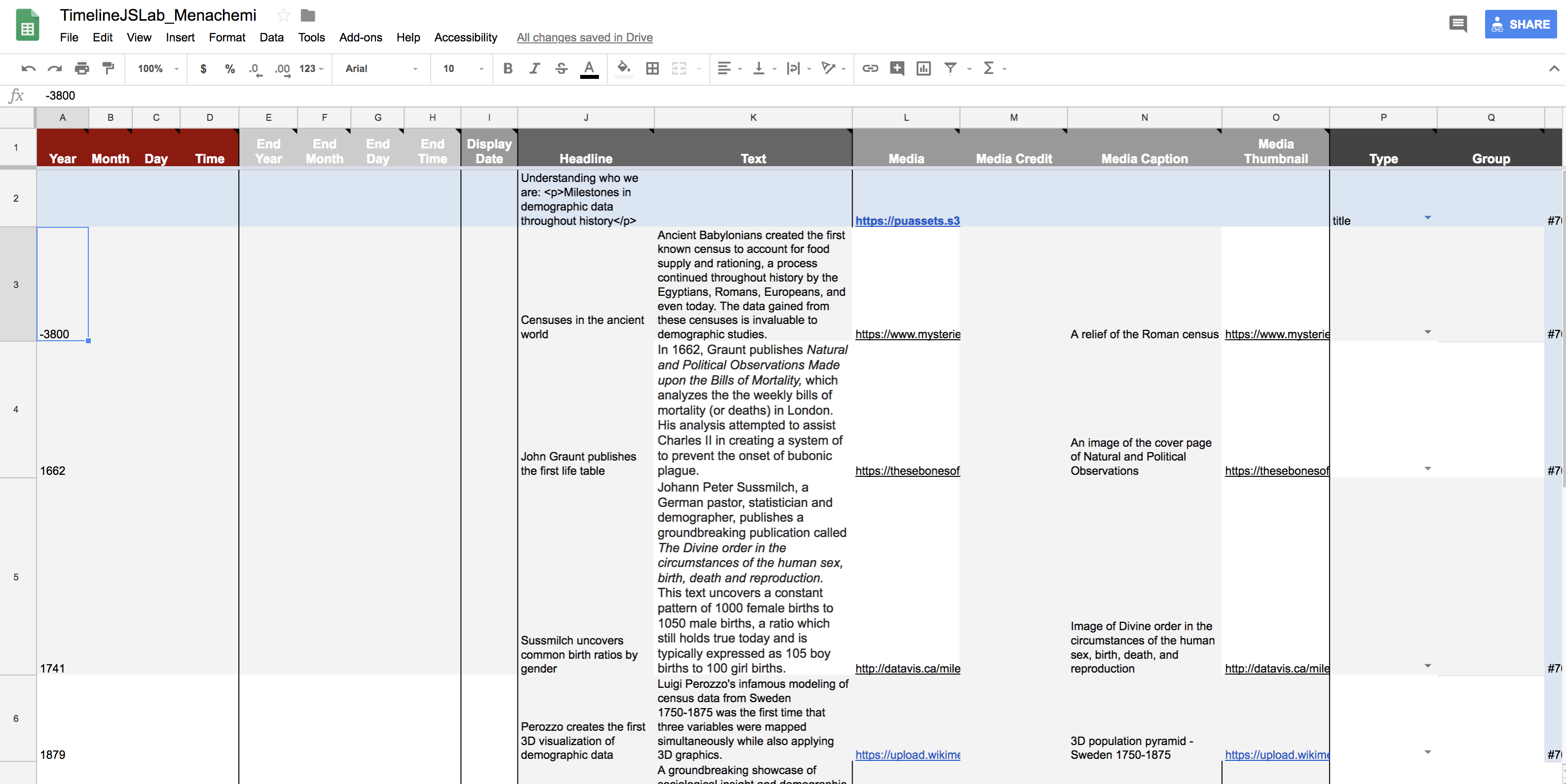
[Figure 2: Google Sheet Template]
Not all of the fields required entries – I used the required fields and any additional ones that I felt would make my visualization more attractive, such as Background and Media Caption.
5. Visualization creation
The final product was created by going back to TimelineJS’s website, inputting the Google Sheet link, and then securing the resultant Timeline link.
Results
The final TimelineJS file can be accessed here.
The final Google Sheet data is also available, here.
It is my hope that this timeline guides others who may be interested in learning about the history of demographic data. The visualization successfully showcases the ease and power of TimelineJS from both an author’s and user’s perspective. The signifying arrows on each side of the screen clearly dictate that to progress or regress the timeline, the arrows can be clicked to view the related milestone.
Reflection and Future Direction
While TimelineJS has many advantages, it quickly becomes clear that there are also certain limitations. First, there are limited ways to customize the slides in the Optional Settings section of the website (below).
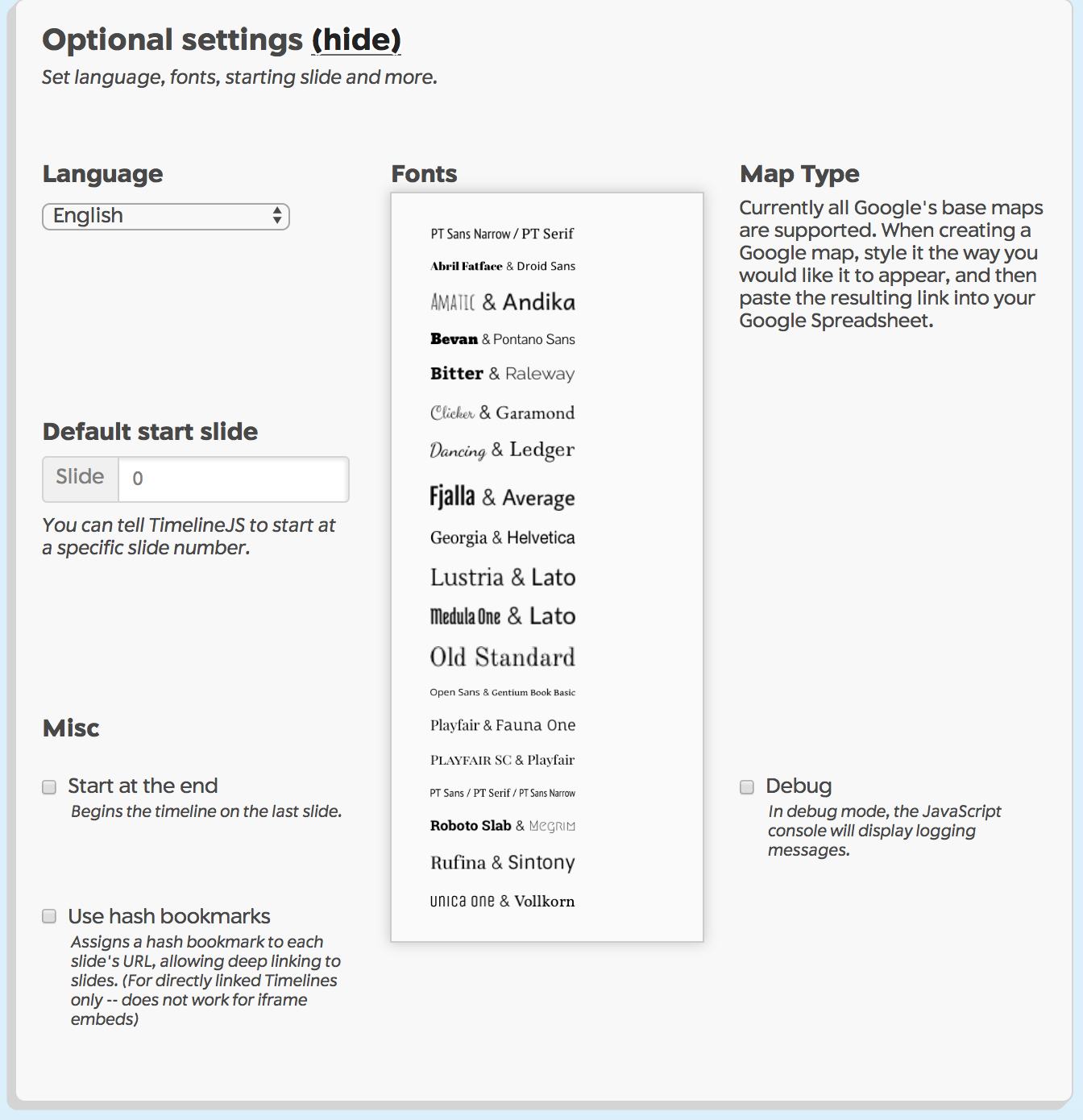
[Figure 3: Optional Settings menu on TimelineJS site]
Some improvements that Knight Lab could create would be: allowing authors to use a font of their choice, to add a “Final” option under the Type column to allow for a conclusory slide, and to allow for the embedding of web-based visualizations in the timeline. It would be wise to think of TimelineJS as a great way to gather related events are sequential in nature, and to do so in a quick, relatively easy way for beginners. For more advanced practitioners, other tools may be more effective.
On a personal front, I would have liked to find demographic milestones in the 20th century. I found it difficult to find any major breakthroughs, which was surprising. This gap caused an odd jump from 1900 to 2000 in my timeline. While my goal was to showcase the progression of demographic studies at a very high level, and I feel I’ve accomplished this goal, in the future I would potentially want to tailor my focus from the 1800’s-present day. This would create a more insightful analysis of the overall trends from the industrial to computer age.
The post Understanding who we are: milestones in demographic data throughout history appeared first on Information Visualization.