
Visualizations and Geovisualizations: Population Summary of NYC
August 1, 2018 - All
Introduction
Previously, I examined the population projection over the years of 2010 through 2040 (Time-Series Visualization: NYC Projected Population over 2010–2040). While those visualizations display a summary of the projected population for the years over 2010–2040, I wanted to seek and attempt to determine more relationships in NYC’s existing population summaries. The dataset is from American FactFinder/US Census Bureau and represents the total population of the six counties (Bronx, New York, Richmond, Kings County, and Queens Counties) that makeup Bronx, Brooklyn, Manhattan, Queens, and Staten Island boroughs of New York City.
Both population datasets are distributed and categorized by borough and age group. The dataset that is described here features a category that separates population by female and male genders. Since the dataset did not include many features like a timescale, I thought it interesting to split the population data of the two designated gender distributions and also plot the data over geospatial information (the boroughs).
The dataset requires refining, like transposing by way of Excel and OpenRefine. I will represent the statistical data in several graphs created by Tableau. I will also render geospatial data on Tableau to supplement the overall, statistical analysis. Whether to compare or contrast, it is interesting to see how the population varies throughout the boroughs.
Research & Design Methods
As mentioned in the introduction, the rich dataset comes from American FactFinder/US Census Bureau and represents the total population of the six boroughs of New York City, Bronx, Brooklyn, Manhattan, Queens, and Staten Island. The table included information like average, median, and total population values, as well as some. This type of data was not necessary for the final product.

I decided to refine the data on OpenRefine. Knowing that I would take it into software like Tableau to graph it on line charts and that total and average values can cause skews in the display of the visual information. I needed to remove these types of values. I also knew that I would want to correlate the counties with their borough names later, but this action was flexible and possible at the beginning or later processes.
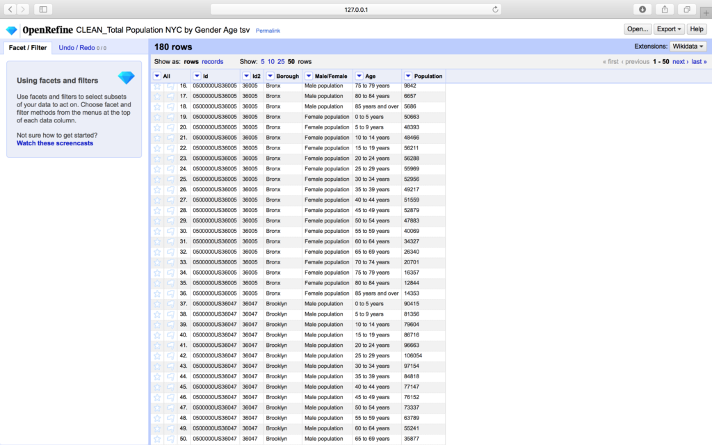
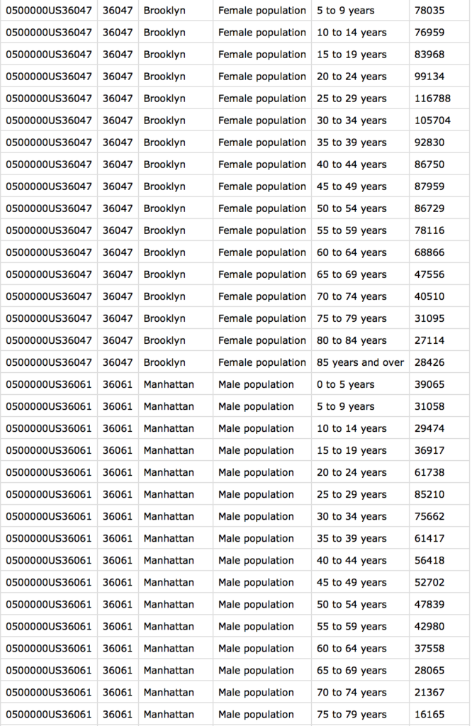
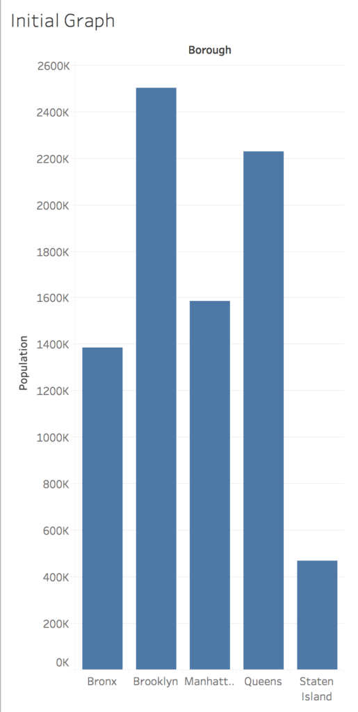
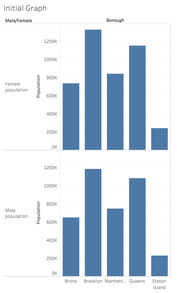
After refining and transposing the data set, it led to the creation of the initial versions of the graphs. I decided to come up with some initial drafts, so I created several visualizations on Tableau by graphing values like age, gender, and boroughs over the population scale. These were quick visualizations to set the initial tone and gather information from use in testing sessions.
The testing sessions included the initial drafts; they were tested amongst three actors that participated by critiquing and analyzing the graphs. I decided to hold independent discussions with several participants. There were no pre-requisite criteria to participate, but it turned out one individual does work extensively with data and refining information. The actors vary in professional and educational experience, though most are in their mid-30s and have at minimum a bachelor’s degree.
After cleaning up my dataset, I decided to come up with some initial drafts. These initial drafts were tested amongst three actors that participated in critiquing and analyzing the graphs. The actors vary in professional experience.
Design of Visualizations
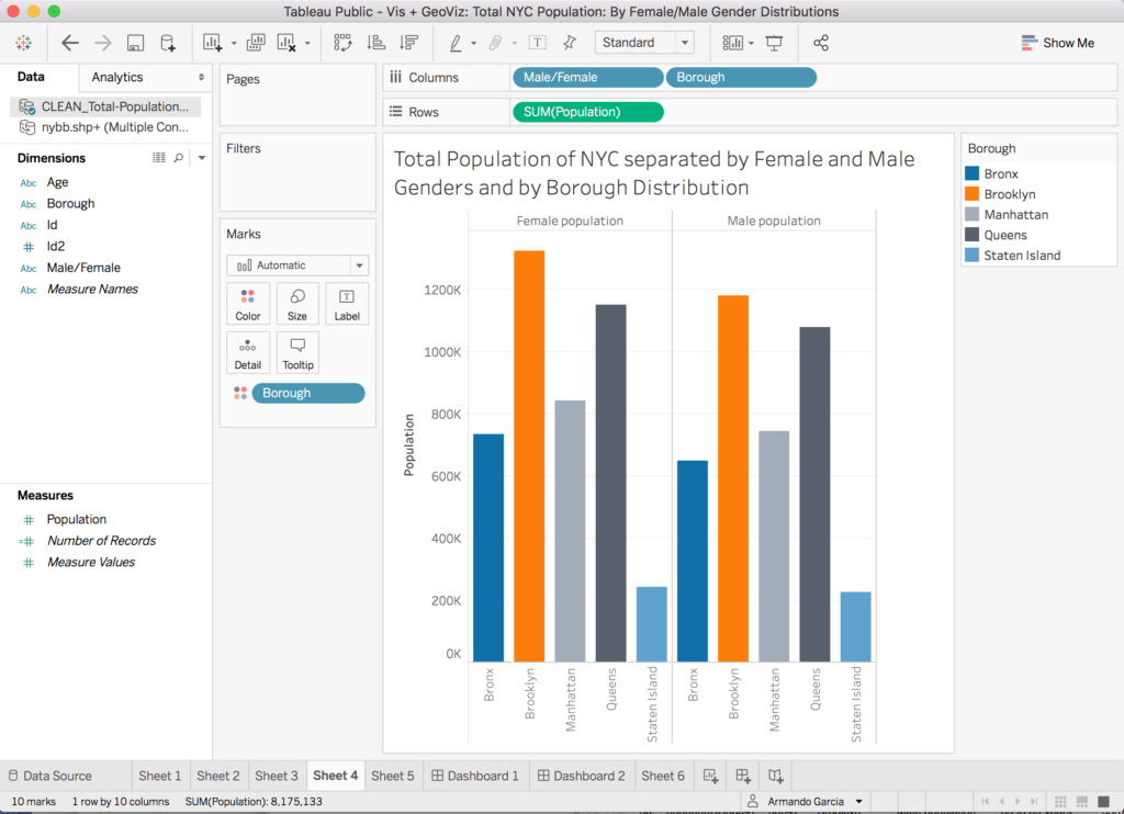
From their feedback, I developed five different visualizations to break up the gender and age information into different visual statements. Again, I created several line graphs on Tableau by plotting values like age, gender, and boroughs over the population scale.
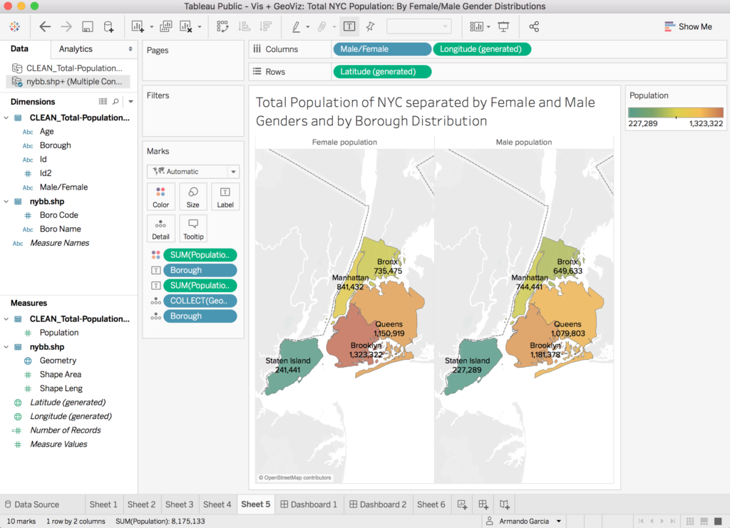
I was also able to find shapefiles for NYC’s boroughs, which allowed me to create the geo-visualization. The color added a heightened effect to the comparison that one makes when analyzing visual information.
Findings
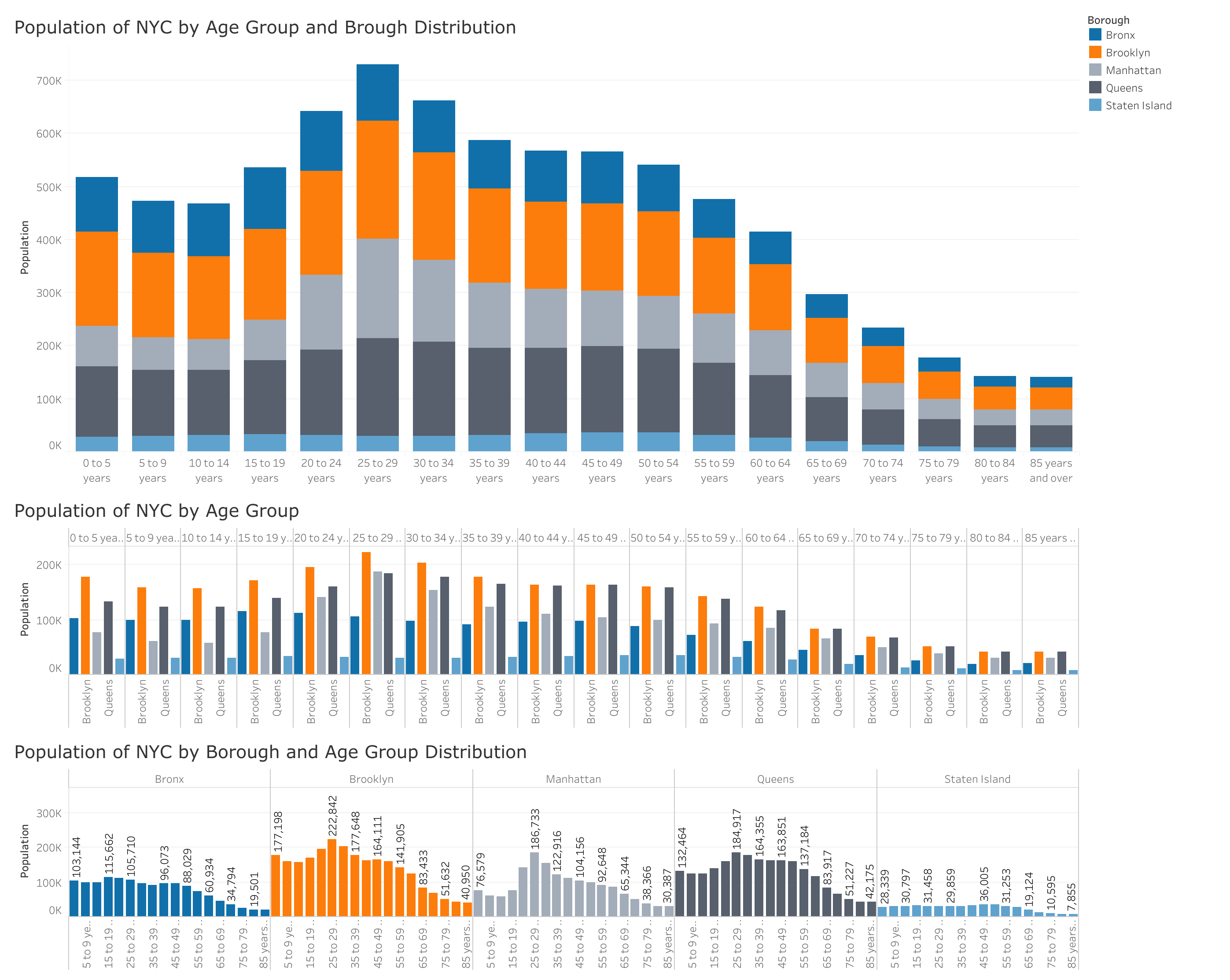
Most participants decided that a geo-visualization to accompany the other charts was a good way to help to understand and compare the information. The distribution by borough was also thought to be significant. One respondent did believe that the stacked bar graph that showcases the borough distribution and age groups all at once is important to help them visualize the data with an increased processing time. That is how they use bar graphs in the professional world, so they were more receptive to that sheet.
Population of NYC by Age Group and Brough Distribution
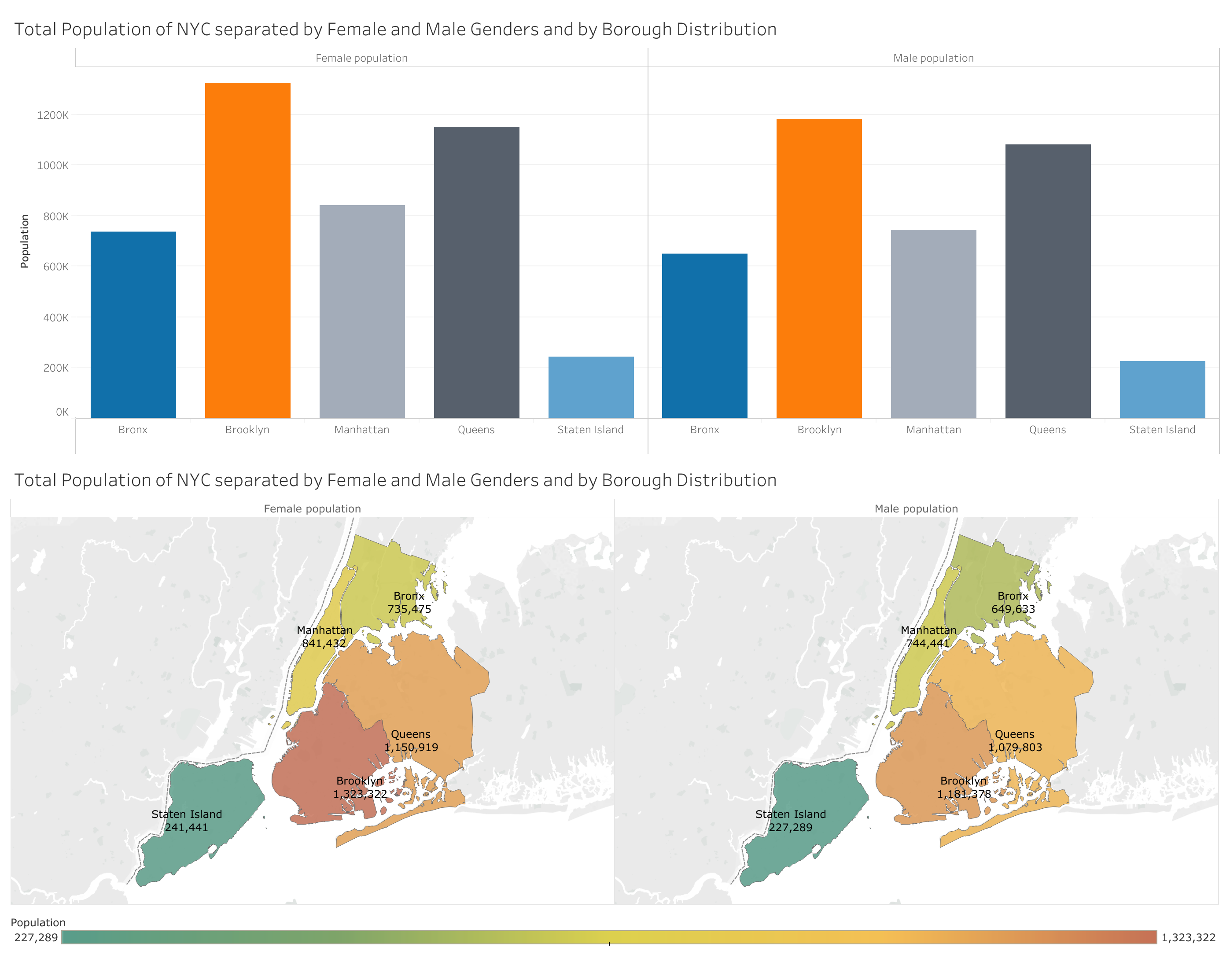
Total Population of NYC separated by Female and Male Genders and by Borough Distribution
Though the population of females does outnumber the total number of males in each borough, it is not by much. Relative speaking, Brooklyn, and Manhattan have the highest and/or considerably larger female populations than the other boroughs.
The second dashboard also shows that Brooklyn is considerably more dense in total population than the other boroughs. Overall, you can note that the age groups with the highest population are between the ages of 15–54 years old. There a lot of newborn and toddler age children (under five years old) in total.
Future Considerations
More research would involve another round of user experience testing with the graphs. One respondent was asked to provide more feedback through informal outreach, but the feedback was limited. They enjoyed the data that came along with geospatial information. The borough shapes in the geovisualizations help them to make comparisons with ease. Perhaps a more definitive test would be more telling of the importance or otherwise of other features of the visuals.
I would also like to note that the census only allows the limited capture of two genders, so there is no telling what really happens to the data entered by those that do not identify by male or female genders. It would be easy to capture that information on forms. As easy as allowing respondents to the census to enter their own information. Though this may not be as easy by governmental standards. At the end of the researcher, it is still important to push for those standards of the people to be met. To be able to graph the true representations of the people of NYC would be met with important benefits. Though rich data like this can be easily swindled and manipulated by the advertisement and marketing industries, instead one can hope that companies are hiring researchers to use this data for benefits like home and health infrastructures.
There is also a natural life-expectancy that should be considered for US residents and more specifically NY residents. Accompanying information, like more gender sections and life-expectancy of residents can involve more information.
Because respondents did imply that color was important to establish easier comparisons within the information, it is important to further test the established color story. Testing like this can provide informative direction on how to progressively correct these visualizations offer the most compelling and truthful information with visual elements balanced.
The post Visualizations and Geovisualizations: Population Summary of NYC appeared first on Information Visualization.