Zachary’s Karate Club
July 19, 2018 - All
Zachary’s Karate Club is a well-known dataset that describes the relationships in a university karate club, used by Wayne W. Zachary in his paper “An Information Flow Model for Conflict and Fission in Small Groups.” This dataset is famous for its clear depiction of community structure, which occurs when nodes of a network can be grouped into densely connected sets. In the case of Zachary’s Karate Club, the network can be split into two groups centered around Mr. Hi, the karate teacher, and John A, the club president, and the network accurately predicts how the karate club splits into two new clubs after an argument regarding pay causes a divide between Hr. Hi and John A. By recording the meetings of group members outside the context of the club itself, the network shows which club members will join which new club in 33 of 34 cases.
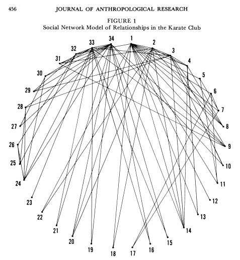
Many visualizations of Zachary’s Karate Club have been created since the original paper was published in 1977. The original visualization of this network places each node (member of the club) of the network in a circular pattern and then draws the edges (relationships outside of the context of the club) in straight lines between them.

In this visualization, nodes 1 and 34 are Mr. Hi and John A respectively. The visualization had the requirement of being printed in black and white, and it does clearly show that nodes 1 and 34 are the most connected of the network. However, because of how dense the relationships are for Mr. Hi and John A, the upper half of the visualization becomes difficult to read. It is also difficult to tell the two new clubs apart from each other given that every line and node is represented in the same manner.
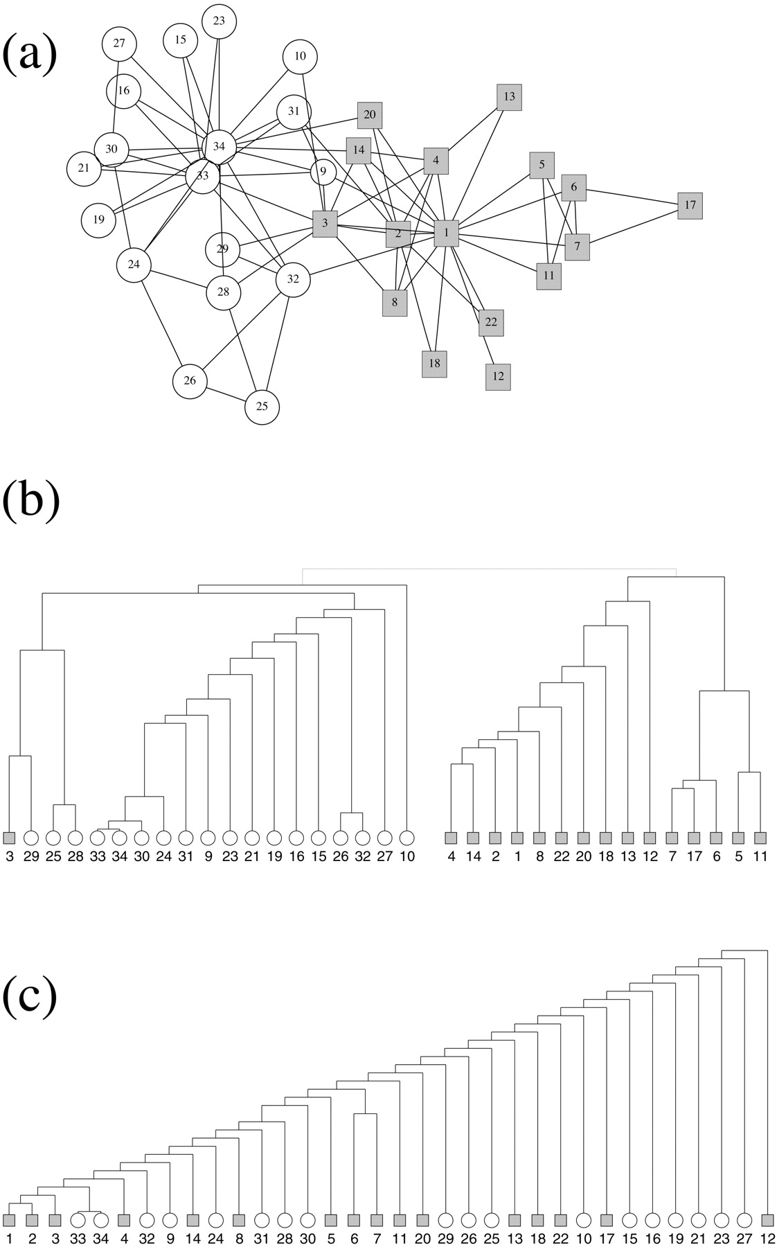
Zachary’s Karate Club was used again in 2002 by Michelle Girvan and Mark Newman to demonstrate community structure in their paper “Community structure in social and biological networks.” In this paper, they use several different methods to visualize the data.

Figure A uses a computer generated network to lay out each member of the club and groups them by Mr. Hi (gray square) and John A (white circle). This makes the division in the group much more clear. Figure B demonstrates the same network using Girvan and Newman’s method which calculates “betweenness” for each node, defined as “the number of shortest paths between pairs of vertices that run along it.” If two nodes share the same number of shortest paths, their dividing point is weighted equally in the hierarchy, thus splitting the network into groups. While this method clearly splits the club into two groups, it becomes difficult to see Mr. Hi and John A as central to those splits. Figure C shows Zachary’s Karate Club split using edge-independent path counts and it fails to split the network accurately.
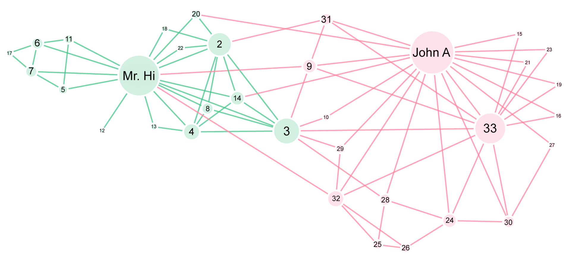
For my own visualization, I used Gephi to create a network using the Zachary’s Karate Club dataset available on the Gephi Wiki. This dataset comes preformatted for Gephi’s needs but the visualization is created by the user. The original Zachary’s Karate Club dataset is weighted by several measures of friendship, but the most frequently used dataset is this lighter unweighted version, as it still demonstrates the same groups without the added information.

My visualization uses a network divided by color to demonstrate the split between each group. Gephi’s default settings detect four groups but since I knew the story of Zachary’s Karate Club as I approached the visualization, I adjusted the settings to display only two groups. Like Zachary’s original network, this network accurately predicts the division for 33 of 34 of the members (number 9 was predicted to ally with John A but in actuality opted for Mr. Hi). The color and layout help show the two groups, like Figure A of Givan and Newman’s example, but I also adjusted the node size to represent the number of connections each club member has to other members. This helps visualize the connectedness of that club member, similar to what I liked about Zachary’s first map. In order to better show the story of Zachary’s Karate Club, I also used names rather than numbers for the central characters, which brings the viewer’s eye directly to Mr. Hi and John A so they can see that these individuals are the driving force of this division.
Other than the number of groups, several other adjustments had to be made in order to achieve this visualization in Gephi. Gephi defaults to curved edges, which in this case resulted in a muddled appearance. The straight lines in this visualization keeps the relationships between each node clear. I also sized the labels according to the node size, though in Gephi the relationship between the smallest and largest sizes turned out to be too extreme for readability. Unfortunately, adjusting the location and size of labels in Gephi is nigh impossible, so I exported the network to svg in order to edit the labels in Illustrator, only to find that the nodes weren’t exporting. It turns out that a plugin called Polygon Shaped Nodes causes the issue, and uninstalling the plugin fixes the problem. Once I had the entire graph in Illustrator, I was able to adjust label size and position, attempting to keep a balance between readability and relationship to node size. Though the image itself is high resolution and readable when seen at a 1:1 scale, this graph does have difficulty being read at smaller scales. However, the weight given to the most connected nodes tells the most important story in the network, which is how the club divided into two new clubs.
If I were to carry this project forward I would like to explore how weighted relationships might affect the visualization. I would also like to explore how different shapes may change how the viewer understands the story. My visualization shows the split centered around Mr. Hi and John A, but visualizations like Givan and Newman’s Figure B seem to have a less political viewpoint with the same information. I would also want to explore further how to best show that Member 9 is predicted to join John A but actually joined Mr. Hi. So far the best I came up with was using a key for colors vs. shapes but I wanted to create a visualization where a key wouldn’t be required, so I shelved that idea for now and focused on this final product. Overall, Zachary’s Karate Club is a well-studied social network that was very interesting to learn from.
The post Zachary’s Karate Club appeared first on Information Visualization.