Impact of Landmarks Designations on Surrounding Areas in Brooklyn
August 3, 2018 - All
Introduction
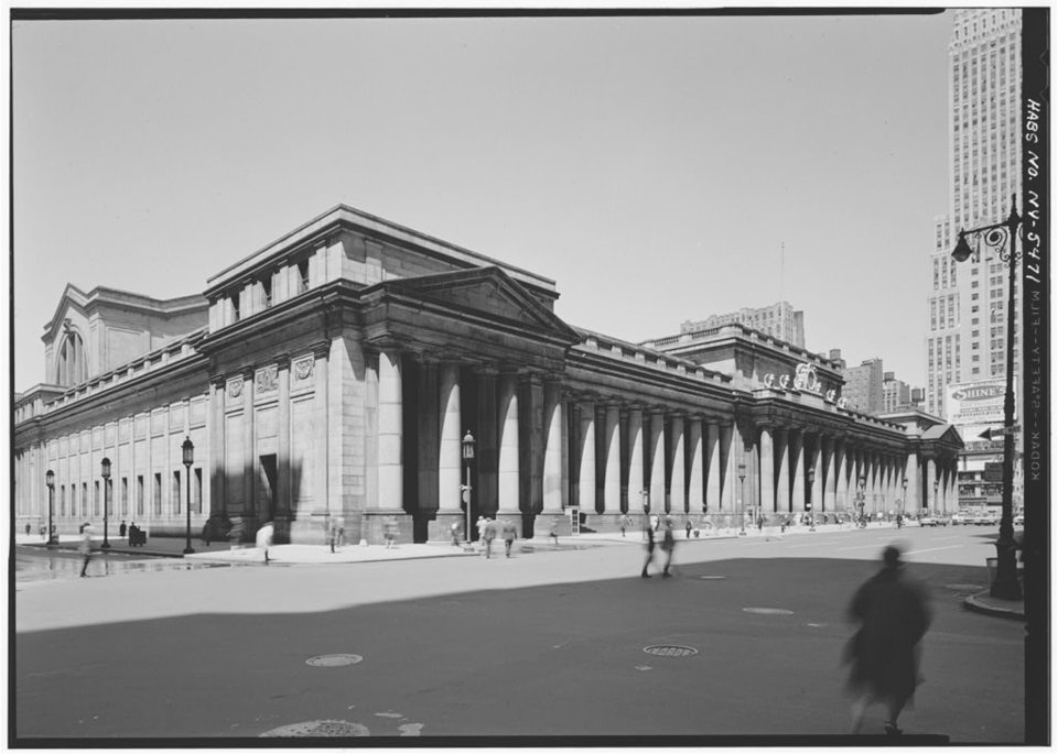
The demolition of one of New York City’s most iconic structures, Penn Station, led to the Landmarks Law and the creation of the NYC Landmarks Preservation Commission (LPC). Created in 1965, the LPC is charged with protecting historic and culturally significant sites throughout the five boroughs. This is done by identifying landmarks and historic districts then regulating them after designation. Besides safeguarding historical value, the goal is also to stabilize and improve property values of these areas since most of them are vulnerable to advancing urban development.


I was interested in exploring whether or not being landmarked had made the impact on properties as the LPC intended. Could landmarking have a positive effect on not only home value but the community? And if so, what data would illustrate it? I also wondered about the impact on residents.
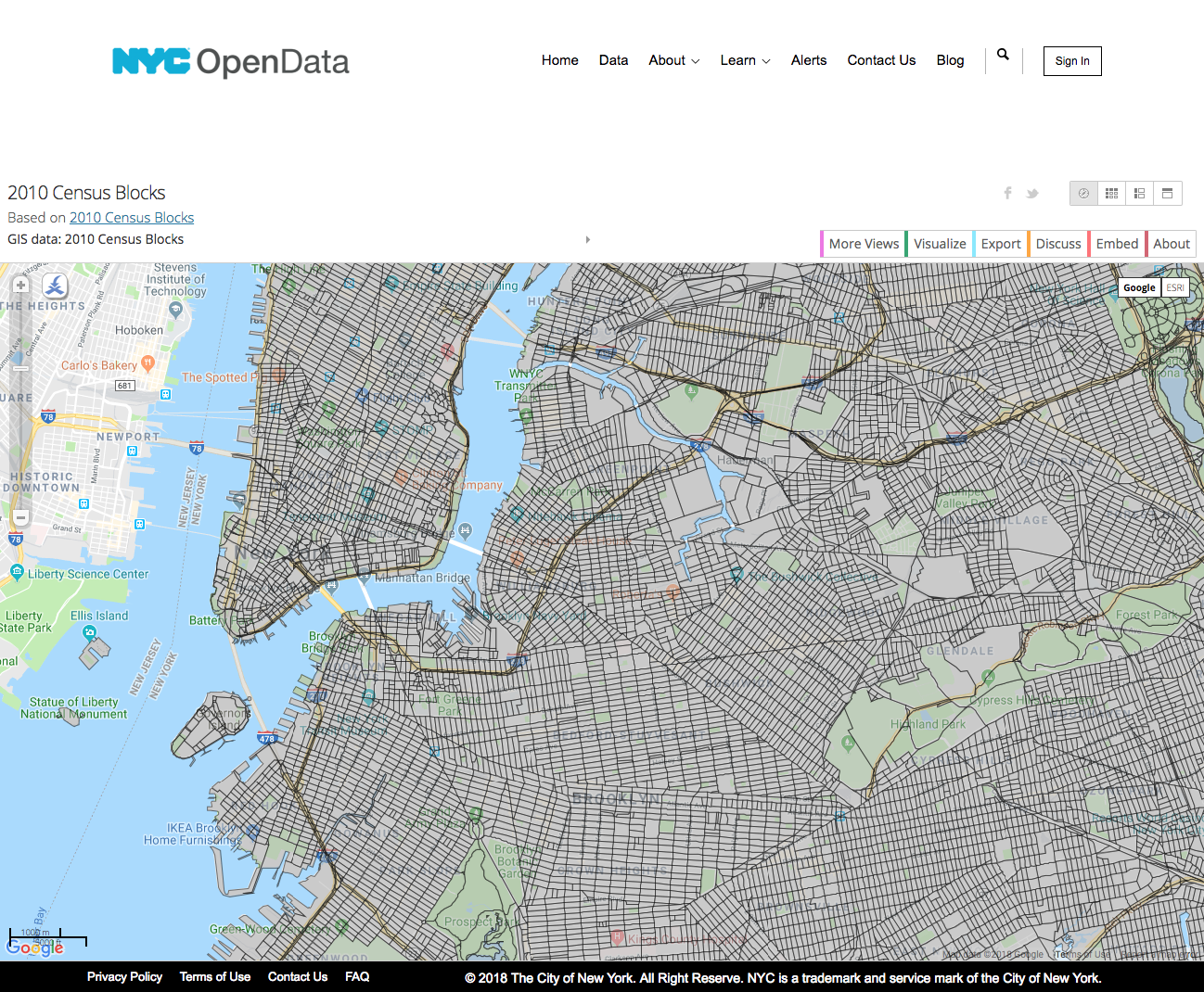
I began by looking through the current historic districts and their dates of designation. I noticed that the most recently designated ones have been in areas where gentrification has been the strongest. I decided to focus on the borough of Brooklyn since it looked to be the most active. I also chose Brooklyn for personal reasons since I live in the Crown Heights North Historic District. This made it easy to discuss the impact of Landmarks with the residents.
Process
Data Collection
Speaking to residents, I got a few different perspectives on Landmarks that aren’t evident in the datasets I worked with. Annette had lived in Crown Heights for 15 years and worked with the community to designate Crown Heights North as a historic district. She spoke mostly of residents that attached garages or painted their brownstones garish colors. It seemed that the upside for her was that landmark regulation would work much like an HOA in a suburban neighborhood.
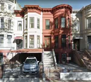
Other residents, such as Janine, saw landmarking as a way to stop developers from coming in and driving up the prices. A brownstone in a landmarked area cannot be demolished and replaced with a modern building. This makes homes in historic districts less attractive to investors. Not everyone sees it as a good thing. Lorin is a real estate lawyer in the same area. He finds that the LPC can be obtuse when it comes to aesthetics versus safety. In one case, a client had replaced a front door with a more secure one due to criminal activity. LPC insisted the old door be installed and his client apply for a new door before installing it. He felt this put the families inside in danger for the sake of historic integrity. Lorin also mentioned that some residents felt that landmarks prevented the creation of more affordable housing by inhibiting development. Of course, by my own observation, any new buildings in the area do not seem to target this income group.
Data Visualization
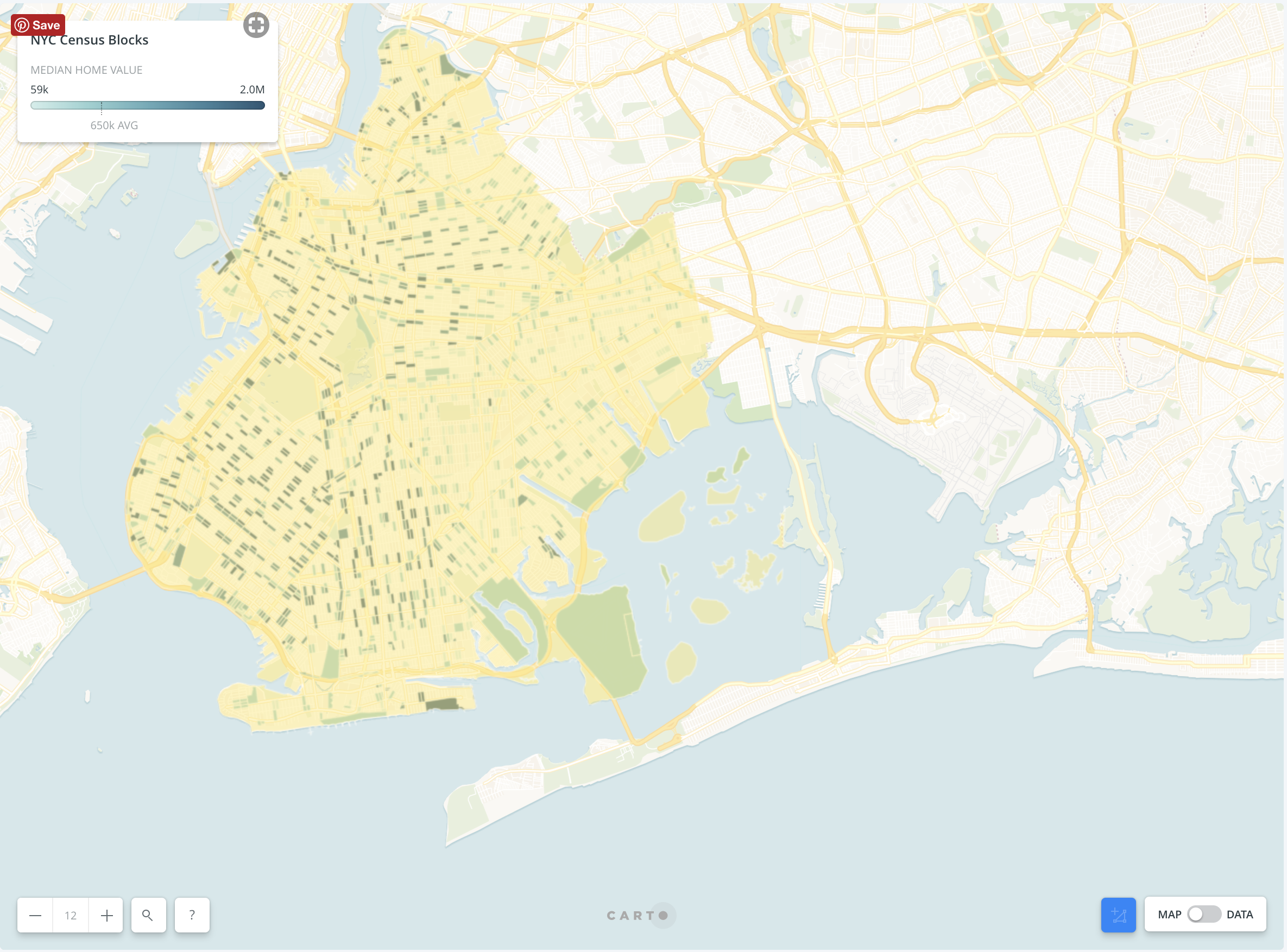
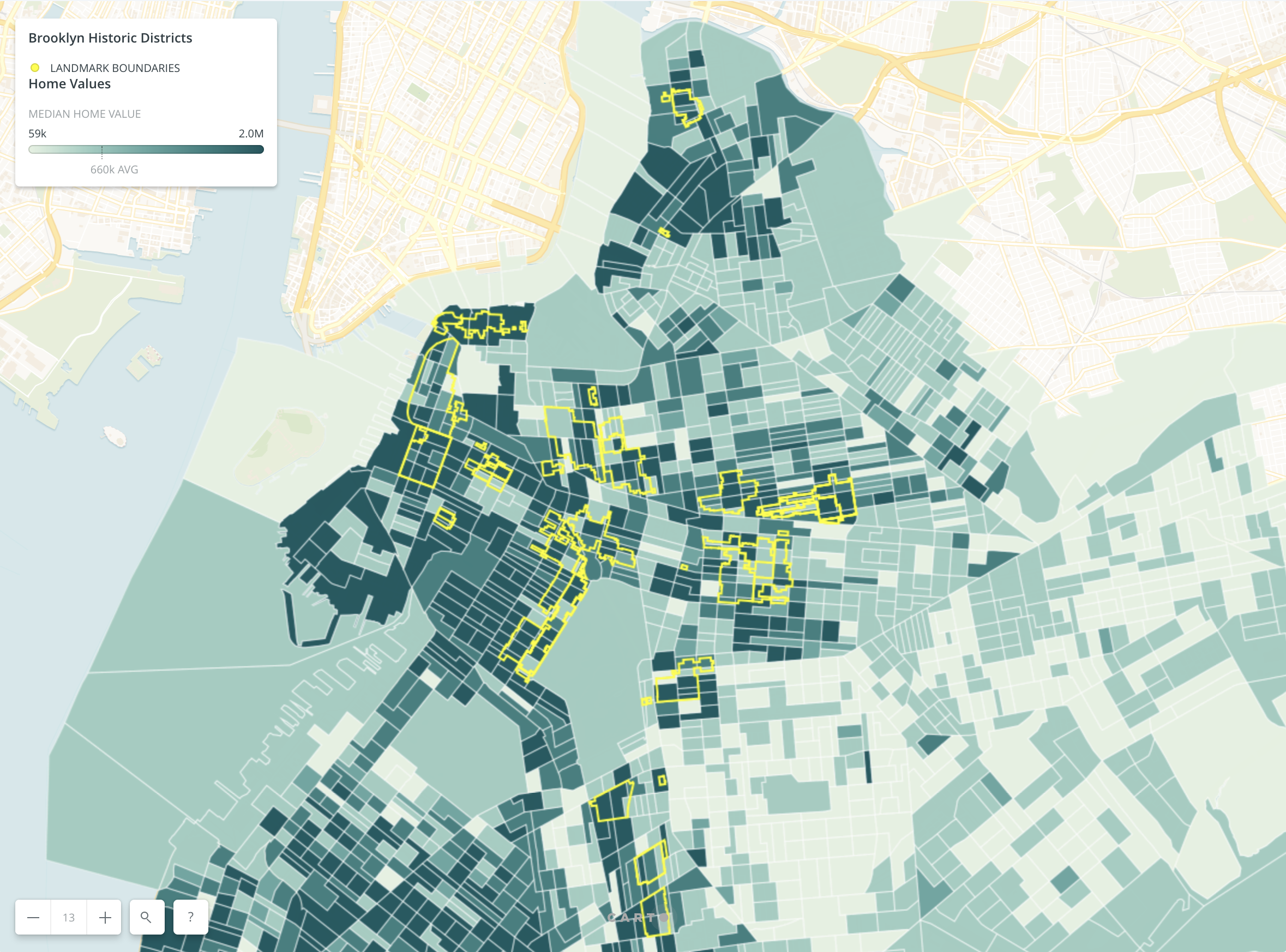
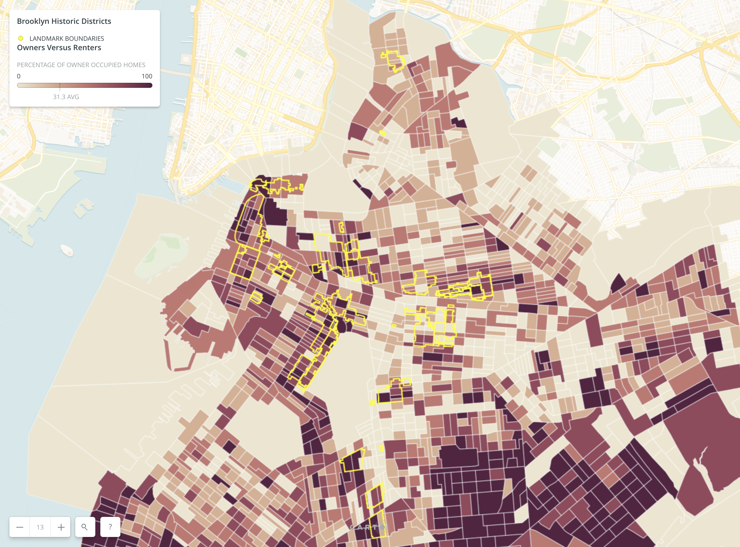
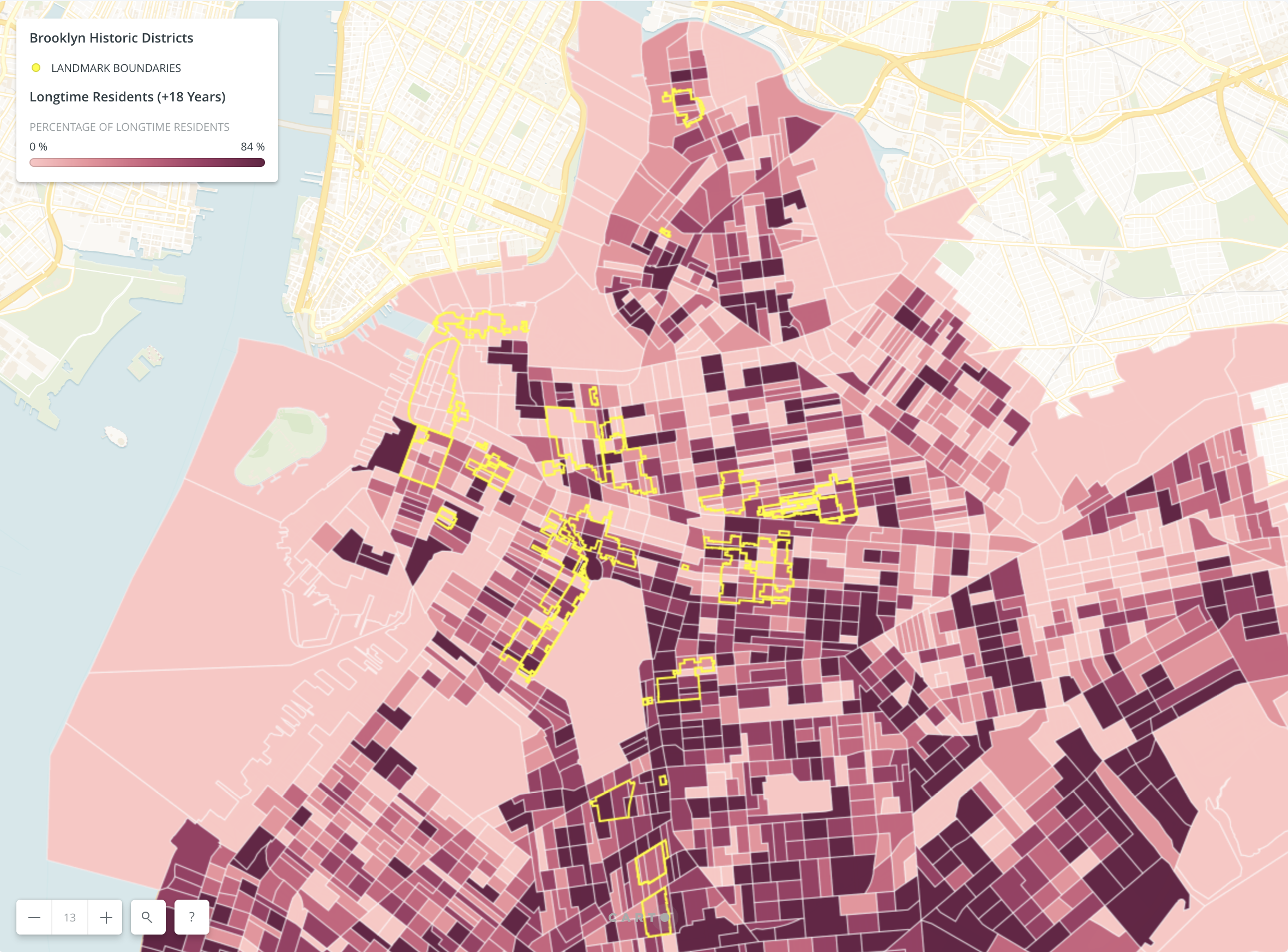
I created small multiples in Carto to illustrate how the areas around and within historic districts varied in regard to home value, home ownership and length of residency. I brought in the shapefile of the historic districts form NYC Open Data and used it to create outlines on the top layer. After importing the datasets from FactFinder, I linked them with the shapefile containing the census blocks. I used monotone colors to show intensity. With the shaded areas of census blocks against the boundaries of the districts, a viewer could see a relationship, if any exists, between census data and landmarked areas.
Tools
Sources
- B25077 | MEDIAN VALUE (DOLLARS) | Universe: Owner-occupied housing units | 2012-2016 American Community Survey 5-Year Estimates
- B25003 | TENURE | Universe: Occupied housing units | 2012-2016 American Community Survey 5-Year Estimates
- B25038 | TENURE BY YEAR HOUSEHOLDER MOVED INTO UNIT | Universe: Occupied housing units | 2012-2016 American Community Survey 5-Year Estimates
References
Results
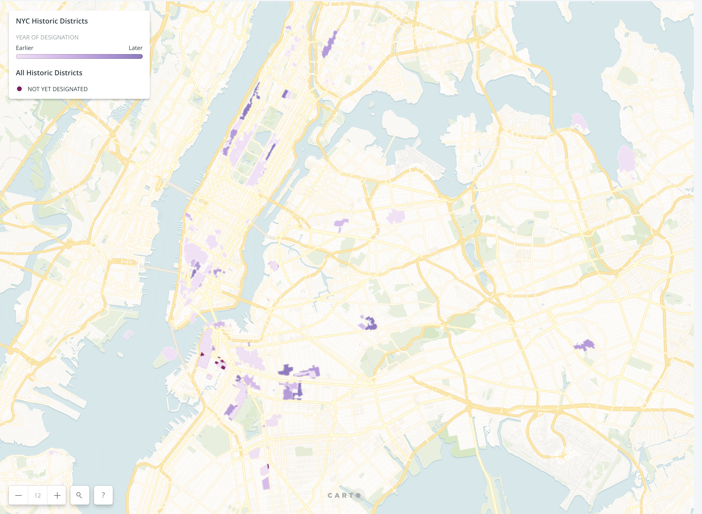
The first map I created was to show all of NYC historic districts colored by their age. The darkest ones were the latest and meant to stand out. There are two clear groupings as you look at this map. There were several areas landmarked when the commission was first created, then there seems to be another group of landmarks done recently. The later ones are areas that have seen a population growth.
The second map displays median home values against districts outlined in yellow above. The darker the shade of green the higher the value of the home. The older districts do seem to see higher values, but more recent designations are less stable. A few have very high values and most are average.
The next multiple focuses on owner-occupied homes versus renters. I used darker shades to show more homeownership. I did not see much of a relationship between the two except for Park Slope and Brooklyn Heights. Once again, this may be due to their older age.
My final map displayed tenure. The census information provided a span of years that a resident moved into their home. I added all the values before 2000 and figured the percentage of residents that had lived in the same home for over 18 years. The more longtime residents would indicate a more stable community.
Further Considerations
In conclusion, a longer span of time may be needed to see a relationship between housing data and landmarked districts. Besides housing, there may also be an impact on services, median income, and school performance. There are also benefits that cannot be easily conveyed through a dataset, such as civic pride and historical value.
The post Impact of Landmarks Designations on Surrounding Areas in Brooklyn appeared first on Information Visualization.