
Gender Portrayal in Film
July 30, 2018 - All
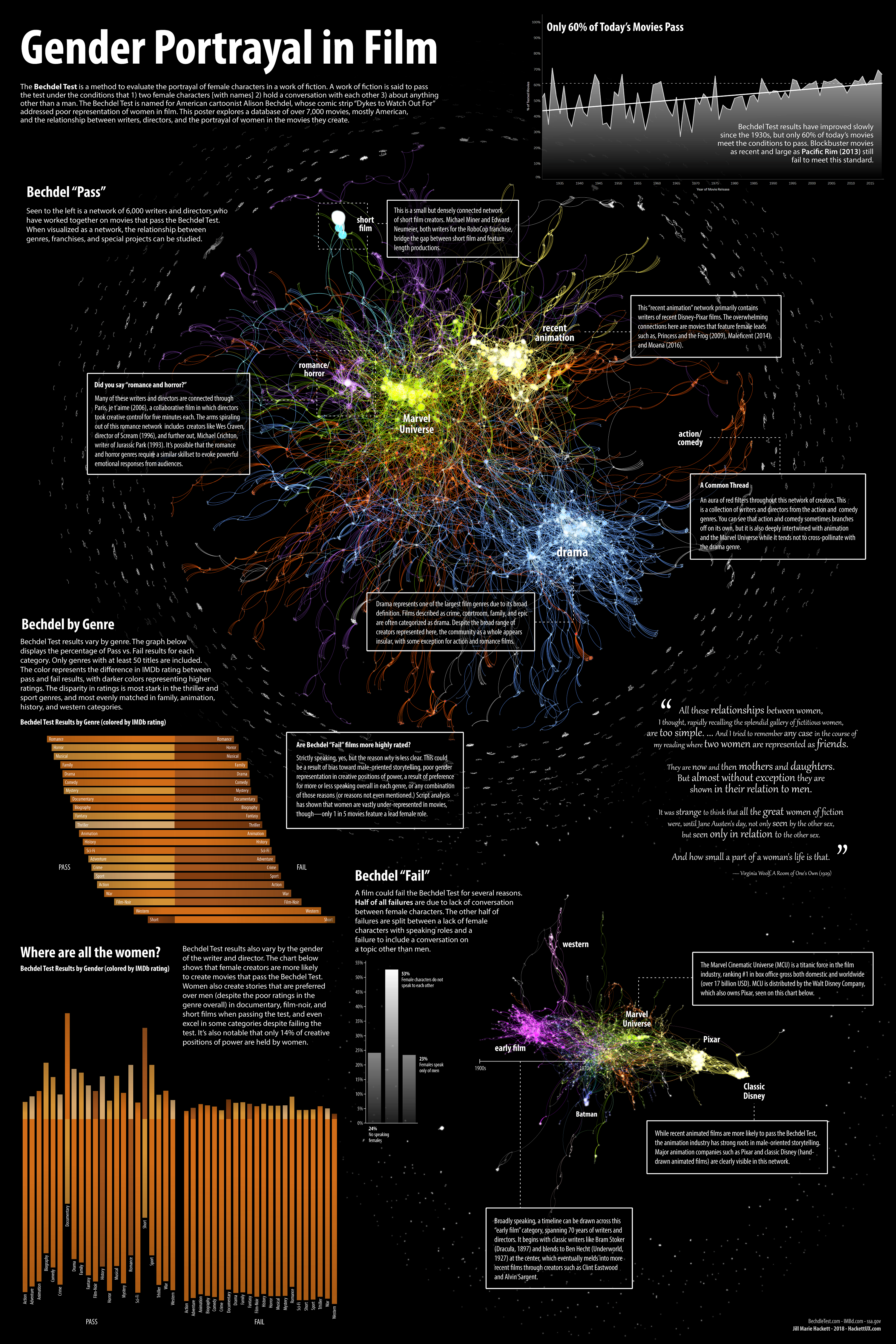
The Bechdel test is a ruleset used to measure the representation of female characters in a work of fiction. A work passes the test under the conditions that 1) two female characters [with names] 2) hold a conversation with each other 3) about anything other than a man. Variations on the test do exist, sometimes adding the condition that the conversation must be sixty seconds or longer and that the conversation must not contain any mention of a subject with context that relates to a man (such as marriage or pregnancy). Bechdel test results are recorded on BechdelTest.com, a volunteer-run database of over 7,000 films, mostly American. Using this dataset in combination with IMDb and SSA.gov (for gender identification), I created a poster that explores the portrayal of women in film.
I opted to create a poster for my final project for several reasons. First, creating a poster felt like I was working within a movie theme (this poster is 40” x 60”, standard movie-size.) I also wanted to select a medium that allowed me to have better control over the final appearance of my visualizations. After working with several different programs this semester, I found that I enjoyed the interactivity available through Tableau but I felt the control over the final look of the product was restrictive. I also felt restricted by the look of Gephi’s network visualizations. To compensate for this, I decided to use Tableau and Gephi to structure the data but I finished the poster in Illustrator.
When I first started to explore the data from BechdelTest.com, I didn’t know what I was looking for, only that the topic interested me. BechdelTest.com’s information is fairly limited for each movie; it includes the title, year, a Bechdel rating (0-3, depending on how many conditions of the Bechdel Test the movie passed), and most usefully, the associated IMDb code. Using this code, I was able to download several IMDb datasets (available on the IMDb website) and get more detailed information for each movie including genres, directors, and writers.
For the UX component of this final project, I relied on guerrilla user testing at Starbucks, where I spent most of my time working. Each time I created a version of my graphs that I felt satisfied with, I asked the nearest person if they would be willing to take a look at my project. (Most people were curious to begin with since network visualizations are a somewhat odd topic for a coffee shop.) I felt comfortable asking strangers to take a look at my project without screening questions beforehand since I wanted to create a poster that anyone could take something away from, though most of my participants tended to be younger women, probably because I’m a young woman myself and striking up a conversation was easier. The user testing created an iterative process for the poster’s creation, incorporating feedback until each graph started to convey the most essential information. What I learned first, though, was that my poster would need an introductory paragraph for the subject, since most of my participants didn’t know what the Bechdel test was (or they had heard of it without knowing what it was called.)
The first question I asked of the Bechdel dataset was how test results varied over time, which lead to the creation of this graph.
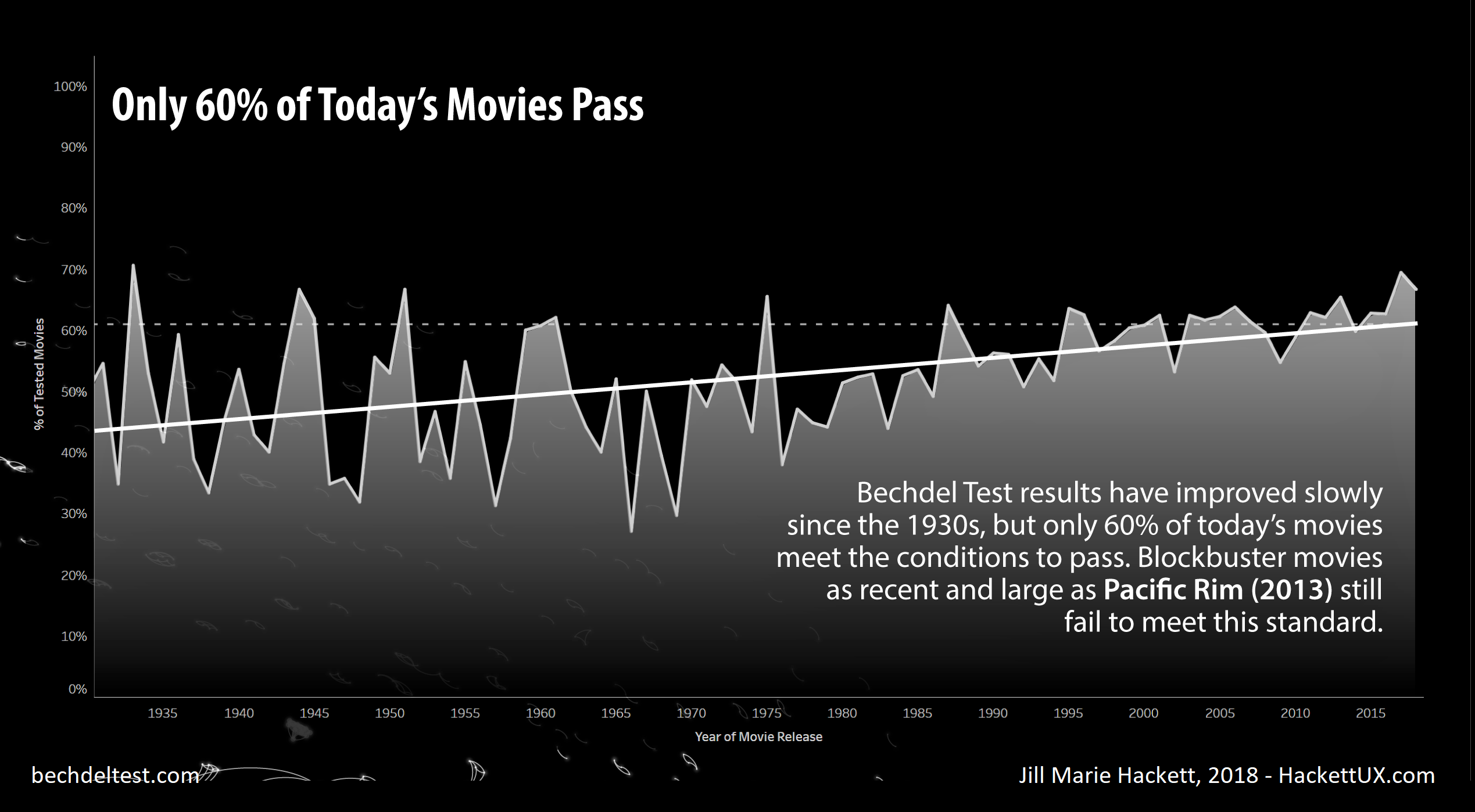
The graph shows that Bechdel test results have improved over time but that only 60% of today’s movies qualify as passing. When looking at the dataset as a whole, only 50% of movies are passing. The Bechdel dataset includes movies previous to 1930, but the number of records prior to 1930 are spotty, so my graph runs from 1930-2018, which represents most of the tested movies. This graph underwent several iterations based on user tests, starting as a simple line graph and moving to an area graph, then a histogram and then back to a line graph with a trend line. Finally, this version includes a trend line as well as a guideline that indicates where present-day test results are at (barely over 60% passing). Since this is one graph on a large poster, the heading is selected for scannability, allowing viewers to see the most important piece of information I wanted to convey and then allowing for further exploration if desired. In the annotation, I specifically mention Pacific Rim (2013), which was so controversial that it inspired a Bechdel Test spinoff to address the treatment of its female characters. Any viewer that chooses to look up Pacific Rim will find a trove of information on the subject.
After I took a look at Bechdel tests through time, the next question I wanted to answer was whether test results varied across genre. It turns out that they vary widely.
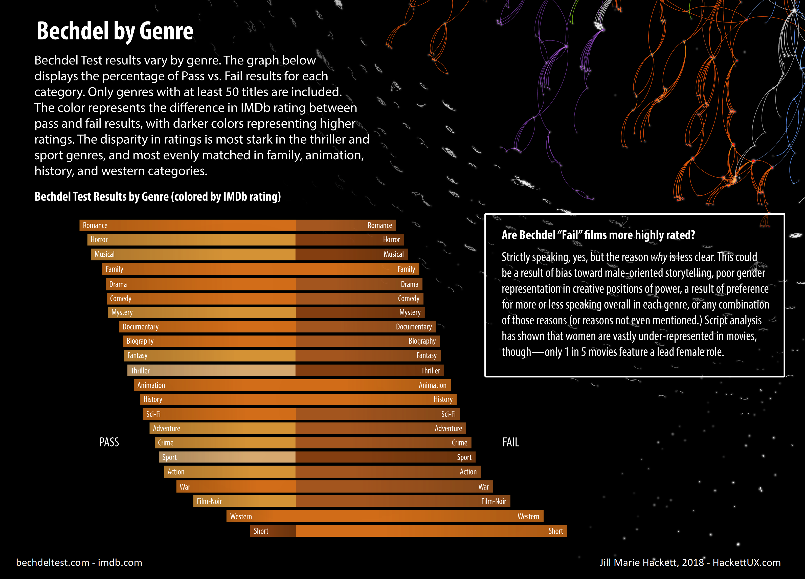
To create this graph, I excluded all genres with under 50 movies. The largest genre, drama, includes over 1,000 movies, but most are in the hundreds range. IMDb assigns up to three genres per movie, so some movies are represented in multiple genres on this graph. In user testing, this graph read well from the start. It was created in Tableau and edited in Illustrator so that the bars align on a center axis that splits pass and fail results. As covered in class, the darker colors did read as higher ratings, and to reinforce that, I also addressed the ratings in the sidebars. The real challenge of this graph was finding a balance between the colors here and the colors in the networks so that the poster as a whole appeared balanced. Orange is a strong color that draws a lot of attention, but I prioritized color choice for the networks so that the categories could be most easily read, which left orange as the only reasonable option for this section. (I did experiment with gray scale, but viewers got confused about what the rating scale meant. I didn’t want to include a legend if I could help it, so I switched back to color.) To account for this, I selected a muted orange and slightly lowered the opacity so that it would blend with the background. This balanced the graph so that it could still be read without overpowering the networks.
Next, I wanted to know how the genres looked when they were split between male and female creators. This was tricky since IMDb doesn’t specify gender with the creator profiles. However, in my research for this project I’d seen other visualizations that explored this, so I returned to those examples and looked into how they acquired gender information. It turns out that SSA.gov offers statistics of first names in comparison to gender, which other researchers using BechdelTest.com and IMDb have used to assign gender to creators. I did the same for this project, eliminating any gender guess under 80% likelihood. I did spot-check the results and they looked consistent, though it still left me with over 1,000 results to work with, so this graph is really a best guess.

To remain consistent with the genre graph, the colors, ratings, and analysis by percentage are the same, so viewers don’t have to shift gears when reading this graph. Instead of splitting the bar graph on pass and fail results (they remain consistent with pass on the left and fail on the right) the results are split between male and female creators. This graph was more difficult to read in initial user testing due to the amount of information to pick apart, but by adding space between the pass and fail sections, the graph became much easier to read. I also used the annotation to help teach the viewer how to read the graph so they could explore further on their own.
The centerpiece of this poster is the Bechdel Pass network, and I find it to be the most exciting part of this project. Formatting the Bechdel data for a network was the most difficult part of this project for me (though creating the final visualizations was the most time-consuming), but it turned out immensely cool and well worth the effort. I used a combination of OpenRefine and R (lots and lots of R) to format the data for this vis.
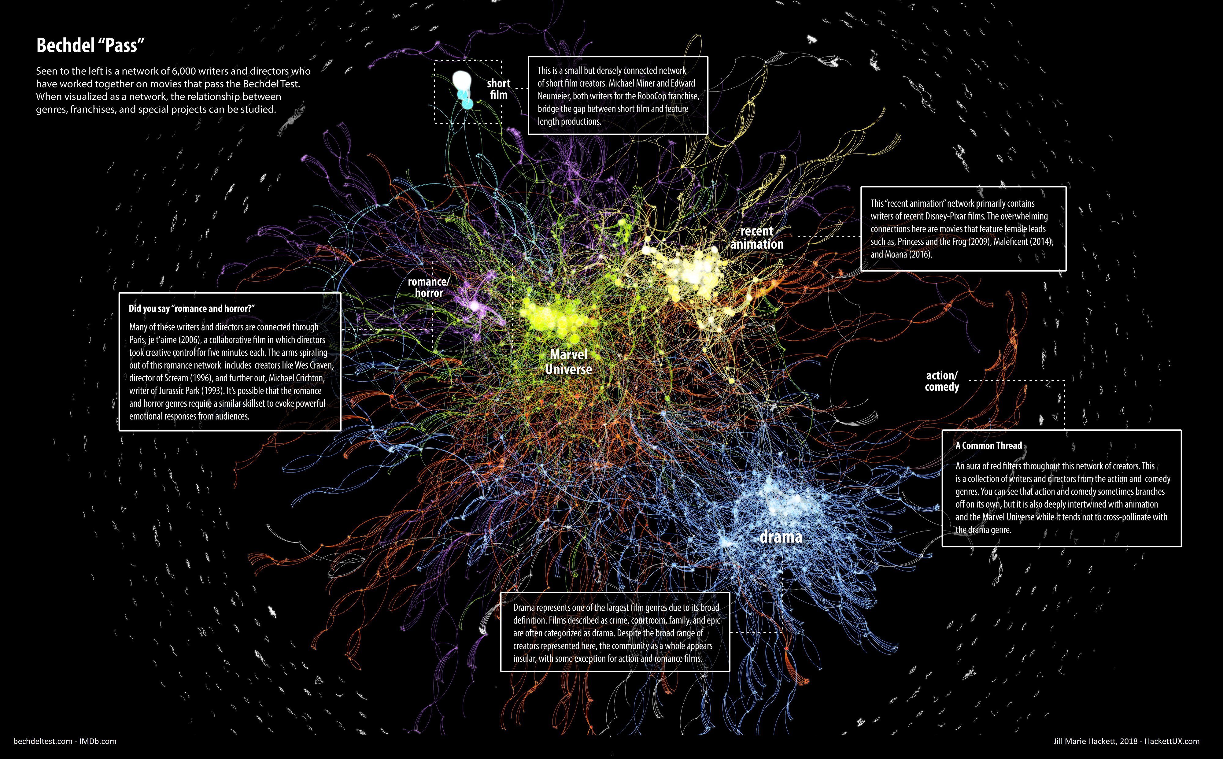
What you see here is a network of creators that worked together on the same movie that passed the Bechdel test. My initial plan was to create a single network with color-coded pass and fail connections, but the point was raised that two creators could work together on multiple movies, some of which may pass and some of which may fail. So the featured network for this project focuses on Bechdel passing movies. Going into this network, I had no idea what I was going to find. I suspected that I might be able to identify top-contributing creators, but with over 6,000 creators included in this graph, the real findings are seen from a higher vantage point. Creators turn out to be connected not just by projects but by genre and franchises. The Bechdel Pass network identified several communities: romance/horror, Marvel Universe, recent animation, drama, and a cloud of action/comedy throughout. These findings are in line with the genre graph, which, for example, identified romance and horror as top contributors to Bechdel pass results.
I created the Bechdel Pass network using Gephi and exported it as SVG to edit in Illustrator. Being able to fine tune my colors in illustrator helped with the readability of the network, but user testing showed that the graph still needed work in order to get a sense of how densely connected some of the genres were. Adding a glow effect to the nodes helped outline the creators, and I also switched the nodes to ‘screen’ which moves the color closer to white the more the nodes are overlapped. This allowed viewers to get a sense of how individuals make up a whole. The Marvel Universe and recent animation shows tightly connected communities while drama and action/comedy appear more scattered. Networks are also somewhat difficult for some viewers to read in general, so I also added annotations throughout the network to show off parts that I thought were interesting and also teach the viewer how to read the graph so that they could then explore on their own.
The Bechdel Pass network was really cool but I didn’t feel that my project would be complete without exploring a Bechdel Fail network as well. Since the Bechdel Pass graph taught me that the communities have shapes based on how connected the creators are, I wanted to know if the communities for Bechdel Fail would have a different shape. I suspected from my own experience in the film industry that established creators would have more closed communities, but I wasn’t sure what those communities would be.
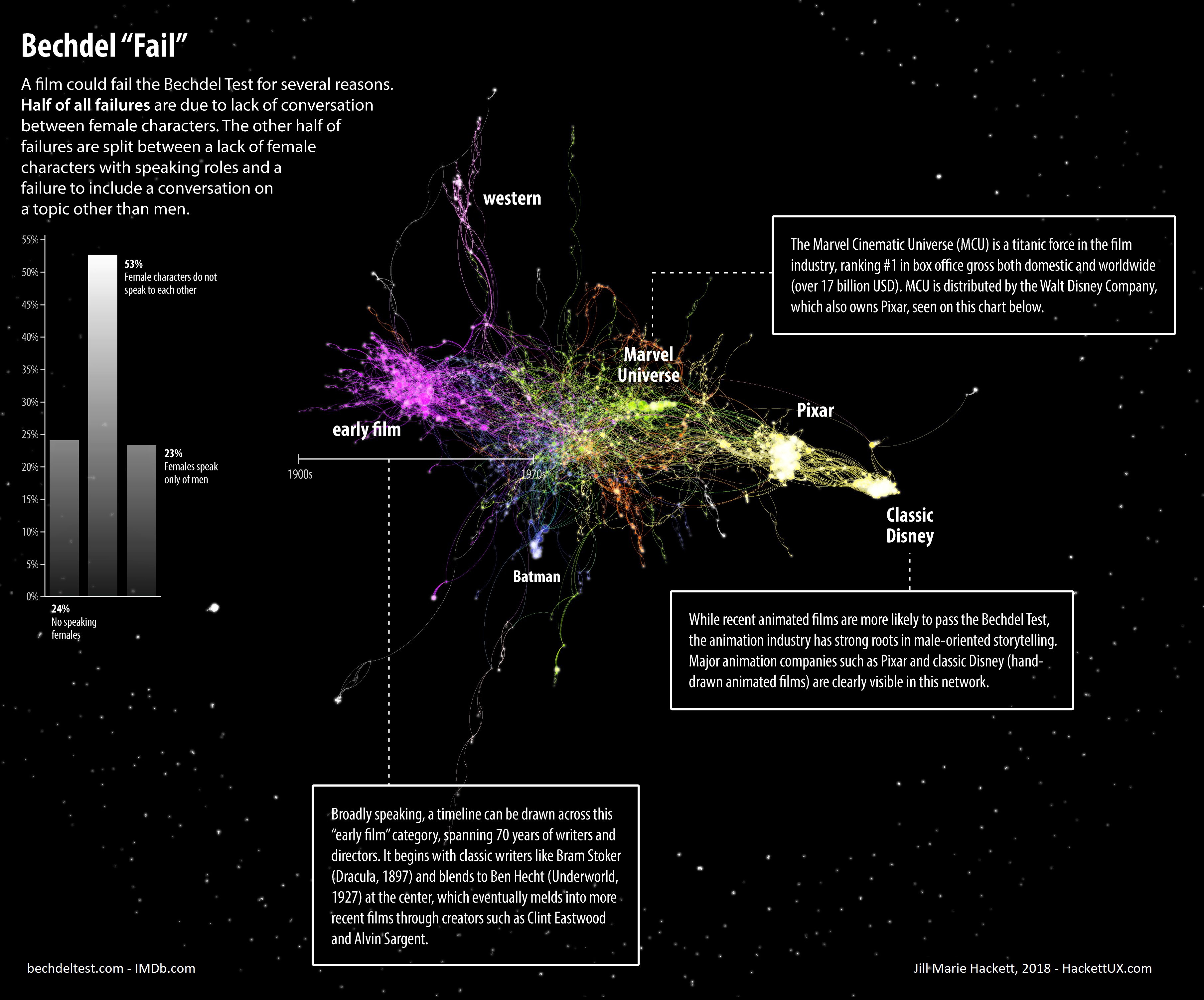
I expected to find clusters, of course, but I was really surprised to see how clearly franchises and companies appeared in this network. In the animation section, Gephi identified classic Disney, Pixar, Blue Sky, and Dreamworks as different clusters, but knowing they were all related through the animation category I recolored them as such. Disney and Pixar were so clearly defined that I gave them their own labels, but those swirling yellow arms flying off near the Marvel Universe (MCU) are Blue Sky and Dreamworks. (It was surreal to see my co-workers’ names appearing on this graph.) I was a bit concerned about the yellow color bleeding into the green MCU, but thinking about it I felt that the bleeding between these two categories was fairly representative of the visual effects industry, which is likely what connects animation to MCU. I was also surprised to find that Batman was its own section, which bleeds into the animation, action/comedy, and early film categories through (surprisingly or not, I can’t decide) traditionally animated Batman movies from early in the franchise. I also discovered that early film is connected almost like a timeline across 70 years of Hollywood tradition, which I explain in the sidebar.
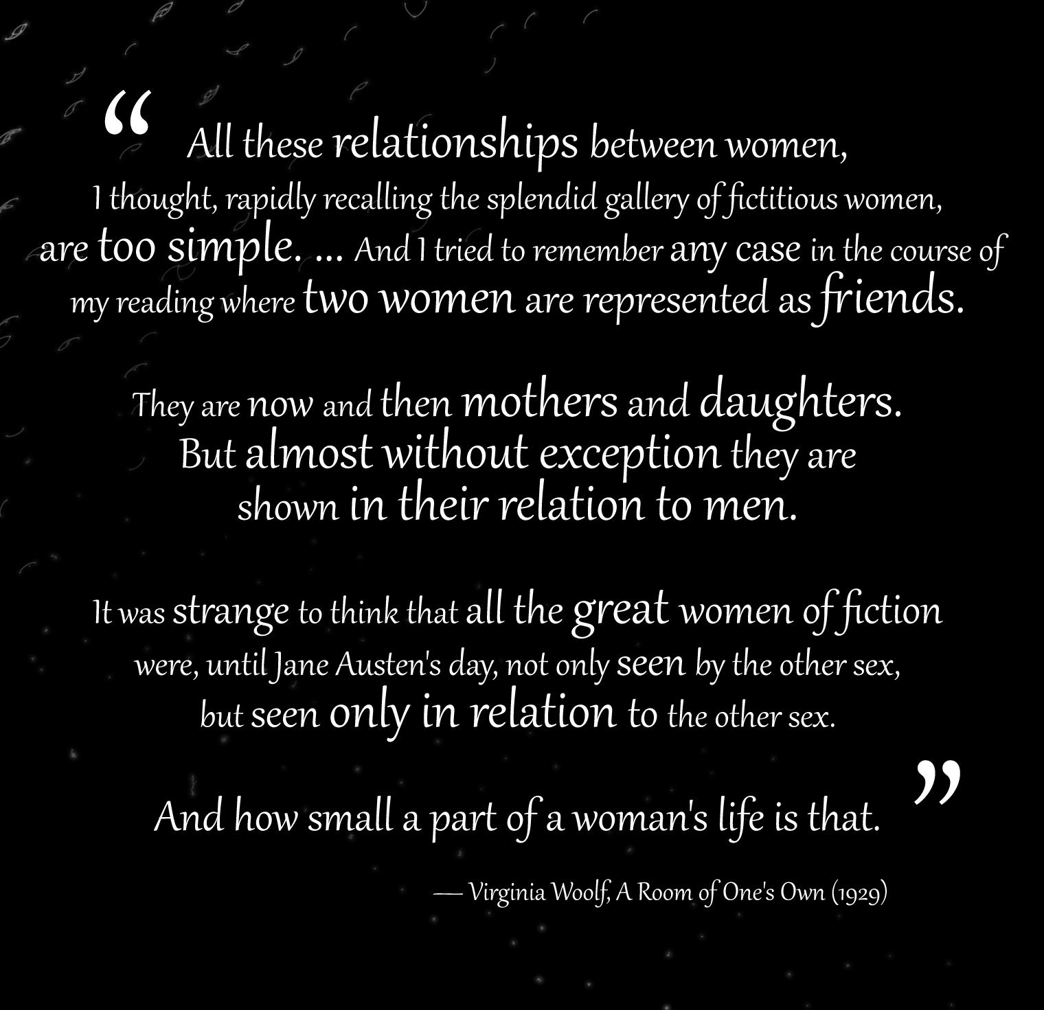
I thought at first that the Bechdel Fail network could stand on its own, but in user testing viewers wanted to have more context for how these movies qualified as a fail status. To answer that question, I added a bar graph that explains the different reasons a movie could fail the Bechdel test and what the division was for this network. I also included a quote by Virginia Woolf in order to provide more context for the poster overall (and I think it adds to the poster’s mood.) This quote is partly credited as inspiration for the Bechdel test.
After adding this context, the question was no longer asked and viewers instead spent their time studying the network.
I tried to revise my final product based on feedback throughout the project. I lost track of how many people I roped into looking at my poster but it was well over 10. If I were to continue working, I would like to continue investigating a better solution for the orange bar graphs. They’re functional but I’m not 100% sold on how they look yet. I would also like to manipulate the Bechdel Pass network’s appearance a bit more. Most notably, the short film category is so condensed that there’s very little distinction between the creators, and even though it’s technically correct, I would like to better represent the number of people involved and create a more appealing shape overall. I think I would also like to play with the position of the sidebars in order to help lead the viewer’s eye a bit better. The viewer tends to start at the top left corner and work in a somewhat S-shape as intended (and I tried to set up the poster so that it could be explored in any order if it came down to it) but I feel it could be stronger with some more experimentation. It’s just a lot of information to balance. Oh, and though this image is designed as a poster, I knew that it would be viewed on the blog, so the colors are set up for computer monitors and would have to be adjusted to look its best in CMYK if I were to print it.
This is undoubtedly my best project yet (though Bigfoot was pretty fun, don’t deny it). The user testing turned out to be helpful for making the poster read as a single unit, as well as making sure the sidebars were teaching the viewer how to explore the graphs, particularly the networks. It’s definitely a project I felt a lot of love for, so hopefully other people enjoy it too!
The post Gender Portrayal in Film appeared first on Information Visualization.