Street Trees Per Capita by UHF in New York
July 26, 2018 - All
While browsing New York City Open Data, I saw a couple of data sets that looked like they would be interesting to compare: the results of the city’s tree census and it’s recent air quality reports. The comparison probably wouldn’t create any real results, but I thought it might be an interesting comparison to make. I quickly ran into problems with reconciling the two data sets, and in the end my map of street trees per capita in New York, divided into the 42 UHF regions, is more of a starting point than a true result.
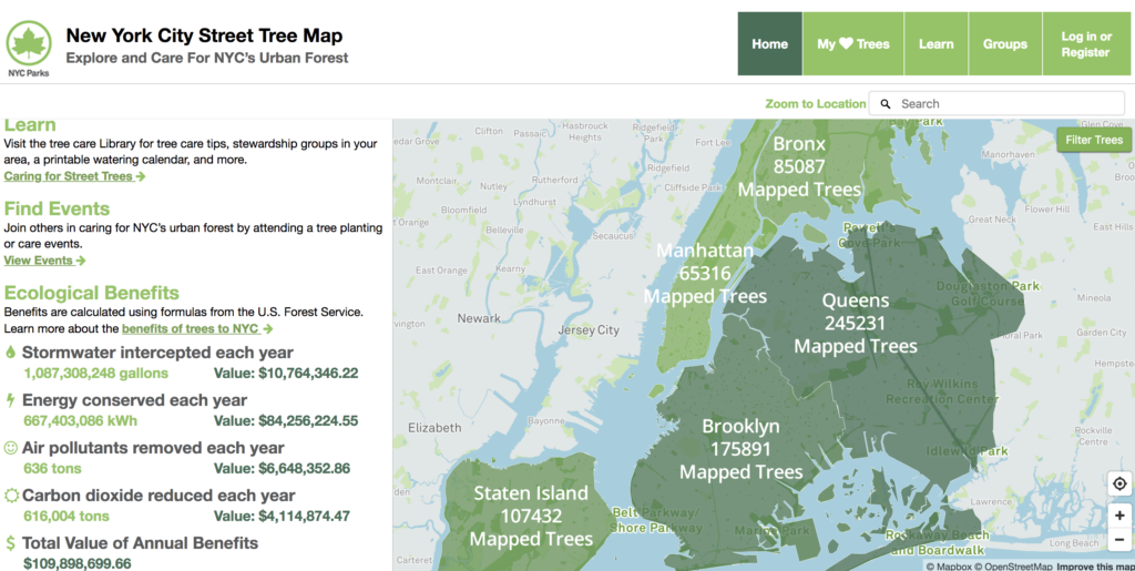
I took a look at the map the Parks Department created with their data. The most recent tree census is from 2015, which is what this map is based on, but I ended up using the 2005 tree census data because of my original goal in comparing it with air quality data. This interactive map counts up the trees by borough and by neighborhood. Zooming in allows users to even look at individual trees on every street. They also used formulas from the US Forest Service to calculate the benefits of having trees in the city and put a dollar amount on it. It’s a fun map to interact with, though it seems like they fell into the trap of tying the count of trees to their color palette, rather than normalizing the numbers. It was interesting to see that they made a calculation for Air pollutants removed by NYC trees each year, though they don’t provide much context to the numbers.

I also found a post on UpOut that tried to map the air quality in New York City during the day. Overall, it seemed like data they used might not have been the most accurate, nor did they try to explain their full methodology. It seems impossible that one neighborhood could be highly polluted, while the next neighborhood over has a much better air quality rating, or how there can be one neighborhood with higher air quality that’s surrounded by poor air quality neighborhoods. At best, the post seems like a poorly thought out visualization, and at worst it seems editorialized to create alarm about air quality in the city.
Finally, there’s the Global Forest Watch map. The map is almost inspiring in the amount of information and features it contains. Users can toggle on and off various kinds of information, view the map in different modes, and look at change over time in the last 15 years–and it was built using Carto.
My map didn’t end up making the comparisons I’d hoped to. When I took a look at the air quality data, it ended up being a a number of different reports compiled together. None of the air quality metrics were on the same scale, and none of them were explained. They were also across various time ranges. I ended up using the 2005 tree census data because it would match up with a subsection of the air quality data, but in the end, I wouldn’t have been able to put together all the different air quality measures to compare with the tree data.
I ended up just sticking with looking at trees per capita when the city was divided into the UHF42 regions. I first had to find the UHF42 shapefile and load it into Carto with the tree census data. I then looked for the census tract shapefile and the census population count from the year 2000, as my tree data from was 2005. I had to then connect the census tracts with the population count. Then I took the UHF regions and counted the trees and summed the population. I exported that data, reloaded it into Carto, and from there calculated the ratio of trees to people, which brought me to my visualization.
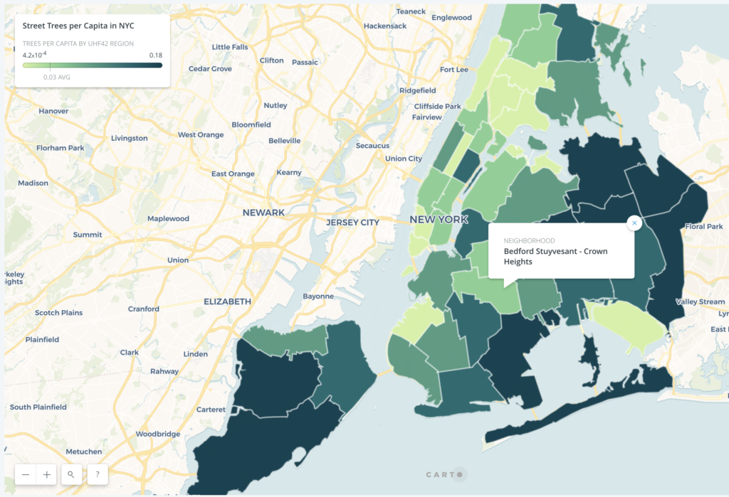
We were able to calculate the ratio using SQL, but I later realized that the population information I downloaded included information for both the 2000 and 2010 census and it was throwing off my numbers. When I went back in to Carto to adjust this, I ended up breaking all the analyses I’d done started fresh with a new map. I then hit a lot of difficulty trying to figure out what the SQL language we’d used to calculate the ratio had been and got stuck for awhile. Finally, after changing one of the values in a float, it worked.
My next thought was to switch gears and look at tree density over time, since tree census data is available from 1995, 2005, and 2015. However, the data restrictions on Carto made it impossible for me to load the large data files from the additional years. A final small glitch to note is that the labels on my map don’t seem to be loading. I set it to show the count of trees and the population, but for some reason the change won’t push to the published map.
As I said at the beginning of my post, this map feels like more of a starting point for other visualizations. It could be used to compare the trees to other city health data, I just wasn’t able to accomplish that this time around.
The post Street Trees Per Capita by UHF in New York appeared first on Information Visualization.