
Geovisualization: Mapping NYC’s Projected Population in 2010–2040
July 25, 2018 - All
Introduction
I decided to take another look at the summary of NYC’s projected population over 2010–2040 by the Department of City Planning. This rich dataset adds categorization to population statistics by age groups and boroughs of NYC.
Besides including totals, the summary sorts the population information into categories of age groups (18 age groups between the ages of 0 and 85+) and by boroughs (Brooklyn, Queens, Manhattan, Bronx, and Staten Island). Time is allotted from the year 2010 through 2040.
When we look back at the visualizations I already developed from this information, we can see that the values were committed to time-series graphs on Tableau. All of the categories of information offer insights into the relationship between the population by age group and progression of that population through time. For example, time-series graphs reported the population values across time and by age group and boroughs. The comparison by borough gave way to present the data on a map using a different mapping and visualization software. The resulting visualization presents the summaries of the projected population and the accompanying geospatial relationship.
Discussion
Geovisualization is an umbrella term that we can regard as alluding to the use of software and critical mapping to present data that references geospatial information (MacEachren & Kraak, 2001). The following are examples that present a new take on mapping. These maps integrate interactive elements on a digital platform to encompass a unique user experience.
Materials and Procedures
Carto, more specifically regarded as Carto Builder, is used to create applications that display data that has a relationship to or is based on location. For example, NYC’s projected population is based on distribution by borough, so logically Carto built a geospatial response to this information. The following interactive map was created by adding a layer of the borough shapes to Carto. The population and categorical data were related to the borough shapes. The data was essentially converted into an application that allows users to interact and choose different age groups to output particular records and an accompanying visual.
Results
Carto allowed for the visual presentation of the population summary per each borough. This is done by plotting by age group and by year over a layer that includes the outline of the boroughs.
If you study all the age groups throughout each projected year, then you can see that the population is steady amongst the boroughs and close to equal as well. While Tableau time-series graphs showed us the steady incline of population throughout time, Carto shows us the equally maintained population throughout the boroughs as time goes by.
Carto also produces an interactive map with legends that allow users to group categories. For example, one can choose to view a specific year, be it 2020, and specific age groups, like 20–24 and 25–29. This allows more narrow comparisons than the general time-series graphs from Tableau.
Future Directions
I should have added information pop-ups to show information about the specific borough as people click on them. The color can be reinforced per each age group (choose a different color per each age group to change the display), but my main concern was to keep the colors easy to compare across the age groups. It can be tricky to maintain a true reflection of the dataset by overwhelming users with color stories.
References
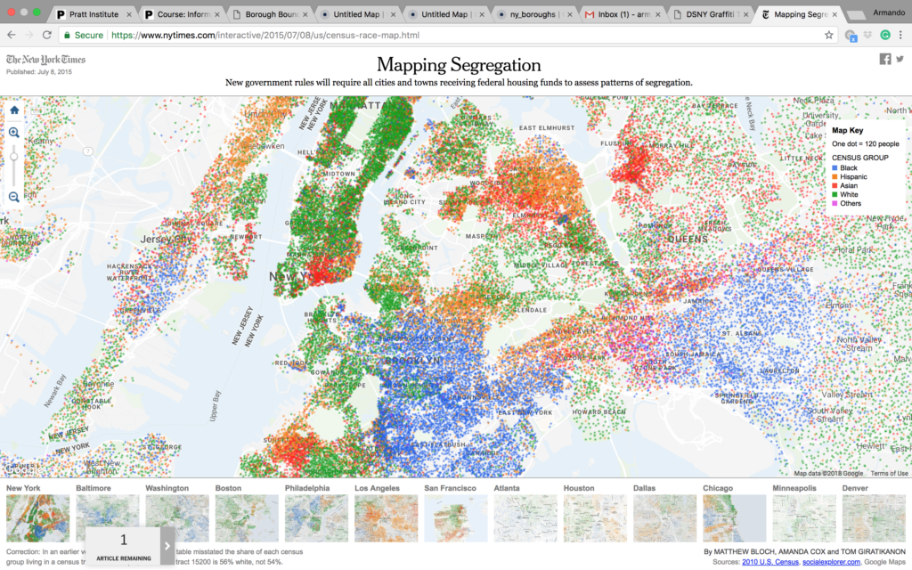
Bloch, M., Cox, A., & Giratikanon, T. (2015, July 08). Mapping Segregation. Retrieved July 19, 2018, from https://www.nytimes.com/interactive/2015/07/08/us/census-race-map.html
Department of City Planning (2014, April 22). Projected Population 2010–2040 – Summary. Retrieved July 3, 2018, from https://data.cityofnewyork.us/City-Government/Projected-Population-2010-2040-Summary/ph5g-sr3v
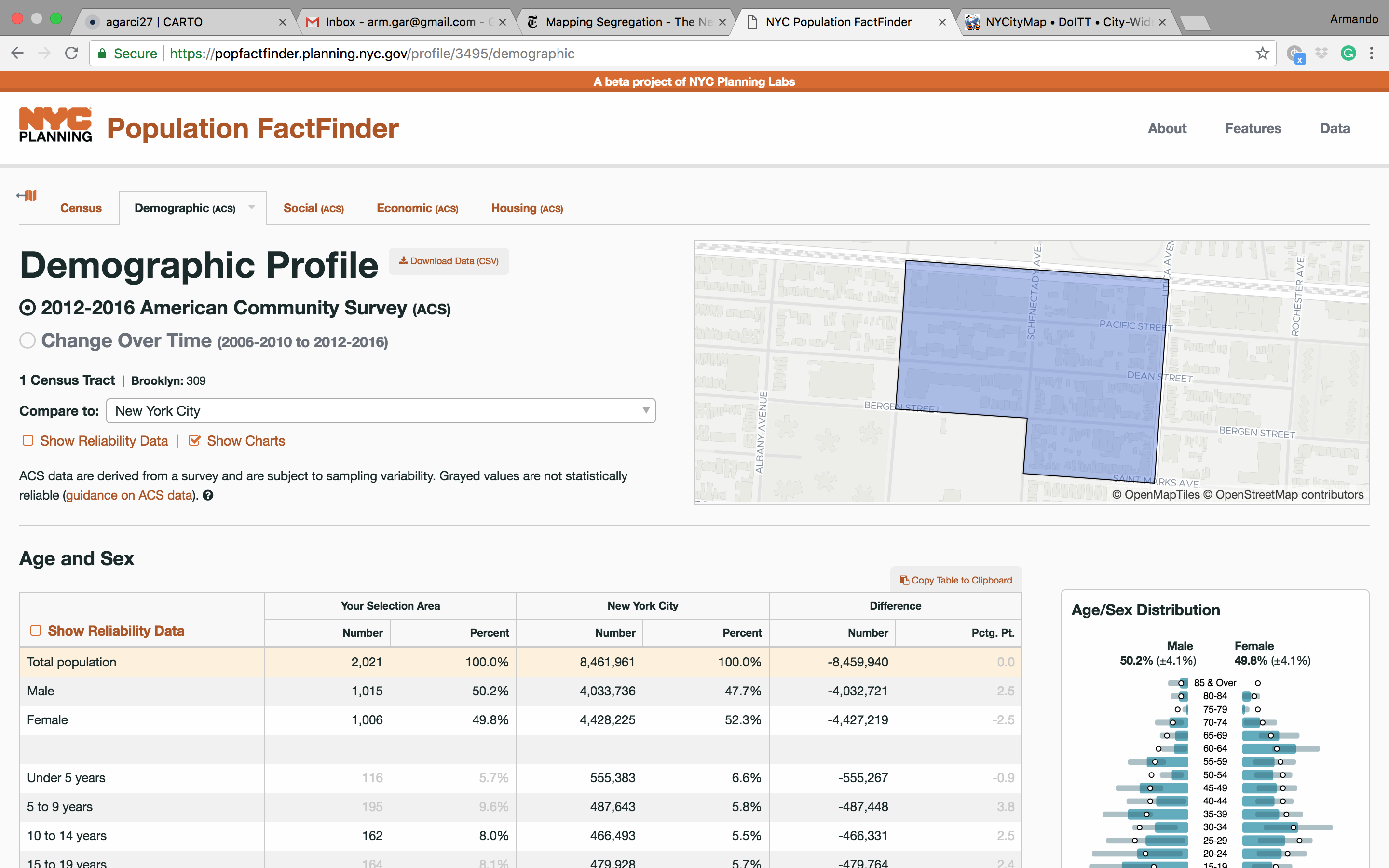
NYC Planning Labs. (2018). NYC Population FactFinder. Retrieved July 20, 2018, from https://popfactfinder.planning.nyc.gov/#12.25/40.724/-73.9868
City of New York. (2018). NYCityMap. Retrieved July 20, 2018, from http://maps.nyc.gov/doitt/nycitymap/
MacEachren, A. M., & Kraak, M. J. (2001). Research challenges in geovisualization. Cartography and geographic information science, 28(1), 3-12.
U.S. Census Bureau, 2010 Census.
The post Geovisualization: Mapping NYC’s Projected Population in 2010–2040 appeared first on Information Visualization.