Our mission this semester was to redesign the content management system (CMS) for Urban Archive, a technology nonprofit. Urban Archive partners with museums, historical societies, and other cultural institutions to bring their collections to life through an iOS app and, most recently, a web app. Digital assets are uploaded to the CMS, geolocated, and shared through the Urban Archive app.
Upon first logging in to Urban Archive’s CMS, it was clear that the system needed a lot of work. The user was presented with a dashboard of links on the main page, grouped into vague categories such as “Media,” “Content,” and “Editorial.”
We spoke with our client, Urban Archive’s creator Ben Smyth, about his hopes for our proposed CMS redesign. He expressed a desire for greater user engagement among institutional partners, and suggested that this could be achieved by making the CMS faster, easier, and more intuitive. What makes Urban Archive special is that it geolocates images and other assets in its system so that users may discover and interact with collections via a map interface.
An Analysis of the Competition
To gain some insight on CMS best practices, we conducted a competitive review. I looked at Flickr, Wix, and Dropbox and took notes on what these successful content management platforms have in common. My takeaways were that ease of uploading, access to metadata, and organization tools should be front of mind when designing features for Urban Archive.

Modeling Users: Interviews, Journeys, and Mindsets
Our team then designed and conducted interviews with users of other CMS platforms to learn more about a typical user’s needs and behaviors. We asked about personal and professional media management, the contexts in which they work, and their experience with asset management. We then conducted a brief observation to see how they walked through a CMS platform, which would tell us a little more about their mental models. Three big themes came up for us: navigation, a need for cross-platform functionality, and sharing.

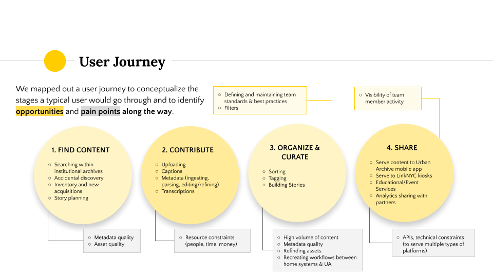
We wanted model users to keep in mind during the design process, but did not want to design around the restrictions of a user persona. Instead, we developed three user mindsets to help us envision a user journey from start to finish through the CMS platform we would design. From our themes, interview results, and research on Urban Archive’s partners, we identified three mindsets:
• Data: A data-centered mindset, keeps the workflow moving.
• Curation: Content-centered with a focus on accuracy.
• Discovery: Drawn to pictures and locations—the app’s end users.
We then conceptualized a user journey through the lens of each of these mindsets and tried to predict the opportunities and pain points they might encounter along the way. In doing this, we found inspiration for features to introduce in our redesigned CMS that would address many kinds of users’ needs. The four steps of the user journey are find content, contribute, organize and curate, and share.
Defining Features, Building Structure
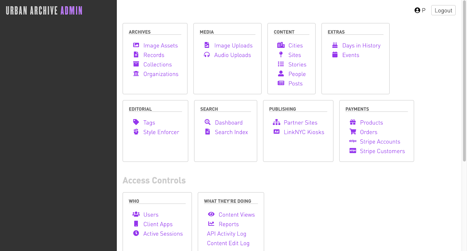
Next, we moved on to attempt to define features that we wanted to incorporate. Our team cited global navigation as a major need for Urban Archive’s CMS. Their interface currently features a charcoal gray bar on the left of the screen that is somewhat helpful. It displays different information depending on where a user is in the CMS and what they’re viewing. However, as users, we needed to navigate back to the home page whenever we wanted to navigate to a different part of the system.
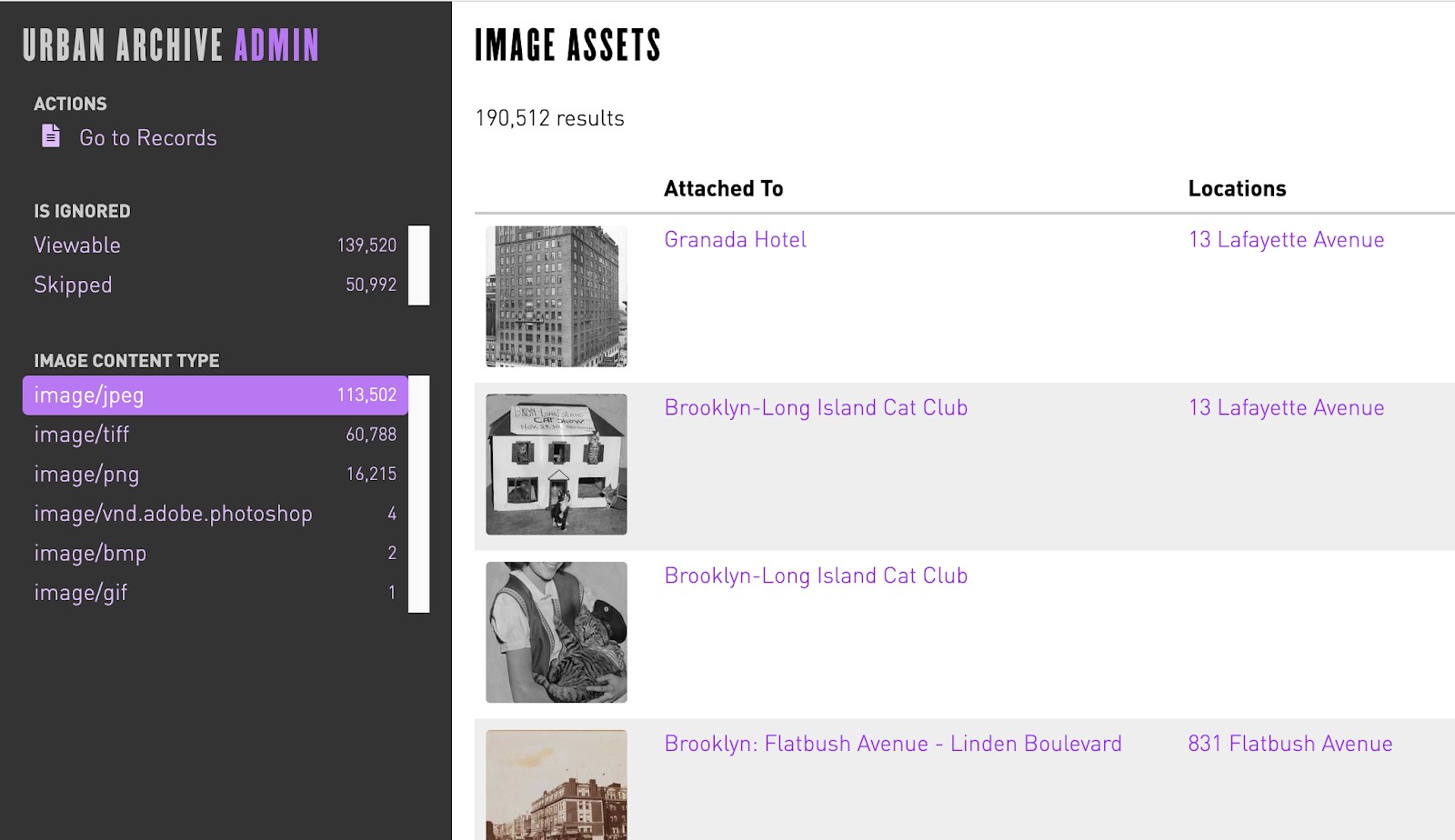
We encountered a challenge in familiarizing ourselves with the system itself, as the terminology used around the site was sometimes redundant and confusing. Take the use of “Image Assets” versus “Image Uploads” from the homepage. Both links lead to pages containing many assets, but what could be the reason for creating these two areas? Why is “Records” separate from the images? And why would a list of organizations be grouped in with the archives? If anything, examining this problem bolstered our reasoning for creating a dedicated upload button to avoid user confusion.
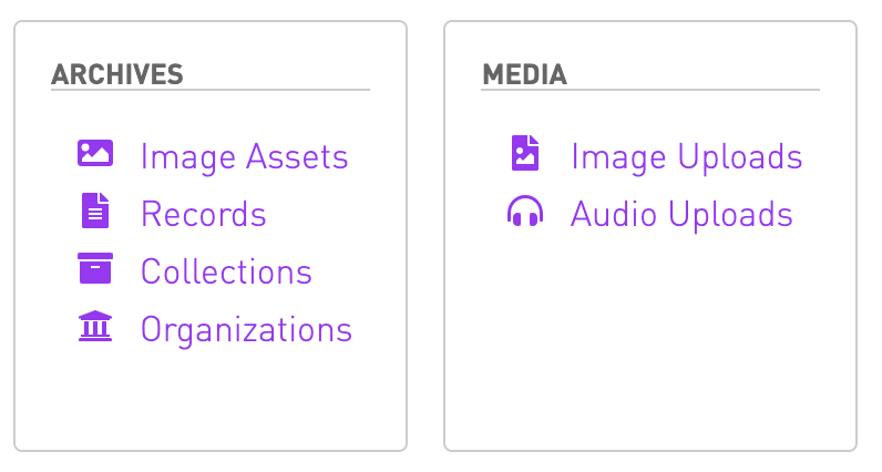
It was several weeks into the project before we realized that under “Archives,” on the left, the list represented the way that assets are nested into records, which are nested inside of collections, which belong to organizations. To simplify the user’s path into their collections, we proposed a search bar that would be part of the global navigation element so that it would always be available. To develop the use of the gray bar to the left of the screen, we proposed filters to enable users to sift through the large volume of assets in their collections. Finally, we planned to implement a simpler uploading tool that would enable users to upload one or many assets of any type (image, audio, or text file) from a proposed assets page.
Site Maps: Third Time’s a Charm
Before we could even begin mapping these features to a visual manifestation of our ideas, we had to test our proposed navigation. We came up with the site map below as an alternative to Urban Archive’s matrix of links:
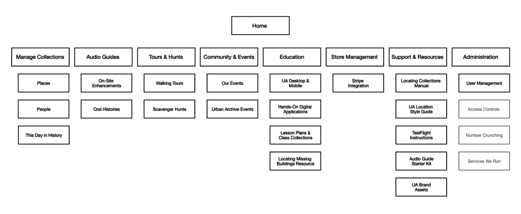
Our main navigation would include links to Manage Collections, Audio Guides, Tours & Hunts, Community and Events, Education, Store Management, Support and Resources, and Administration. Management of the assets themselves is nested under one heading here, as is a place to manage other types of content used in the app, such as biographies of historical figures—“People” and important dates—“This Day in History.” Picking up on Ben’s desire for more engagement with institutional partners, we chose to highlight sections for “Community & Events” and “Education.” The “Support & Resources” section also provides user resources and manuals, all of which we found in the Partner Handbook on Urban Archive’s website.
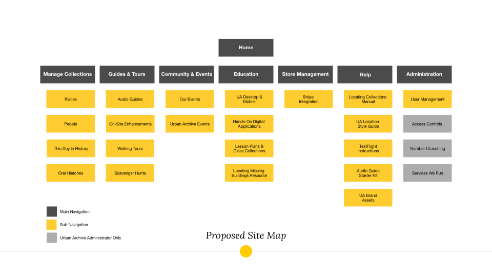
When we tested our navigation, we found that users were a bit confused on where to find the content we asked them to locate. Users needed clarification on collections versus assets. They were also misled by the slightly complicated title of the support and resources section. As a result, we moved “Oral Histories” from “Audio Guides” to “Manage Collections,” merged “Audio Guides” and “Tours & Hunts” into simply, “Guides & Tours,” and renameed “Support & Resources” to, simply, “Help.” Our tree testing showed that users did well navigating to areas with simple titles such as “People” and “This Day in History,” so we decided to keep those as-is.
Below is the second iteration of our site map.
Confident that we were ready to proceed with our structure, we begin wireframing. However, we were immediately met with an unforeseen challenge. Under this structure, how would users conduct the simplest of tasks: uploading and viewing an image? In our struggle to wrap our heads around Urban Archive’s present structure, we missed the importance of the “Image Assets / Records / Collection / Organization” element in Urban Archive’s original CMS.
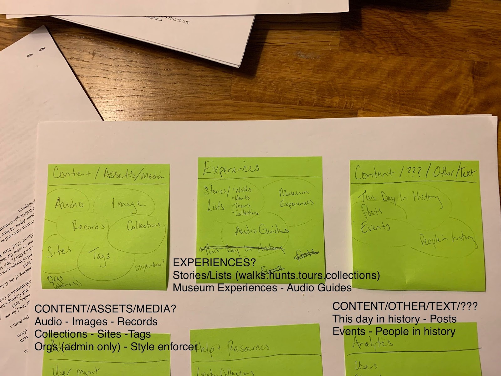
In preparation for the following group meeting, I mapped out a draft of a revised structure and Slacked it to the team.
At this point, we recognized the relationship between assets, records, and collections, so we grouped these together under “Manage Assets.” For simplicity, a valued quality in our tree testing, “Guides & Tours” was renamed “Experiences,” and the technical-sounding “On-site Enhancements” was renamed “Museum Experiences.” Non-asset content was re-grouped and given its own place in the global navigation. We seized the opportunity to highlight “Analytics” and group all such tools under this heading, per our client’s stated need to promote this value add. At this stage in the planning process, our team realized that community, events, and education was slightly outside of the scope of this project. We made the decision to omit it from the next iteration of our site map, which is below.

Having refined our site map to our satisfaction, we could finally begin the wireframing process.
Prototype Design and Testing
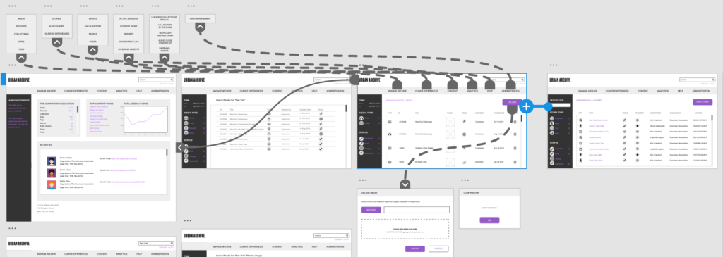
As we put pencil to paper, we mapped the main navigation from our site map onto a navigation bar along the top of the page. The search bar was positioned above it to the right, and on the left, we drew in the gray bar, whose use we planned to improve on in this our CMS redesign.
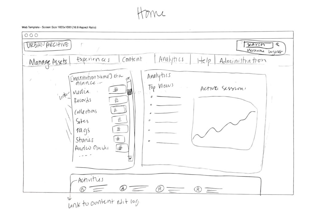
The home page would serve as an analytics and activity snapshot for users as they log in.
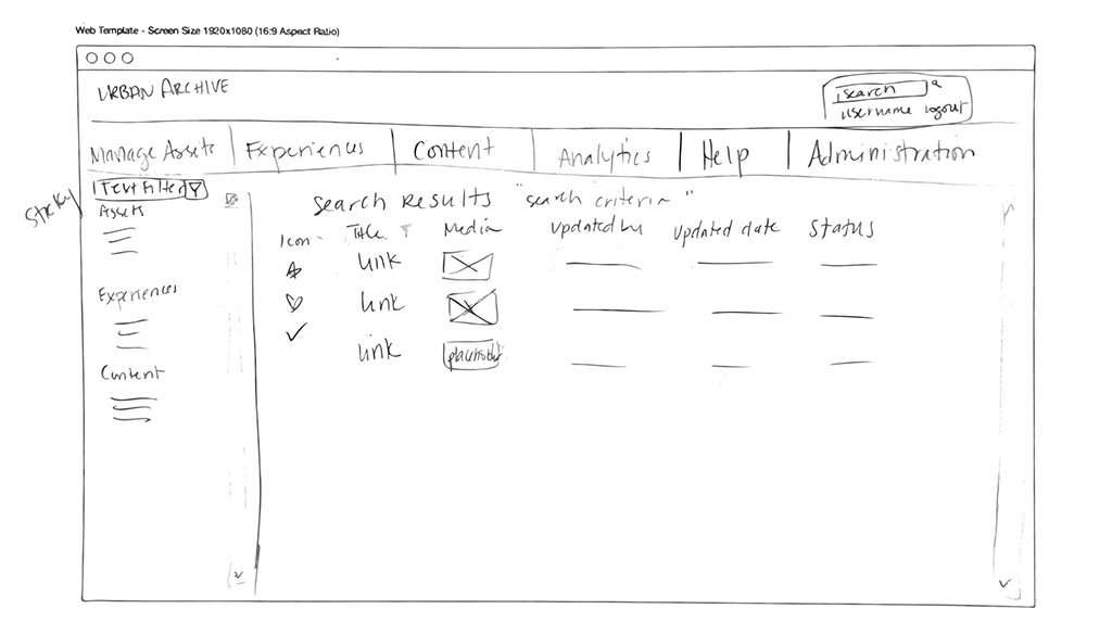
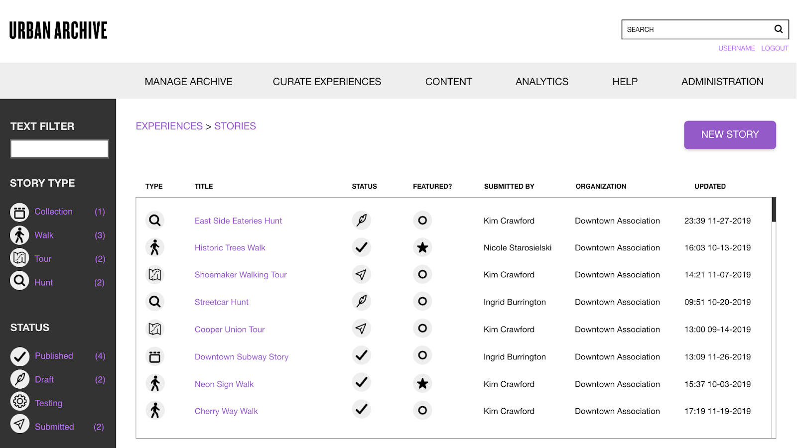
We mapped out what results we thought our new simple search would yield. The details bar allows users to filter by text or asset property.
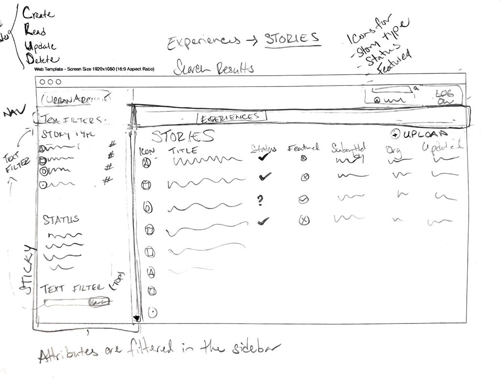
As I designed my Experiences wireframe, I compared it to Urban Archive’s current stories page to be sure that I caught all of the important existing features. I found that icons, which they currently use, could be helpful to the readability of our team’s prototype. When scrolling through volumes of data, visual cues can help the user parse out content on their screen.

Our team initially felt unsure about the degree of similarity to the current CMS. At the start of this project we envisioned ourselves presenting something totally new and unexpected to our client, but we reminded ourselves that the radical improvement to the information architecture of the CMS was the point of this exercise.
We began bringing our wireframe designs to life on Adobe XD. Our first prototype included the home page with the analytics dashboard, image search results, an upload feature, and story view and edit workflow.


We developed our style guide alongside our first prototype. Inspired by Urban Archive’s use of icons in their current CMS, I created a suite of vector icons that we would use to communicate media types, story types, statuses, and actions.

Upon testing, we found that users needed a better understanding of the relationship between page content and the filters in the sidebar. To address this, we extended the navigation bar all the way to the left of the page to unify the sidebar and page content into one main viewport. Because our initial prototype was rather flat, users had trouble finding call to action buttons, such as “Edit Story” and “Upload.” We updated our style guide to make these buttons more recognizable by softening their edges and adding a pop of Urban Archive’s signature violet color.
Users were also vocal about the jargony language used in our interface. Once again, we found that simplicity in our language was one of the most helpful factors for our users. Our team collectively had a “lightbulb moment” when we realized that “Manage Archive” was a much for fitting title for that particular section of the CMS than “Manage Assets.”
Our final style guide is below.

Final Prototype and Next Steps
After a final review of our work, we revealed our CMS prototype to our client, Ben Smyth. We walked through the features we designed and demonstrated the search and filter function, image upload box, and story curation feature.
The home page, rather than a matrix of links, has been redesigned to give users a high level overview of their organization’s collections and a offer a snapshot of app activity in an analytics panel. We designed these features for the needs of data-minded users, as well as the activities panel that shows which assets were last edited, and by whom.

Search results can be filtered by time, media type, and status.

Color guides the user’s eye through our interface to ensure they don’t miss any important calls to action, such as “Upload.”

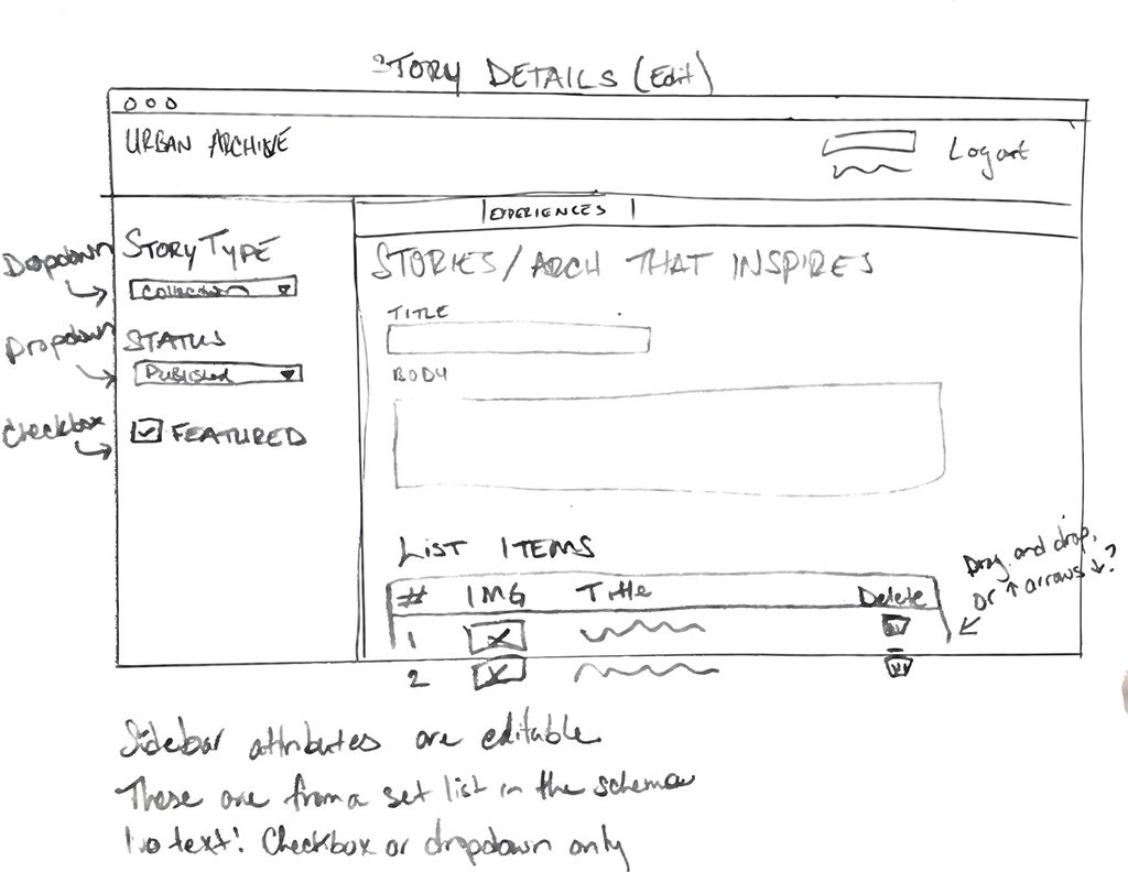
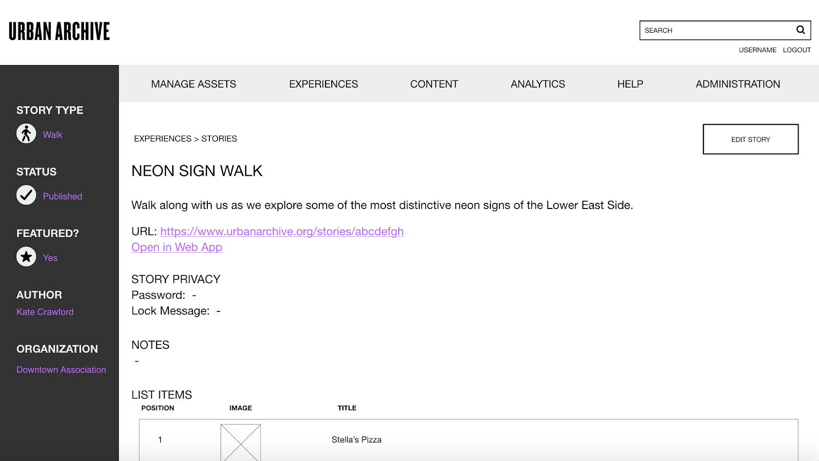
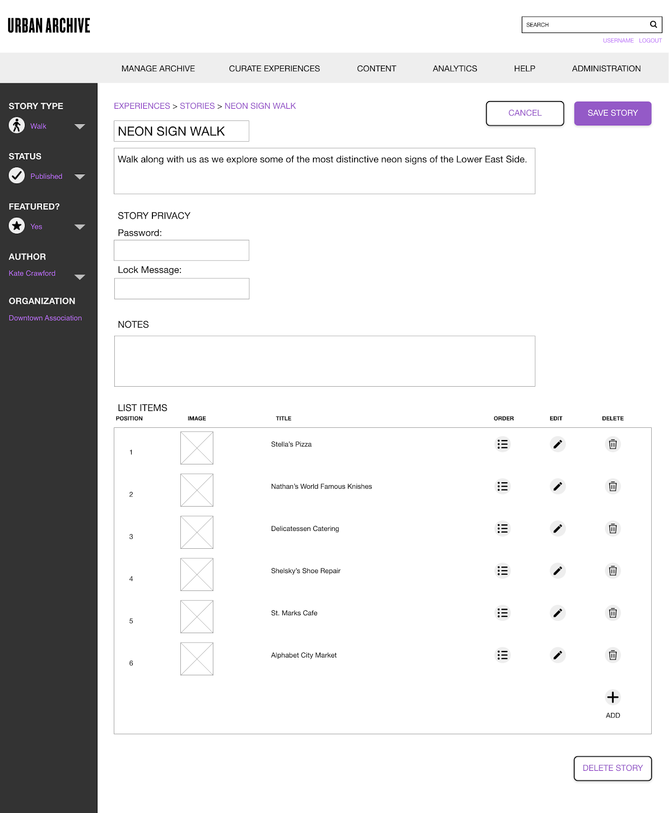
The story editing feature was my particular contribution to the wireframe. I built out a workflow to demonstrate how a user would edit an existing story using an existing image from their collections.
The sidebar, which usually shows static information, can be used to edit metadata in this view such as story type, status, and author.
To simplify the process of expanding experiences with new items, I gave users the option to browse by image or collection, as organizations may share several collections with Urban Archive.
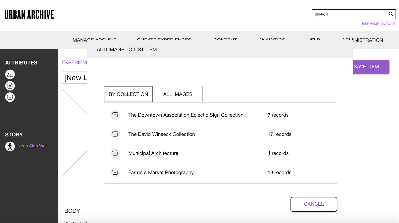
When an item, in this case an image, is added to the story, the sidebar for this individual item is populated with metadata on the image. Including metadata on this story item will make it easier to find in the CMS moving forward.

During our presentation, Ben confirmed that future versions of Urban Archive’s CMS will be more closely integrated with their new web app and will likely look quite different from the CMS that we proposed. However, Ben said that his team might still consider a back-end CMS for managing metadata and analytics as well as the web app CMS that users will manage assets and curate experiences with. To that end, he gave the suggestion that we move the activities panel to an analytics sub page, so that it could be adapted into a more powerful audit trail tool. Overall, our prototype was received well and Ben was appreciative of how our team conceptualized such a complex and abstract task and brought it to life.