The MTA’s new mobile website. Critiqued through the lens of Peterson, “Mobile and Beyond,” Learning Responsive Mobile Design.
In July of 2018, the MTA launched a refreshing new take on MTA.info. The new site, which was designed in collaboration with customers, is currently in beta, which makes it an excellent subject for critique. I am looking specifically at how this site’s design handles responsiveness by not solely considering the devices used, but the context in which users browse the site.
The mobile site pares the content of the full desktop version in a way that maintains sequence and readability. However, there are a couple of discrepancies.
Conflicting Priorities
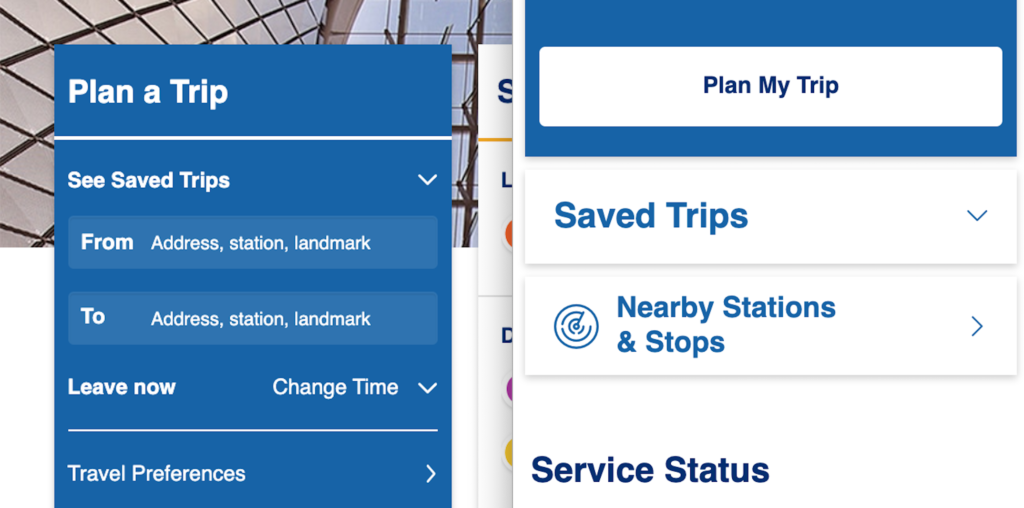
The desktop layout appears to me to prioritize Service Status. Plan a Trip is positioned like a sidebar—handy, but out of the way.

Perhaps after glancing at the service status of the L train, a user might enter their location and destination to find an alternate route to Bushwick.
The mobile site differs here in a few key ways. Firstly, perhaps because this site employs semantic HTML, the Plan a Trip module is now the first thing users see. Users must scroll down to see Service Status, which reads to me as a big red flag for usability. A user unfamiliar with this site might think they are in the wrong place and look elsewhere to find out whether their train is delayed.

It’s worth pointing out, however, that this module may be minimized, and a user’s preferences for this module (whether to close the Plan a Trip module or leave it open) are saved in cookies and remembered the next time they visit the site.

I’m not in favor of this move, however. Why not bump Service Status up to the top? Why did the designers of the narrow-width version of the home page opt for this position? I know now that this was a choice and not a result of any limitations related to the use of semantic HTML because of the location of the Saved Trips button.
Compare the location of Saved Trips in the desktop and mobile versions of this page. In desktop, it appears above the heading “Plan a Trip,” but still within the sidebar module. On mobile, it’s visible as a separate element outside of our minimized Plan a Trip module.
Perhaps user research revealed that this site is most frequently used by people who do not have public transit apps on their phones, and that many of those people are likely out-of towners. As a native New Yorker, this is a user context that I might not have considered at first, but therein lies the importance of user research.
Responsive Menu, Even on Desktop
Another user context I might not have considered, especially before reading Peterson’s article, is that of users browsing the Web on large-screened devices with touch capability. A laptop that uses a touch screen, for example, would not default to the narrow-width layout when in landscape. Without the hamburger menu in the upper corner of the view port, these touchscreen users will have to use the regular menu.
That won’t pose a problem here. Note how the touch targets on the menu items on the desktop website (yellow outline) are nice and large. On the MTA’s website, touch screen users would be able to make their selections with ease.

Elevating Frequently Used Links
Now, let’s go back to the main those large blue buttons under Other Services. The links in the module are bold and legible, arrayed in a simple 2 by 4 grid with blue icons that stand out against the rest of the page.

We can see where the designers of this page took the opportunity to elevate sections of the website that the MTA wanted customers to pay more attention to, as they positioned links with information about their System Modernization initiative and Transparency in the same vicinity as Accessibility and Planned Service Changes. The other buttons include Schedules, MTA eTix, Bridges and Tunnels, and News and Events.

This is a sorely needed improvement to the old homepage, in which the links pointing to these crucial pages were spread throughout various elements on the page.

A Reintroduction to an Old Standby
While we’re making direct comparisons to the old website, I want to highlight one more page: Subway Service Changes. I’m personally thrilled that they finally gave my favorite page—Old Reliable, the one I turn to as the Source of Truth when my 3rd party apps are giving me conflicting information—a mobile-friendly makeover.
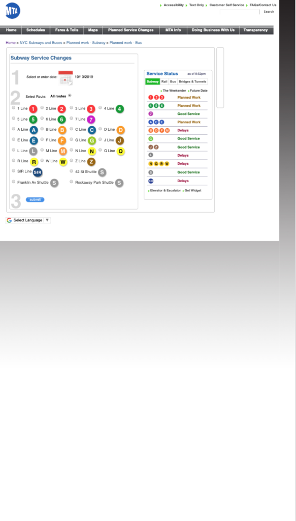
Subway Service Changes on mobile; old site. 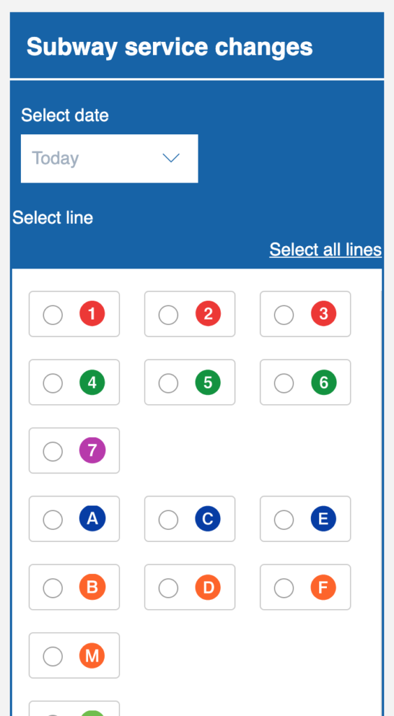
Subway Service Changes on mobile; new responsive site.
The old page had no mobile version, leaving users (that’s me; I’m users) squinting at tiny radio buttons in a too-small viewport. No longer! I have already bookmarked the New MTA version of this page, in which buttons for individual subway lines are given plenty of room to breathe.
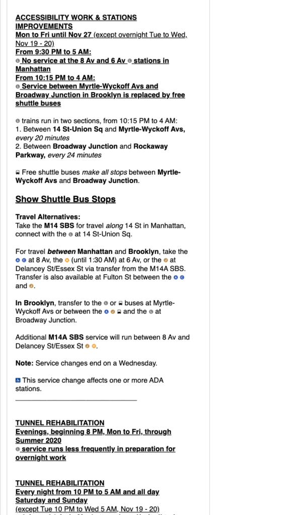
Results on mobile; old site. 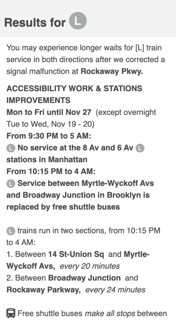
Results on mobile; new site.
The presentation of results is more pleasing and easier to navigate as well.
In Conclusion
This critique has not been very critical, but in all honesty, I do not find myself navigating to the MTA’s website that often. As mentioned earlier, I use it as a last resort to verify information about service changes. Long ago, I bookmarked the one page I needed to that I could travel directly to Subway Service Changes instead of navigating the the old website’s cluttered layout. It is because of this, in fact, that I only recently learned about this redesign even though it was released well over a year ago. I have been using the old Service Changes page the entire time! Given the greatly improved layout, I’ll certainly pay the new website a visit, even from my mobile device.