Evaluation Story: Barnard Digital Collections

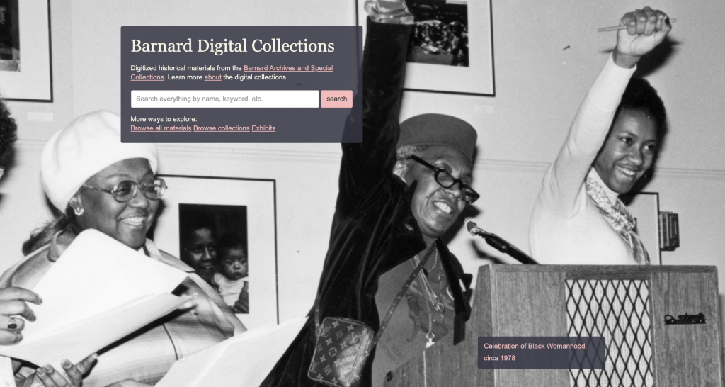
The goal for this project was to run an evaluation of the Barnard Digital Collections portal and analyze its potential usability issues. The Barnard Digital Collections portal was created in 2014 to serve as the online home for Barnard’s archival materials and special collections spanning the 19th, 20th, and 21st centuries. Our team was composed of Hiral Parekh, a Communications Design student, and Mayank Gupta, Mohammed Hosen, and myself, who are all Information Experience Design students at Pratt Institute. 

At first blush, the Digital Collections portal didn’t appear to have any glaring usability issues. In our pre-test interview with the client, we learned that the Digital Collections team has been planning a major update to their site and was interested in incorporating recommendations from usability experts at this crucial juncture. 

It was determined that typical users of the Barnard Digital Collections website include current Barnard College students, staff (typically in the areas of public relations and fundraising), and independent researchers. From our discussion, we gathered that the Barnard team was particularly interested in enhancing the user experience in these three areas: metadata and filters, ensuring that users have a sense of where they are and what materials they are viewing, and enhancing discoverability. With this in mind, the team took a close look at the interface and searching experience of the desktop browsing experience.

Designing the Test

We designed our user tasks to make use of the simple and advanced search features of the portal, given that a typical visitor’s objective is to search for and locate materials. We wanted at least one task to require a user to execute a broad search for materials (such as a document about a place or historical figure), and a narrower, more rigorous search to locate a specific document in the archives. In addition to text documents such as scrapbooks, letters, and yearbooks, we wanted our users to experience browsing through photographs and their details.

Below are the tasks we settled on for our user test.

  1. Find the digital exhibit on Student Publishing.
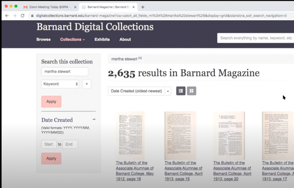
  2. Martha Stewart is a notable alumni from the class of 1964. Locate an article in the Barnard Alumnae magazine about her.
  3. Your research involves second-wave feminists’ concerns for women in higher education. Search for proposals on this subject matter in the digital collection.
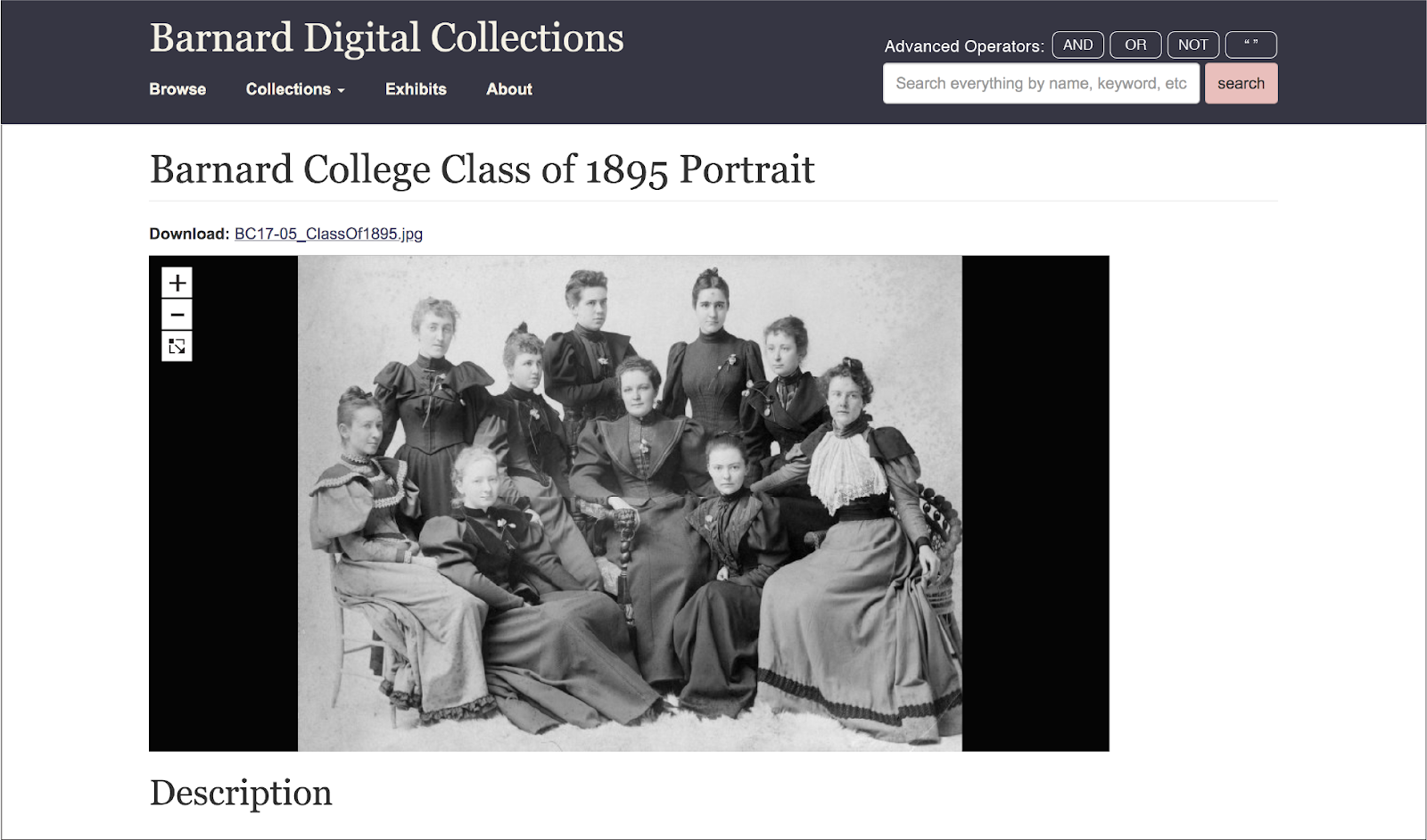
  4. You are a historical researcher looking for images of greek games held at Barnard in 1966. Try finding the photos using Barnard’s digital collection.

To help set the scene for our test users, we came up with a scenario that might plausibly lead someone to the Barnard Digital Collections site and motivate them to search through the archives.

Imagine that you are an independent researcher looking for information on student life at Barnard College in the 1960s and ’70s. You have come to the Barnard Digital Collections portal to source materials from their archive.

Test User Recruitment

Our next step was to recruit 8-10 test users for this assessment. Given that this our test involved browsing through archival materials, we thought it would be best to screen for users that might already have experience in this field, either informally or professionally. With our client’s help, we compiled a mailing list of students and staff in the Barnard community as well as independent researchers and sent them a screener survey to gauge their interest and expertise in archival research. 

Screener Questions:

  • Are you, or have you ever been a Barnard College student/faculty/staff?
    • Yes No
  • What are some reasons you have used archival material? (check all that apply)
    • Academic research (student)
    • Academic research (faculty)
    • Family/genealogy research
    • To create public relations or marketing materials
    • Exhibits or artistic purposes
    • I have not used archival materials
    • Other (Fill-in)
  • Indicate the highest level of education achieved/pursuing.
    • High school
    • Bachelor’s degree
    • Master’s degree
    • Doctoral degree
    • Other (Fill-in)
  • Do you have experience researching materials in a digital archive?
    • Yes No

When the responses came in, we paid particular attention to those who had attained at least some higher education and had experience with database research. We hoped to find participants that were at least somewhat familiar with Barnard College and would have a knowledge of search procedures beyond how one might use a search engine such as Google. In total, we recruited 8 users, 1 of whom was an independent researcher and 7 of whom were part of the Barnard College community. Of the Barnard-affiliated test users, one was a staff member who worked in fundraising. 

Once we secured our test users, our team scheduled Zoom video calls with each of them. Each test was attended by two researchers: a facilitator who would introduce the test and guide the test user through the tasks, and a recorder who would take notes and record the session for later review. 

We held a team debrief as soon as all 8 tests were complete, reviewing our compiled interview notes. We identified patterns in direct user responses to our tasks as well as analyses of particular behaviors that we observed. We drafted a usability report outlining the following problems and our respective recommendations as well as a client presentation when our analysis was complete.

Observations and Recommendations

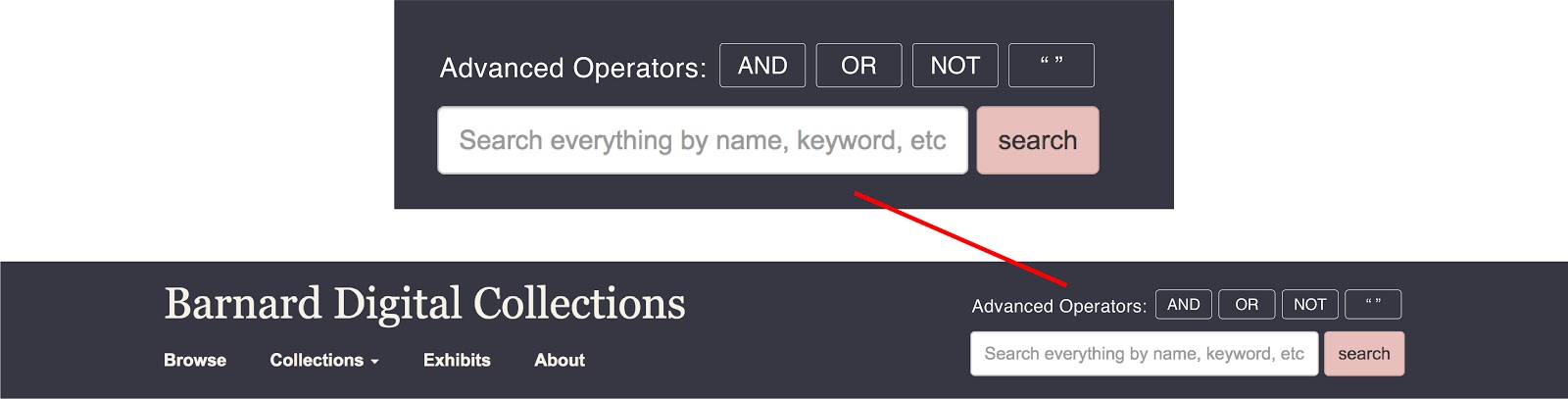
Some observed behaviors were related to specific tasks. For example, when trying to find materials related to Martha Stewart, virtually all users started their search by entering her name into the search bar, without quotes, which yielded tens of thousands of results. Through trial and error, some users eventually discovered that using quotes aided their search considerably.

Screenshot from recorded user test

To aid users in the future, we recommended adding a tooltip to the global search bar with tips for users to enhance their search. The mockup below shows buttons that instruct users to make use of boolean operators such as “AND,” “NOT,” and “OR,” as well as quotation marks for searching for phrases.

Mockup including advanced search operators

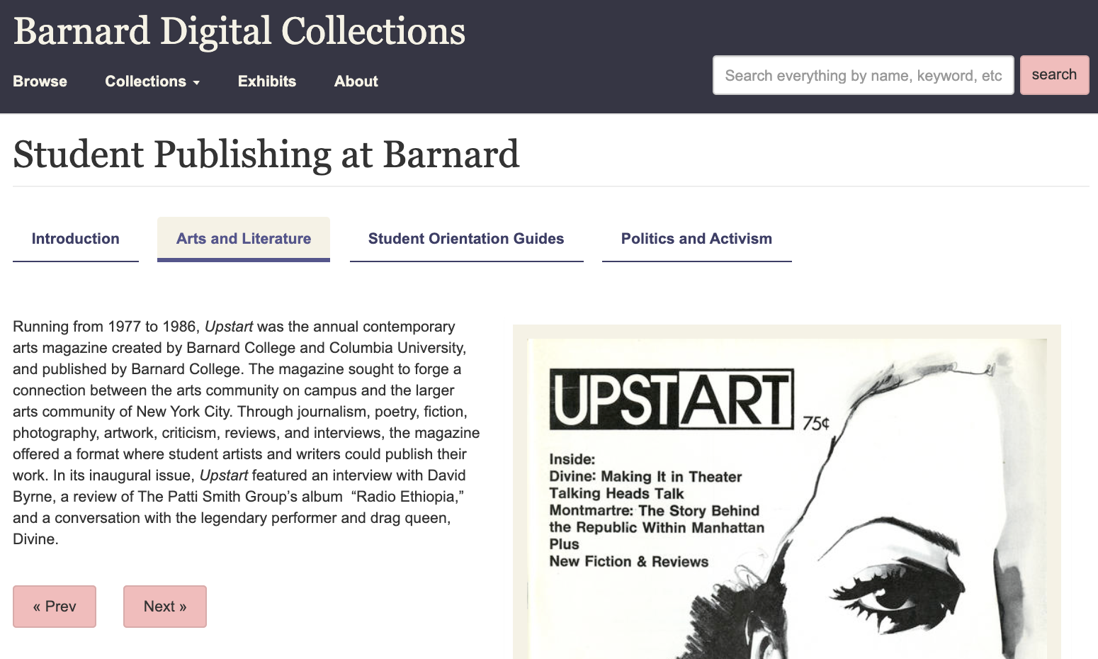
Another task-specific problem we observed involved navigation through the Digital Exhibits. While users had no problem locating the exhibit we asked them to find in the first task, we received strong feedback that perusing the Student Publishing exhibit was rather cumbersome. One user said they “felt forced to go through the linear experience” of the exhibit by relying on the “Previous” and “Next” buttons to explore, with no option to jump right to an entry of interest.

Screenshot inside Student Publications Digital Exhibit

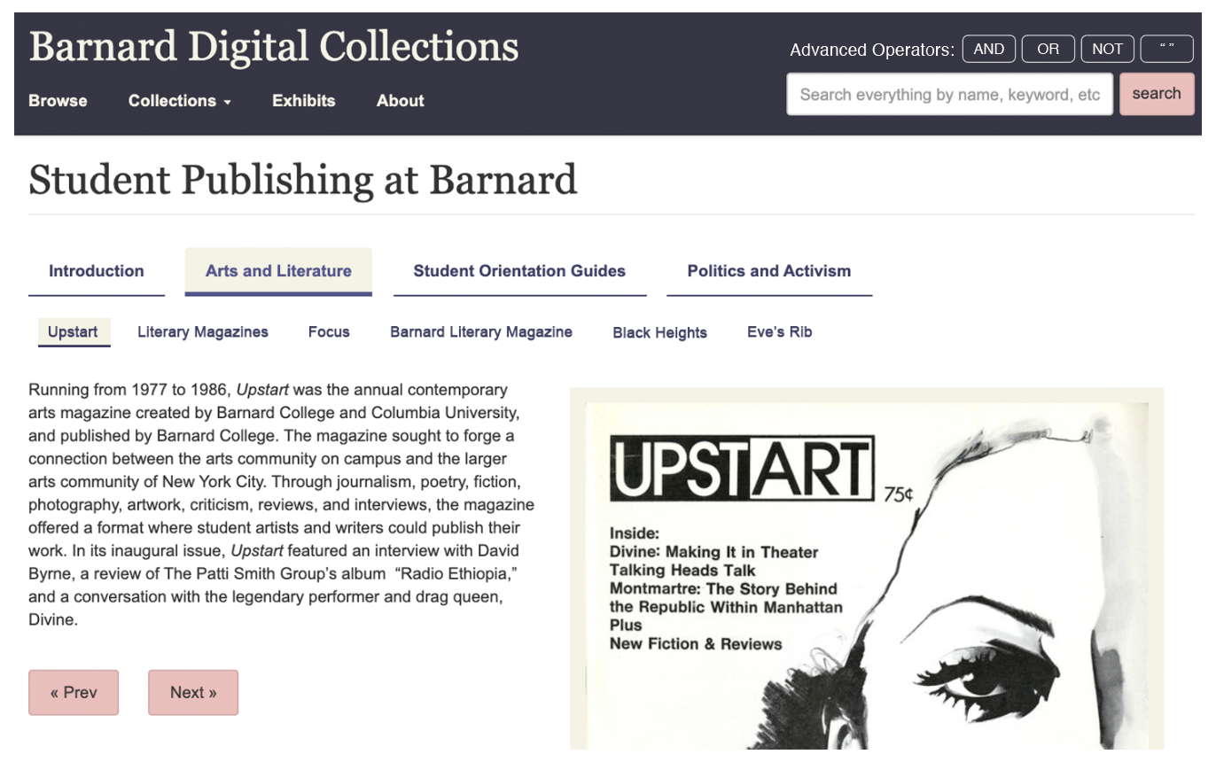
As a solution, we recommended adding a progress bar to the interface. This progress bar displays a row of buttons with titles pertaining to each slide in the exhibit. It echoes the style of the existing navigation bar, subtle changes in format and font size indicate that the entries in this bar fall below the sections above in the exhibit hierarchy. 

As users navigate through the exhibit, the highlighted titles serve the purpose of showing where in the exhibit users are and also provide an escape from the “linear experience” described in user feedback. By clicking on the buttons, users have a way of jumping to entries of interest outside of relying on the Previous/Next buttons to flip through each page in sequence.

Mockup of progress bar in Digital Exhibit

Some of our users noted the display of photographs as another area of improvement. They did not appreciate that by default, photos are displayed slightly zoomed in, which cuts off potentially important areas. This requires the extra step of zooming out to view the entire image.

Screenshot of archived photo with callouts to describe the issue in detail

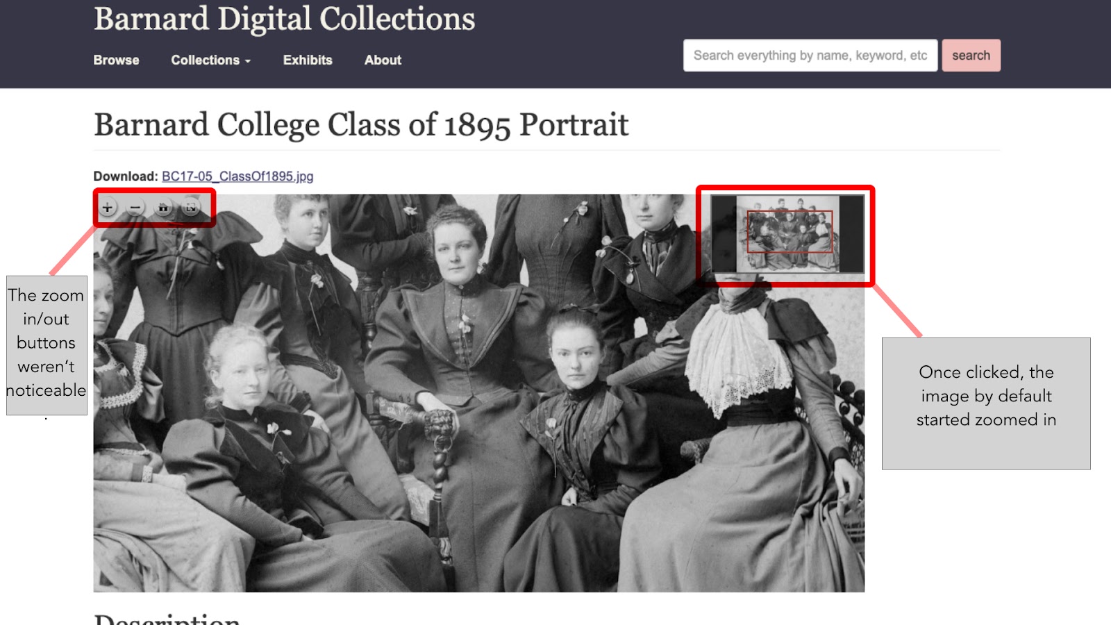
We suggested the the Digital Collections team remedy this by setting the default zoom to fit the entire image. During our client presentation, they confirmed that this was within their abilities.

Mockup featuring preferred zoom setting and enhanced view option buttons

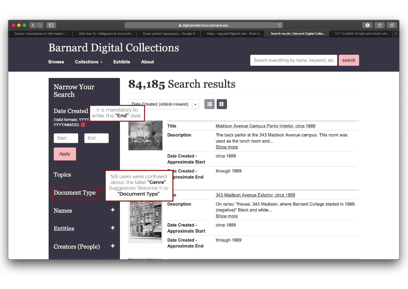
Other behaviors were more general. All team members noted that in their tests, users seemed to struggle with the date filter function. When trying to narrow their search results by date, it wasn’t immediately clear that they needed to populate both the “From” and “To” fields. The error message wasn’t very helpful in telling them how to correct their entry.

Screenshot of filter bar with callouts describing the issue

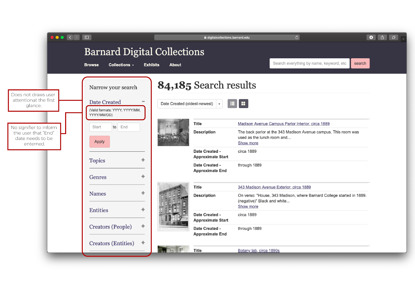
We suggested adding a tooltip to more clearly inform users that both date fields are required. After consulting with our client, we learned that they have the ability to make either field optional from the back-end of the site. Given that this is a simpler solution than adding another element to the page, we supported this solution moving forward.

Mockup of improved filter bar with callouts describing the proposed solution

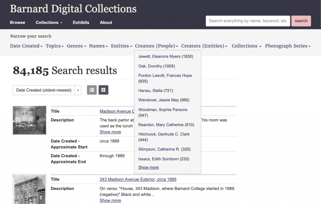
We also noticed that for many tasks that would have been helped by narrowing search results using filters, users preferred to refine their keyword search instead. To promote the use of filters, we recommended either increasing the contrast of the sidebar that houses the filter to better draw the eye towards it. 

At the request of our client, we proposed an alternate layout for the filter bar, orienting it horizontally instead.

Mockup featuring horizontal filter bar

Our last observation about the use of filters was that very few users filtered by Genre. They preferred to narrow their searches by date or topic instead, neglecting a filter that would present only the types of documents or images that they wanted to see. We heavily considered adding this to our report with the recommendation of changing the title to “Document Type,” a more common term that users might recognize. However, we had insufficient evidence to support the need to change the terminology and so this recommendation was dropped from our report.

Conclusion

Our recommendations were received well by the client on the whole. Their feedback was a supportive, but also realistic voice in terms of implementing our proposed solutions on their redesigned website. They appreciated solutions that made a large impact without a lot of development needed on their end, such as our recommendation regarding the date filter. However, even where more intervention was needed to implement a solution, our client supported a solution if it was demonstrated that it would have a noticeable impact on the search experience. 

Design Story: Urban Archive

Our mission this semester was to redesign the content management system (CMS) for Urban Archive, a technology nonprofit. Urban Archive partners with museums, historical societies, and other cultural institutions to bring their collections to life through an iOS app and, most recently, a web app. Digital assets are uploaded to the CMS, geolocated, and shared through the Urban Archive app.

Upon first logging in to Urban Archive’s CMS, it was clear that the system needed a lot of work. The user was presented with a dashboard of links on the main page, grouped into vague categories such as “Media,” “Content,” and “Editorial.”

The home page of Urban Archive’s CMS as of Fall 2019

We spoke with our client, Urban Archive’s creator Ben Smyth, about his hopes for our proposed CMS redesign. He expressed a desire for greater user engagement among institutional partners, and suggested that this could be achieved by making the CMS faster, easier, and more intuitive. What makes Urban Archive special is that it geolocates images and other assets in its system so that users may discover and interact with collections via a map interface. 

An Analysis of the Competition

To gain some insight on CMS best practices, we conducted a competitive review. I looked at Flickr, Wix, and Dropbox and took notes on what these successful content management platforms have in common. My takeaways were that ease of uploading, access to metadata, and organization tools should be front of mind when designing features for Urban Archive.

Takeaways from the competitive review.

Modeling Users: Interviews, Journeys, and Mindsets

Our team then designed and conducted interviews with users of other CMS platforms to learn more about a typical user’s needs and behaviors. We asked about personal and professional media management, the contexts in which they work, and their experience with asset management. We then conducted a brief observation to see how they walked through a CMS platform, which would tell us a little more about their mental models. Three big themes came up for us: navigation, a need for cross-platform functionality, and sharing.

Looking for themes from our interviews with users.

We wanted model users to keep in mind during the design process, but did not want to design around the restrictions of a user persona. Instead, we developed three user mindsets to help us envision a user journey from start to finish through the CMS platform we would design. From our themes, interview results, and research on Urban Archive’s partners, we identified three mindsets:
Data: A data-centered mindset, keeps the workflow moving.
Curation: Content-centered with a focus on accuracy.
• Discovery: Drawn to pictures and locations—the app’s end users.

We then conceptualized a user journey through the lens of each of these mindsets and tried to predict the opportunities and pain points they might encounter along the way. In doing this, we found inspiration for features to introduce in our redesigned CMS that would address many kinds of users’ needs. The four steps of the user journey are find content, contribute, organize and curate, and share.

The four stages of the user journey.

Defining Features, Building Structure

Next, we moved on to attempt to define features that we wanted to incorporate. Our team cited global navigation as a major need for Urban Archive’s CMS. Their interface currently features a charcoal gray bar on the left of the screen that is somewhat helpful. It displays different information depending on where a user is in the CMS and what they’re viewing. However, as users, we needed to navigate back to the home page whenever we wanted to navigate to a different part of the system. 

Viewing an image asset in the Urban Archive CMS.

We encountered a challenge in familiarizing ourselves with the system itself, as the terminology used around the site was sometimes redundant and confusing. Take the use of “Image Assets” versus “Image Uploads” from the homepage. Both links lead to pages containing many assets, but what could be the reason for creating these two areas? Why is “Records” separate from the images? And why would a list of organizations be grouped in with the archives? If anything, examining this problem bolstered our reasoning for creating a dedicated upload button to avoid user confusion. 

The difference between “Archives” and “Media” is not made clear.

It was several weeks into the project before we realized that under “Archives,” on the left, the list represented the way that assets are nested into records, which are nested inside of collections, which belong to organizations. To simplify the user’s path into their collections, we proposed a search bar that would be part of the global navigation element so that it would always be available. To develop the use of the gray bar to the left of the screen, we proposed filters to enable users to sift through the large volume of assets in their collections. Finally, we planned to implement a simpler uploading tool that would enable users to upload one or many assets of any type (image, audio, or text file) from a proposed assets page.

Site Maps: Third Time’s a Charm

Before we could even begin mapping these features to a visual manifestation of our ideas, we had to test our proposed navigation. We came up with the site map below as an alternative to Urban Archive’s matrix of links:

Proposed site map, version 1.

Our main navigation would include links to Manage Collections, Audio Guides, Tours & Hunts, Community and Events, Education, Store Management, Support and Resources, and Administration. Management of the assets themselves is nested under one heading here, as is a place to manage other types of content used in the app, such as biographies of historical figures—“People” and important dates—“This Day in History.” Picking up on Ben’s desire for more engagement with institutional partners, we chose to highlight sections for “Community & Events” and “Education.” The “Support & Resources” section also provides user resources and manuals, all of which we found in the Partner Handbook on Urban Archive’s website.

When we tested our navigation, we found that users were a bit confused on where to find the content we asked them to locate. Users needed clarification on collections versus assets. They were also misled by the slightly complicated title of the support and resources section. As a result, we moved “Oral Histories” from “Audio Guides” to “Manage Collections,” merged “Audio Guides” and “Tours & Hunts” into simply, “Guides & Tours,” and renameed “Support & Resources” to, simply, “Help.” Our tree testing showed that users did well navigating to areas with simple titles such as “People” and “This Day in History,” so we decided to keep those as-is. 

 Below is the second iteration of our site map.

Proposed site map, version 2.

Confident that we were ready to proceed with our structure, we begin wireframing. However, we were immediately met with an unforeseen challenge. Under this structure, how would users conduct the simplest of tasks: uploading and viewing an image? In our struggle to wrap our heads around Urban Archive’s present structure, we missed the importance of the “Image Assets / Records / Collection / Organization” element in Urban Archive’s original CMS. 

In preparation for the following group meeting, I mapped out a draft of a revised structure and Slacked it to the team. 

Draft of revised structure.

At this point, we recognized the relationship between assets, records, and collections, so we grouped these together under “Manage Assets.” For simplicity, a valued quality in our tree testing, “Guides & Tours” was renamed “Experiences,” and the technical-sounding “On-site Enhancements” was renamed “Museum Experiences.” Non-asset content was re-grouped and given its own place in the global navigation. We seized the opportunity to highlight “Analytics” and group all such tools under this heading, per our client’s stated need to promote this value add. At this stage in the planning process, our team realized that community, events, and education was slightly outside of the scope of this project. We made the decision to omit it from the next iteration of our site map, which is below.

Proposed site map, version 3.

Having refined our site map to our satisfaction, we could finally begin the wireframing process.

Prototype Design and Testing

As we put pencil to paper, we mapped the main navigation from our site map onto a navigation bar along the top of the page. The search bar was positioned above it to the right, and on the left, we drew in the gray bar, whose use we planned to improve on in this our CMS redesign. 

The home page would serve as an analytics and activity snapshot for users as they log in. 

Wireframe sketch: home page.

We mapped out what results we thought our new simple search would yield. The details bar allows users to filter by text or asset property.

Wireframe sketch: search results.

As I designed my Experiences wireframe, I compared it to Urban Archive’s current stories page to be sure that I caught all of the important existing features. I found that icons, which they currently use, could be helpful to the readability of our team’s prototype. When scrolling through volumes of data, visual cues can help the user parse out content on their screen.

Wireframe sketch: view experiences.
We liked Urban Archive’s use of icons and decided to expand upon it in our prototype.
Wireframe sketch: edit story.

Our team initially felt unsure about the degree of similarity to the current CMS. At the start of this project we envisioned ourselves presenting something totally new and unexpected to our client, but we reminded ourselves that the radical improvement to the information architecture of the CMS was the point of this exercise.  

We began bringing our wireframe designs to life on Adobe XD. Our first prototype included the home page with the analytics dashboard, image search results, an upload feature, and story view and edit workflow

Prototype draft: home page.
Prototype draft: search results.
Prototype draft: upload image dialog.
Prototype draft: view story.

We developed our style guide alongside our first prototype. Inspired by Urban Archive’s use of icons in their current CMS, I created a suite of vector icons that we would use to communicate media types, story types, statuses, and actions.

Icon suite.

Upon testing, we found that users needed a better understanding of the relationship between page content and the filters in the sidebar. To address this, we extended the navigation bar all the way to the left of the page to unify the sidebar and page content into one main viewport. Because our initial prototype was rather flat, users had trouble finding call to action buttons, such as “Edit Story” and “Upload.” We updated our style guide to make these buttons more recognizable by softening their edges and adding a pop of Urban Archive’s signature violet color.

Users were also vocal about the jargony language used in our interface. Once again, we found that simplicity in our language was one of the most helpful factors for our users. Our team collectively had a “lightbulb moment” when we realized that “Manage Archive” was a much for fitting title for that particular section of the CMS than “Manage Assets.”

Our final style guide is below.

Style guide for proposed Urban Archive CMS.

Final Prototype and Next Steps

After a final review of our work, we revealed our CMS prototype to our client, Ben Smyth. We walked through the features we designed and demonstrated the search and filter function, image upload box, and story curation feature.

The home page, rather than a matrix of links, has been redesigned to give users a high level overview of their organization’s collections and a offer a snapshot of app activity in an analytics panel. We designed these features for the needs of data-minded users, as well as the activities panel that shows which assets were last edited, and by whom.

Final prototype: home page.

Search results can be filtered by time, media type, and status.

Final prototype: search results.

Color guides the user’s eye through our interface to ensure they don’t miss any important calls to action, such as “Upload.”

Final prototype: upload media.

The story editing feature was my particular contribution to the wireframe. I built out a workflow to demonstrate how a user would edit an existing story using an existing image from their collections.

Final prototype: view experiences.

The sidebar, which usually shows static information, can be used to edit metadata in this view such as story type, status, and author. 

Final prototype: edit story.

To simplify the process of expanding experiences with new items, I gave users the option to browse by image or collection, as organizations may share several collections with Urban Archive.

Final prototype: add item to story.

When an item, in this case an image, is added to the story, the sidebar for this individual item is populated with metadata on the image. Including metadata on this story item will make it easier to find in the CMS moving forward.

Final prototype: add image to story.

During our presentation, Ben confirmed that future versions of Urban Archive’s CMS will be more closely integrated with their new web app and will likely look quite different from the CMS that we proposed. However, Ben said that his team might still consider a back-end CMS for managing metadata and analytics as well as the web app CMS that users will manage assets and curate experiences with. To that end, he gave the suggestion that we move the activities panel to an analytics sub page, so that it could be adapted into a more powerful audit trail tool. Overall, our prototype was received well and Ben was appreciative of how our team conceptualized such a complex and abstract task and brought it to life.

Weekly Critique, MTA.info

The MTA’s new mobile website. Critiqued through the lens of Peterson, “Mobile and Beyond,” Learning Responsive Mobile Design.

In July of 2018, the MTA launched a refreshing new take on MTA.info. The new site, which was designed in collaboration with customers, is currently in beta, which makes it an excellent subject for critique. I am looking specifically at how this site’s design handles responsiveness by not solely considering the devices used, but the context in which users browse the site. 

The mobile site pares the content of the full desktop version in a way that maintains sequence and readability. However, there are a couple of discrepancies.

Conflicting Priorities

The desktop layout appears to me to prioritize Service Status. Plan a Trip is positioned like a sidebar—handy, but out of the way. 

Perhaps after glancing at the service status of the L train, a user might enter their location and destination to find an alternate route to Bushwick. 

The mobile site differs here in a few key ways. Firstly, perhaps because this site employs semantic HTML, the Plan a Trip module is now the first thing users see. Users must scroll down to see Service Status, which reads to me as a big red flag for usability. A user unfamiliar with this site might think they are in the wrong place and look elsewhere to find out whether their train is delayed. 

It’s worth pointing out, however, that this module may be minimized, and a user’s preferences for this module (whether to close the Plan a Trip module or leave it open) are saved in cookies and remembered the next time they visit the site.

I’m not in favor of this move, however. Why not bump Service Status up to the top? Why did the designers of the narrow-width version of the home page opt for this position? I know now that this was a choice and not a result of any limitations related to the use of semantic HTML because of the location of the Saved Trips button. 

Compare the location of Saved Trips in the desktop and mobile versions of this page. In desktop, it appears above the heading “Plan a Trip,” but still  within the sidebar module. On mobile, it’s visible as a separate element outside of our minimized Plan a Trip module.

Desktop is on the left; mobile is on the right.

Perhaps user research revealed that this site is most frequently used by people who do not have public transit apps on their phones, and that many of those people are likely out-of towners. As a native New Yorker, this is a user context that I might not have considered at first, but therein lies the importance of user research.

Responsive Menu, Even on Desktop

Another user context I might not have considered, especially before reading Peterson’s article, is that of users browsing the Web on large-screened devices with touch capability. A laptop that uses a touch screen, for example, would not default to the narrow-width layout when in landscape. Without the hamburger menu in the upper corner of the view port, these touchscreen users will have to use the regular menu.

That won’t pose a problem here. Note how the touch targets on the menu items on the desktop website (yellow outline) are nice and large. On the MTA’s website, touch screen users would be able to make their selections with ease. 

Elevating Frequently Used Links

Now, let’s go back to the main those large blue buttons under Other Services. The links in the module are bold and legible, arrayed in a simple 2 by 4 grid with blue icons that stand out against the rest of the page. 

We can see where the designers of this page took the opportunity to elevate sections of the website that the MTA wanted customers to pay more attention to, as they positioned links with information about their System Modernization initiative and Transparency in the same vicinity as Accessibility and Planned Service Changes. The other buttons include Schedules, MTA eTix, Bridges and Tunnels, and News and Events.

In the mobile version of the homepage, the items in the Other Services grid are rearranged vertically to preserve the large touch area.

This is a sorely needed improvement to the old homepage, in which the links pointing to these crucial pages were spread throughout various elements on the page.

A Reintroduction to an Old Standby

While we’re making direct comparisons to the old website, I want to highlight one more page: Subway Service Changes. I’m personally thrilled that they finally gave my favorite page—Old Reliable, the one I turn to as the Source of Truth when my 3rd party apps are giving me conflicting information—a mobile-friendly makeover.

The old page had no mobile version, leaving users (that’s me; I’m users) squinting at tiny radio buttons in a too-small viewport. No longer! I have already bookmarked the New MTA version of this page, in which buttons for individual subway lines are given plenty of room to breathe.

The presentation of results is more pleasing and easier to navigate as well.

In Conclusion

This critique has not been very critical, but in all honesty, I do not find myself navigating to the MTA’s website that often. As mentioned earlier, I use it as a last resort to verify information about service changes. Long ago, I bookmarked the one page I needed to that I could travel directly to Subway Service Changes instead of navigating the the old website’s cluttered layout. It is because of this, in fact, that I only recently learned about this redesign even though it was released well over a year ago. I have been using the old Service Changes page the entire time! Given the greatly improved layout, I’ll certainly pay the new website a visit, even from my mobile device.

Weekly Critique, LastPass

In response to The Elements of User Experience, Jesse James Garret.

Strategy

LastPass was created to address the needs of Web users to create unique, complex passwords for all of the interfaces they use. Given the risks of having one’s passwords leaked in a security breach, best practices dictate that users avoid using the same passwords for multiple accounts. 

But with all those passwords to remember, users might keep track using a Google Doc, a spreadsheet on their local hard drive, or pen and paper, but none of these solutions are ideal as far as cyber hygiene is concerned.

LastPass was designed to be a virtual “vault,” storing and encrypting your personal information behind a single master password, yet remotely accessible via desktop and mobile interfaces. Indeed, your master password is the last password you would ever need to remember.


The LastPass Vault

Scope & Structure

LastPass’ functional specifications were designed to address the problem of password management for websites, accounts, and services across the Web. Its main selling point is that it will simplify your life by allowing you to let go of all your passwords except one, your master password, which will be used to unlock your vault and retrieve all of your passwords. 

Users can use LastPass to store other kinds of information such as payment card numbers, server passwords, and secure notes, and sort those items into folders based on function or category. 

As users sign up for new products and services which require new, unique passwords, LastPass encourages its users to employ best practices in creating new login information. Users can create passwords of varying length and complexity with the “Generate Secure Password” tool.

Generating a secure password

LastPass also offers a browser extension that will auto populate username and password fields and store new passwords as they are created, without the need to log into the LastPass site. 

LastPass autofill plugin

As good as this sounds however, conflicts sometimes arise when this feature interferes with the autofill function of the browser itself, presenting the user with a confusing overlap of opposing systems. 

To mitigate this issue, which is not quite an “error” as Garret describes, LastPass might be more forward in encouraging their users to disable password storage in their favorite browser. Even if this prevention measure does not work (as you can see, I myself am still holding on to my saved passwords in Chrome), LastPass should offer a correction measure to make these fields easier to see and fill.

Autofill conflict in Google Chrome

There are dozens more features available in this software, especially as a paying premium user, but these basic features are the ones that I use most frequently.

Skeleton and Surface

The interface design of LastPass on desktop is simple and easy to navigate. A red search bar stretches across the top of the page. Courtesy navigation in the top left corner provide easy access to account settings and the help center. The menu, a gray column on the left side, expands to display account categories and additional settings.

Tiles represent the user’s accounts and services. A “Launch” button that appears upon hover sends the user to the appropriate site where, if the LastPass extension is enabled, the login information will auto populate. Icons for editing, sharing, and deleting also appear on hover. 

LastPass provides users with an even simpler interface on the mobile app. Even though the same options (editing, sharing, deleting) are available, the developers thoughtfully included a button for users to easily copy a password from here into another app.