Introduction
Most of us are familiar with Lego. We might recognize the brand from movies, games, competitions, and even amusement parks from all across the world. [1] The Lego Group has come a long way from its humble origins in a carpenter’s workshop in Denmark. [2] Today, as one of the most popular and best-selling toys of all time, Lego is recognized as one of the “world’s most powerful brands.”[1] Fans cannot get enough of these colorful interlocking bricks. With just two bricks, 24 combinations can be made. Add one more brick to the mix and you have 1,060 combinations at hand. [3] The possibilities are truly endless!
The fun with Legos comes from its versatility and interchangeability. The ability to assemble and reassemble pieces makes Legos entertaining for young and experienced users alike. Lego pieces can be connected to construct objects ranging from vehicles to buildings to whole cities. In this lab, we want to explore the versatile nature of Lego bricks, and how they may interrelate among different sets. Some of the questions we would like to address are: (1) How has the rate of production of lego pieces changed over time? (2) How is specialization of lego sets reflected in the intricacy of color? (3) How have themes evolved over time, and what sort of themes have gained popularity?
According to a 2018 Lego study, “the vocabulary of bricks has increased significantly resulting in sets sharing fewer bricks.” [4] Tracing the number of Lego bricks over time may be telling of the increasing specialization and complexity of Lego sets. Looking at the number of specialized pieces in relation to interchangeable pieces may also help us determine if increased specialization has resulted in fewer shareable bricks.
Additionally, we would like to assess the implications of the increased complexity of LEGO sets and bricks. As Bartneck notes, the complexity of LEGO potentially “enables skilled builders to design ever more amazing models but it may also overwhelm less skilled or younger builders.”[4] We would like to assess the validity of this statement from a UX standpoint, by analyzing the data on Lego reviews based on user age. We hope to get a clear sense of how complexity has impacted the popularity of Legos among different age groups.
Data Source
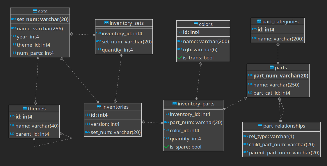
This project is developed based on two Lego datasets from a LEGO fan website Rebrickable. The primary database we encountered contains an elaborate schema. It is updated monthly and includes “[t]he LEGO Parts/Sets/Colors and Inventories of every official LEGO set.” It is a database (as shown in the schema below) that has information stored in different datasets.
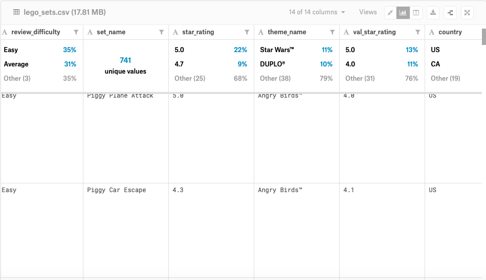
The second dataset was provided by the Kaggle website. This dataset contains more user-centered content, such as reviews, prices, ratings, and difficulty level. This information can help us analyze legos from a UX perspective.
The first step in our data cleaning process begins with identifying and understanding the relationship among these datasets.
Materials
OpenRefine – OpenRefine is a essential tool for cleaning up messy data. We used OpenRefine to eliminate unnecessary values and rows, convert strings and numerical values appropriately, and split up cells .
Tableau – Tableau was the primary tool used to create our visualizations. It is a platform that allows users to make graphs by dragging, dropping, and filtering measures and dimensions.
RStudio – RStudio is an open-source software that is commonly used to debug and visualize data using code. We utilized RStudio to mainly refine and merge our datasets.
Rebrickable – Rebrickable is the website where we encountered our large-scale dataset on Lego bricks and their statistical measurements over the years.
Kaggle – Kaggle is the website where we extracted a dataset that supplied interesting user-centered information about Lego, like reviews and ratings.
BrickLink – BrickLink was used to help us define all the variables we were presented with on the Rebrickable dataset, like set_id or is_spare.
Data Cleaning and Preparing
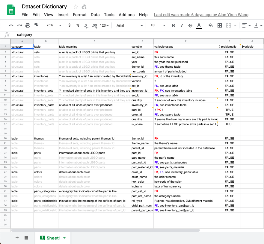
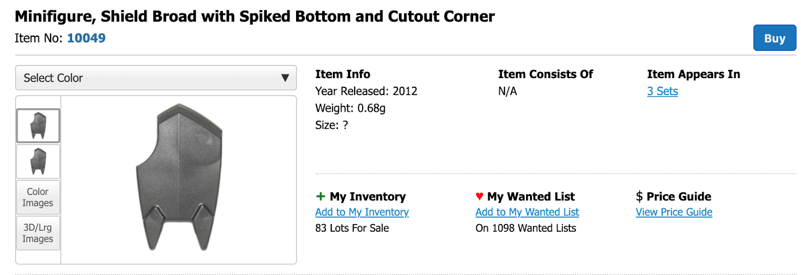
The first step to our data cleaning process was creating a dictionary of the primary dataset from Rebrickable. We wanted to understand exactly what the primary and foreign keys represented in the dataset before proceeding with a plan. Using Rebrickable and BrickLink, we were able to compile a list of variables by which we could merge the separate datasets together. We determined that set_id was the key link between sets, colors, part_categories, part_relationships, and themes.
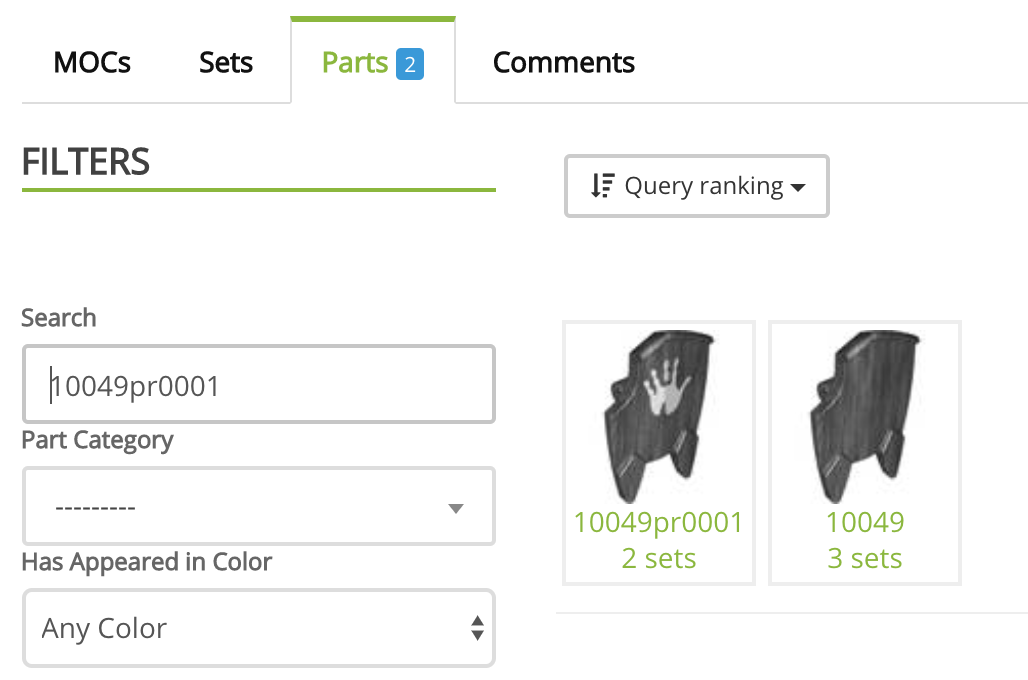
After determining the link between our datasets, we cleaned up the data using OpenRefine and Tableau by removing unnecessary rows, such as duplicates of inventory parts that had different version numbers. In the process of defining and scrutinizing the data, we also uncovered problematic areas. The part_id, for instance, proved to be an unreliable primary key because it was not unique to the shape of the part. Instead, part_id was often assigned to more than one part if that part had multiple patterns. We thought about separating the suffix (representing pattern code) from the part_id, in effort to trim down the data. However, this proved to be an impossible task, as it required hypothesizing the undefined code or meaning of each part_id. We decided not to trim the part_id likewise, as it would require arbitrary categorization that would make the data unreliable.
The Kaggle dataset did not require as much cleaning and refining. We first split the string of age ranges into three numerical columns for Tableau: min_age, max_age, and age_range. Additionally, we quantified the “difficulty rating” from 1 (originally “very easy”) to 5 (“very challenging”). Using R Studio, we then transferred the content from the Rebrickable dataset into the Kaggle dataset using part_id as the primary link. This left us with a more comprehensive dataset of legos within the US market.
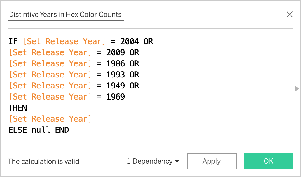
In order to filter the extensive data on Tableau, we used the conditional label shown below. We realized that the data can be hard to digest with so many distinct themes. In effort to draw out a pattern among themes along the years, we created a separate column from theme_name called theme_group, which Lego uses to categorize its small themes into larger families. The goal was to generate a visualization that could compare the rise of commercial-themed legos in contrast to lego-themed legos.
Visualization Process and Thoughts
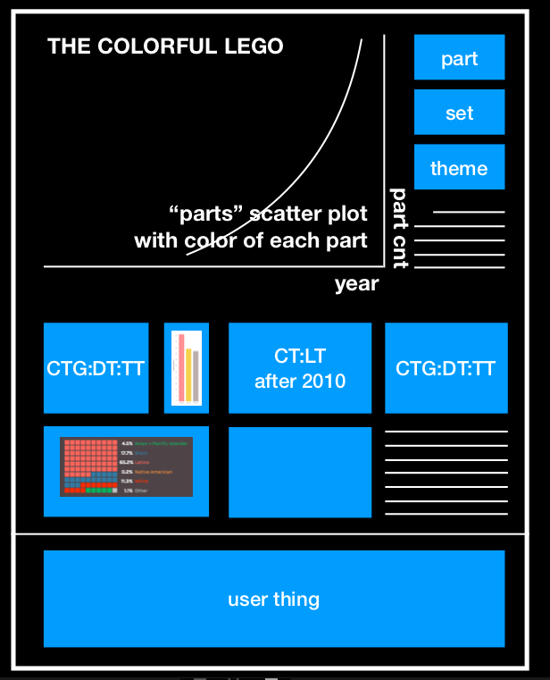
After experimenting with several concepts on Tableau, we decided that the most important graph to highlight is one detailing the apparent increase in the number of lego parts over the years. This key finding sets the theme of our visualization storyboard, which is that the number of Lego bricks have increased dramatically over the years. This key finding could be complemented by three supplementary graphs that track the uniform rise in sets, parts, and themes over the years. We then envisioned visualizing insights about the specialization of Lego bricks with additional graphs. One of these graphs could break down the specialization of Lego bricks in relation to color. Another could depict the effects of specialization by comparing the number of unique parts (e.g. figureheads) versus the number of interchangeable parts over the years. Along with the appendix, we considered providing information about lego from a UX perspective. Here, our graphs could highlight how customer ratings and feedback transformed over the course of the years. We designed the following mockup of our dashboard to help guide our data visualization progress. Initially, we thought about presenting our findings in a poster format (as shown below). For the sake of the presentation, however, we thought fitting all our graphs in one screen would be difficult if we kept this poster layout. So we later decided to distribute our graphs into a story-board consisting of multiple screens.
Results and Observations
In an effort to capture the complexity and specialization of lego sets, we created the following graphs in Tableau. These graphs were altered based on user feedback to design the final storyboard.
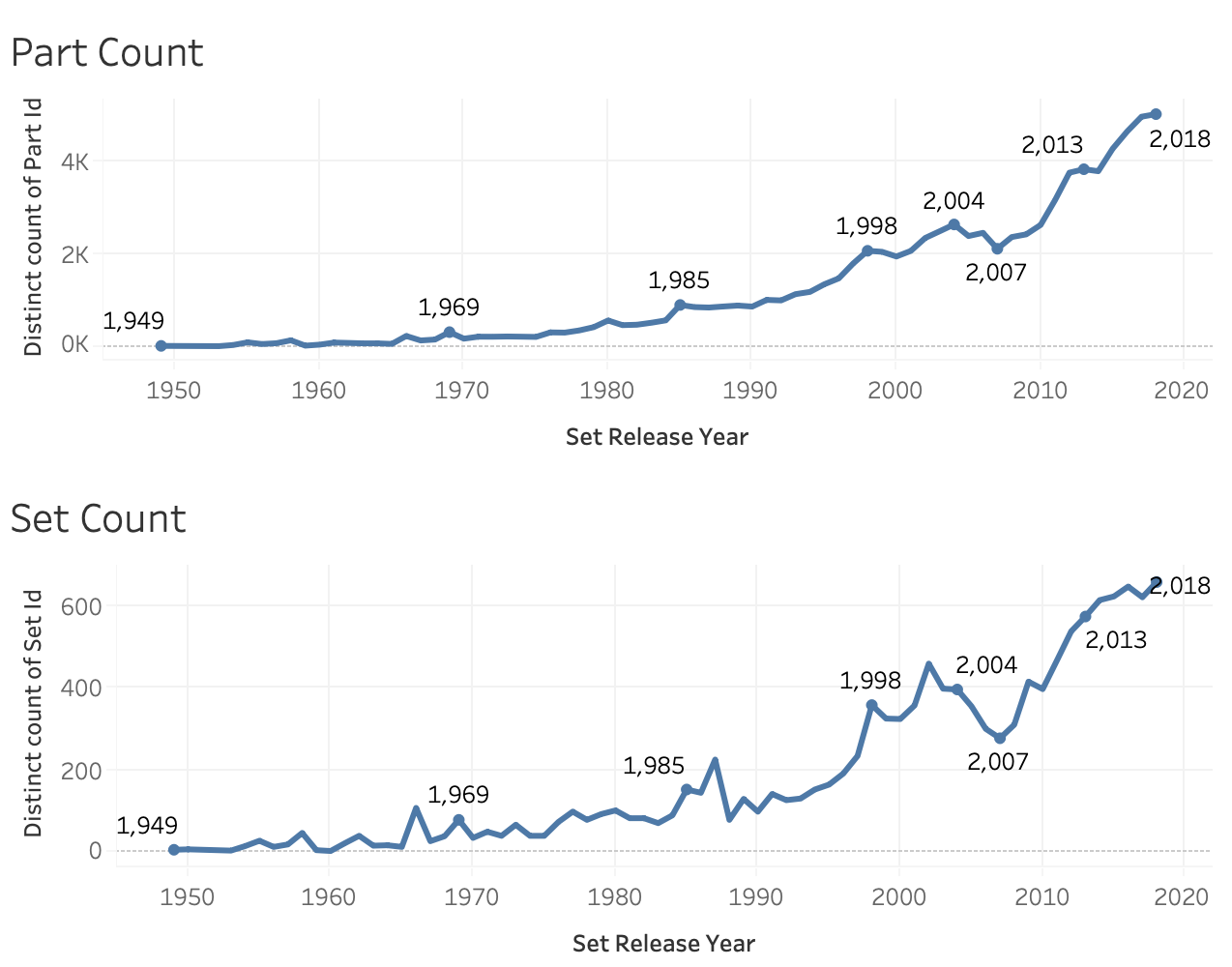
The first set of graphs we created on Tableau helped us comprehend the general rising pattern in Lego complexity. The two graphs shown above illustrate the upward trend in part count and set count over the years. We were curious about the apparent decline in Lego production that occurs in 2007. After some investigation, we learned that in this particular year, the Lego group had to outsource major parts of production to external partners in effort to cut costs due to economic difficulties. [5]
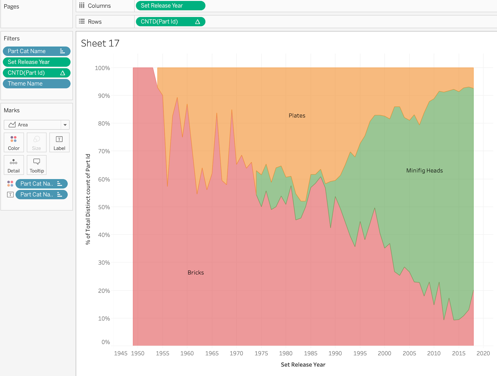
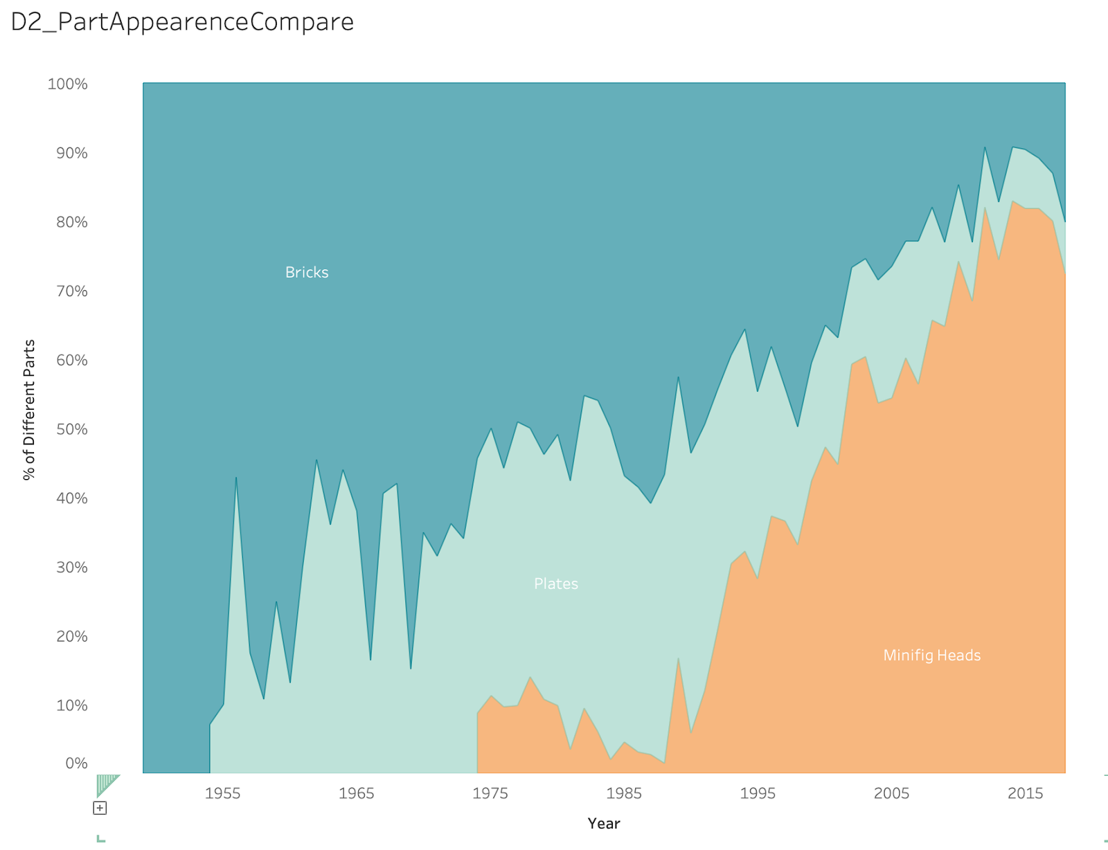
The following graph was designed in effort to illustrate the rising specialization of Lego bricks. It is apparent here that unique/specialized Lego pieces, like Mining Heads, have been on an incline, whereas interchangeable/shareable pieces like bricks have steadily declined.
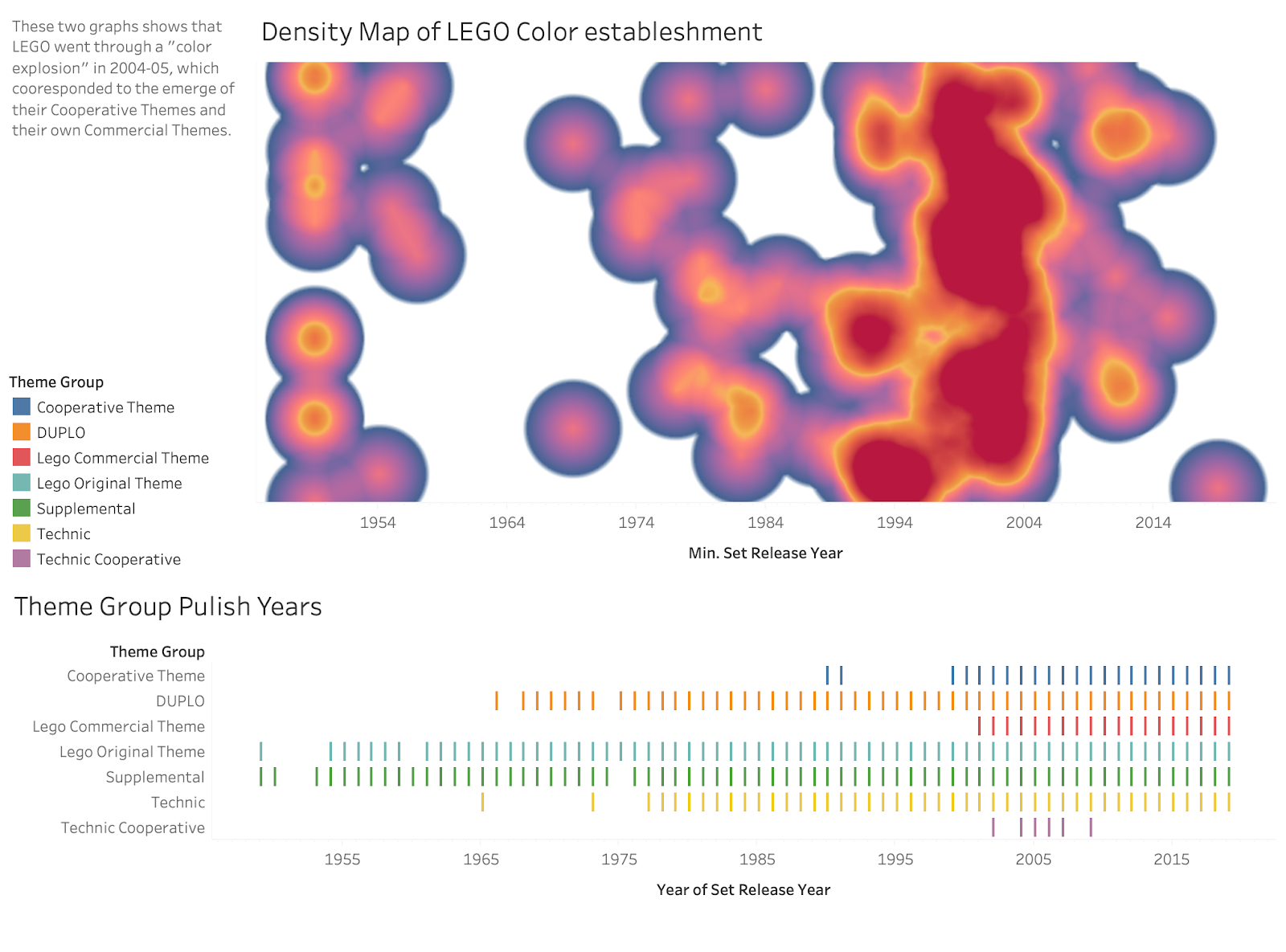
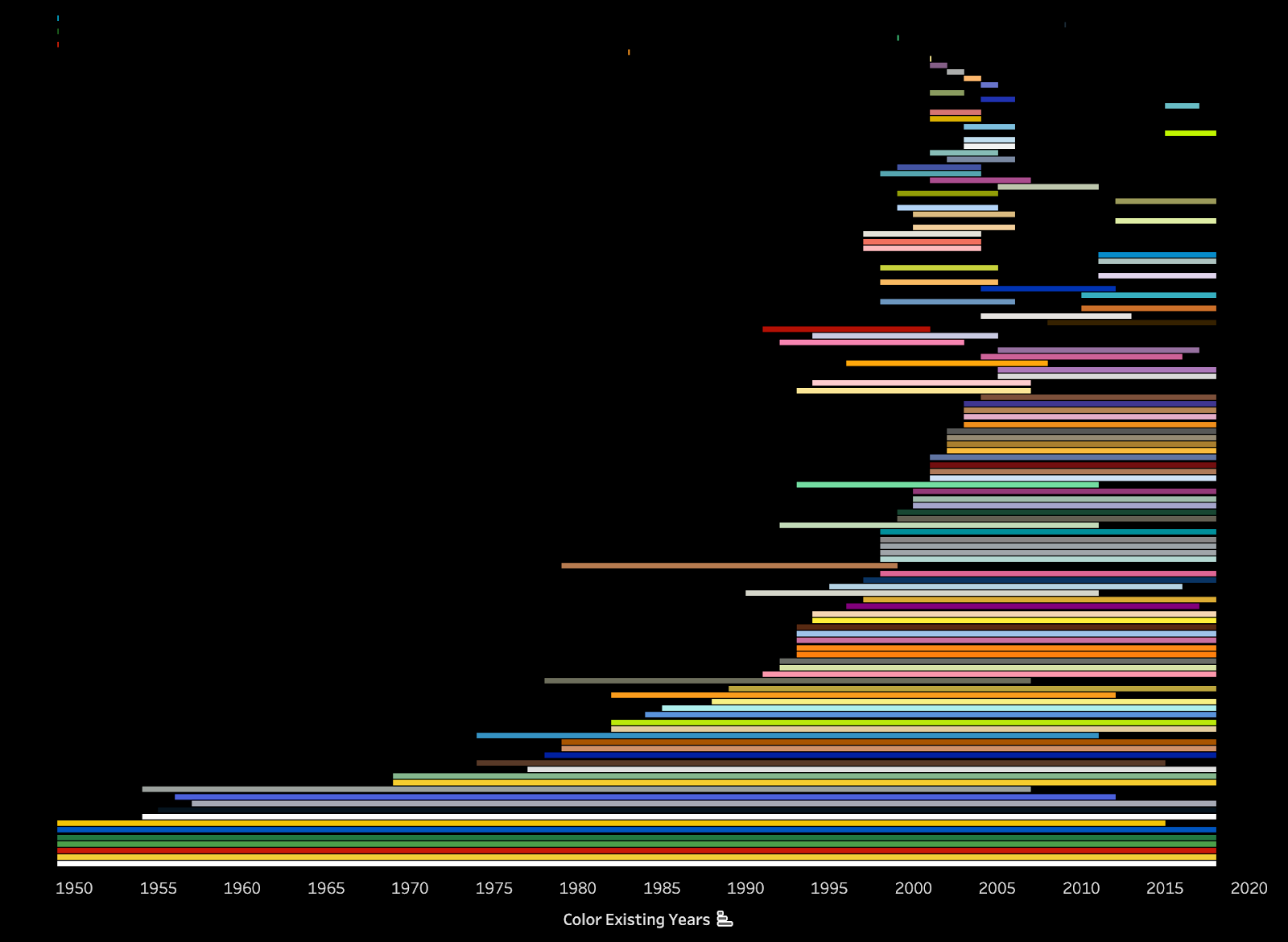
This density map aims to emphasize the rising intricacy of colored Lego pieces over the years. It is apparent here that a “color explosion” occurred in 2004-2005 due to the emergence of more complex and commercial themes.
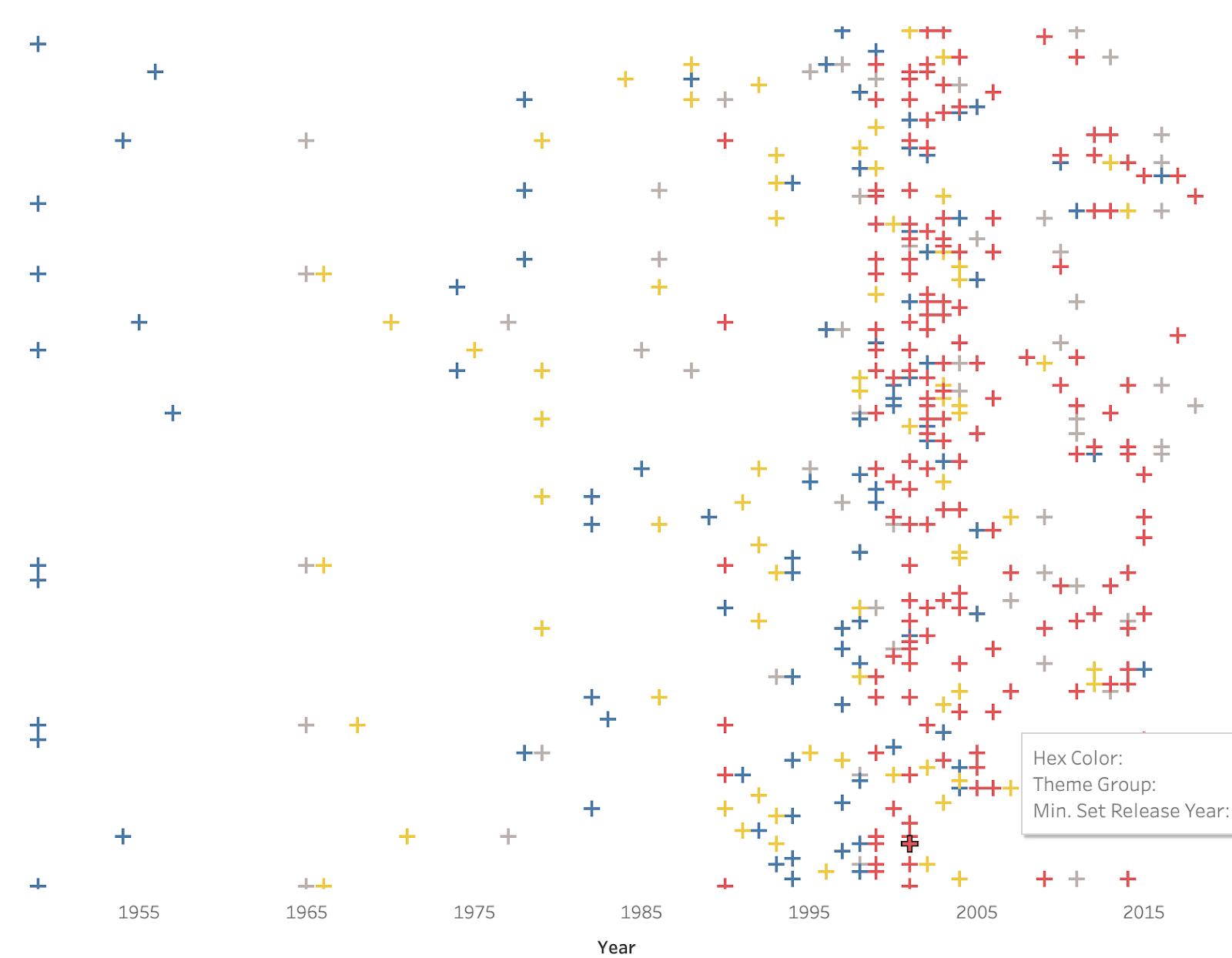
The purpose of this graph is to demonstrate how Lego has introduced more and more colors over the course of the years, as a result of their rising complexity. However, the lifespan of colors introduced later in the decade is shorter than those introduced early on.
The following graph reveals how most of Lego’s new colors are developed for commercial themes.
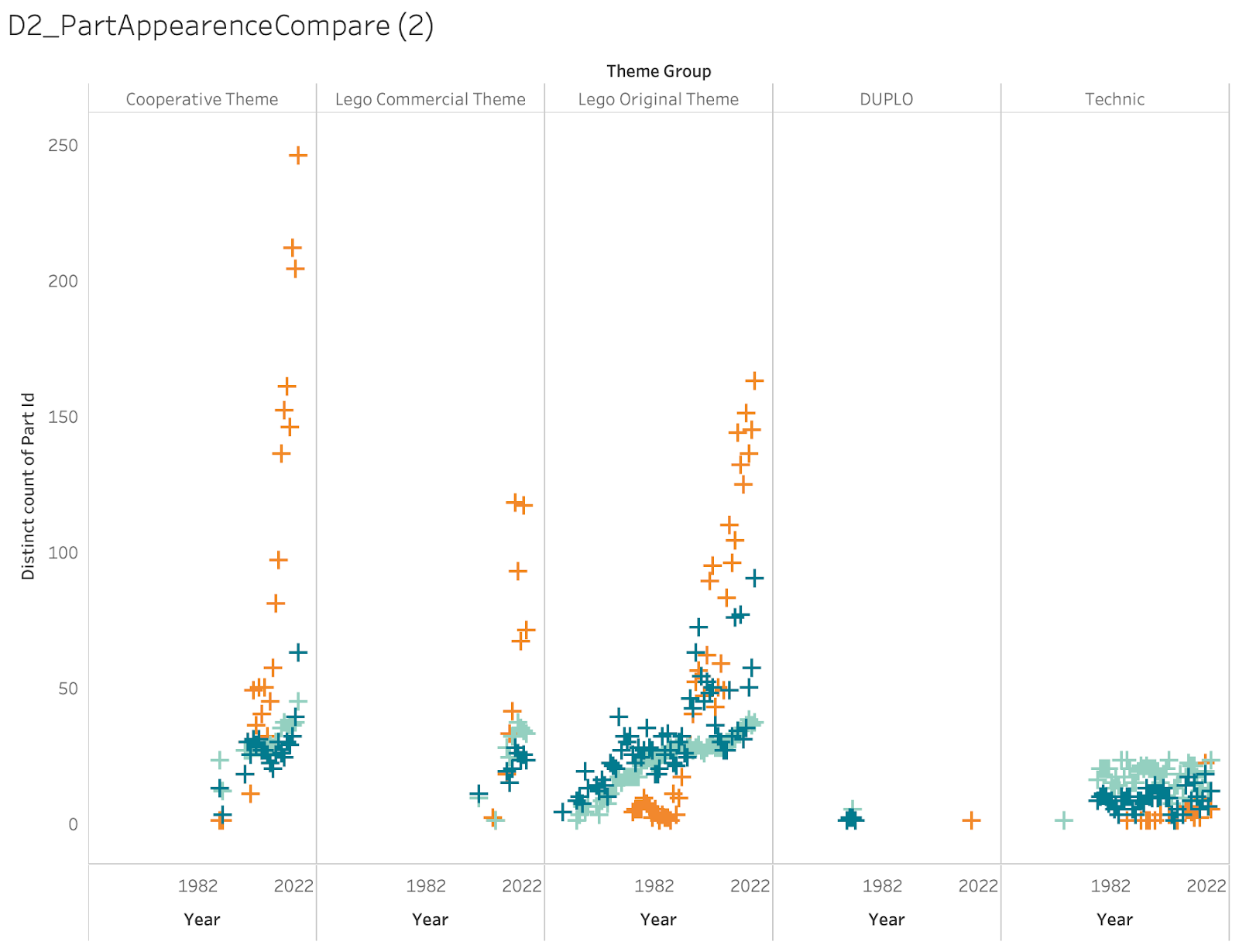
These two graphs show that more specialized Lego pieces, specifically mini-figures, have developed in recent years. It turns out that these mini-figures are the differentiating piece in Lego themes. As a result, mini-figures can be used to represent the specialization of Lego themes.
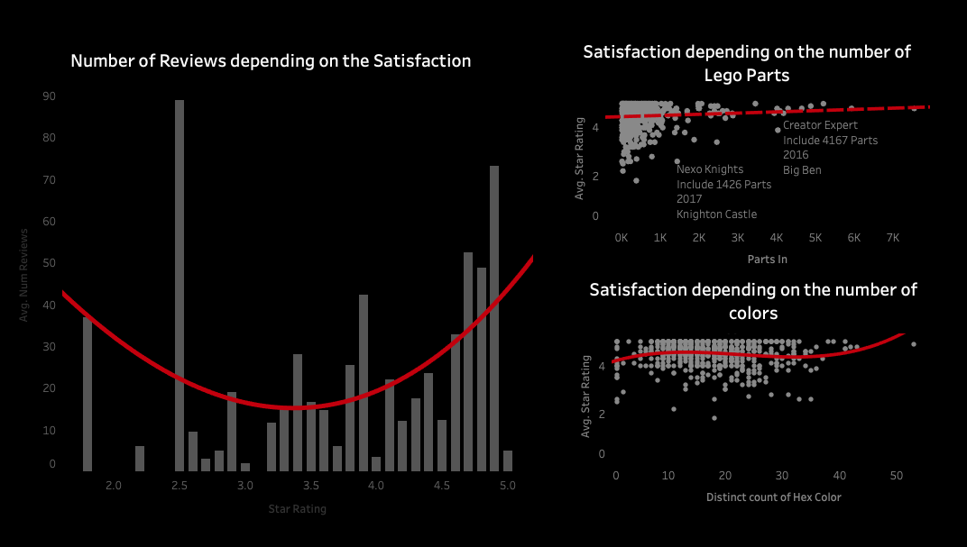
Number of Reviews depending on the Satisfaction
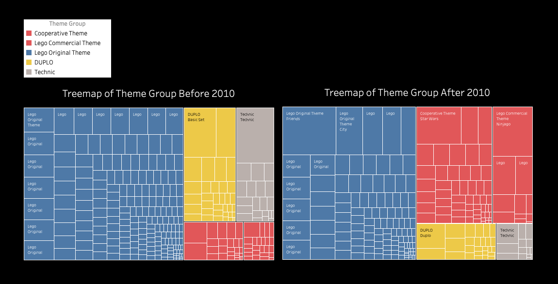
In these two graphs, the proportion of different theme groups is put into perspective. It is apparent by the relative size and color that commercial themes have expanded most rapidly.
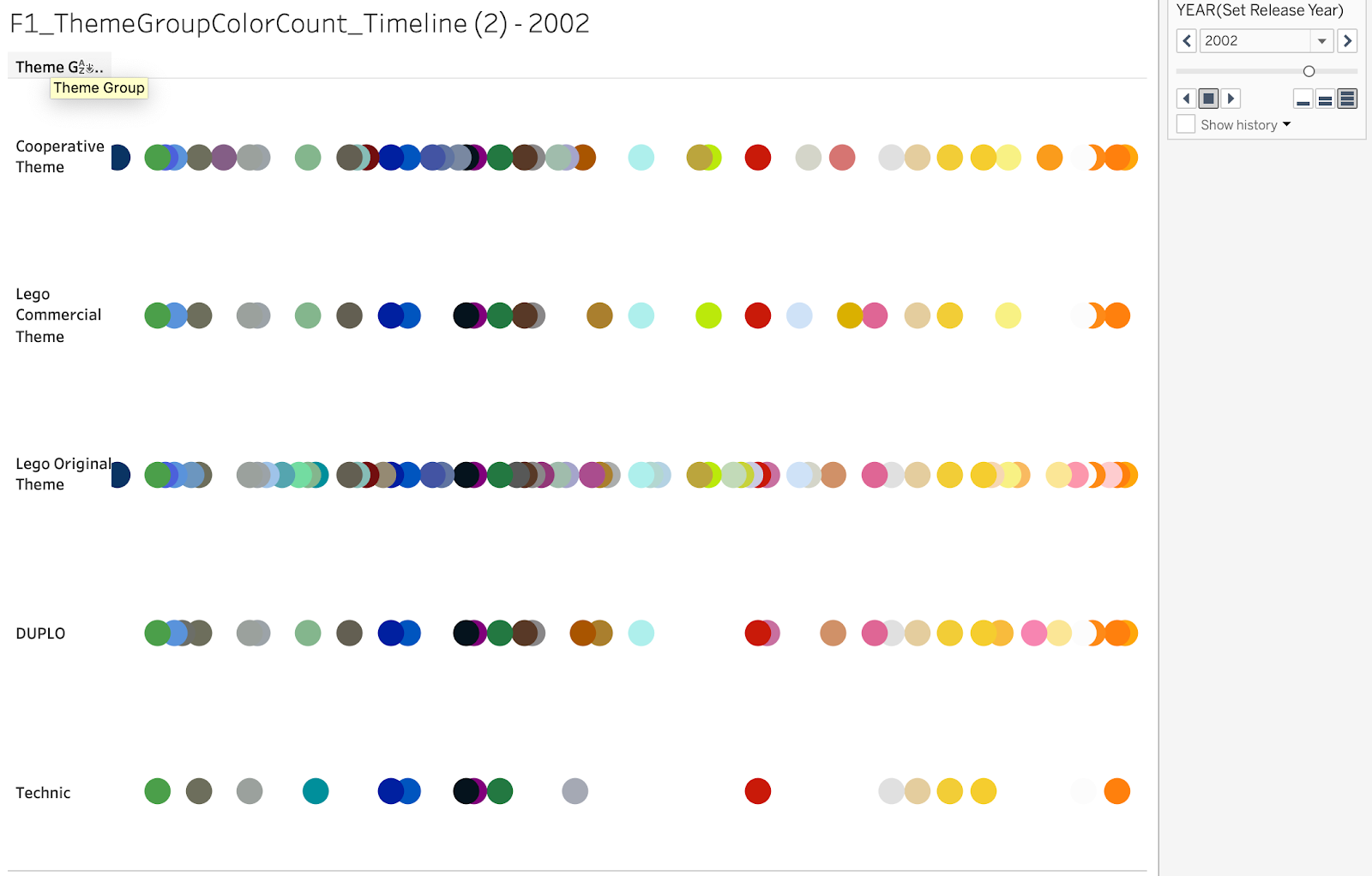
Finally, in this last visualization, the complex nature of each major Lego theme is marked by the color count.
User Testing & Evaluation
We wanted to test how effectively our visualizations were able to communicate the rising complexity and specialization of Lego pieces. It is important to get a user’s perspective on the storyboard, to see if the organization, layout, and labels of all the graphs helped bring the main message across. We devised the following unstructured interview protocol to get user feedback on our final dashboard visualization. A Pratt Institute student was recruited for the user test, and his comments are recorded below.
Screening Questions
- How old are you and what are you studying?
27, IXD
2. Are you familiar with Lego?
Yes, a little. Know how it works
3. Have you ever used Lego? What sets / themes have you played with?
No, never.
Interview Protocol
Please take some time analyzing the storyboard in front of you. Look through the different graphs and read through the labels. We will ask you some questions about what you see.
Interview Questions
- What was your initial/ immediate reaction to the storyboard?
There should be a title for each board. I like the descriptions so i don’t have to figure it out. I like consistent color patterns.
2. How would you interpret all this information? What do you think is the key message that is trying to be conveyed?
The color seems to be the main theme. And its relationship to user feedback. Not sure about the reviews- the title is missing. Some labeling. I don’t understand the minifig area chart- it needs more explaining.
3. What do you make of the sequence of the story (the order in which colors are displayed)?
I think that the color ones should be successive, and come first.
4. Are there any recommendations you would suggest?
-headings would be helpful
Reflection
Working with the Kaggle and Rebrickable datasets was a challenge well worth it in the end. Most of the time we spent cleaning, refining, and merging the data. But this was a crucial step for us to determine what the main theme of the project would be, and how we could explore it from a variety of angles. Although we started with a vision for our visualization, the way we achieved this vision was a gradual process that emerged out of trial and error. We could not predict, for instance, that commercial themes, color explosion, and figure-heads would be the most useful variables to help capture the rising complexity and specialization of Lego pieces.
We initially imagined creating a network visualization to demonstrate the complexity and interrelatedness of Lego parts. However, the refining and coding necessary to create a network out of our loaded datasets were too ambitious for us to pursue considering our time constraints. Nonetheless, if we had more time, creating a network visualization would be a step worth taking with this project. It is hard to imagine the patterns and clusters that might emerge, but they might bring to light how unique or specialized lego parts have gotten over the years.
References
[1] Production of LEGO® Bricks in the US. (2013, December 31). Retrieved from https://www.lego.com/en-us/themes/lego-history/articles/production-of-lego-bricks-in-the-us-99bade5ac6764a278d6ff1e92cd1aada
[2] Brick2Recycler. (2018, September 14). LEGO Fun Facts That You Never Knew. Retrieved from https://www.brickrecycler.com/lego-fun-facts/
[3] LEGO Fun Facts, Worksheets & Historical Information For Kids. (2017, April 24). Retrieved from https://kidskonnect.com/fun/lego/
[4] Bartneck C, Moltchanova E (2018) LEGO products have become more complex. PLoS ONE 13(1): e0190651. https://doi.org/10.1371/journal.pone.0190651