Introduction
For this week’s lab, I used a dataset that included the most commonly used nouns and adjectives from Charles Dickens’ novel, David Copperfield. Some of the questions I wanted to ask were: What are the common words used in this novel? Are there common words that could be closely connected to the themes of the book? What words appear closest to others in the novel? Could students and researchers look at this info visualization and use it for their own work?
Information Visualizations Critique
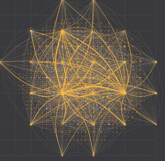
For this week’s info visualization, I looked at two other visualizations that helped to inspire my design. The first one is a map (Fig. 1) of the internet showing ISPs from different universities and Internet Exchanges. With nodes and lines of varying sizes, one can quickly see where bigger or smaller connections are. Using graph lines to chart different sections of the map, viewers can use the legend at the bottom of the infovis to see which nodes belong to which company or university. For me, the colors and thickness of the links provide a clear message of where stronger or weaker connections are. I also like how the map is segmented, allowing for easy reference.
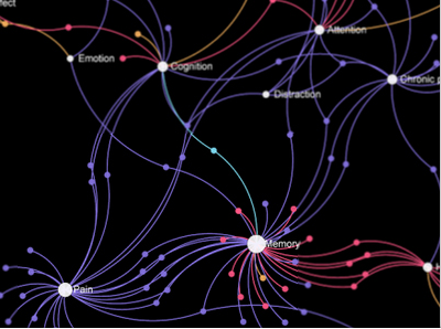
The second one is a visualization (Fig 2) of keywords used in papers on neuroscience and memory. Because I wanted to use data based on keywords used in a novel, I felt this info visualization would be a great reference to work off of. I love the use of colors and the white text is effective against the black background and colorful nodes. From the visualization, it is clear which keywords are most often cited in academic papers, allowing for a viewer to pick out trends and relationships in research.
Materials
For this info visualization, I used the open-source program Gephi. My data was in GML format and found at GitHub.com.
Methods & Process
The goal for my info visualization this week was to see not only what words occurred most frequently but also to try and see the strongest connections between words and whether or not those connections reinforced the common themes of the novel.
I started out by uploading all of my data in Gephi and seeing which format best depicted my data. I went back and forth between layout styles but, when considering how these words were connected through adjacency, realized that Fruchterman Reingold showcased my data the best.. I then experimented with the size of the nodes and the text for the nodes. Because I wanted the nodes to be sized based on the usage, the varying sizes were important. However, when I changed the size of the text as well, the words either became too small to read or so big that they obstructed other nodes, words, and links. I changed the transparency of the edges so that they were more visible.
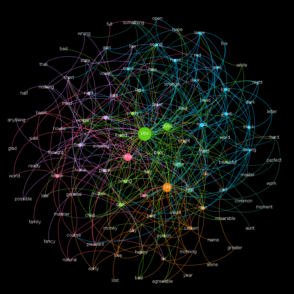
I also experimented with background colors. Because I liked the black background with white text so much, I tried to do that with mine (Fig. 3). However, when I did this, I found that the legibility of my text became worse because of the density of my network. With that in mind, I reverted back to the white background with black text.
Results, Interpretation, & Reflection
The final result (Fig. 4) is a network of words, sized by usage and linked by adjacency to other words. I think this color pattern is successful due to its brightness but also because the edges don’t bleed too much into neighboring edges. Considering that the main themes in the novel touch on classism, wealth, and the abuse of people who are seen as not having resources, the fact that the words little, other, old, and good are the most frequent make sense. Little has the most edges to other nodes which again ties in to the theme of abuse. It makes sense to see adjectives such as glad and hope on the fringe of a network when discussing a book whose themes often depict abuse; however, it is also interesting that words such as hard, bad, and alone are also on the fringe.
In my ideal world, I would have had access to all of the words in the book for my data set. If this were the case, stronger trends could be seen as well as how words were used in relation to each other to shape themes and narratives. For future projects, I would like to make more networks of word adjacencies and usage rate because I believe a visual interpretation could greatly help the research of academics. It would also be intriguing if there could be a potential animated timeline where networks shifted as the novel progressed.
