Timeline.JS Lab Report by Kyle Palermo, June 9, 2020.

Background
This timeline attempts to place humanity’s use of color in the context of a technological struggle. Color has been part of the entire human existence but only for the last several hundred years have we been able to meaningfully exploit it; for most of our history we have largely had to take it as-is from nature, notwithstanding some limited adventures in chemical synthesis. Today we can reproduce color freely and cheaply on and off screen but this historical framework provides a useful conceptual background.
Process Documentation
Timeline.js is a tool that allows non-developers to create interactive timelines simply by populating a Google Sheets template. Supporting maps, images, video, and other media, in addition to multiple levels of text and information, Timeline.js provides a reasonably immersive experience with minimal time investment by the author (besides whatever time is spent developing/sourcing the content). The platform displays events as a slideshow that moves along a horizontal timeline, which stretches and shrinks depending on the date range of the timeline. Authors can get fairly granular with the dates, include title slides and eras, and tweak some pre-populated variables including a limited selection of font pairs, the base map for Google Maps displays, start slides, zoom level, iframe width percentage and height, jump links, and a couple of other low-impact factors. Those with development chops can get under the hood and more fully exploit the platform though the documentation warns that it’s fairly complex.

Before creating my own timeline I reviewed examples provided in the documentation, including the “Decline of IRS Nonprofit Regulation” by the Center for Public Integrity,” Knight Lab’s in-house “Women in Computing” example, and their timeline on “Revolutionary User Interfaces.” I would separate two distinct applications for Timeline.js: as a way of navigating addenda within an experience (example 1) and as standalone experience (examples 2 and 3).
Results and Discussion
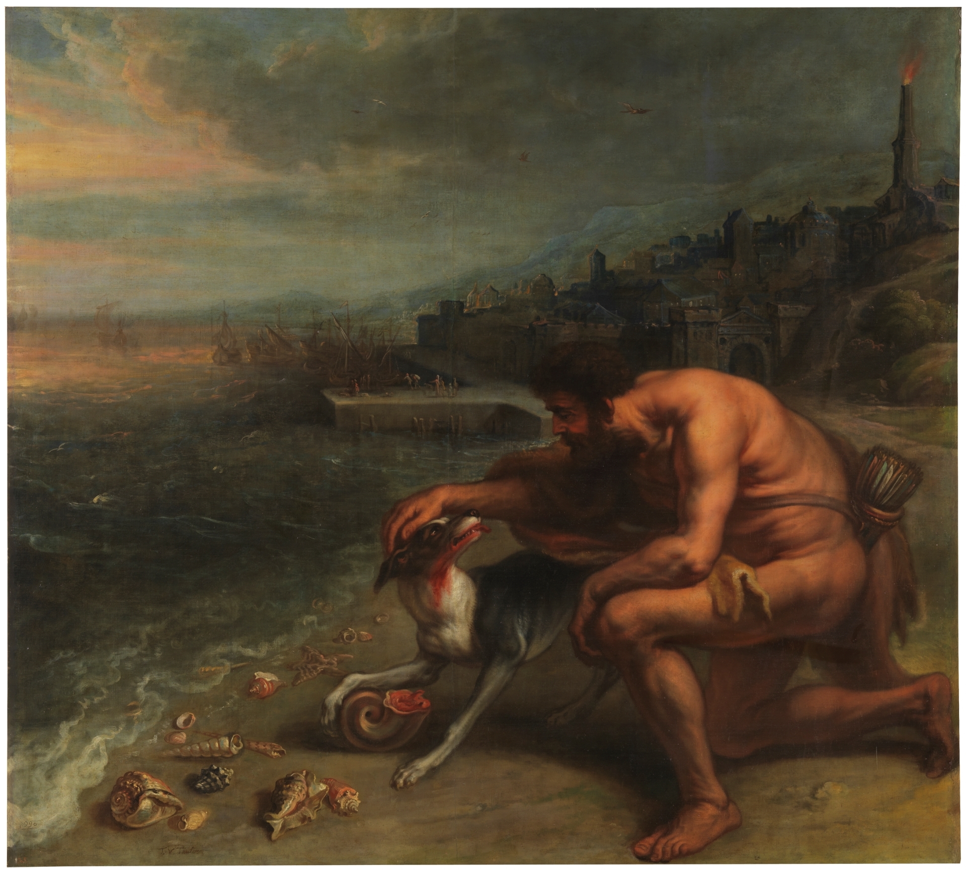
My timeline comprises 8 events and one title slide, taking readers through the history of naturally derived pigments, the first synthetically produced pigments, and the advent of modern color systems. The takeaway that I hope to provide readers is that color was once something both ubiquitous and elusive–all around us but largely impossible to reproduce–even though today we take advantage of full exploitation of huge color gamuts. This required contrasting of the pigment- (and thus rock-, insect-, snail-, etc) based world of color that persisted from prehistoric times up until a few centuries ago with the light- and industrial chemical-based world that exists today. Thus the timeline begins in deep time and ends in the 1980s, with most events clustered around the most recent few centuries. I pieced this narrative together through various Wikipedia entries dealing with color theory and history and added a layer of my own commentary. Each event includes a header image, a display date for the event, a video, as well as copy explaining the event and a link for further reading or exploration. I chose to use several different media items for each entry in order to hopefully match the immersive experience of the platform.
Reflection
On one hand, Timeline.js is an extremely easy-to-use tool that fulfills a useful function in journalism/storytelling: chronological presentation of events. Newsrooms and others can output more and/or better work without diverting resources to hiring or managing developers. The downside is relatively fixed functionality. Timeline.js is a one-size-fits-all solution and once readers spend a little time with it, they may feel more like they’re looking at the same old Bootstrap carousel they’re used to ignoring, only this time with a chronological ruler fixed to the bottom. Returning to the two uses for Timeline.js that I noted above (full-page experience vs embedded addendum), I feel that the latter is probably a stronger application for this plugin. Using Timeline.js as a standalone experience turns it into a standard carousel and tempts authors to load it up with content, sealing that fate. Whereas embedding the plugin at column width may better support lighter, text-based content with limited images, which would then allow the novel aspect of Timeline.js–the timeline–to stay in focus. This is a useful tool for summarizing or arranging text in a more interactive way and placing it in chronological order, rather than using a text-based list, and focus (in my opinion) should be on crafting a rich chronological story supported by strong text.

In crafting my timeline, however, I may have been distracted by filling in the timeline template and trying, as noted above, to provide enough content to match the immersive platform and hold reader attention. If I were to carry this visualization of the history of color forward into the future, I might focus on crafting a more robust story and including Timeline.js as a component of it, rather than as the main show.
On a more practical note, Timeline.js could benefit by opening itself up to more customization, which as noted above is very limited unless users can target CSS selectors and run the plugin using their own javascript. In addition, creating a non-linear scale for years would allow ancient and more recent events to be included on the same timeline without crunching the latter into a very small portion of the timeline (as happened to me when I attempted to include 400,000 YA on the same timeline as events in 1963 and 1987. I hacked around this by placing the timeline date much closer to the year 0 for the ancient events).
Notwithstanding some limitations and limited customization, Timeline.js seems to be a very useful and even more user-friendly tool allowing non-coders to provide a rich user experience without breaking the bank.
Links:
“Conquering Color,” timeline by Kyle Palermo: https://cdn.knightlab.com/libs/timeline3/latest/embed/index.html?source=11SEVh9mQBkTSxUIaKwcDd1prsmbI6fAJdbmpHRBCmr0&font=Default&lang=en&initial_zoom=2&height=650
Timeline.js home page and “Women in Computing” timeline https://timeline.knightlab.com/
Knight Lab, “Revolutionary User Interfaces” timeline https://timeline.knightlab.com/examples/user-interface/index.html
Center for Public Integrity, “Decline of IRS Nonprofit Regulation” timeline https://publicintegrity.org/politics/irs-rarely-audits-nonprofits-for-politicking
Primary Wikipedia articles consulted:


