Evaluation Story: Barnard Digital Collections Website
May 12, 2020 - All
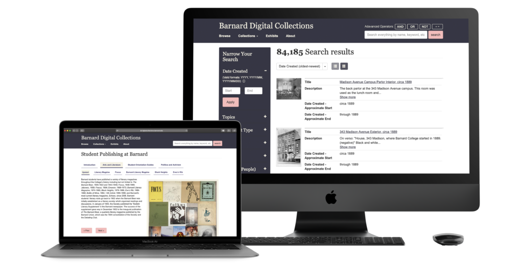
Barnard Digital Collections offers students and researchers with a vast collection of digital archival material. It gives users free access to nearly 85,000 academic sources, including but not limited to newspapers, scrapbooks, photographs etc. No major design changes have been made to the website since its inception.
The goal of this study was to test the desktop version of the digital collections website to recognise and address some of the main usability issues. The client wanted us to address the issues related to particular features of the website, including the filters and exhibits section.
Team Members & Roles
I worked in a team of four alongside Hiral, Mohammed and Lillian. Although most aspects of the project were completed by the team together, I focused on working through our first recommendation and designing proposed mock-ups for it. I also actively participated in the entire research process including brainstorming user tasks and compiling a sound final analysis report.
During the course of this study we used Zoom, Adobe Illustrator and Adobe Photoshop.
The Process

The Problem
Our client wanted us to work on the overall discoverability of the website and test if the metadata levels (filters) are confusing to the users.
“In my opinion the Exhibits section is low priority and underutilized” – Elana Altman, Academic Technologist at Barnard Digital Collections.
Define
Content is added to the Barnard Digital Collection regularly, but no major redesign has been done. The website is used an by array of users, including Barnard students and staff members and external researchers. 85% of the users use the desktop version of the website.
Some of the key concerns mentioned by the client are as follows:
- They wanted to enhance the discoverability of the website for better user engagement.
- They were concerned about the metadata (filters) categories being confusing to users.
- In their opinion the exhibits section was kind of low priority and underutilized, so they had no idea about how the users react to it.
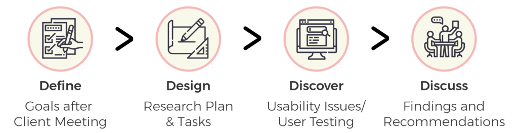
Design
We brainstormed and shortlisted 4 main tasks based on a given scenario to test different website features. Our tasks were defined comprehensively to mimic actual website usage. We made sure to address the goals and priorities defined by our client while testing the website.
Scenario and Tasks:
We presented the users with the following scenario to perform all the tasks.
“Imagine that you are an independent researcher looking for information on student life at Barnard College in the 1960s and ’70s. You have come to the Barnard Digital Collections portal to source materials from their archive.”
Task 1:
Find the digital exhibit on Student Publishing.
Task 2:
Martha Stewart is a notable alumnus from the class of 1964. Locate an article in the Barnard Alumnae magazine about her.
Task 3:
Your research involves second-wave feminists’ concerns for women in higher education. Search for proposals on this subject matter in the digital collection.
Task 4:
You are a historical researcher looking for images of Greek games held at Barnard in 1966. Try finding the photos using Barnard’s digital collection.
Discover
Out of a sample size of 20 we shortlisted 8 prospective candidates for our study. We selected a blend of candidates from Barnard students and staff and some external researchers (Figure 1).
Some of them had never used digital archives for research (Figure 2).
-
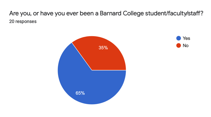
Figure 1 -
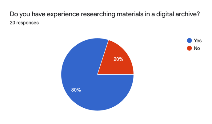
Figure 2
User Testing
The user tests were initially planned to be conducted in person, but due to the unprecedented situations from COVID-19, we had to switch to remote methods. We conducted our users tests using the Zoom platform.
Analysis
All the team members individually conducted 2 users tests as the moderator, while one of the others was responsible for taking down notes. The amount of data we gathered at the end of the study was overwhelmingly large, so in order to simplify the process we independently analysed the data from our interviews and wrote our own findings.
After careful analysis and discussion we compiled 4 final recommendations based on our findings from the research process.
High Level Findings
Here is the summary of our high-level findings from the entire website experience and for each task:
- Overall the users found the website to be aesthetically pleasing, particularly the colour scheme.
- The metadata (filters) categories are really helpful means to narrow down the search results.
- The number of metadata (filter) categories is too overwhelming for some of the users.
- Inexperienced users had a hard time finding relevent results for the first task as they were not aware of the advance search operators.
- The “View Object” button in the exhibits section should look more clickable.
Findings & Recommendations
Finding 1:
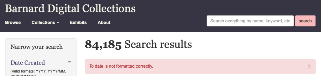
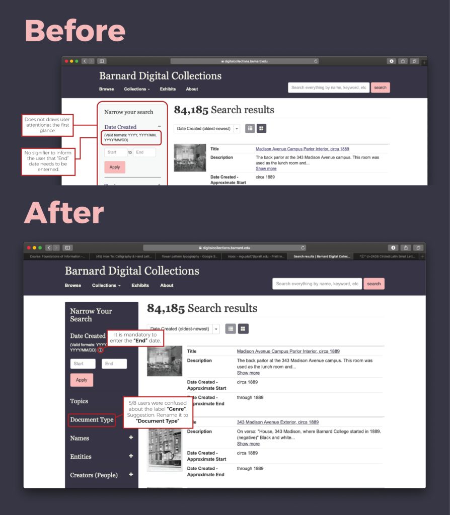
37.5% of our users completely missed out the “Narrow Your Search” section, which indeed helped the rest of the users to streamline their search results and was recommended by them. It was also noted that 75% of the users struggled with the date filter, as not entering the “End” date gave them a vague error with no feedback on how to correct that.
Recommendation 1:
Make the “Narrow Your Section” more contrasting which would draw their attention and make the panel more noticeable. Add an information button along the date filter to further inform the user about the correct date formats and compulsion to enter the “End” date.
Finding 2:
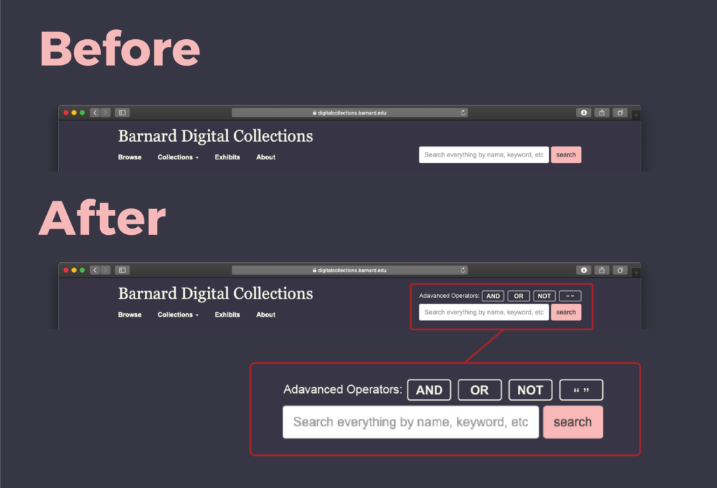
Inexperienced researchers were not always aware about the advance search options like “AND”, “OR” or double quotes etc. Although the digital collection website offers these features they are not prominent on every page and their functionality is hidden.
Recommendation 2:
Add the button for advance operators on top of the global search bar, we suggest adding them on top due the fact that sometimes the recommendation drop box might cover them if they are added at the bottom of the global search.
Finding 3:
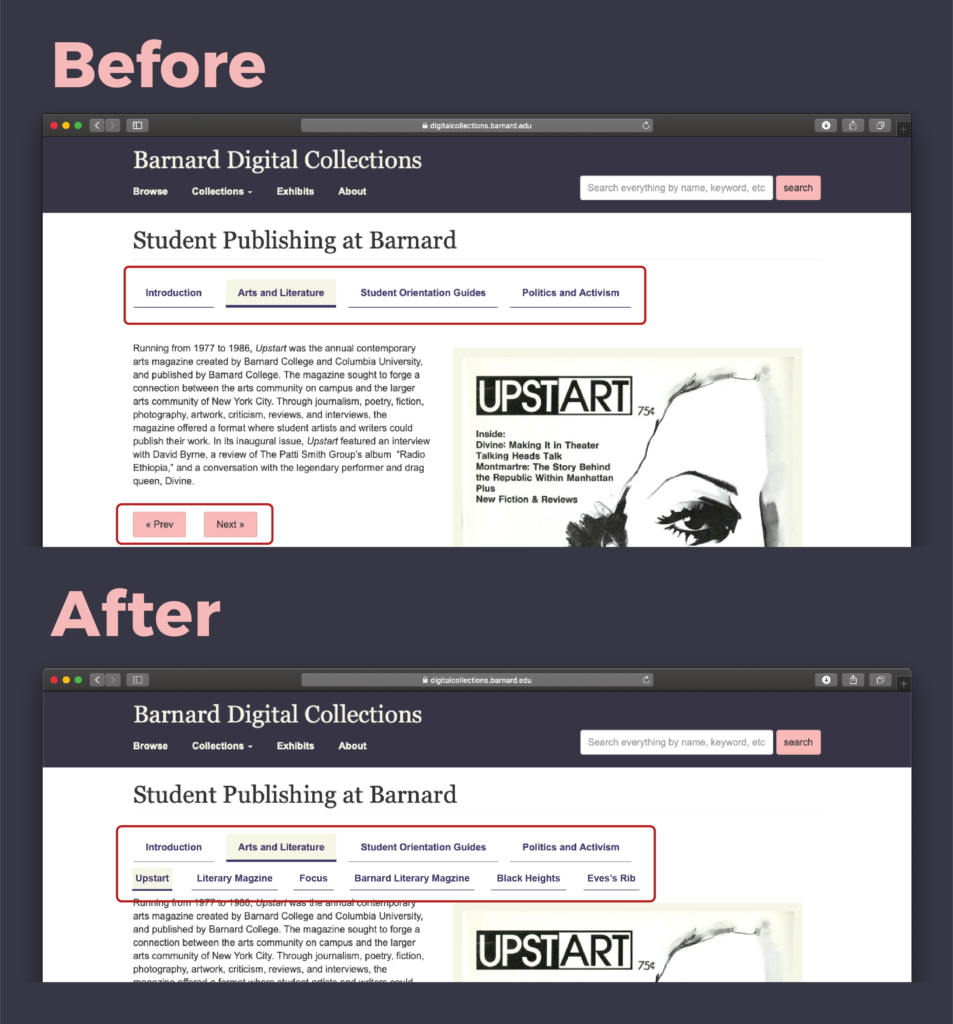
The digital exhibits section features only “Next” and “Prev” navigation buttons. This way the user is unaware of all the different exhibits the section has to offer. The users also don’t get a sense of how far along have they come in the collection.
Recommendation 3:
Adding an additional navigation menu with the titles of each individual exhibit under the main headings.
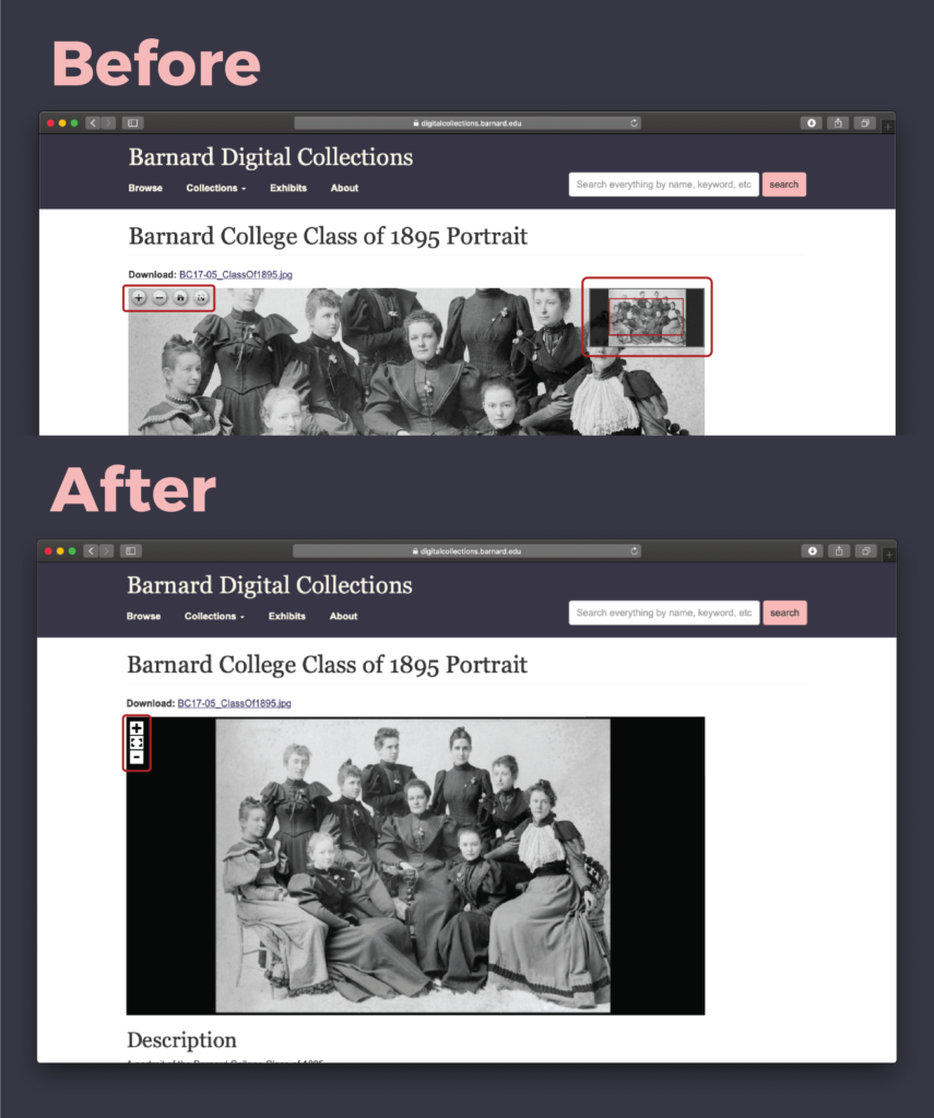
Finding 4:
After finding and clicking on a photo to find out more details about it, users were presented with a default cropped view of the image. Users on the whole found it confusing as they thought they have landed on a different photo altogether. This also resulted in low visibility of function button like “zoom in” and “zoom out”.
Recommendation 4:
Displaying the photo in its entirety when clicked on for the first time, giving the user the choice to zoom in or out. Changing the style of the button to make them look more prominent.
Conclusion
Our client really appreciated all of our recommendations and the fact that they are easy fixes that can be implemented easily through some programming modifications. Our tasks were well defined, covering the most important sections of the website. The next steps of this study could be, to user test the focusing only on meatadata categories and its user flows.
Since the tests were conducted in a remote setting, it was easier to make the participants feel more comfortable. Although I wish we had run few more pilot tests before testing with actual users, this way we could have further perfected them for remote setting.