Pratt Institute Website: Evaluation Story
December 13, 2019 - All
A team of four researchers completed a seven-week-long user testing study to test the usability of Pratt Institute’s website. This research was undertaken for the benefit of Pratt’s Communications and Marketing department, and was completed for the Usability Theory and Practice class taught by Prof. Elena Villaespesa.
This project culminated in the compilation of a detailed usability report, which can be found here.
Research Goals
RESEARCH TEAM
This study was undertaken by four researchers: myself, Hyerim Hwang, Meera Nathan, and Archana Ravi. Our team functioned well together, each of us taking on various roles over the scope of the project. Primarily, I held a leadership position within our team, organizing the workflow and ensuring that everyone stayed on schedule. I also acted as the main communicator with our clients, the study participants, and other collaborators such as the Office of Student Affairs. In addition, I did a large amount of the writing. I collaborated on the user consent form, wrote our test script, wrote most of the emails we sent to clients or participants, wrote large parts of our final user report, and edited our final report. Meanwhile, my colleagues were adept in complementing my skills by contributing other written material, problem-solving ideas, visualizations, mockups, and design.

CLIENT MEETING
We first held an introductory meeting with our clients, Sarah Hromack and Luke Degnan from Pratt’s Communications and Marketing department, to discover their main priorities for this study. We had a productive meeting, which gave us a good idea of the most important information our clients wished to learn. This allowed the research team to narrow our focus to the most pressing problems on Pratt’s website.
User Testing Process
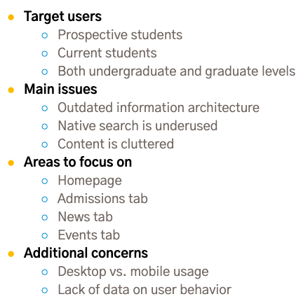
TARGET USERS
Because our clients wanted to understand the experience that both prospective and current students have on the website, the research team decided to recruit a specific type of participant. This enabled us to explore tasks geared towards both prospective and current students.
TEST STRUCTURE
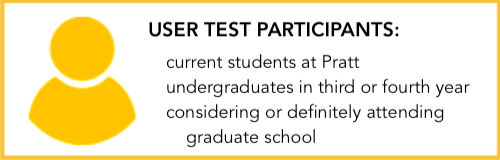
After the user profile was decided, we had to decide on a task list. We wanted to test four areas of the website, and both desktop and mobile interfaces, so we settled on 7 tasks.
We then assembled the rest of the materials we would need: the recruitment questionnaire, participant consent form, pre- and post-test questionnaires, testing script, and note-taking sheets.
Before conducting user testing, we performed a trial run with a colleague. This familiarized us with moderating user testing, and made sure our testing materials were suitable for the project. I was concerned that 7 tasks might be too many for a user test intended to take 30-45 minutes, but this test run proved that the tasks were short enough for users to complete in that timeframe.
USER RECRUITMENT
Recruitment proved to be the most difficult part of the user testing process, between finding enough people to respond to our recruitment questionnaire and aligning the schedules of participants and researchers.
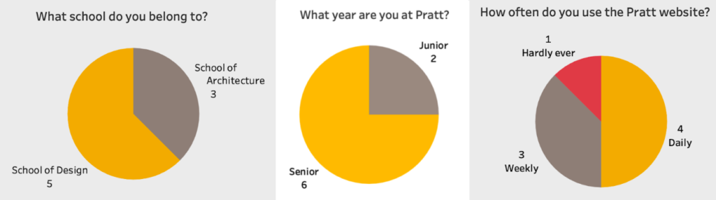
First, we sent out an email to all Pratt undergraduate students in their third and fourth years, by communicating with the Pratt Office of Student Affairs to send a Communicator email. While we got a fair number of responses from this initial push, we had to send the email out multiple times, as well as recruiting through word-of-mouth and our acquaintances at school. In all, it took about 2 weeks to recruit the 8 participants we needed.
USER TESTS
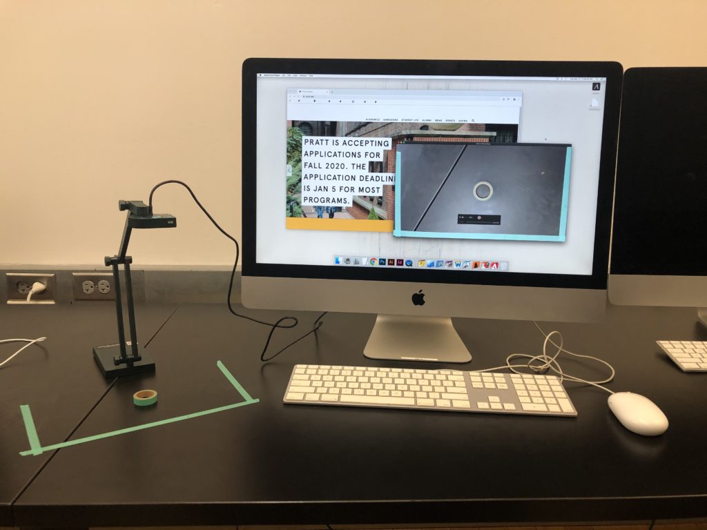
Moderated user tests were performed at Pratt’s Manhattan campus, with two members of the research team present for each test. One member moderated, while the other took notes on the user’s performance. In addition to these notes, tests were recorded using screen recording and audio recording equipment.
User Testing Results
After conducting user tests, the research team reviewed the notes and recordings in order to assess the usability of Pratt’s website. We quickly noticed patterns in the way users interacted with various parts of the interface, and took stock of the most actionable problems to address, and the most feasible solutions.
MAIN FINDINGS
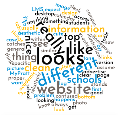
Word cloud created by WordClouds.com
In analyzing the data provided by our users, we discovered some major themes about Pratt’s website. Firstly, users had a good first impression of the site, calling it “clean” and “sleek.”
However, users had difficulty navigating some parts of the Pratt website. We noticed features in many areas of the site that confused or challenged users.
To mitigate users’ confusion, the research team focused on four main issues, and formulated recommendations on how to solve them.
- Recommendation 1: Redesigning the homepage
- Recommendation 2: Redesigning the admissions page
- Recommendation 3: Improving the layout and content
- Recommendation 4: Improving responsiveness for mobile users
The full descriptions of these findings and recommendations can be found in our full user report. Below are the two most important recommendations.
RECOMMENDATION 1
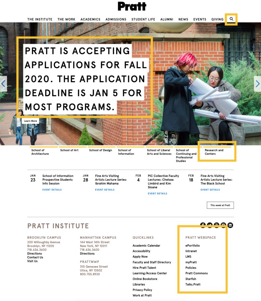
The research team found the homepage was using space ineffectively and confusing users with ambiguous wording. The most common issues encountered during user testing are shown in the figure below.
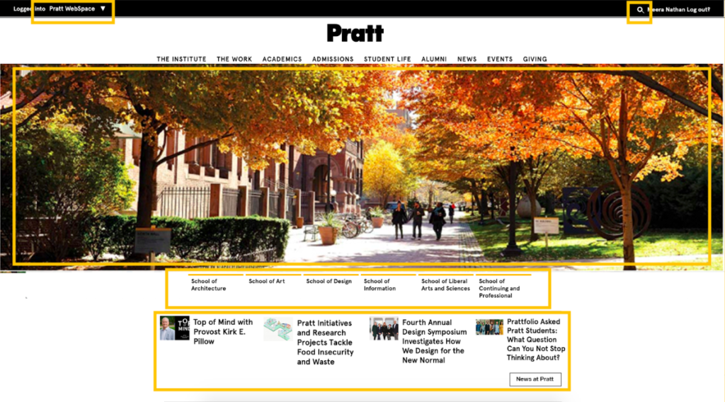
In order to solve some of these issues, the research team recommended some changes to the structure of the page, illustrated in the figure below.
RECOMMENDATION 2
The research team also found several problems that could be easily solved with some simple fixes on the Admissions page of the Pratt website. The original layout made it difficult for the user test participants to find tuition, cost of attendance, and other important information for prospective students. This was the most-failed task in our user test, so we proposed some changes to make it easier to navigate the Admissions tab.

Project Conclusion
After completing the final user testing report, we additionally presented our findings to Sarah and Luke, as well as their colleague David Frisco. Following this presentation, we went over the report and our findings in more detail with the clients.
They were quite pleased with the results of the user test; Sarah informed the research team that our study had confirmed some flaws of the website which they had already suspected. The clients appreciated that they now had real user feedback to support their claims, hopefully leading to a more functional redesign of Pratt’s website.
We also discussed possible future avenues of research on Pratt’s website; eye-tracking, heat-mapping, and other physiologically-based tests may yield further conclusions on which parts of the website draw users’ eyes and communicate important information. While those tests were not in the scope of this study, other research might yield valuable conclusions to further inform future designs of the site.
In summary, this project fulfilled its goal to discover the usability of Pratt’s website. The research team was able to provide actionable advice on how to improve the user experience overall. We all worked hard on this project, using many techniques in user testing for the first time. I felt we produced a satisfying result, and would be eager to work on other similar projects with this research team.