
Mapping Popular Topics of Climate Change
December 17, 2018 - All
INTRODUCTION
For my final project in Information Visualizations, I chose to explore the topic of climate change in order to better understand the many subtopics within it. A couple months ago I came across an article that addressed the issue of food waste and how it is a factor in climate change. I had also recently worked on a project that involved data on rising sea level projections, another topic related to climate change. Scour the news on climate change and you’ll get everything from rising temperatures to food waste to threats on penguin colonies. It’s a long thread of discussion with various touchpoints, and I feel that I fall under a category of people who know that effects of climate change are a real threat, but don’t have a grasp on the immensity of the topic itself. At a time where news headlines are focusing on climate negotiations, completely without support of the current U.S. President, I felt that it was my responsibility as an inhabitant of our shared planet, and as an aspiring information professional, to delve into a topic I know little about.
Spurred by an interest in network visualizations and inspired by research conducted by my professor, Dr. Chris Alen Sula, on Mapping Topics in Bioethics, my plan was to gather citation data from popular science journals to visually map out common keywords that occur alongside climate change. I further hoped to discover patterns or trends that may have emerged over time. As we’re at the end of the year, I decided to use the past decade as my timeframe, beginning at the start of 2009 to December 2018. My goal for these visualizations is that they offer an introductory analysis on the popular topics of climate change, to be used by fellow students, researchers, and anyone interested in learning more about the subject. The visualizations will hopefully serve as a springboard to further research.
MATERIALS
- Data was gathered from Scopus database
- Microsoft Excel and OpenRefine were used for for dataset creation and to clean and analyze data
- R was used for transforming dataset into network data
- Gephi for network visualizations
- Tableau for bar graph visualizations
- Adobe InDesign for poster creation
PROCESS
Data Creation
- Conducted a keyword search in Scopus database for “climate change”, limiting results to article as document type, journal as source type, and English as language. I wanted to search articles dating back to January 2009 and ending through December 2018.
- Because I was interested in the most popular articles within this timeframe, I started out by exporting entry data for each individual year. To pull up the most popular articles in my search, I would refine the results page by each year individually, and sorted by highest citation count. I then exported the fifty most cited articles within each year in CSV format.
- Once I was done exporting entry data for each year, I combined the ten CSV files into one masterlist of the top 50 articles for the years 2009-2018 (500 articles in total). View masterlist in Google Drive file here
- 75 articles were excluded due to a high number of keywords (I ended up limiting the number of keywords per article to 50). The number of keywords was generally high because I was using a combination of author keywords and Indexed keywords for each article. Other articles that were excluded were ones that contained some variation of climate change, but not specifically “climate change”. This left me with 425 articles.
Data Cleaning
- I created another CSV containing only keyword information, and split the keywords column into multiple columns. Each row represented an article and each column was a keyword within the article.
- After scanning the dataset in Excel, I made the following changes:
- Eliminated cells containing the keywords “priority journal” and “article”
- Deleted duplicate keywords within each article. Duplicates were common in that an article held variations of the same keyword capitalized and in lowercase.
- Because many articles contained both singular and plural forms (or in certain cases misspellings) of a word (“Plants” and “Plant”; “Animals” and “Animal”; “ground water” and “Groundwater”, etc.), I made changes across the entire dataset to ensure consistency, specifying the following word forms to be used in such cases:
- plants; humans; trees; groundwater; animals; fish; fossil fuels; drought; seasons; soil; rain
- Lastly I opened the dataset into OpenRefine where I trimmed leading and trailing whitespace and transformed all cells to lowercase.
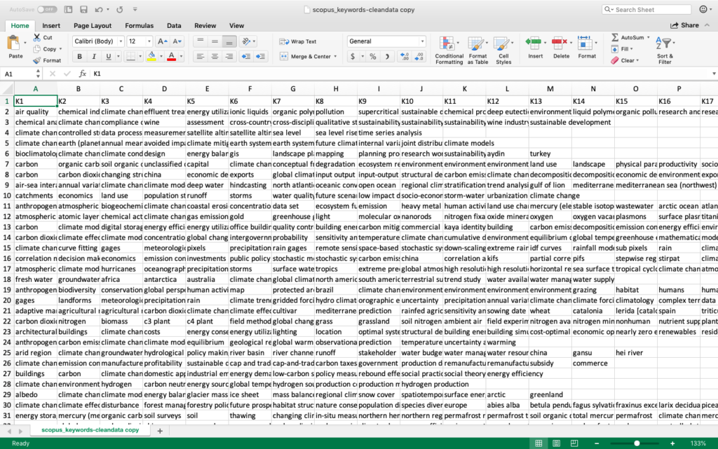
In order to better understand the number of co-occurrences between keywords, I ran the dataset in R creating a weighted edgelist. My final network dataset contained 3,280 nodes (uniques keywords), and 171,818 edges (number of connections each keyword has to other keywords).
Data Visualization
I created my visualizations using both Gephi and Tableau and finalized them in Adobe InDesign.
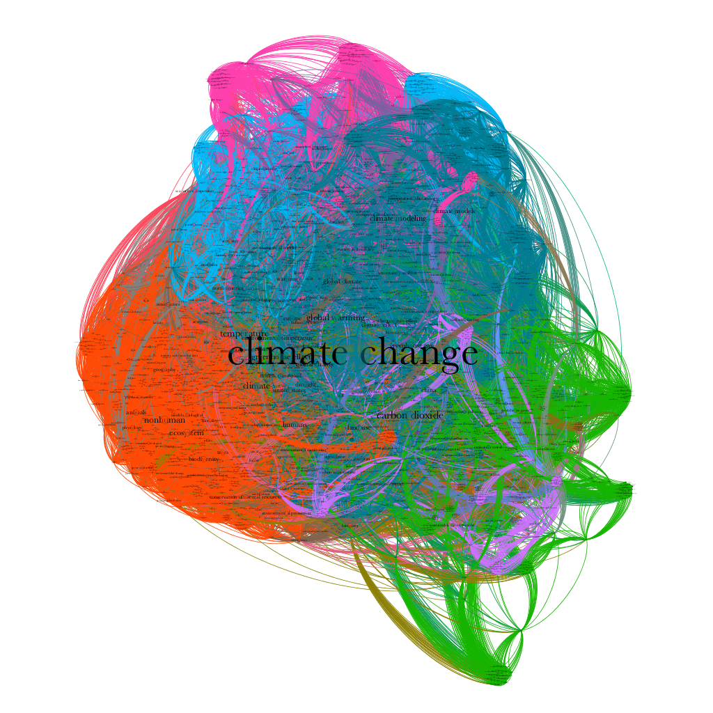
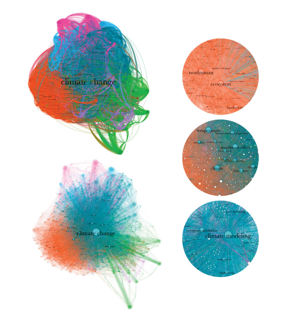
My first step was to import my network dataset into Gephi to create a network graph. The graph was created using the Force Atlas 2 layout and the statistics ran were average degree and modularity with a resolution of 1.25. Nine communities were detected, which I further visualized by partitioning node color by modularity class. I tweaked the coloring and labels to ensure that communities were visible and that the graph would show well against a white background. Once I completed the network visualization process, I exported the new data table which contained degree and modularity class for each keyword. Before further data analysis, I refined my latest dataset to contain only three columns: Keyword, Degree, Group ID.
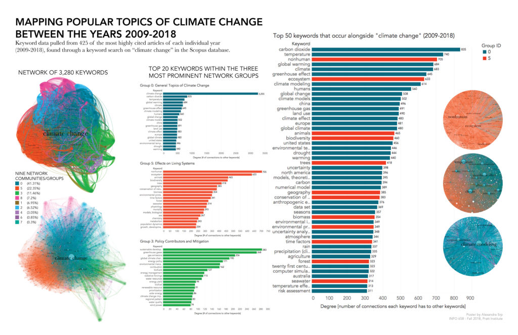
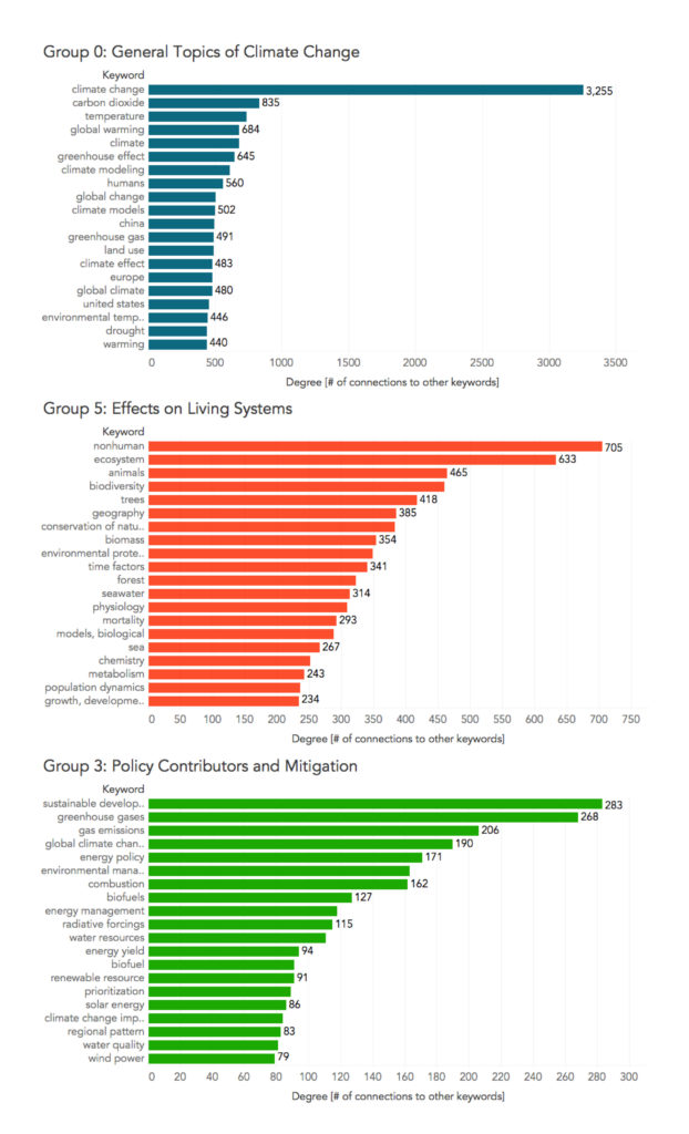
Before moving into Tableau, I analyzed the communities (Group ID) detected in Gephi. I pulled the top 20 keywords from each grouping (having sorted them by highest degree), and presented them in list format in a Google doc. My goal was to define themes for each group, in which case I employed the help of an ecologist and an environmental educator. We three came up with possible themes for each community, but concluded that further research should be done to refine these themes guided by expert opinion with a climate scientist. Because these themes are by no mean certain, I chose to create visualizations for only the three most prominent groupings within the network graph: General Topics of Climate Change (Group 0), Effects on Living Systems (Group 5), and Policy Contributors and Mitigation (Group 3).
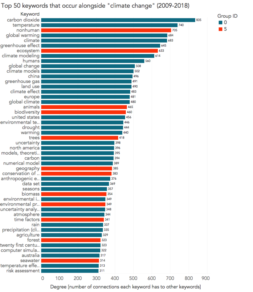
All further visualizations were created as bar graphs in Tableau. I initially started with Tableau Public, but because this version does not support exporting visualizations in image format to my computer, I looked into Tableau Desktop. Where the Desktop version is usually $35-$70 per month, Tableau offers students a free one-year license to the product. The first bar graph I created lists the top 50 keywords that occur alongside “climate change” ranked in order by degree and color coded by Group ID. Three more graphs were created listing the top 20 keywords within the three prominent groups specified above. To ensure consistency across visualizations, I matched colors to the network graph.
Lastly I combined and finalized the visualizations in Adobe InDesign, using a small poster format, 11 x 17 inches. During this final phase, I conducted user testing on the total design, gathering feedback on the poster layout and placement of images. Two points of feedback that led to visualization redesigns were as follows:
- For the bar graphs, participant did not understand what Degree meant. As a solution I included a subtitle along the x-axis that defines Degree as the number of connections each keyword has to other keywords.
- For the network graphs, participant recommended including zoom-in views to show important labels other than the large “climate change” in the center. As a solution I created three enlarged images of the graph, but due to limited poster space I placed the images at the opposite end and slightly overlapping with the main bar graph.
FINDINGS
Overall, I was not surprised by the expanse of topics covered within the subject of climate change, although I did find it fascinating to discover how keywords grouped together to form categories (or communities). Themes created for each group are very general, as the groupings have a tendency to overlap with one another in certain subject areas. The list of group themes created for the modularity classes are as follows:
- Group 0: General Topics of Climate Change
- Group 1: Anthropogenic Effects Causing Climate Change
- Group 2: Ice Melt Research
- Group 3: Policy Contributors and Mitigation
- Group 4: Effects of Increased Heating and Fire Threats
- Group 5: Effects on Living Systems
- Group 6: Research and Science
- Group 7: Modeling
- Group 8: Effects on Earth’s Physical Systems OR Drivers and Trends. We were unable to reach consensus on this final grouping.
Link to PDF and JPEG versions of final visualization poster are available in this Google Drive folder.
REFLECTIONS AND FUTURE DIRECTIONS
I believe that my visualizations successfully provide insight into the popular areas of climate change that have been explored over the past decade. They also offer a great place to start research on climate change for people who aren’t too familiar with the topic. However, I failed to achieve an initial goal for this project, which was to explore keyword patterns and trends over the years. I ran into a few obstacles while trying to match my final datasets back to the years included in the master dataset. I had been hoping to include a line graph to see how keywords rose and fell in popularity over time, but due to time constraints I settled on the current visualizations which combine keyword popularity over the entire span of given years.
Looking back at the overall process, I am more comfortable now in my understanding of Gephi and Tableau than I was at the start of this semester, but I’ve also found areas for improvement in my workflow. My greatest challenges for this project were in the dataset creation and figuring out how to organize the datasets in meaningful ways to accomplish my goals. I was easily overwhelmed by the vast amount of data that I actually ended up scaling down from an original plan of using 2,000 article citations to 425. I must also acknowledge my lack of experience in working with dataset organization programs, as I manually cleaned much of the data. My process of data cleaning was not only time consuming, but may have also led to possible errors in my keyword dataset.
A future direction for this project is to get expert advice from a climate scientist on the themes for each modularity class, which may lead to further runs of the modularity function in Gephi. I would also like to take this project further to complete my initial goal of mapping keyword changes over time.
The post Mapping Popular Topics of Climate Change appeared first on Information Visualization.