
Bronx River Trash Collection and Fecal Bacteria Analysis
December 16, 2018 - All
By: Seth Crider, De Han, Lindsay Menachemi, Nat Quinn, Drew Stanley, and Zack Walker
Introduction
In October 2018, Professor Chris Sula from the Pratt School of Information reached out to students in his Information Visualization class with a dataset given to him by Diana Fu, the Education and Stewardship Associate from the Bronx River Alliance (BRA). The BRA is an environmental nonprofit that advocates for maintaining the ecological health of the Bronx River. In 1974, BRA started as Bronx River Restoration Project, Inc., formed with Ruth Anderberg as its first director, to help restore and maintain the river. Bronx River Alliance became an organization in 2001. In 2007, a beaver was spotted in the Bronx River for the first time in 200 years, and Secretary of the Interior Ken Salazar cited the river as a model for conservation and restoration.
The dataset provided was really two datasets: one that showed how much trash was picked up out of the river by BRA volunteers – including what side of the river and what type of trash it was – and another that showed the prevalence of fecal bacteria (Enterococcus) that has ended up in the river, including the geospatial locations of where this bacteria has been measured in the river.
After speaking with Fu, this group of students found that six main research questions emerged, three per dataset. For the trash-specific dataset, the following questions were uncovered:
- Which booms collect which type of trash? How much of it is coming from Westchester County?
- What trends over time do we see within the trash data? (e.g. are there certain seasons where trash increases or decreases? are there certain events that correlate to these changes?)
- Which side(s) of the river have the most trash collection?
For the fecal and contamination dataset:
- Where are river segment sources of illegal discharge?
- How does this data correlate to rainfall over time?
- Where are the main sewage treatment plant locations and how do those locations correlate to contamination?
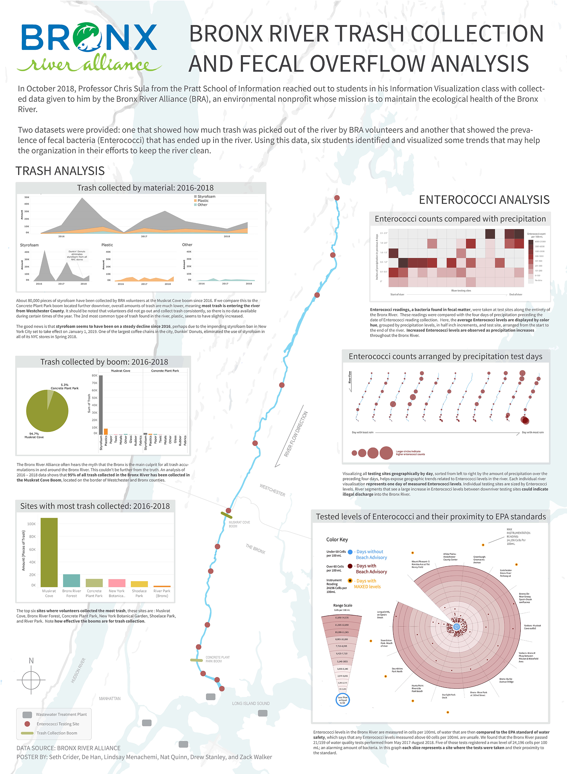
Six students in this Information Visualization class volunteered to tackle these six questions, with the ultimate goal of creating a physical large-scale poster for the Bronx River Alliance to display in their new space. BRA’s goals were to better understand core trends and meaning in their data, and to provide a display that highlights the impactful and important work of their current volunteers.
Materials
Data:
- Excel workbook file of data from BRA (trash + fecal/contamination)
- Rainfall data from Weather Underground
- Email from Fu with boom geolocations
Tools:
- Openrefine and Google Sheets for data cleaning
- Tableau Public for creating visualizations
- Mapbox Studio for creating the base map and geospatial visualizations
- QGIS for the creation of geospatial data
- Illustrator for creating vector graphics and compositing all visualizations and maps onto one cohesive final poster
- Photoshop for more styling options
Methodology
General Trash Data Cleaning
The Excel workbook we received from the Bronx River Alliance was comprised of 8 separate worksheets. Three of these, labeled “2016 data,” “2017 data,” and “2018 data,” contained the raw data recorded at each trash collection date within that year. On each collection date, the total amount of trash and the type of trash was recorded in columns. Many of these sheets contained aggregations of data in separate tables to the side of the raw dataset, which had to be removed in order to use the data in its purest form for future calculations – we did not want to rely on previous aggregations in case anything was aggregated in error. Some of these worksheets also contained columns that were not present in other worksheets, so after checking with BRA, we consolidated columns in order to make the categorization of trash the same across each worksheet. We also noticed that only that trash that was collected was given a number – any other trash category was left blank which caused errors with calculations, and so these blank cells were turned into 0’s. After separating a few consolidated date values, the data was then transposed to make it more interpretable for Tableau.
Next, we realized that all columns were color-coded, and that these colors matched up to larger subtypes of trash (e.g. styrofoam, plastic, metal). The finest level of column data provided data as to what exactly was picked up (e.g. cardboard, food waste) and then these larger subtypes were created by the BRA in order to better analyze the kinds of materials that were majorly impacting the river. We therefore combined the data in all three sheets into one composite table with all trash collection dates and all subtypes and types combined appropriately. This cleanup effort was lengthy, but worthwhile in getting to a data table that could be more easily analyzed in our visualizations.
Trash Type Analysis
Using this table, we began our analysis on the data. One of the core questions that the Bronx River Alliance team had highlighted for analysis was whether Westchester County was contributing more trash to the Bronx River versus Bronx County, and if so, what kind of trash was most prevalent. To answer these questions, we further cleaned the dataset to only include the Muskrat Cove and Concrete Plant Park booms. Muskrat Cove is the northernmost boom, on the border of Westchester and Bronx counties, and would be integral to understanding what was coming from Westchester. Concrete Plant Park was the southernmost boom, and would better reflect the trash entering the river in Bronx County only. To get the data for only these two booms, more cleaning was needed – these two booms were not consistently named in the dataset. For instance, the Concrete Plant Park boom would sometimes be called “CPP” or “Concrete Plant” or even “CPP Boom.” All instances for both booms were combined to aid in this analysis.
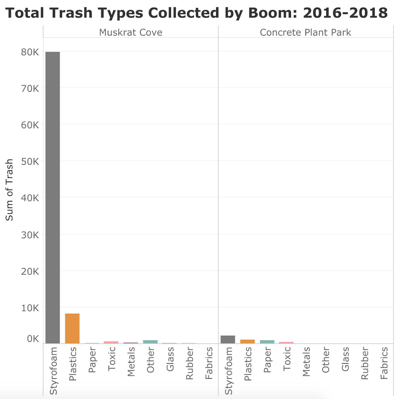
After the data was cleaned, it was imported into Tableau to begin analysis and visualization. We began by using Tableau to see the composition of all trash over all years by boom. This was helpful in getting our arms around the problem. It quickly became clear that styrofoam and plastics were the two main offenders in each boom, but also, that Muskrat Cove had an enormous amount of trash collected in these categories as compared to Concrete Plant Park. With this knowledge in hand, we created a comparison chart to better highlight this issue, and dove further into each boom’s trash composition to understand what subtype of materials were comprising these numbers. Lastly, we looked at the trash numbers holistically by boom, to better view the disparity between trash in each boom.
Trash Time Analysis
One of the main questions about this dataset asked by BRA was about how the amounts of trash collected had changed over time, especially when it came to styrofoam, the most common type of trash. After uploading the data in Tableau, an area graph was used to show each separate type of trash collected over time, shown month-to-month from 2016-2018. This view didn’t seem to yield as much results as looking at the data by quarters per year, however, so the data was then separated into an area chart for each year, and then combined into a dashboard in order to show small multiples. This allowed for much more interesting results to be gleaned, including that styrofoam found in the river seems to be on the decline over the three years provided in the dataset. We also noticed a spike in trash collection in August and September, but it can be assumed that more volunteers are available and willing to pick up trash at that time. It’s important to keep in mind that this data does not represent the total amount of trash in the river, but rather the amount of trash picked up by volunteers.
Trash Location Analysis
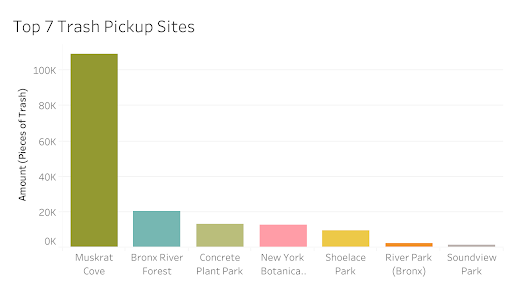
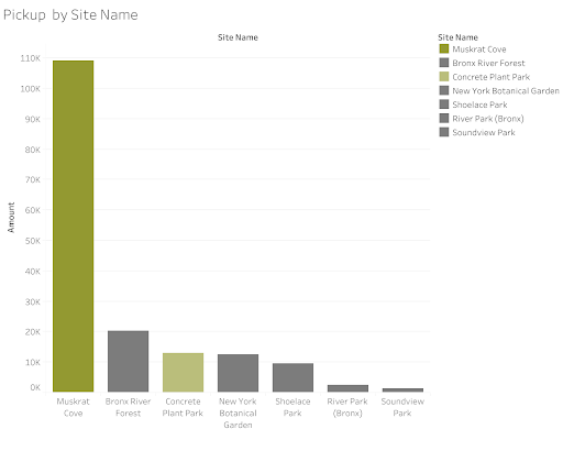
Also, knowing that all of the trash data reflects only where trash was collected by volunteers (and not true trash totals), we analyzed where these trash collection points typically occur around the river. This would help us better understand whether a certain side of the river was getting trash collected more often, something that the BRA would be interested in knowing as they try to clean the river as a whole. Data cleanup was yet again key here, as we needed to combine disparate site names by using refine with text facet (e.g. L to Left, include left to Left). 70 locations in the original dataset became 25 locations after this effort. There were also meaning issues, such as the upper boom referring to Muskrat Cove Boom, or Sound View meaning Sound View Park. These 25 locations were then imported to Tableau, with the final view only showing the top 7 sites. We also consider two types of value measures, measure of total items picked up, and total number of records for pickups (number of times volunteers picked trashed up per location).
Fecal Data Cleaning
The Fecal Data was arranged by location code in columns, and dates of testing sites in rows. In order to make the data a bit more accessible for organization for visualizations based in QGIS, Tableau, and Illustrator the entire data set needed to be transposed. The textual locations needed to be entered through the provided codebook and outstanding outliers had to be addressed. One of which included the reading 24196 cells per mL. that needed clarification as a max instrumentation reading instead of a mistake due to how far away it was from the second largest outlier. The cleaned data set was widely circulated around the fecal data team and a manipulated based around the specific questions being answered. Certain data from River Keeper was attached to the original BRA data set to account for gaps, and add deeper understandings of precipitation, outflow levels, and environmental conditions. All the additions benefitted vital geospatial relationships that helped the team conceive of the testing sites, and the stories they held within the data. Processing the initial set in traditional column-based methodology proved to be an efficient decision; Making further adjustments more clear and less prone to errors. This step ensured we all worked with the same numbers.
Enterococci measurement averages compared with precipitation
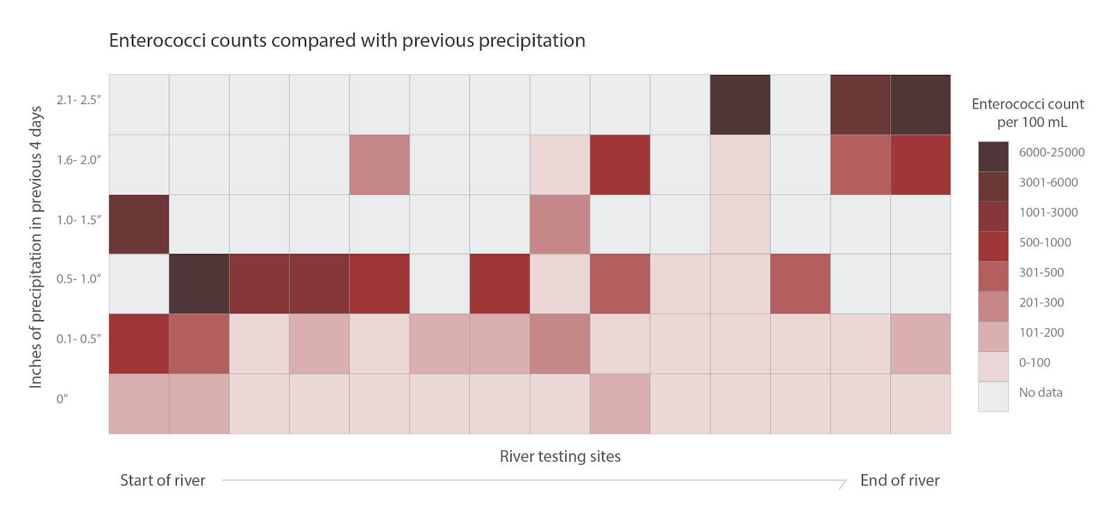
The color gradient grid visualization was analyzed and calculated in Tableau, from which the information was converted into a different format, color scheme and layout in Illustrator in order to achieve design cohesion across all three enterococci visualizations. The field enterococci measurement data was matched to the corresponding date’s precipitation. Along the x-axis, sites were used as the variable, and along the y-axis, combined precipitation values were used (in half-inch increments). The enterococci level data within each corresponding grid square was averaged, and colors were assigned based on this calculation. The graph calculated and analyzed in Tableau is seen below.
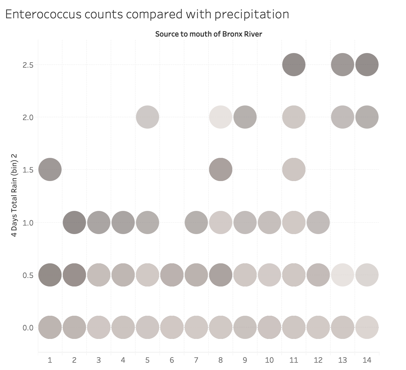
From this graph, the information was recreated in Illustrator, using a square grid layout and assigning the reddish-brown color palate seen in final visualization.
Geospatial Components
To give both sides of the team (trash and fecal) a basemap to work from and to build our large poster from, QGIS was used to digitize the Bronx River into a shapefile. Individual polygons were created to segment the river by Enterococci testing locations, where a river segment would be the upstream portion of the river from one testing location to the next. QGIS was also used to digitize and geolocate the actual testing locations, which were created as a point-based shapefile. Line segments were also created using QGIS for every segment of the river. North of the Bronx County boundary line, the river is represented spatially using only line segments since the river is quite small and occasionally underground. The basemap for the poster was created using Mapbox Studio and coded in CartoCSS. It was exported from Mapbox Studio as a high-resolution PNG file and converted to an SVG file in Adobe Illustrator, allowing us to scale it up to poster size without resolution issues.
For the map small multiples visualization of Enterococci levels at testing sites, each small multiple was built individually in Mapbox Studio. A shapefile with the individual locations of testing sites with all Enterococci measurements was upload to Mapbox. Each site was sized according to the measurement for the specific sites on the specific days, using an exponential scale for the bucketing while increasing the marker size by 15 pixels for each successive bucket.
The buckets:
<=60 cells/100mL (EPA limit for safe water)
>60 <= 500
>500 <= 1000
>1000 <= 2000
>2000 <= 4000
>4000 <= 8000
>8000 <= 16000
>16000
Each day was visualized and then exported as PNGs. The individual maps were combined using Photoshop, and ordered by the total amount of rain for the preceding 4 days from the testing date.
After critique of the visual, some minor design changes were implemented to clear up the legend, make the overall organization clearer, and add an indicator for river flow direction.
Analyzing Proximity to EPA Standards
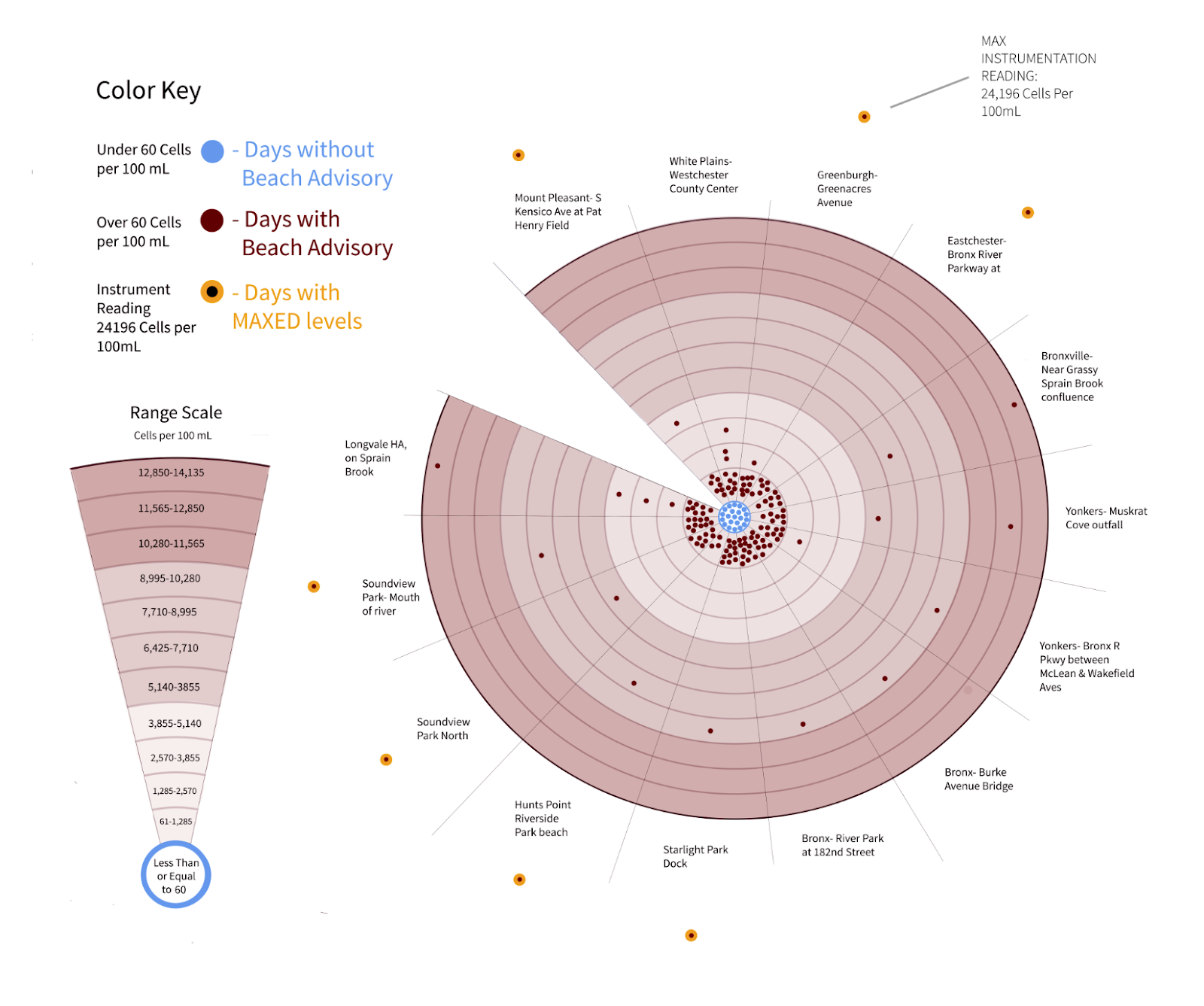
One aspect that Fu didn’t ask but seemed to be fundamental to dissecting and understanding the Fecal (Enterococci) data set was the highlighted red levels that indicated failure to meet EPA safety standards. It was an important story to tell because the potential conclusions were that a vast majority of days tested between May 2017, and August 18, 2018 were exceptionally unsafe. A total of 138/159 tests were deemed unacceptable, or advisory (above 60 cells). The first misstep taken was to gather the Enterococcus data by date and location and link it to testing dates which made an interesting timeline of levels but didn’t form a broad enough picture of missed goals, or correlation to outside factors. It became apparent to focus on the EPA standard as it was a core component of the initial dataset (highlighted by red) and seemed like a useful way to raise awareness about the amount of times the river missed the mark. In order to illustrate a type of Bullseye (dartboard-esque) visualization with each pie slice representing testing sights and a range toward a goal (center); a bottom-up vis needed to be produced using illustrator.
How the range was created:
To organize the 159 points within the date range in equidistant scales or bins an equal range between 12 segments had to be manufactured. The range was created by extracting the largest outlier levels (max readings 24196 cells per mL) for they were to be represented off of the normal scale, and finding the second largest reading of 14135 cells per mL. With center being 1-60 cells (acceptable) the concentric circles were broken into ranges radiating out from there. The breadth of the data made it impossible or problematic to base each section by 60. Therefore, 11 sections were created, excluding the center for bins of exponential value. (1285*11)
Scaled Bins:
12,850-14,135
11,565-12,850
10,280-11,565
8,995-10,280
7,710-8995
6,425-7,710
5,140-3,855
3,885-5,140
2,570-3,855
1,285-2,570
61-1,285
0-60
This data visualization is not about extreme scientific exactitude but more about visually illustrating a serious problem in an approachable novel (the idea of a dartboard or bullseye and targets have prevailing literacy) way. This is key as we keep in mind that these posters will reach people from all different educational backgrounds and literacies.
Feedback:
6 versions of the visualization were created before arriving at the final after useful feedback from group members and friends who recommended:
- Value changes to the scale key, and circular ‘dartboard’ component
- Changing the shape of the scale key to a pie slice for consistency
- Instituting circular color swatches for square ones (consistency)
- Really highlighting max instrument readings (according to Fu)
- Organize Color elements with fellow Fecal data group members in order to provide a consistent and focused group of graphs.
Findings
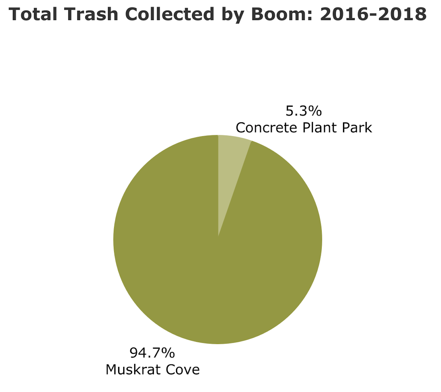
Trash Data: The Westchester Problem
The Bronx River Alliance often hears the myth that the Bronx is the main culprit for all trash accumulations in and around the Bronx River. This couldn’t be further from the truth. An analysis of 2016 – 2018 data across the two booms in the Bronx River shows that 95% of all trash collected in the Bronx River has been collected in the Muskrat Cove Boom, on the border of Westchester and Bronx counties.
If we take a closer look at what’s comprising this figure, we see that styrofoam is overwhelmingly the main contributor, with around 80,000 pieces collected over the past two years. If we compare this to the Concrete Plant Park boom, located further downriver, we see that only a few thousand pieces of styrofoam has been collected, and overall amounts of trash are much lower.
An even deeper analysis into the this massive styrofoam figure at the Muskrat Cove boom shows that the top two sources of styrofoam trash are medium pieces, and small pieces smaller than a nickel. Future inquiry might dive further into the origins of these pieces and where they are entering the riverstream.

Trash Over Time
When looking at trash collected over time in the Bronx River, it seems clear that styrofoam use has been on the decline since 2016. This decline could be attributed to the impending styrofoam ban in New York City, set to take effect on January 1, 2019. One of the largest coffee chains in the city, Dunkin’ Donuts, eliminated the use of styrofoam in all of its NYC stores in Spring 2018.
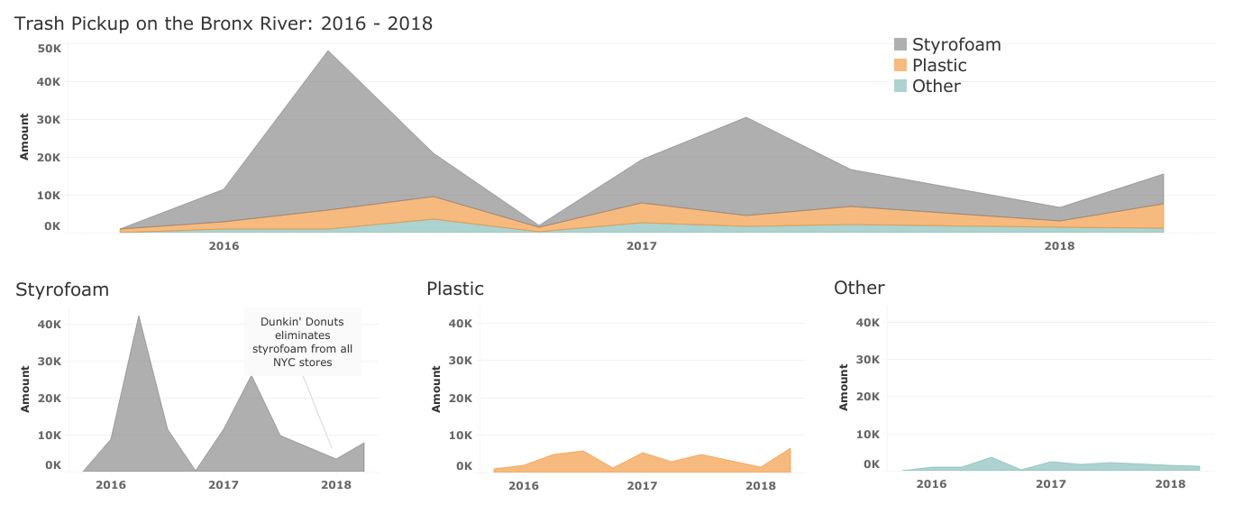
The 2nd most common type of trash found in the river, plastic, seems to have unfortunately increased. Quarter 3 of 2016 shows 4,907 plastic items collected, then 2,929 in quarter 3 of 2017 and 6,492 in quarter 3 of 2018.
Trash Data: Trash/Location Findings
Most trash collected was on the Right side of the river, with 4462 items of trash, compared to 3913 items of trash on on the Left. At the same time, it is noticeable that, most trash pick up from the Whole, with 120106 items. This intrigued us to investigate deeper.
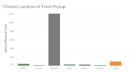
After we sort data based on Site Name, we see the reason. Trash collected from Booms, including Muskrat Cove and Concrete Plant Park, was recorded as Whole, rather than Left or Right, since the trash flow into the river and it is hard to tell where it originated from. From the next figure, we can see the top five sites where volunteers collected the greater amount of trash, these sites are : Muskrat Cove, Bronx River Forest, Concrete Plant Park, New York Botanical Garden and Shoelace Park.
Fecal Data: The Rain Problem
Concern around Enterococci levels in the Bronx River has lead the Bronx River Alliance to pursue answers to questions around the impact of rain on the levels of bacteria in the river, locations where illegal discharges are happening, and the effect of wastewater treatment plants on the river. All three of these questions were addressed through a combination of maps and statistical visualizations.
It is well understood that heavy rain events cause sewage overflows into the waterways of New York City. So the question isn’t so much whether the Bronx River suffers from this problem, but where and how severe the problem is. Our findings suggest that the Bronx River, while not obviously a dumping site for wastewater treatment plants, still suffers from severe bacterial pollution when it rains.
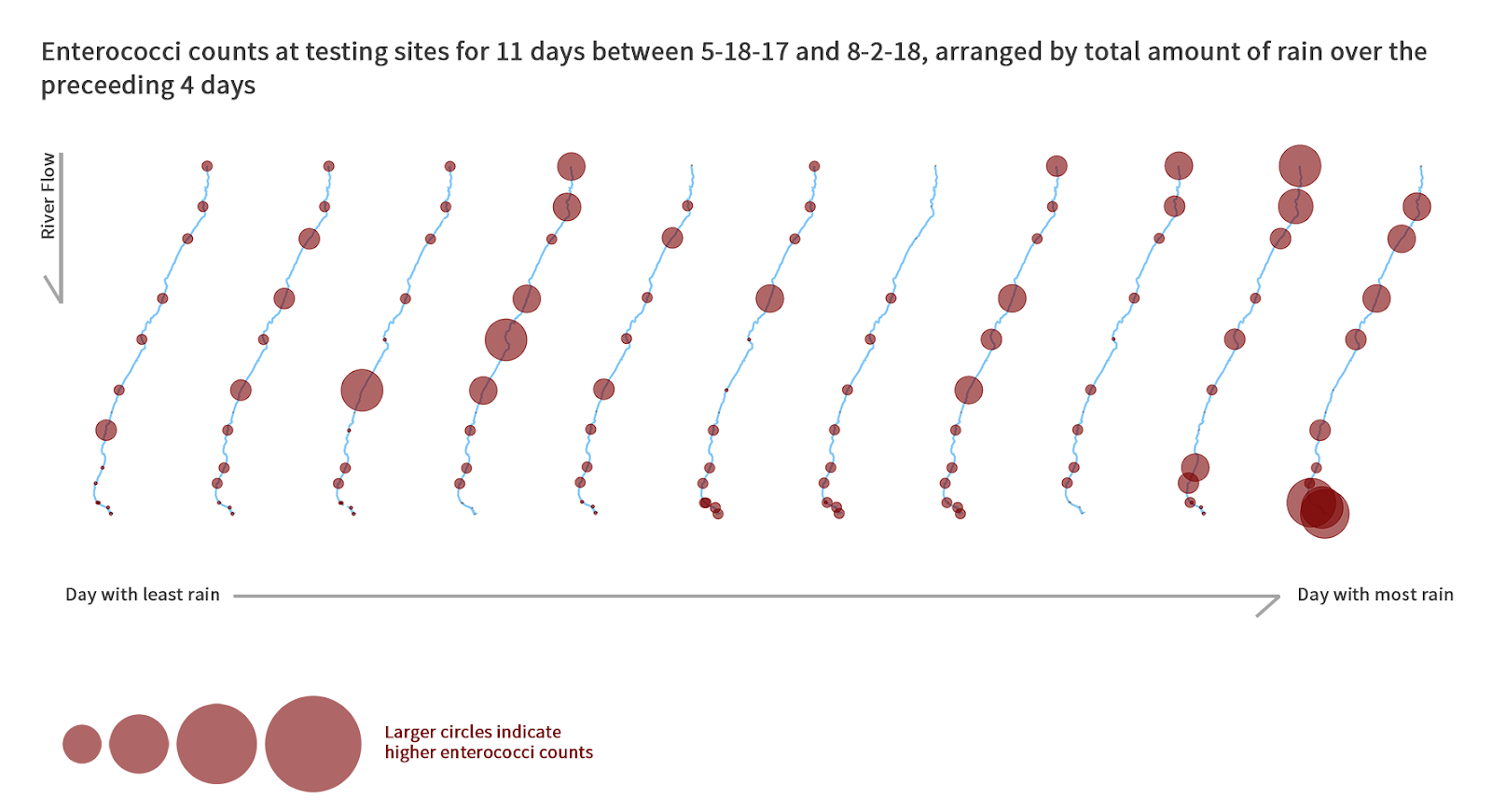
With the data available, the average values of enterococci counts increased with higher precipitation. This adheres to the understanding that New York suffers from sewage overflow during precipitation events. While the limited dataset makes it difficult to conclude certain sections of the river are affected greater or lesser than others, it does imply that there are locations where illegal discharges into the river are occuring. A smaller enterococci level upriver of a much larger measurement on a single day could indicate discharge into the river. However, it can be concluded that rain does increase the average levels of enterococci in the river, and a clear correlation and pattern emerges, as seen in both the geospatial and grid visualizations.
Fecal Data: EPA Safety Proximity
The most current data shows an incredible divergence in the river’s tested levels and water quality standards set by the EPA. The graph is focused primarily on the missed marks to raise awareness of high Enterococci levels. The time span chosen was the most current, and consistent set of data on the these levels. Pertinent to this graph are the “maxed out” instrumentation levels (if they are true) that stand out as totally irresponsible levels of bacteria in a public water source. The graph when viewed with the knowledge that the data set didn’t provide sufficient answers to “why” this dilemma is happening should encourage more scientific developments about the sources of Enterococci. Hopefully the BRA can solicit more resources for explorations of filtration options, more advanced recording equipment, and consultation with a data scientist to encourage richer biological data, and longevity of datasets.
Design Choices
Below are some of the design choices made according to best practices in data visualization as well as feedback from class and UX participants.
- Consolidating smaller trash categories into an “other” category.
- Using a vertical map of the river due to the cardinal directions of north and south.
- Using color that corresponds to the item in the viz according to cultural conventions, such as blue to denote water, brown to denote fecal bacteria, and grey to denote styrofoam.
- Using small multiples to break down data for more a granular analysis, or to show change over time.
- Eliminating extra detail in the base map and other geospatial visualizations to focus the reader on the needed details.
- Adding annotations to specific events that took place during the dataset’s timeframe.
- Showing river flow direction and where the mouth and source of the river.
- Adjusting percentages
- Adjusting labeling to clarify purpose of visualization
User Experience Research
During the project, we conducted UX research both in the early and late stages. Before we started analyzing the datasets, two members of the team conducted a meeting with the client, Diana Fu from Bronx River Alliance. This meeting provided the team a set of six questions to analyze. In the final report, all six questions are discussed and answered. With the expected poster ready, the other four members of the team also conducted four user tests with random participants viewing the poster and took notes of these participants’ impressions of the poster design. It should be noted that user tests were conducted digitally on a dramatically scaled down version of the final poster. From these user tests, the following observations were gleaned:
- There was too much text on our initial poster
- Some users had difficulty with some of the jargon used (mostly scientific wording around the fecal bacteria)
- The text was crowding out some of the visualisations
- Subheaders would greatly improve the narrative flow
- We needed to free up some space on the poster, which was in general too crowded
To address these issues, we cut down the amount of text by nearly half, and added bolding to important pieces of information to help the users eye locate pertinent information. We reformatted the text and rearranged it to provide more space between the text and visuals. Scientific wording was reduced and explained better. Subheaders were added to symbolize more clearly which side of the poster was which narrative. In general, the user tests helped us focus and refine the spacing and text on the final poster.
Future Thoughts/Directions
Overall, with the data that was given to us, we were able to identify some definitive patterns that begin to answer these questions, but some questions do need more analysis and more detailed data. We can’t say for sure that we can point to a clear answer for each question – doing so would require a broader scope and timeframe for this project – but we can posit that our assumptions would probably prove to be accurate after further analysis.
To collect more evidence that bacteria and trash are both coming mostly from Westchester County, we would recommend for BRA to explore those sites and booms further in order to find out where exactly this trash and bacteria are coming from. We also think that, for the trash dataset, the data needs to be normalized to the number of volunteers picking up trash across the same timeframe, and how many volunteers picked up trash per boom or pickup site.
The post Bronx River Trash Collection and Fecal Bacteria Analysis appeared first on Information Visualization.