NYC Shooting Incident Data 2013-2017
December 14, 2018 - All
Introduction
For this final project I wanted to continue using New York City crime data to further expand upon projects I had done earlier in the semester. My first lab report that dealt with crime data looked specifically at data about felonies committed in New York City parks across all five boroughs from 2016-2017. This park felonies data was visualized using Tableau. From this project I had learned that there was a slight increase in felonies in Manhattan, Staten Island, and Brooklyn, with park crime slightly decreasing in the Bronx and Queens. Of the seven types of felonies reported (grand larceny, robbery, felony assault, rape, burglary, murder, and grand larceny of a motor vehicle), grand larceny was the most frequently occurring felony followed by robbery, and then felony assault. The next project using New York City crime data involved shooting incident data from the first six months of 2018 and was visualized using Carto. Using Carto I was able to create an animated map of NYC that showed where shootings occurred overtime. This animation was layered over a choropleth map that was colored based on the total number of shooting incidents per police precinct. The visualization of this data helped make it apparent that the majority of shooting incidents occurred in Brooklyn and the Bronx. Unfortunately, there wasn’t a very aesthetically pleasing or interesting way to also represent all the demographic data that was also available in the shooting incident data file. This limitation of Carto and wealth of information available in the shooting incident data files inspired my final project which utilizes shooting incident data from 2013-2017 and is visualized in Tableau. Tableau will give me the ability to better represent the demographic data, as well as the locations and total number of shooting incidents in New York City.
I chose specifically to use the historical shooting incident data, instead of data from just (or including) 2018, because at the start of this project only data from the first six months of 2018 was available. By not including 2018 I was able to compare whole years of data against one another than having to break the data into 6 month chunks that may not be as easily understood or represented visually. The historical data also allowed me to create visualizations that would help reveal any long term trends or anomalies present in the data. My main goals for these visualizations was to represent the change in shooting incident locations over time (Which boroughs are seeing more/less incidents over time?) and how the demographics of victims compared to perpetrators over time (What demographics are more likely to victims/ perpetrators? Does this change over time?). Before beginning I knew I wanted at least one of my visualizations to be in map form and that I was going to create a full dashboard of data that had some kind of interactive element. To find some inspiration for what kinds of visualizations would work best for both this data and as a dashboard I did a Google search for “crime data dashboard”.
Inspiration
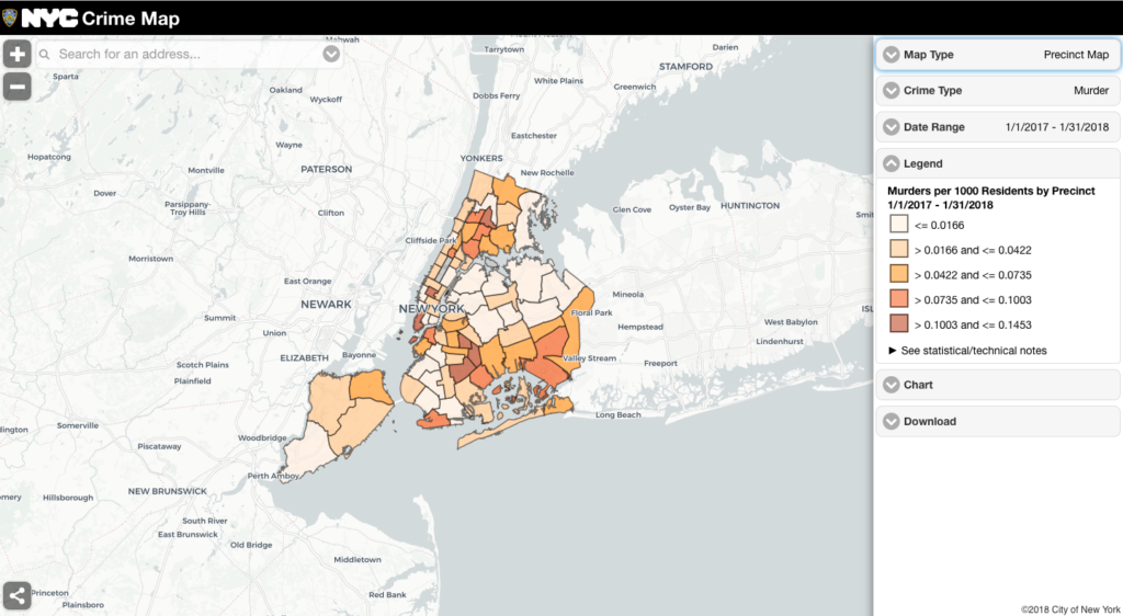
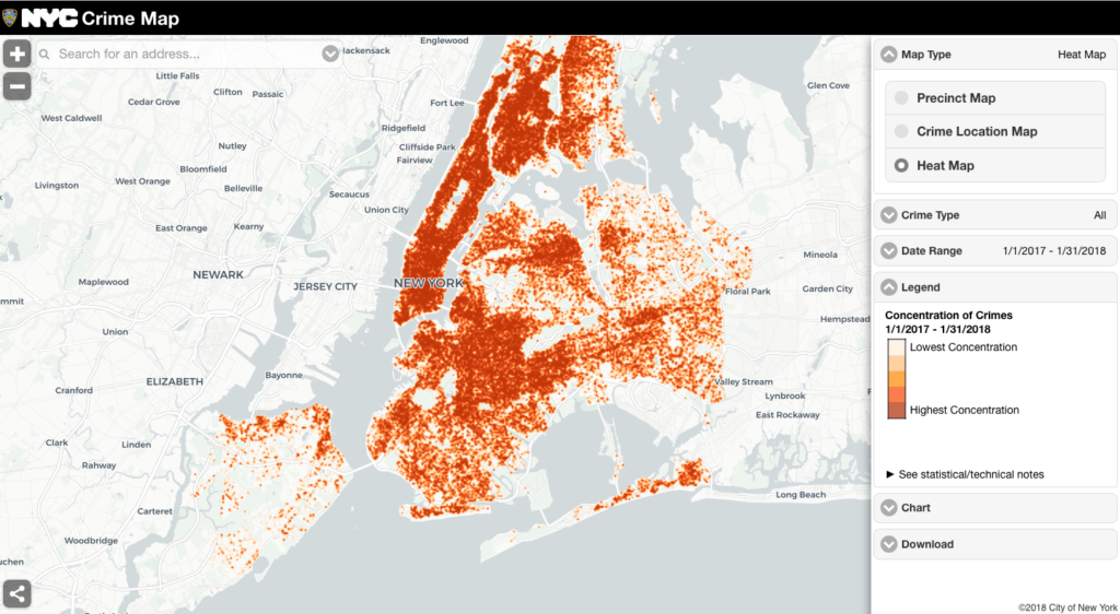
For my final visualizations I was again inspired by the NYC Crime Map, because of its depth of information and the variety of filters and ways to view the data are available. I especially like the precinct map view, and was able to create a similar visualization for my final dashboard (Figure 1). One of the more negative aspects about the NYC Crime Map is that the heat map view can be overwhelming and looses a lot of detail especially when looking at the distribution of all the felony types over a longer time period (Figure 2).

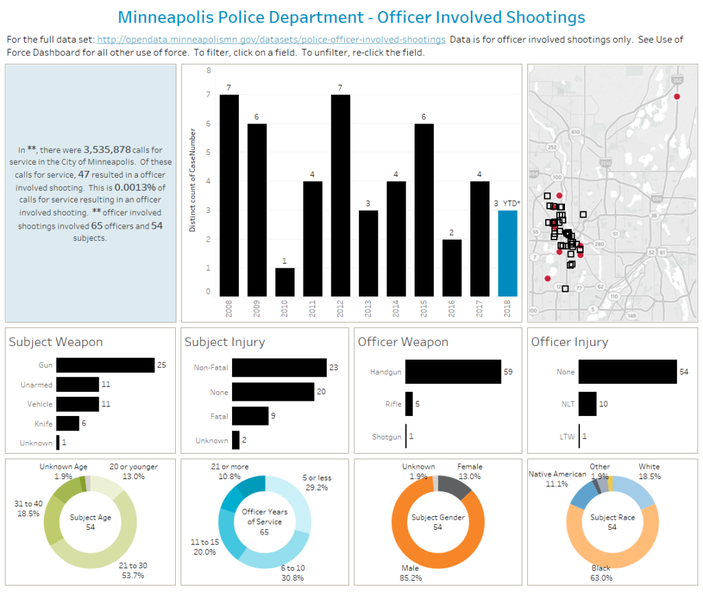
The other visualization I came across was a dashboard from the Minneapolis Police Department about officer-involved shooting incidents (Figure 3). Although this dashboard has a lot of really interesting information, because of poor visual design, it’s not immediately apparent what the major trends are or what is the difference between some of the charts. For example, because the bar charts are all the same color my first instinct was to try to compare them all together rather than weapon to weapon and injuries to injuries. However, I did like the circular visualizations of the demographic data and ended up doing a similar visualization for my race data.
Materials
- NYPD Shooting Incident Data (Historic): contains data from 2013-2017; data includes incident location, time, and victim/perpetrator data among other variables
- Police Precincts Boundaries: shape files for NYPD precincts across all five boroughs
- Tableau: data visualization software
Methods
Before I could begin creating any of my visualizations I had to first link my precincts boundaries file to my shooting incident data. Without this link I wouldn’t be able to visualize the precinct boundaries or shapes necessary to create a choropleth map demonstrating the total amount of incidents by precinct. To do this in Tableau I had to do a ‘right join’ (joining the shape file into incident data file) and match them based on a common column/variable, which was precinct number (Figure 4).
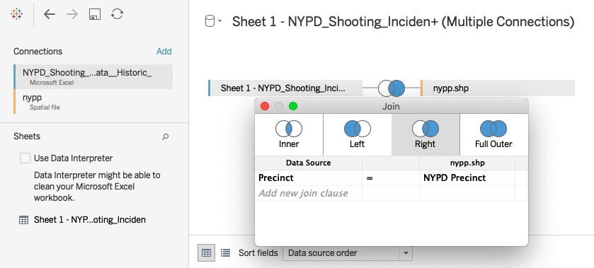
This process actually took quite a long time to get working properly as my incident data file had categorized the precinct column as ‘string’ data (i.e. nominal) and required a lot of trial and error before it could be changed into numerical data and then joined with the shape file. Once this was done however, creating the visualizations for the dashboard was fairly straightforward.
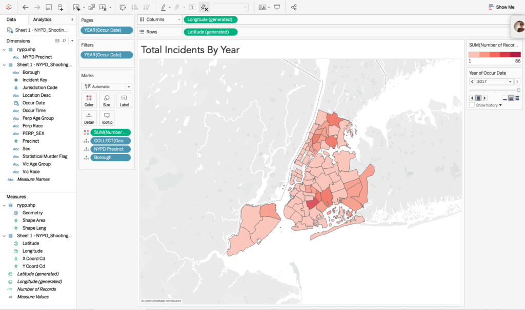
First, I created a choropleth map depicting the total incidents per precinct with the darker red precincts having more incidents and the lighter red having less (Figure 5). I also added the ‘years’ data as a pages filter so that users can see how the number of incidents and incident locations change over time.
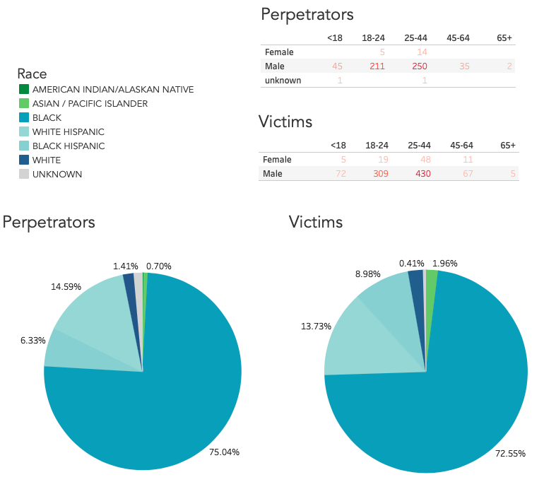
Then I began experimenting with various visualizations for the victims and perpetrators demographics. Demographics provided by the dataset including age range (<18, 18-24, 25-44, 45-64, 65+), race (American Indian/Alaskan Native, Asian/Pacific Islander, Black, Black Hispanic, White Hispanic, White and Unknown), and sex (Male, Female, Unknown). The ‘unknown’ designation is most commonly used in the case of perpetrators because unlike the victims’ identities, perpetrators may be unknown to the New York Police Department. After trying out several visualizations I decided to demonstrate the victims’ and perpetrators’ races each as a separate pie graph (Figure 6). Then I chose to represent the age ranges and sex through a table with each sex being a separate row, each column a specific age range, and each point colored a shade of red with higher numbers being dark red and lower numbers being light red (Figure 6). This table shows users total number of victims or perpetrators that fit that particular age range and race. Each of these visualizations also included the ‘years’ data as a pages filter so that users could explore the data based on a particular year rather than all of the data at once.
After I created these five visualizations, my next step was to arrange these together on a single dashboard. this involved resizing the different visualizations and choosing colors for the pie graph that were visually pleasing and not overlapping with the colors used in the choropleth map. Finally, I had to format my legends, and adjust title/label fonts and sizes.
UX Research
In order to ensure that my visualizations were usable and easy to understand, I did some user testing. My user tests involved a think aloud portion and some task observations. In the think aloud portion, users were instructed to spend a few minutes exploring the visualizations while verbalizing all of their thoughts, feelings, and reactions. The think-aloud method is one of the most widely used user experience testing methods and has several benefits including the following: it is “cheap” (no equipment is needed to use this method), provides robust data (direct user quotes), and is flexible (can be applied at any stage of development) (Nielsen, 2012). I also asked participants to feel free to ask any questions they might have or think of while going through the various visualizations. This helps me better understand if the user thinks anything is unclear or confusing. I chose to start with the think-aloud portion so that I could understand people’s initial reactions and feelings about the overall aesthetics of the dashboard and the kinds of impressions that they had about what the visualizations were attempting to convey. Following the think aloud portion I asked users to find three pieces of information:
- Which precinct has the highest number of shooting incidents in 2015?
- Looking at the visualization for perpetrators, which age range per sex had the lowest number of incidents across all the years?
- Now looking at the pie charts for victims, which 3 races were involved in the highest number of shooting incidents?
Design Rationale
Starting with the choropleth map, I wanted to use shades of red to depict the number of incidents per precinct, with higher number of incidents being the darkest shade and lower number of incidents being the lightest, because in the United States red is often associated with the meaning of danger or warning. I felt that associated meaning was appropriate and fit well with the data and story I was trying visualize. I also made this map the largest portion of my dashboard because it was the most interesting visually and was something that my users really liked and felt was important. After trying to visualize the sex/age range portion of the data in a number of ways, I settled on using a table, so that it would be easily understood and simple enough that it wouldn’t to pull too much focus from the choropleth map. I did add the same red gradient coloring just to help tie it back (visually) to the choropleth map and also to make it more visually appealing than just a monochromatic alphanumeric table of data. Finally, for the pie graphs, I wanted to use a color palate that was visually pleasing, but didn’t compete with the red gradient or contain any shades of red itself. After trying out several different combinations of colors I finally settled on a blue-green palette that doesn’t conflict with the choropleth and communicates the differences between the pie “slices” well. Originally, I had used a palette that had a wider range of colors (orange, blues, purples, green, etc.) but through user testing and my own desire to create a more attractive color scheme, I decided to go with the green-blue palette. Two things that I specifically want to point out with this color palette. First, for the white/black hispanic categories I chose to use the same blue but in different shades to represent that the two categories are really sub-divisions of a larger category (Hispanic). Second, because the race of a particular perpetrator or victim is sometimes categorized as ‘unknown’ I decided to use a light grey to represent that rather than a blue or green to further signify that this is lack of race information.
Results
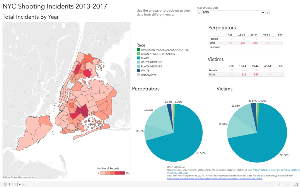
To use the dashboard interactive features go here.
From creating these visualizations and dashboard I learned that although most precincts were seeing less shooting incidents overtime, several precincts were (in Brooklyn and the Bronx specifically) always consistently higher than all others. Additionally, the demographic trends were almost totally unchanging across time. That is to say, the demographics of victims and perpetrators were fairly consistent from year to year. From this portion of the data, I was surprised that the demographics for victims/perpetrators was not only extremely similar, but overwhelmingly consisted of black males in the 18-24 and 25-44 age ranges. This particular demographic makes up almost 75% of the data for every year of data available.
From my user tests, I learned that the content of the dashboard was easily understood and the bulk of the issues were centered around aesthetics. One point that confused my users was the use/purpose of the slider bar underneath the years filter. Because users were comfortable using the arrows and dropdown menu to toggle between the years pages, it seemed that the slider was redundant and some users felt it was excessive. The other thing that confused users was what the colors used in the pie graphs meant. Originally, I had positioned the legend to be on the far left and floating higher above the circle graphs. Following this feedback I repositioned the legend in the middle of the dashboard so users wouldn’t miss it and moved it closer to the graphs so it was easy to recognized that these two things go together. Other issues surrounding aesthetics involved adjusting the size of the map to be bigger and to be more of a focal point for the dashboard, and to create a more pleasing palette for the pie graphs.
Recommendations
If I were to continue with this project I would recommend adding in population and socioeconomic data for a more robust analysis and to provide more context for users. Additionally, I would combine the perpetrator and victim demographic data so it could be visualized together in single charts, rather than having to create individual charts for each type of data every time. This would allow for easier direct comparison, filtering by victim/perpetrator, or possible different ways of visualizing this information.
References
Nielsen, J. (2012). Think Aloud: The# 1 Usability Tool. [Web log post]. Retrieved from https://www.nngroup.com/articles/thinking-aloud-the-1-usability-tool/.
The post NYC Shooting Incident Data 2013-2017 appeared first on Information Visualization.