San Francisco’s Restaurant Inspection
November 30, 2018 - All
Introduction
San Francisco is famous for its restaurants and food trends. Along with its iconic Golden Gate Bridge, scenic streets, and booming culture, one of it’s main attraction is food. Often times, important housekeeping things may be overlooked in the food industry in the fast paced modern culture. To keep the food quality healthy and safe and to keep the restaurants and food handlers accountable, the Health Department has developed an inspection report and scoring system. These inspections may be unscheduled or planned. After an inspection of the facility, the Health Inspector calculates a score based on the violations observed. Violations can fall into high, moderate, and low risk categories. High risk category records specific violations that directly relate to the transmission of food-borne illnesses, the adulteration of food products and the contamination of food-contact surfaces. Moderate risk category records specific violations that are of a moderate risk to the public health and safety Low risk category records violations that are low risk or have no immediate risk to the public health and safety. Once a score is give, the score card will be issued by the inspector and is maintained at the food establishment, available to the public in this dataset. San Francisco’s LIVES restaurant inspection data leverages the LIVES Flattened Schema (https://goo.gl/c3nNvr), which is based on LIVES version 2.0, cited on Yelp’s website (http://www.yelp.com/healthscores).
The dataset used to create this map is an open data set, updated daily, hosted by the city of San Francisco.
Inspiration
I was inspired by “My Bookmarks” section on yelp.com. It’s a tab where all of the places I bookmarked can be viewed. The page shows in two formats: list and map. The list gives quick glanceable access to the information about the restaurant and the map form shows an easy view of where the bookmarked place is located.
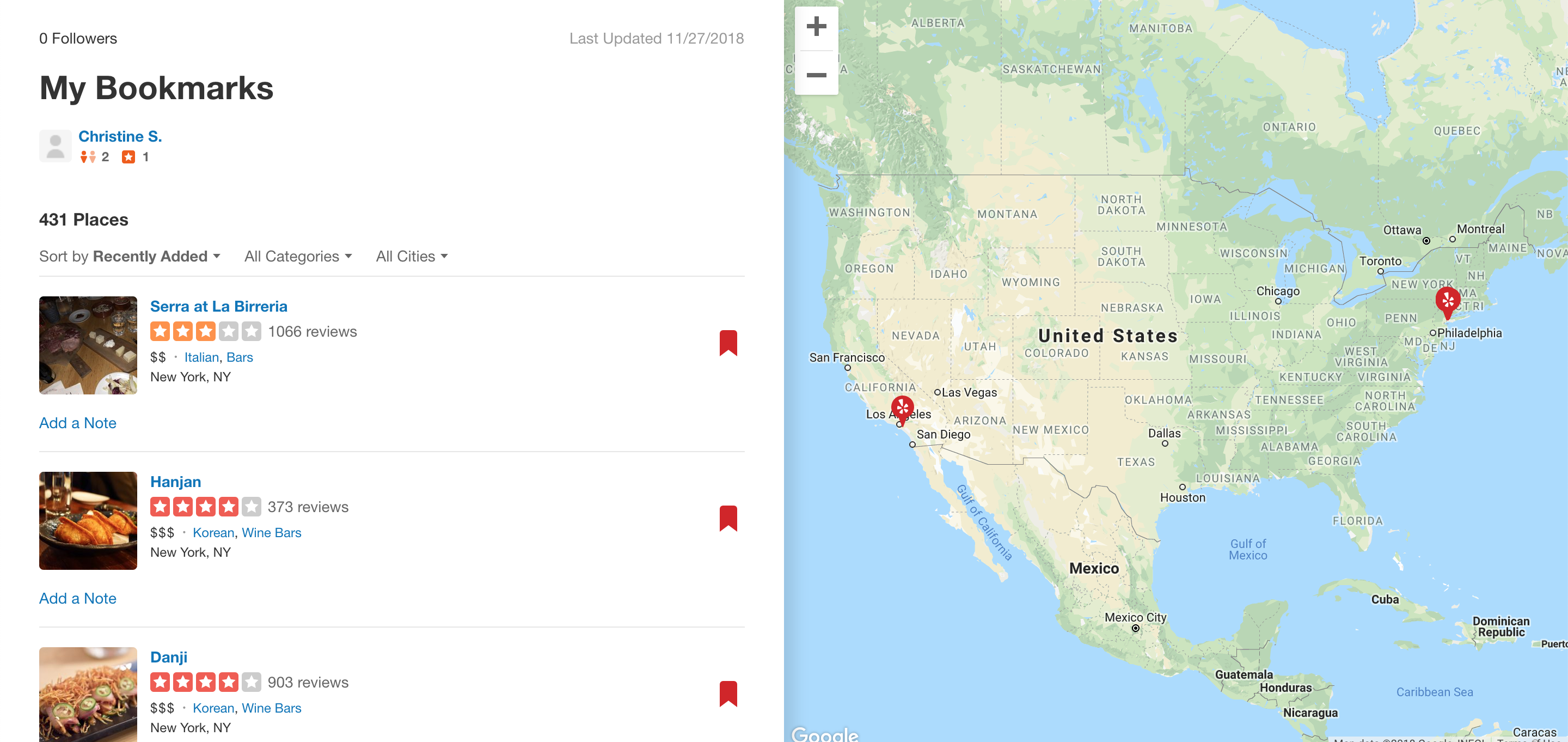
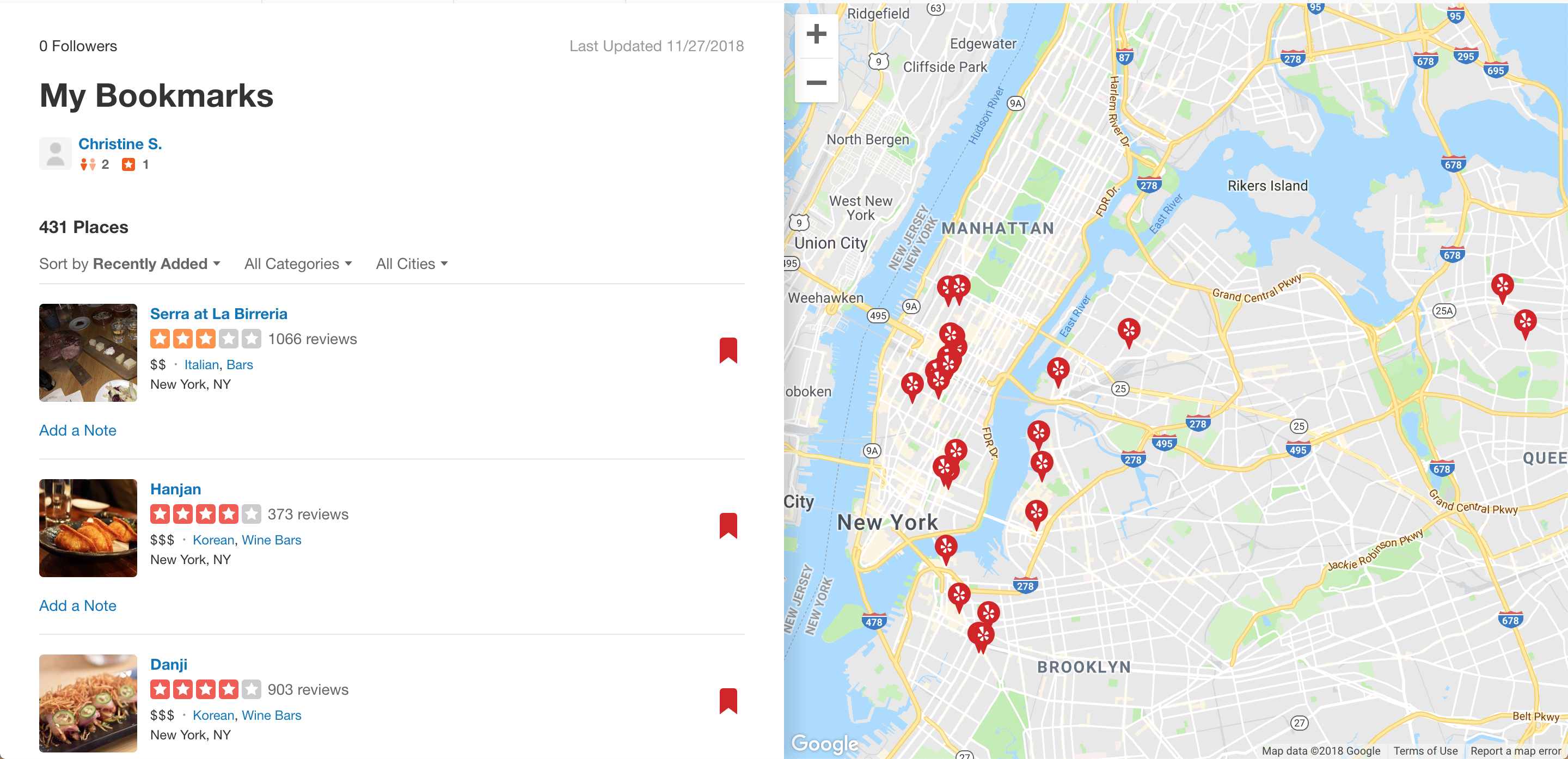
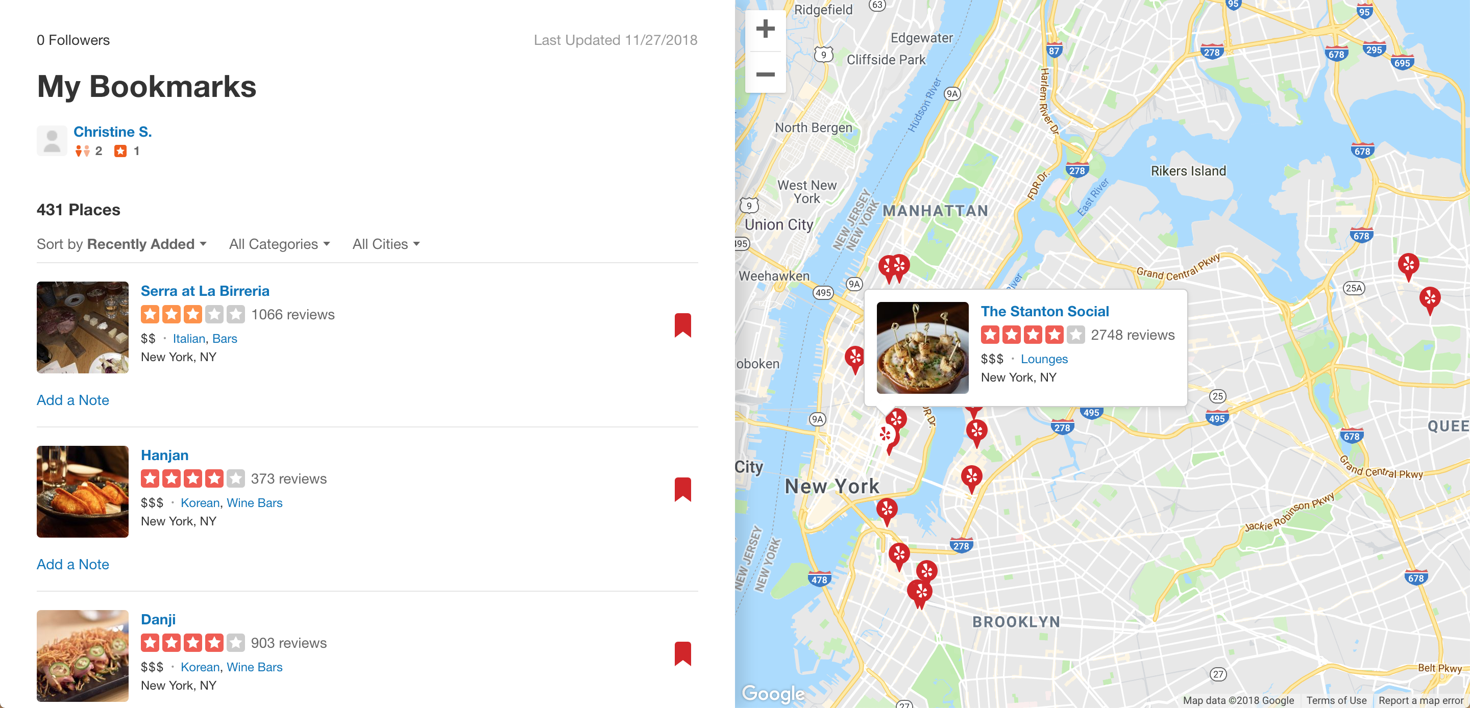
This section of Yelp is useful in seeing my Bookmarked places and quickly understand where it is in the area. However, in order to look into more information, I had to click into the restaurant’s page and scroll around. One important information about the restaurant that is missing in the first glance view is the restaurant’s score according to the health department. The score would indicate the cleanliness or if the restaurant abides by the rules set by the health department for best practices in handling food. This inspired me to look further into creating a map where the restaurants’ score, list of violations, and risk category can be viewed as easily as Yelp shows users’ ratings.
Materials
CartoDB: a Software as a Service cloud computing platform that provides GIS and web mapping tools for display in a web browser (Wikipedia, CartoDB)
Kraggle: a is an online community of data scientists and machine learners, owned by Google (Wikipedia, Kraggle)
Methods
I went to kraggle.com to find my data set. Within the data set, I was able to access what kind of information was in the dataset. In order to create a map, it is important to find a data with latitude and longitude data.
The .csv data file was downloaded and inputted into the data section of Carto as “New Dataset.” Once the dataset was connected into Carto, I was able to create a map. Initially no information was shown on the map. The parameters needed to be defined where longitude was read as longitude and same for latitude. Once the parameters were set correctly, data populated onto the map.
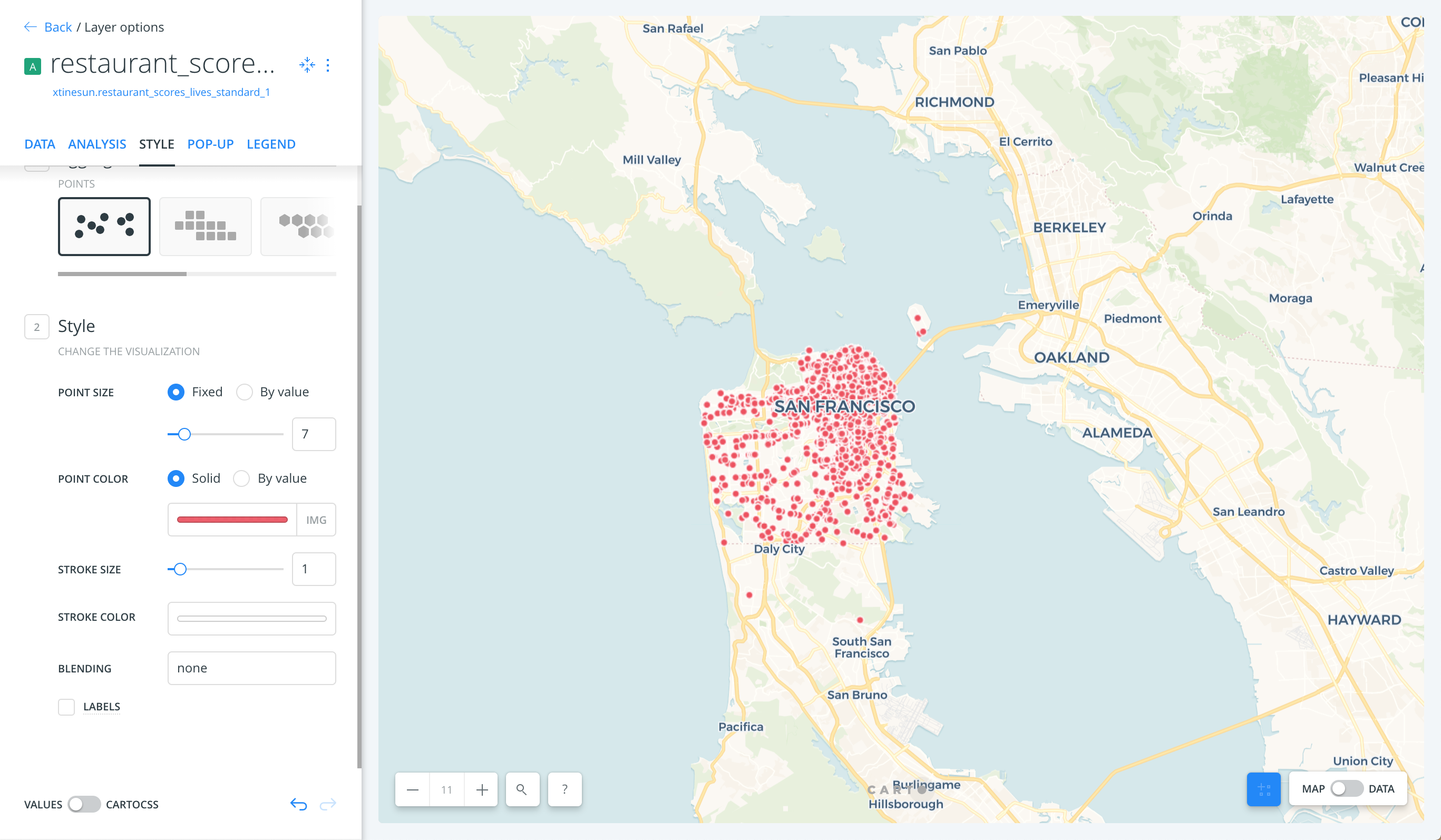
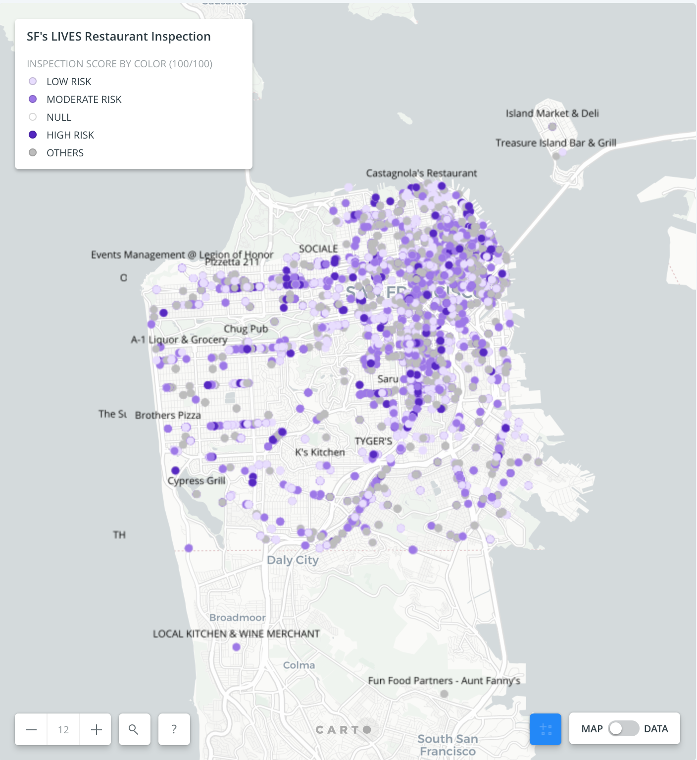
The style of the points were then edited to be more visible and to show more than the point of location. I wanted color to indicate the risk category for a quick comprehension of how the restaurants are generally rated in the region.
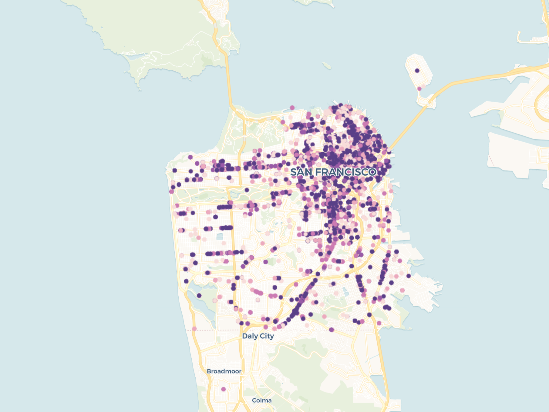
Then I went in to include the names of the restaurants so that the dots themselves gave more information without looking further.
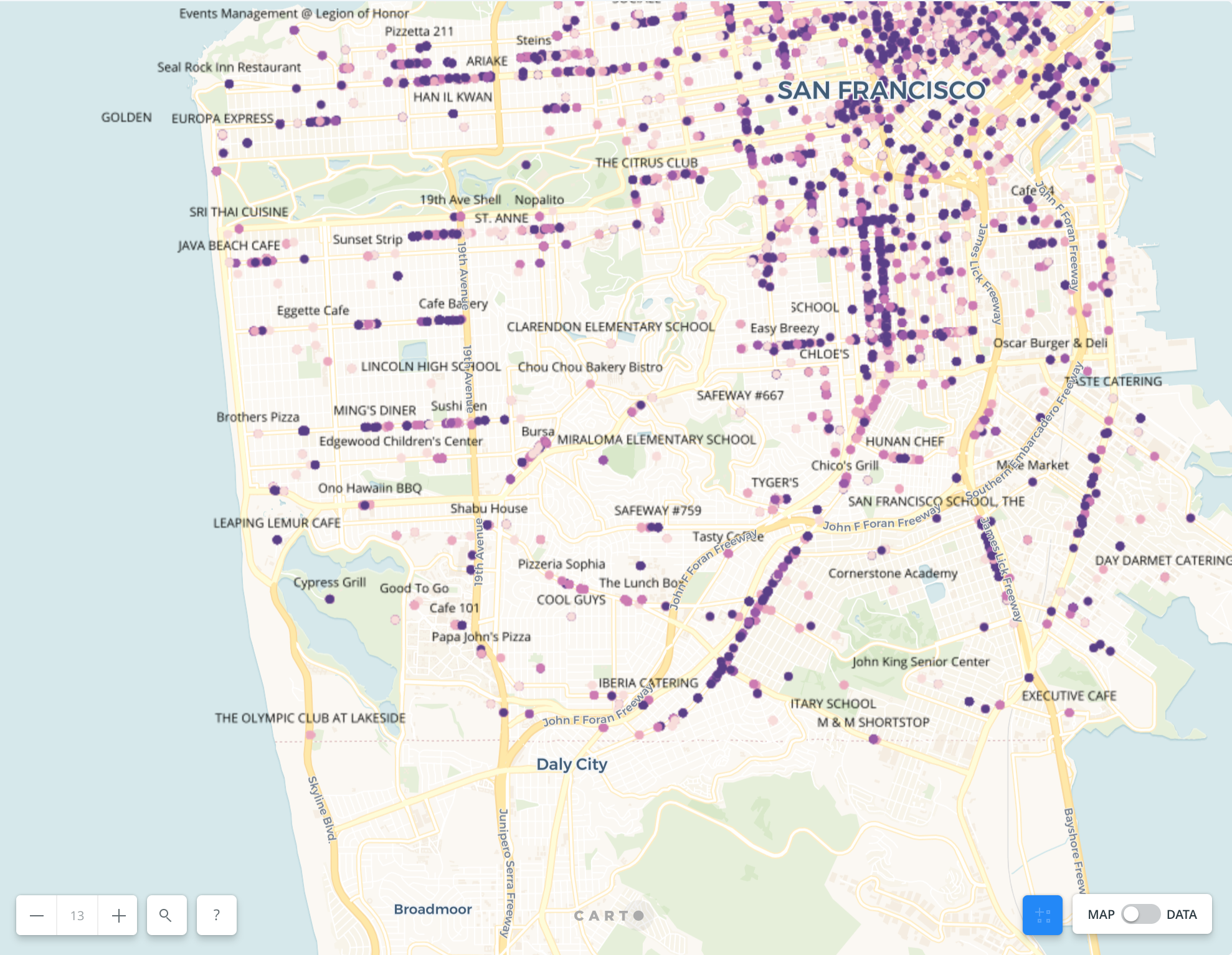
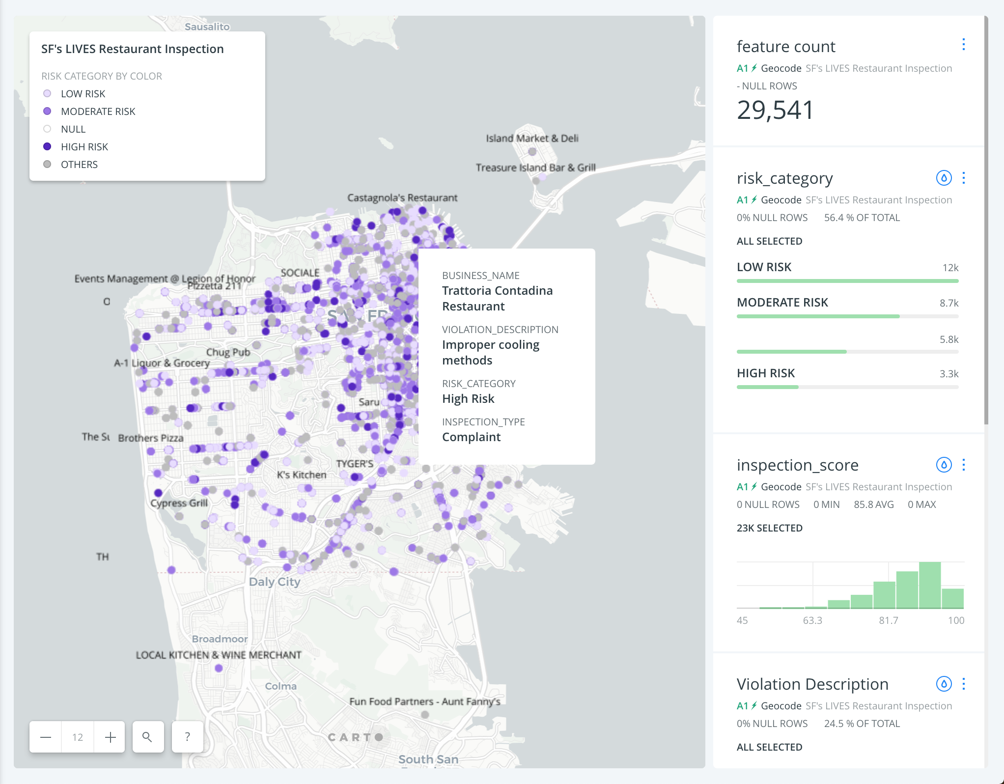
I then changed the style of the map to make the dots and information more prominent. Hover was added so that once the mouse hovered on the dot, the viewer is able get the business name, inspection score (out of 100, 100 being the perfect score), violation description, risk category, and inspection type.
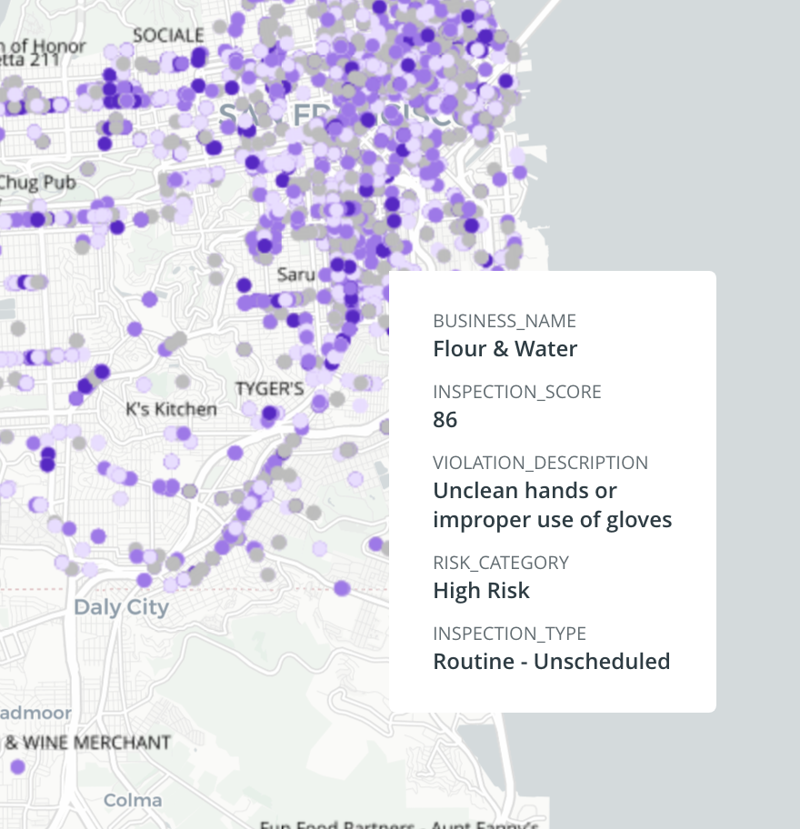
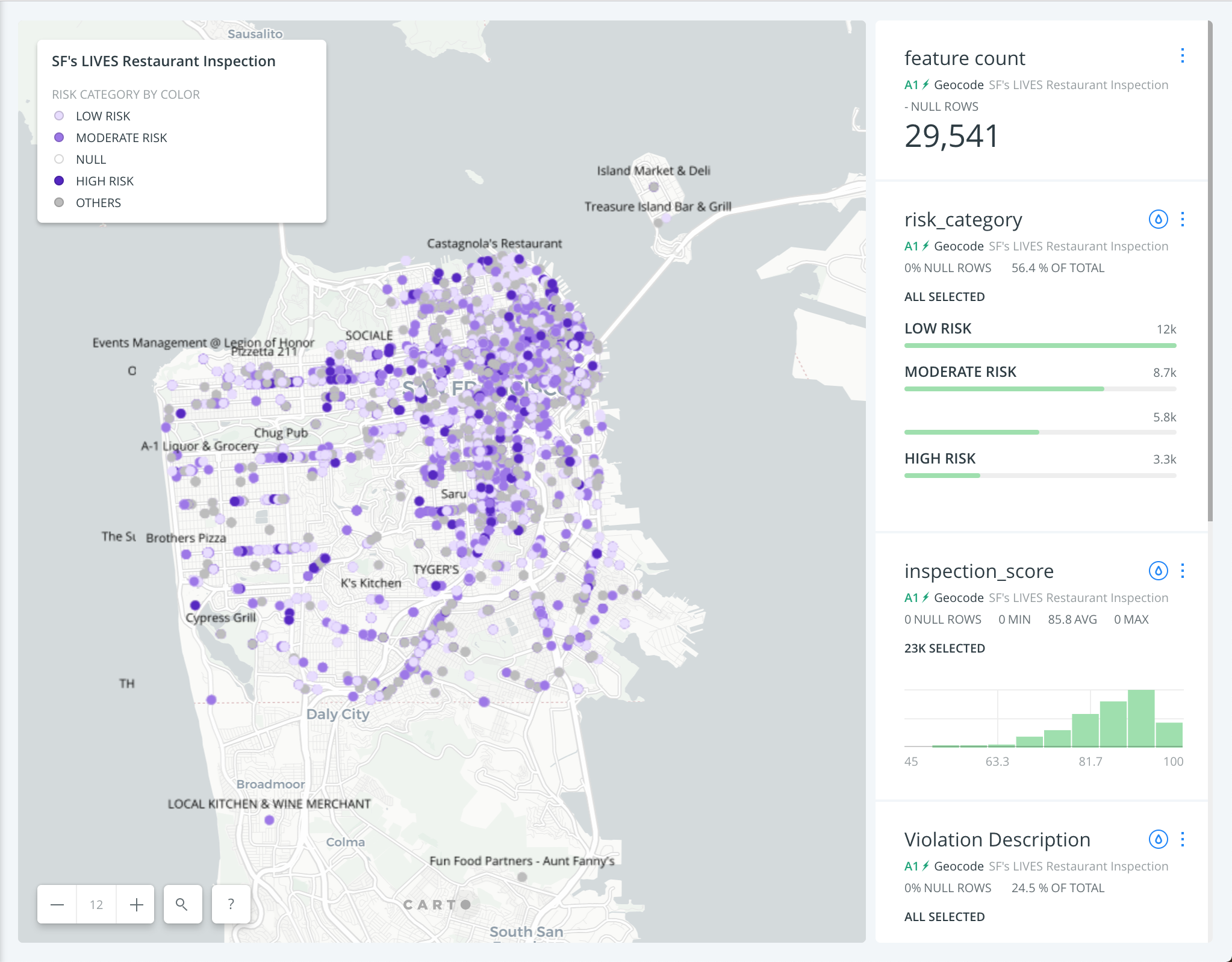
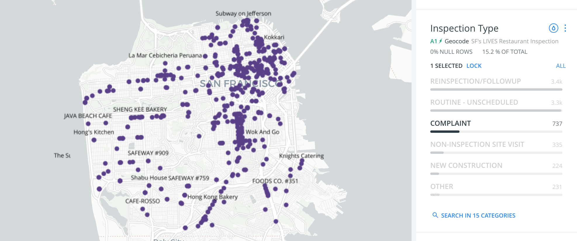
Then a legend was added to show what the color scaled indicated. Lastly, widgets were added that analyzed data as a whole to show overall how San Francisco’s restaurant is doing according to the health department. Clicking onto the widget allows the ability to solely view the specific restaurants that fall in the category.

Results and Interpretations
Mapping out SF’s LIVES restaurant risk category, scores, and violations allows the viewers to quickly see the score of the restaurants and its violations.These informations may help educate the customers of the restaurants’ conditions and what is being violated. The restaurant should not be judged by the few times it is scored but the overtime score of the restaurants would be telling of how well the restaurant is following of the health codes.
The conditions of the restaurants in San Francisco range from low to high risk but overall, most inspections are categorized to the low risk and the average of the scores lay in the 90’s.
Reflection
The information mapped is very interesting and informative. However, these information alone would not be telling the full story. I believe that this map would be more useful if it was incorporated with data that was qualitative and reflecting of people that have eaten at the restaurant. It would be would be very interesting to incorporate this information with yelp data on users’ reviews, ratings, cost of the food, etc.
Along with incorporating Yelp’s data into this map, the next step I would like to take is mapping out scores and risk categories of these restaurants from over a span of time to see how they have changed. This would help get a fuller view on the restaurant’s’ scores and whether or not they have been improving their conditions.
The post San Francisco’s Restaurant Inspection appeared first on Information Visualization.

