Distribution of Cultural Related Institutions in New York City
November 30, 2018 - All

Introduction
In the earlier assignment, I used Tableau Public tool to visualized the museums and related Organizations in the United States. As the student of Museums and Digital Culture program, at the same time, as I mentioned earlier, in the consideration of that museum undertaking the huge responsibility in our society, I would love to expend my visualization skills in the same field and refine my spatial data part in last assignment.
Inspiration
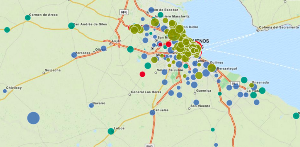
At the beginning of the assignment, I went to the Carto gallery to search for visual examples. My first inspiration is Mapping the Monetary Contributions to Argentinian Elections which created by Andy Tow. He used “points aggregation” style and color scheme to present the different type of data in his mapping result, as well as the size of the dot to show the number.
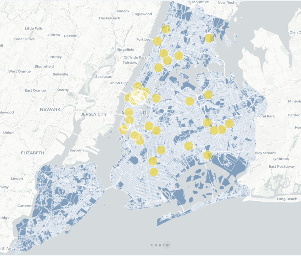
Another inspiration I got was from the sample that shared with us in Carto dashboard. This example also used “point aggregation” style. At the same time, I appreciate the simple color and color contrast in this example. However, I don’t think the color scheme suit for my database.
Materials
- Carto: a Software as a Service (SaaS) cloud computing platform that provides GIS and web mapping tools for display in a web browser.
- OpenRefine: a free and open source tool that helps users to explore, clean and transform large sets of data.
- Enigma Public: is an operational data management and intelligence company that specializes in data analytics and connected data.
- Institute of Museum and Library Service—Museum Universe Data File: where I found my target worksheet. This worksheet includes basic information on aquariums, arboretums, botanical gardens, art museums, children’s museums, general museums, historic houses and sites, history museums, nature centers, natural history and anthropology museums, planetariums, science and technology centers, specialized museums, and zoos. The initial data collection occurred in 2013 from Institute of Museum of Library Services administrative records for discretionary grant recipients, IRS (Internal Revenue Service) records for tax-exempt organizations and the recipients of grants from private foundations.
Methods
My worksheet was found in Enigma Public database which has 33,072 rows and 49 fields, and I used OpenRefine to clean the data. In this assignment, I only used 5 critical metrics to visualize which including Museum name, discipline code, longitude and latitude, as well as income. To see the database, check out the original worksheet in Enigma Public. After refining the database, and before my visualization, I decided to show my final result mainly base on the discipline code and income.
Results
In my Carto result, I employed “Point Aggeration” to present the museum and related institution in New York City and support it with “Heatmap” for the museum distribution in the United States.
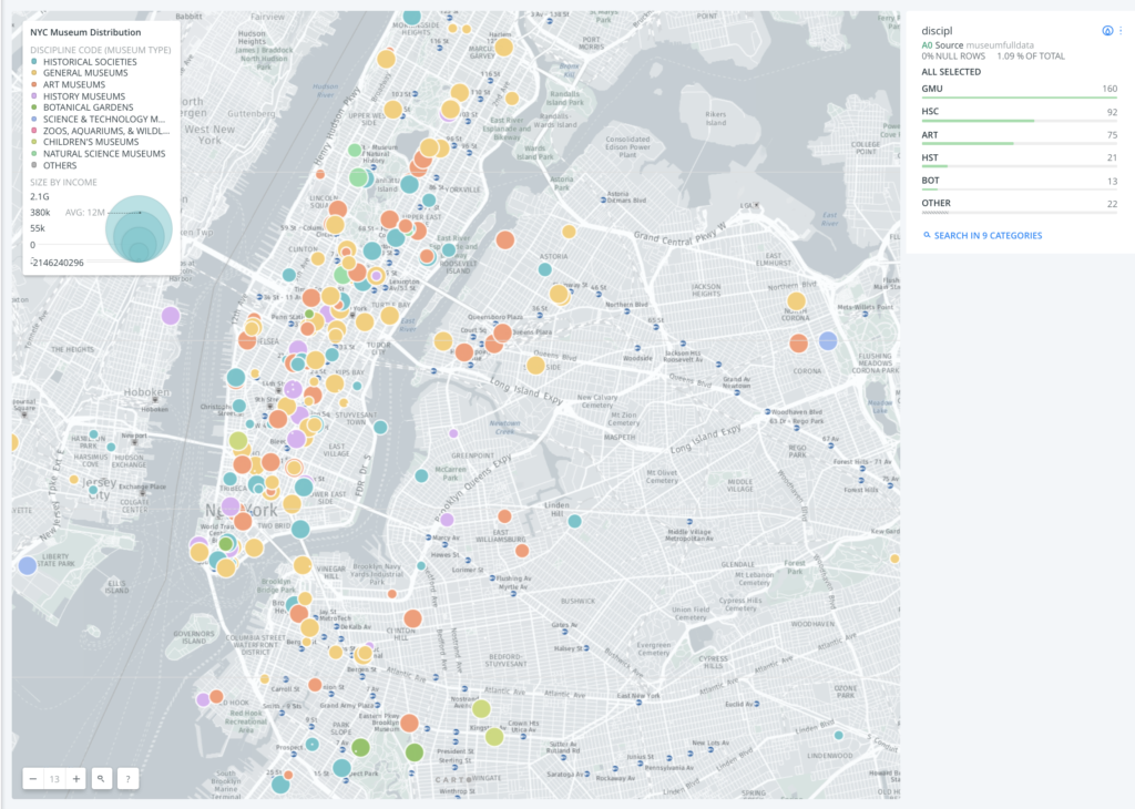
In my point aggregation map, I used the color scheme to present 10 types of cultural organization. These discipline codes representing: ART – Art Museum; BOT – Arboretums, Botanical Gardens & Nature Centers; CMU – Children’s Museums; GMU – Uncategorized or General Museums; HSC – Historical Societies, Historic Preservation; HST – History Museums; NAT – Natural History & Natural Science Museums; SCI – Science & Technology Museums & Planetariums; ZAW – Zoos, Aquariums, & Wildlife Conservation.
At the same time, I arrange the point size by income value and the size range is 2 to 45. The larger the point size, the bigger the income for that museum. I intend to let the audience generate a visual idea about how many profitable museums in the NYC.
Moreover, I added a weight of discipline code. From this weight, we can calculate the total number of different type of the museum in a certain area on the map. We can see that in New York City, the general museum got the largest number, then is the art museum and historical societies.
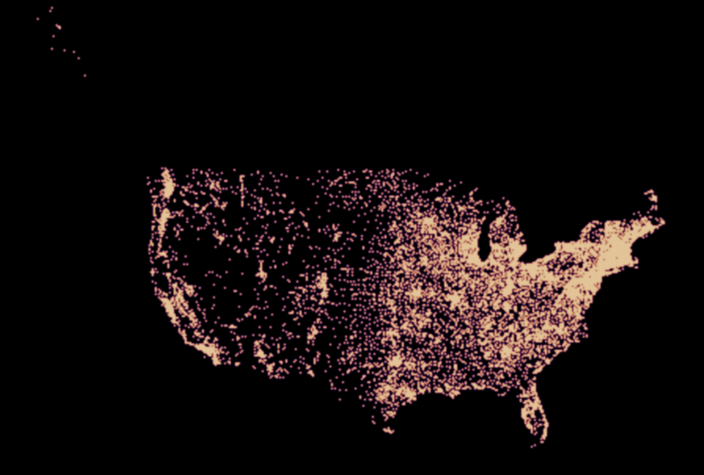
I also created a Heatmap for the distribution of the United States, in order to improve my heatmap result in the earlier assignment. From this heatmap, we can see most museum located in NY, MA, CA, TX and FL.
Reflections
Carto is a really powerful tool to visualize the spatial data. It provides multiple choices for map style and extracts precise data from my dataset. However, like all the tools, it has its own limitations and flaws. Firstly, I can’t re-do my changes if I can’t remember my previous move. This is really hard for me to control the perfect result because I want to experiment different style in the software. Secondly, I can’t edit the discipline codes’ name in weight like what I did in the legend title. This makes context inconsistency in my final result. Thirdly, the maximum size of the point is 45, so I can’t accurately present the contrast of the income by point size.
If I can expend this assignment, I will choose to refine the income number in my dataset into a certain range. If I can categorize the point size into 10 to 20, the audience will easily get the visual idea about the income contrast between different museums.
The post Distribution of Cultural Related Institutions in New York City appeared first on Information Visualization.