Flood risk in NYC: the areas & subways most at risk, and the effectiveness of the FEMA models
November 17, 2018 - All
Introduction
In August of 2017, Hurricane Harvey hit the Houston, Texas area with immense impact, causing widespread devastation and unexpected flooding. Compound this with the fact that in 2015 and 2016, two other “500-year” storms hit the Houston area, and we’re faced with the fact that an area that FEMA has deemed to be unlikely to receive that level of flooding even once in a 500-year period has been hit three times over. (Lind, 2017) And Houston is not alone. Recent hurricanes like Sandy and Maria show that storms are flooding areas in the U.S. more frequently and more devastatingly than in years past.
Climate change certainly has a large part to play in the frequency and strength of the storms we’re seeing. But I also question whether city planning and prevention efforts are working effectively to protect citizens as much as possible when these storms do indeed hit. This is where FEMA’s 100-year and 500-year flood plans come into play.
A quick primer for those unfamiliar with how these models are calculated: because we don’t have hundreds of years of flood data, and because flood data is not recorded evenly throughout the U.S., calculating future floods comes down to probability. These probabilities by FEMA consider the prevention measures an area has implemented as well as details like elevation, annual rainfall, and more. An area designated to be in the 500-year flood plain therefore represents a 1/500 (.2% chance) that a flood will strike an area each year. A 100-year flood plain would represent a greater risk at 1/100 or a 1% chance of a flood each year. With this data in mind, cities can plan for protection and evacuation measures. This could certainly include advising (or mandating) residents of these areas to purchase flood insurance.
For this lab, I chose to review FEMA flood plain data for the NYC area, to better understand what areas of the city are most at risk, what subway transportation would be most affected in the event of a 100- or 500-year flood, and whether the damage from Hurricane Sandy matched up with the FEMA flood plains. I had a few reasons for tackling this information:
- Through these lenses, I could theoretically understand whether Sandy’s damage was out of the bounds of a 100 year or 500-year flood plan. If Sandy’s flooding was within the bounds of FEMA data, it would mean that the FEMA models are fairly accurate in capturing storm flood levels.
- Should the FEMA models be fairly accurate, they would be able to inform NYC residents of whether their area of residency or local transportation lines would likely be affected in the event of a 100- or 500-year flood.
Inspiration
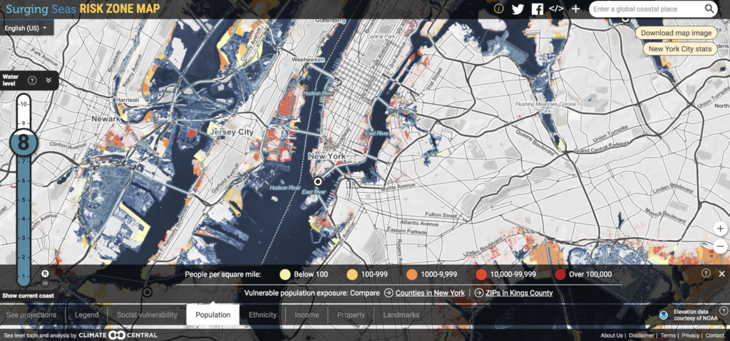
As I investigated potential design inspirations, I particularly liked Climate Central’s Surging Seas Risk Zone Map. This interactive map allows the user to view an area of the United States and toggle variables to understand their impact on flood zones. For instance, users may select a scenario of “unchecked pollution,” raise the water level by a level of 6 meters, and then see the impact that creates on the area by ethnicity, income, population, and even property value. These are just some of the options available to play with. The engagement that this creates with the data is phenomenal, inviting users to create different scenarios to understand environmental impact. However, I do think this experience could be stronger by inserting some annotations or suggested variable configurations to create a narrative walkthrough of the variables and their impact.
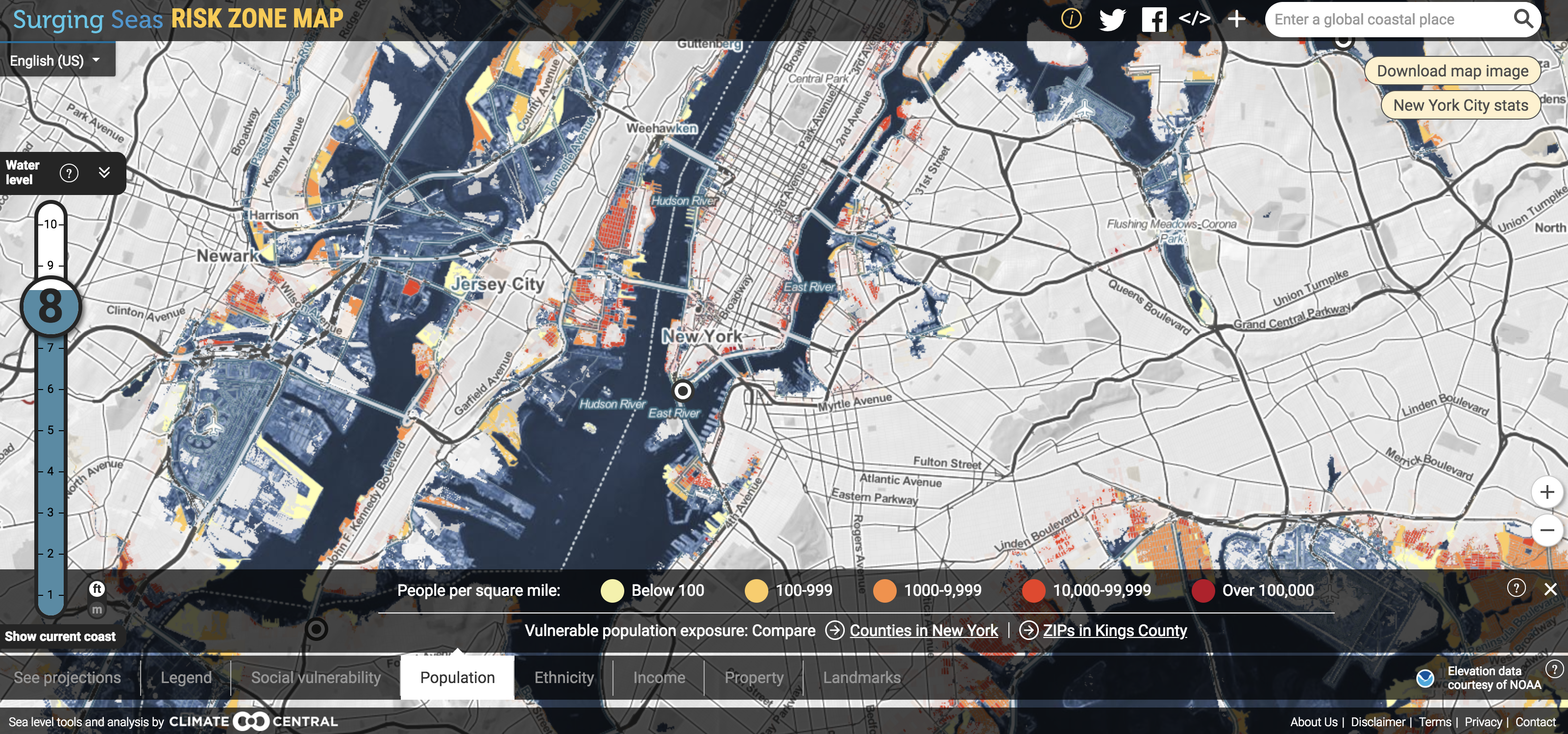
Figure 1: Climate Central’s Surging Seas Risk Zone Map
I also really liked AIR Worldwide’s map of the Hurricane Harvey flood zones. It shows the areas impacted by the storm, and provides a handy legend to help the user understand the flood depths by location, as well as a population overlay. The overall concept is strong but the execution leaves a bit to be desired in that the flood zone degrees are too similar in color to make strong differentiations, visually. I also would have wanted to see a bit more detail on the population variable – how are they determining what a populated area is? How can we see which areas are most dense and therefore most displaced by the damage? That is unclear. That being said, I like the idea of showing a more static map that reflects damage as compared with factors like population.
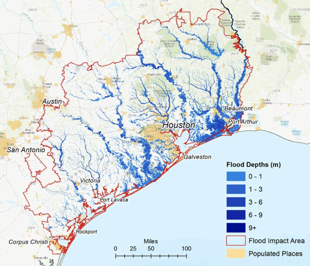
Figure 2: AIR Worldwide’s Hurricane Harvey flood map
Materials
To create my visualizations, I used geoJSON datasets from NYC’s Open Data website. These are publicly available:
- Sea Level Rise Maps (2020s 100-year Floodplain)
- Sea Level Rise Maps (2020s 500-year Floodplain)
- Hurricane Sandy Inundation Zone
- NYC Subway Stations
- NYC Subway Lines
Carto, a SaaS platform for analyzing location data, was used to create the visualizations.
Methods
“Subways Affected by Flood” Map: I began by adding the 100-year and 500-year flood data to a single map to understand how they related. While I initially had 100-year and 500-year flood data as light blue and dark blue, respectively, I thought this made them too hard to differentiate, so I changed the 100-year flood data to green. In this way, the user could toggle the layers to see either or both of the floodplain datasets at a given time and compare them using color.
I then layered in the subway lines dataset to add further detail and understand which subway lines would be most affected by each type of flood event. I quickly realized that this dataset did not contain detail about each line’s train types – instead, it was simply a set of lines that reflect the layout of the system. Therefore, I knew I had to gather subway station data so that users could understand which lines in particular would be affected. I colored the subway station dots to be assigned by the “line” column, reflecting the subway train type that uses that line (e.g. A trains, D trains). This helped, but because the dataset mixes multiple trains lines in one cell of data if that station has multiple lines of service, I also wanted to add a pop-up on each station to allow someone to click on the station to see exactly what station and lines are being serviced at that point. Lastly, I made all the subway lines one dark color, in order to connect the subway stations without adding more unnecessary visual clutter.
Lastly, I changed the basemap to “Here Reduced Day” in order to have most of the detail of the map fade into the background and reduce visual clutter even further. And, I reordered the datasets in the Carto layout to ensure that the subway stations and lines were at the forefront, the 100-year data was next, and the 500-year data was at the very back, in order to create a static layout that made sense for the narrative being told.
Hurricane Sandy Inundation Map: For this map, I first imported the 100-year and 500-year flood data once again, and ensured the colors matched the colors I used for each dataset on the first map. I then imported the Sandy data, and made this an orange color to create differentiation.
In this map, it was most important to see what areas were affected by Sandy but NOT covered by the 100 year or 500-year data, and so I placed the Sandy inundation layer to the back on top of the basemap (which was the same as above – Here Reduced Day). In this way, the user could easily how much or how little was projected in the FEMA probabilities.
NOTE: In both maps, I created a Layer Selector tool to allow users to toggle on/off the various floodplain data in order to see how flood severity would impact subways and how it compared to Sandy’s actual flood output.
Results
CARTO visualization: Subways Affected by Flood Map
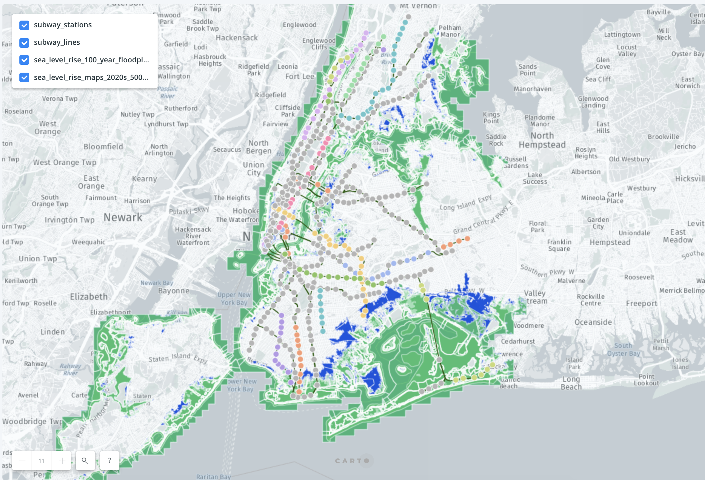
Figure 3: CARTO visualization of Flood Plain and Subway Data
As we look at the results of this map, there are many subway lines that stand out as being the impacted by a 100-year flood. These are: the 6 Express line in the Bronx, the 1-2 and A-C-E lines around Canal Street and lower Manhattan in the FiDi area, and the F-Q-D lines in the Sheepshead Bay area of Brooklyn, and the A and S lines in the Howard Beach / Jamaica Bay, Broad Channel area. The three hardest hit areas in terms of subway and land flooding are the Broad Channel area, which is completely inundated, lower Manhattan, and northern Queens. As we toggle the map to reflect 500-year flood data, we see even greater risk, as you might expect, namely in the Bronx and south Brooklyn regions near Jamaica Bay.
CARTO visualization: Hurricane Sandy Inundation Map
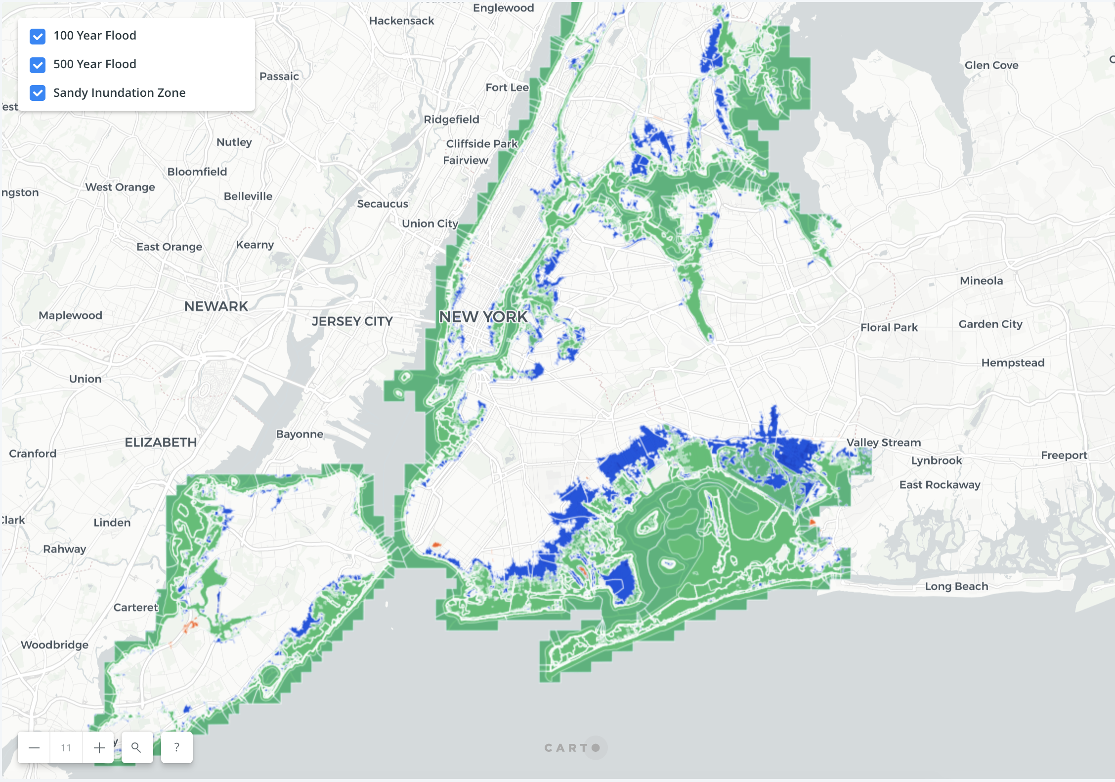
Figure 4: CARTO map of flood plain data & Hurricane Sandy flood data
As we compare Sandy data to the 100-year flood data, we see that the 100-year flood data largely captured the area of damage of Sandy. There are some pockets of orange (Sandy data) around Southern Brooklyn, which in general seems to be a very risk-prone area for flooding (great to know for flood insurance and protection purposes). The western coast of Staten Island also has a few areas of Sandy damage that this 100-year model did not predict, but by and large the 100-year model predicted most of what might happen in Manhattan, the Bronx, and Queens. As we transition to viewing the 500-year data, we see that most of the Sandy inundation zones are now covered by this model. However, inland Western Staten Island is again an issue, perhaps reflecting poor drainage or flatlands in this area. We also see that a park near Bensonhurst was hit hard and was not captured in the FEMA model. Comparing these, it may be safe to say that Sandy was a 500-year storm and that the model captured it fairly well.
Future Thoughts
While the two FEMA models capture with decent accuracy the areas that may flood based on storm severity, I would still question the labelling of a 500-year flood. Is it truly a 500-year flood or might it be an unfortunately more likely scenario than .2% chance/year? Only looking at storm data over a time series would be able to lend this question more insight.
Overlaying a topographic map with elevation would have been very interesting to see as well. It may explain that region of inland Staten Island that experienced issues during Sandy although it was not captured by the FEMA flood models.
It would also be very interesting to overlay data around flood insured properties here. I think this would really get at the meat of my original question around using FEMA models to plan appropriately for the event of a major event (which seem to be happening more often). Which areas have the most flood insurance protections? Do they match up with the riskiest areas to live? (Southern Brooklyn, Broad Channel, Northern Queens, Eastern Bronx, Western Staten Island?)
Lastly, I’d really like to see dam, flood walls, and other flood prevention structures that NYC has implemented. Are the flood damages at all preventable by implementing more or better structures throughout NYC?
Working with CARTO was very interesting, and fairly easy to work with, but I think to get at some more meaty answers, other datasets like the ones above would have to enter the picture.
Sources:
Lind, D. (2017, August 28). The “500-year” flood, explained: why Houston was so underprepared for Hurricane Harvey. Vox. Retrieved from https://www.vox.com/science-and-health/2017/8/28/16211392/100-500-year-flood-meaning
The post Flood risk in NYC: the areas & subways most at risk, and the effectiveness of the FEMA models appeared first on Information Visualization.