Connection between Rank of Happiness and other Factors
October 12, 2018 - All
Introduction
“Happiness” is a worldwide popular topic, especially for people like me, who is from a high-speed developing country like China, people there have too many things to care about, too much competitive pressure, family pressure on our daily life, we rarely have time to deeply think about “What’s happiness? What can help me create a happier life?”. So I would like to take this project as an opportunity to take a deeper look at this topic.
To see the final visualizations, check out my visualization dashboard on Tableau Public.
Inspiration
By searching “top happiest country”, I found that 70% of the top 10 are Europe countries. These are the top 10 happiest countries in the world It made me curious about what makes residents in those countries so happy and I also curious about what makes people less happy in countries ranked low. Looking at the chart my by “World Economic Forum”, I noticed there are relationships between Happiness Rank with Economic, Social Supports etc, so decided to visualize each relationship on my chart. The data I found on Kaggle includes elements as Health Scores, Economy, Family, Freedom, Trust(Government Corruption) and Happiness Rank & Score.
Materials
The dataset used in this project was the Happiness Report, downloaded from Kaggle Dataset After some cleanup, I then used Tableau Public to make the visualizations.
- Kaggle Dataset: where I found my target data. This datasheet includes elements: Health Scores, Economy, Family, Freedom, Trust(Government Corruption) and Happiness Rank & Score from 2015-2017.
- Tableau Public: It is a platform that enables users to make multiple types of visualizations, dashboard creation, publishing to the web, and embedding into web pages.
Results and Interpretations
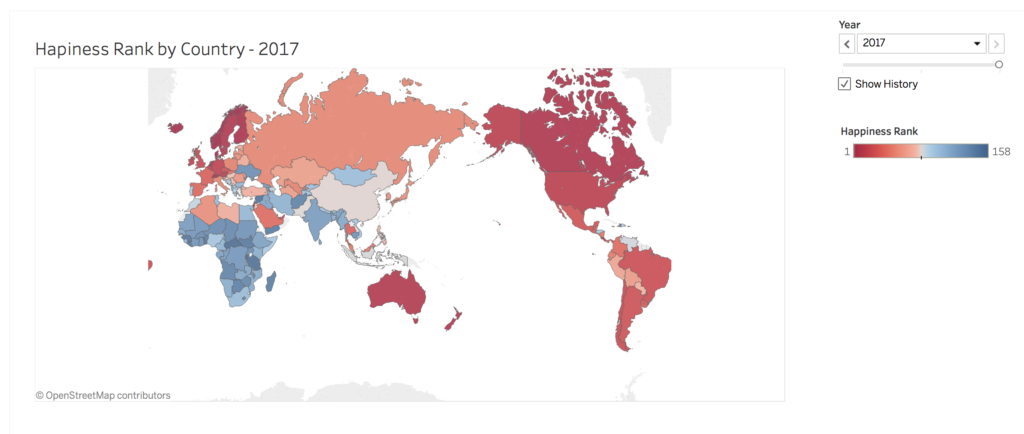
 Figure 1
This is the heatmap of happiness rank in the world (Figure1). Red indicates higher ranking, blue is opposite. It is clear to see that top-ranked countries are mostly from continents like Europe, North America, and Oceania. Africa is the least happy region and followed by South Asia. It looks like people in developed countries are happier.
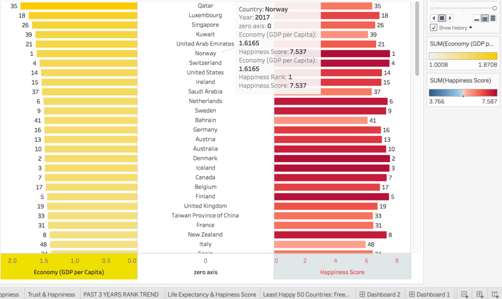 Figure 2.
On figure 2, I set GDP 1-1.87 per Capita as the comparison range, and I made a butterfly chart to see the connection between Economy and Happiness Scores, I also set a “pages” function to divide data of 2015, 2016, 2017.
It is interesting to see that the happiest country of 2017– Norway is indeed rich, although it’s not ranked on the very first. The richest country Qatar has a ranking as the 35th happiest country in the world, it is still a relatively great grade among 158 countries in the world. And among these 50 richest countries, the lowest grade of the happiest country is Italy, which is located on 48th–still in the top 50.
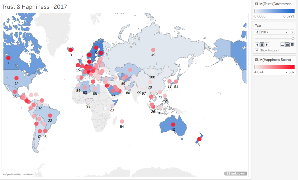 Figure 3.
Then I moved to look for connections between Trust (Government Corruption) and Happiness (Figure 3).
Darker blue indicates the higher score of trust, brighter blue means less trust. And darker red indicates the higher score of happiness, vice versa. It is clear to see that these two elements are closely related. Countries have a higher score of trust mostly have the higher score of happiness.
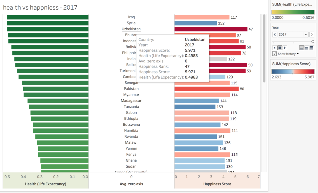
Figure 4
Then I looked at another popular topic Health to see if there is any obvious connection between them. I set 0-0.5 (around half of the top score) as the comparison range. It is interesting to see that among the around top 30 most healthy countries, most of them are ranked after 100 on the aspect of Happiness. The country that has the best balance between these two aspects is Uzbekistan which is the third healthy country and has a happinest rank at No.47.
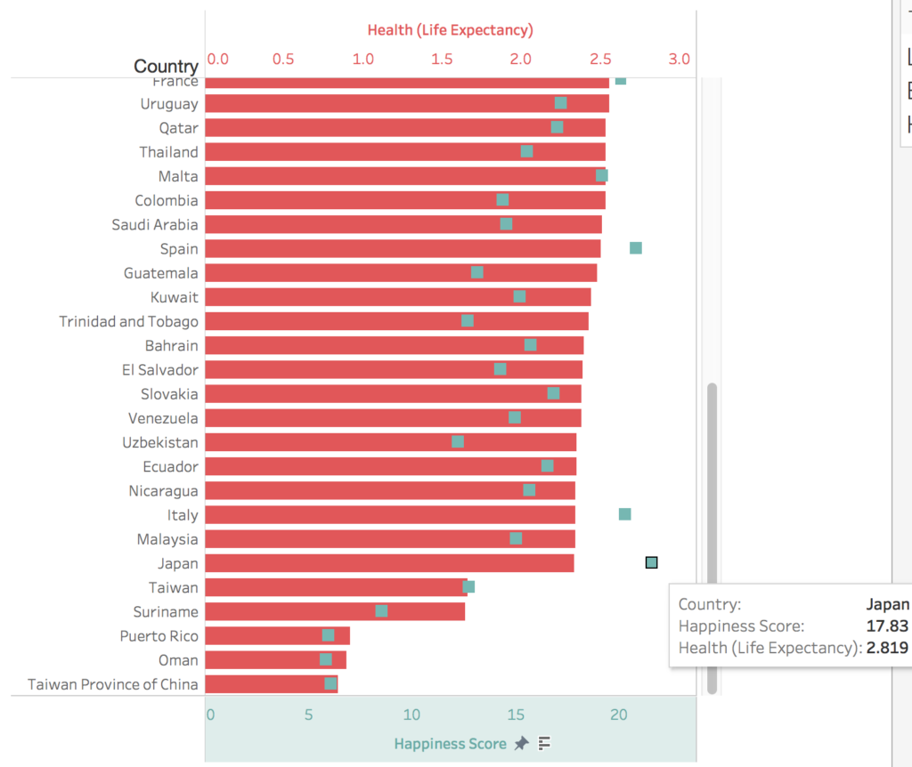 Figure 5
I also looked at another relevant element–life expectancy vs Happiness rank (figure 5). The red bar indicates happiness score, health life expectancy is represented by small green squares. The data that attracted my attention was Japan–which has a surprisingly high life expectancy and even has the second highest score among these 50 countries. For other countries, there is a vague relation between these two spects. Countries who has higher happiness score has a relatively higher life expectancy.
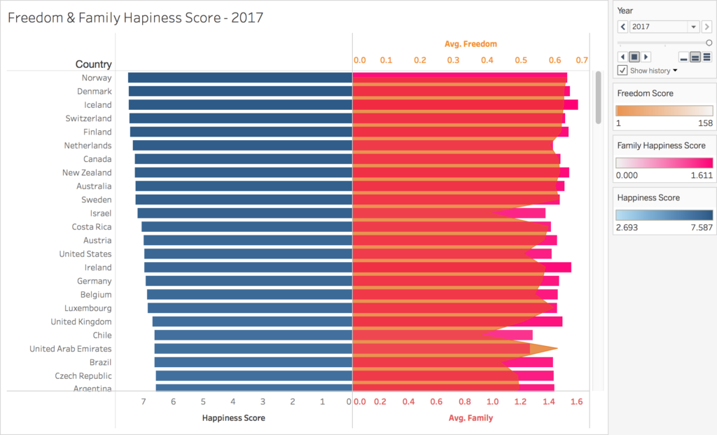 For Freedom and family, I combine the three elements together, if you browse the full chart, it’s not hard to see they influence each other a lot. Residents feel more free and happy with their families will have a corresponding higher happiness score.
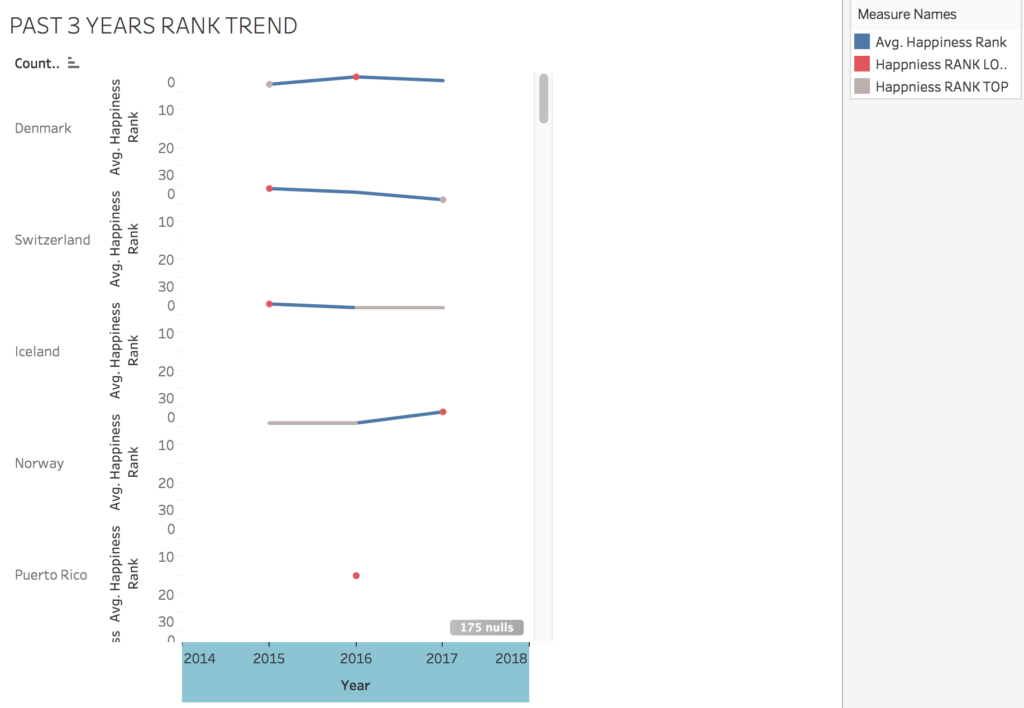
I also checked the trend of ranks of every country. I utilized calculation function to highlighted their top rank and lowest rank. It is not surprise to see there are only small changes during the past 3 years.
Reflections
It was not a smooth learning journey of tableau for me, the first difficulty I met was the dataset, I changed my topic three times because of the dataset I chose did not generate any insightful knowledge from those visualizations. The other difficulty I met was the way of using Tableau, I spent a lot of time on watching youtube tutorials to figure out how to make some forms of visualizations. And the homework turned out to be sent quite late.
However, I enjoyed learning a new tool from knowing nothing to become relatively familiar with it. Although I still not pretty sure about some of it’s functions.
The post Connection between Rank of Happiness and other Factors appeared first on Information Visualization.