NYC Leading Cause of Death
October 9, 2018 - All
Introduction
Health is a very important factor to people’s lives regardless where you live. The causes can be very broad, and NYC is not an exception when it comes to people trying to live a healthy life. Living in NYC is very hectic because of the busy environment. We hear a lot of ambulances everywhere in the city and wherever we go. It has gotten to a point where noise pollution is an issue.
Some of the questions I wanted ask were:
- What is the leading cause of death in NYC?
- What other causes of death exist in NYC?
- With so much diversity in the city, how would the death rate differ by race?
By using the dataset that was found, I will be utilizing Tableau Public to visualize and analyze the data about leading causes of death in NYC.
Inspiration
Before creating the visualization, the first thing I did was to explore other existing visualizations about health related topics. I wanted to find out what other people created and the type of visualization that were explored. I also wanted to find out what kind of questions were answered and if there were any unanswered questions that I would be able to answer with my datasets. I found two different data visualizations that were appealing to me.
-
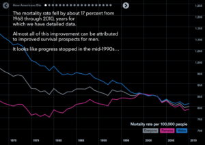
How Americans Die – Bloomberg Visual Data By Matthew C.Klein
 This is a highly interactive timeline that I found online about How Americans Die. This presentation explains why and how the mortality rate fell through 1968 through 2010. When I move the cursor around the timeline, it shows the mortality rate where the cursor is. The slide deck is very interactive as well. It’s amazing how easy it is to understand what is going on and each deck explains the visualization very clearly. The colors, animation and interactions are all very interesting, it had me playing with the entire information for a long time.
 -
Vaccination Heatmap – By Mike Watson
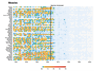 This is a heatmap about the amount of Measles Vaccination introduced over the years in each states in America. I had first encountered this heatmap from an in class lecture by my professor, which looked very interesting to me. It also got me thinking about how I could use my datasets to create a heatmap. I find heatmaps visually appealing and I feel like it is easy to absorb information with difference in colors. This heatmap did get me wondering why some states stay white. This might be the case because there are not enough data or because the vaccination were never introduced in those states. I feel like it would have been better if I could hover over to the little squares and know the exact numbers, but this visualization had no interaction.
Materials
- Tableau Public – A free data visualization software that allows creating different kinds of data visualization, create dashboards and share to public.
- Microsoft Excel – A spreadsheet that helps look and clean simple datasets.
- NYC Open Data – A place where you can find all kinds of datasets about NYC for free.
Methods
-
Search Datasets
First, I had to look for datasets. Since I had decided on doing data visualization on NYC causes of death, I decided to go on NYC Open Data. It was perfect because the datasets on this website were focused on NYC population. It wasn’t too hard to find the leading causes of death. It was one of the first data that appeared when I searched ‘health’. When I opened the data, it had all the values I needed so I decided this would be my dataset.
-
Visualization Inspiration
Like how my inspirations were explained previously, I went online to look for health related data visualizations. It was not easy to find the right visualization because there were so many but very few that appealed to my eyes. Other than the heatmap I was exposed to during the class lecture, I found an interactive data visualization that was fun to look at.
-
Cleaning Datasets
This dataset looked clean at first glance. However there were over 1000+ rows to look at, which would take a long time to clean up if I were to select each one of them individually to make them consistent. At first I thought if I needed to take it to open refine, a free tool that helps clean messy data. But my data was relatively clean and didn’t need much tidying up. These are the few things I did to clean my data:
- Adding mm/dd/yyyy format – The date on the dataset was by year. I decided to add the last date of the year in mm/dd/yyyy format so that Tableau Public would not get confused when creating the timeline.
- Deaths, Death Rate and Age Adjusted – These were either whole numbers or decimal numbers. I had to use the TRIM function to remove any extra numbers or decimals on cells that didn’t have any numbers.
-
Visualizing Data
A lot of work goes into creating a data visualization. It’s not simply finding some data and opening it on Tableau Public. Once the datasets were cleaned, I brought it over to Tableau Public and explored what I could do with the dataset. There were two sections I could move around to make different kinds of visualizations: Dimensions and Measures. I had to drag the values I wanted on the column and the row in order to create the visualizations. There were many different types of graphs that Tableau Public could make depending on what type of dataset is used. It was a lot of trial and error to create visualizations that were satisfying. I created around ten different sheets and narrowed it down to three in the end. These visualizations can be viewed in this dashboard.
Results
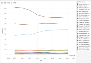
There are so many different causes of death but only three causes were very high: Disease of Heart, Malignant Neoplasms (cancer) and all other causes. Just by looking at this line graph, I could clearly tell that the cause of highest death rate is the Disease of Heart. The remaining causes seem a lot less compared to the top three. This line graph answered the questions I was trying to answer: What is the leading cause of death in NYC? And What other causes of death exist in NYC?
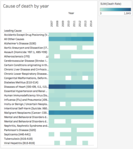
This is a heatmap that I created by each cause of death. I displayed it to show the gradual difference by each year. The white spaces tells me that there are no data in those particular years, or it could be that there were no deaths reported during those years which would be very odd. Most of the causes are fairly light, towards the lower side of the death rate. However the really dark blue parts of the heatmap represents the high death rate of those causes.
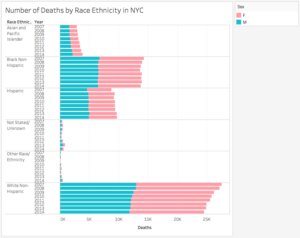
I created this bar graph to show the number of deaths by each race each year. I also decided to add a legend on the right corner to see the difference between the female and male death rates as well. It didn’t seem like there was much difference in genders when it came to the number of deaths because it’s half and half. But clearly White Non-Hispanic people have the highest number of deaths each year compared to the other races. A reason why this might be happening could be due the population of the race as a whole in NYC. It’s clear that there would be more white non-hispanic people living in this big city compared to other races. But it was still interesting to visually see the comparison of the number of deaths in NYC by race.
Reflection
Overall, using Tableau Public was an interesting experience. I always used to wonder how visual representation of data were made. Especially with numbers because I thought graphs were usually made on excel spreadsheets. This was a new experience for me. Looking for the dataset wasn’t as difficult as I thought it would be, but I wish there were more years of data on this topic. If given more time, I think I would have also thought of looking for data on each borough and analyzing data there as well. Cleaning the dataset overall was not too complicated since my dataset was relatively clean. While performing the visualization of my data, I found Tableau Public a bit challenging to use. I had to ask for help in the beginning because I didn’t know how and where to add the values. I had to do some exploring of the tool before I was comfortable creating the visualizations I desired.
If I were to expand on this project, I would look for more data about if the death rate is affected by how wealthy a person is or information about each boroughs. I think that would be another interesting approach of this dataset. Combining datasets can be very complicated but I think this can create really complex and interesting data visualizations.
The post NYC Leading Cause of Death appeared first on Information Visualization.