Distracted Drivers in NYC: Looking at Cyclist Injuries Due to Vehicle Collision from October 2017 – October 2018
October 9, 2018 - All
Introduction
As a cyclist who’s relatively new to New York, I’ve been wondering how often bicycle accidents from cars occur in the city, especially after watching a cyclist get hit by a car in front of my apartment last week (don’t worry – they ended up being fine). I decided to look at the rate of cyclist injuries from vehicle collisions in New York City from October 1, 2017 to October 1, 2018 for Lab 2 of Information Visualization. I’d initially intended to include cyclist deaths by vehicle collision, but according to the NYPD Motor Vehicle Collisions dataset from NYC Open Data, only 2 cyclist deaths due to vehicle collision occurred in this date range; unfortunately, so did 4,624 injuries. To see the final visualizations, check out my visualization dashboard on Tableau Public.
Inspiration
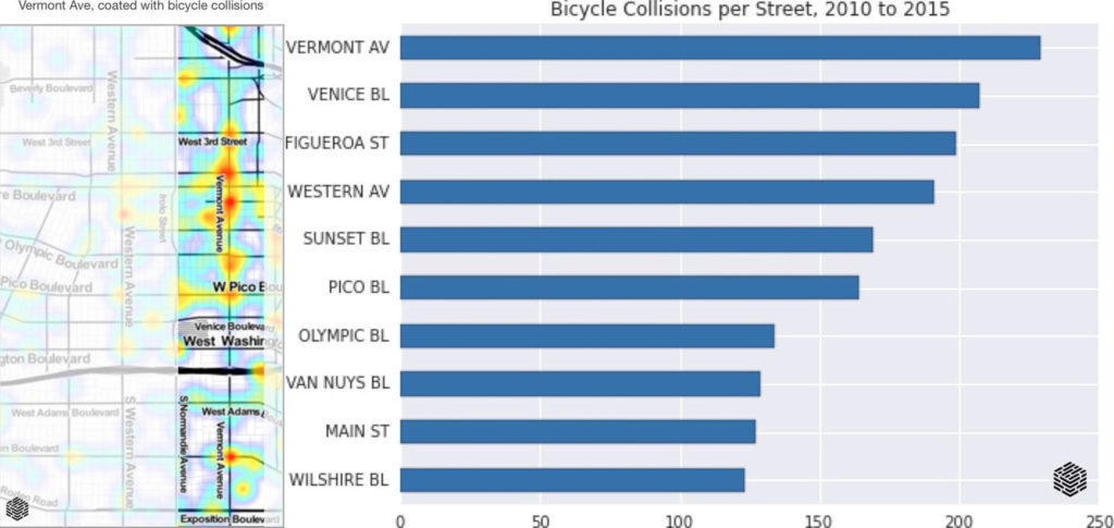
The LA Times ran a report in 2015 on using data to help save cyclist lives that included data on car-on-bike collisions in LA over five years (Figure 1). This definitely inspired my chart on contributing factors that caused a cyclist injury from a vehicle.

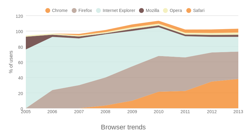
Looking at various kinds of part-to-whole charts, I decided to go with a stacked area chart like the visualization from ChartBlocks in Figure 2 to show cyclist injuries by city borough.

Materials
The dataset used in this project was the NYPD Motor Vehicle Collisions dataset, downloaded from NYC Open Data and filtered by date range using NYPD Motor Vehicle Collisions Summary and Google Sheets to combine two sets of the filtered data. After uploading into Open Refine for some cleanup, I then used the cleaned data in Tableau Public to make the visualizations. I also used Google Maps to look up the latitude/longitude of null (empty) values in the “Borough” column of the dataset during the cleanup process.
Methods
The dataset
The full date range of the dataset that I used goes all the way back to 2012, racking up about 1.35 million rows of raw data in the entire table. Since I was only interested in the past year, I decided to only go back to October 2017 before downloading by using the date filter on NYPD Motor Vehicle Collisions Summary, which uses the same original dataset. I had to first download two CSV files, one where the crash that occurred resulted in one cyclist injury and another where the crash that occurred involved two cyclist injuries. I then combined both of those sheets using Google Sheets, downloaded the resulting CSV, and then uploaded into Open Refine. I chose not to link the Google Sheet to Open Refine because I wanted to work on a copy of the table from my hard drive, but I also saved a backup copy of the cleaned data as a Google Sheet just in case.
Data cleanup
After uploading the CSV into Open Refine, I clustered together any duplicate cell values in the Contributing Factor column. Since this was the only column that had any duplicate cell values that needed to be clustered, I then checked for any leading or trailing white space in the table.
Wanting to show cyclist injuries by borough, it was important to me that this part of the data be as accurate as it could be. Unfortunately, this dataset had 1,322 null values for borough location in this date range, but it did provide an almost complete set of latitude/longitude numbers to work off of. Using these, I plugged each coordinate into Google Maps to manually look up each missing value to assign to a borough. Although tedious, this brought the null value count in the Borough column down from 1,323 to 64 and offered a much more accurate picture of the number of cyclist injuries across the city as a whole.
Deciding on types of visualizations
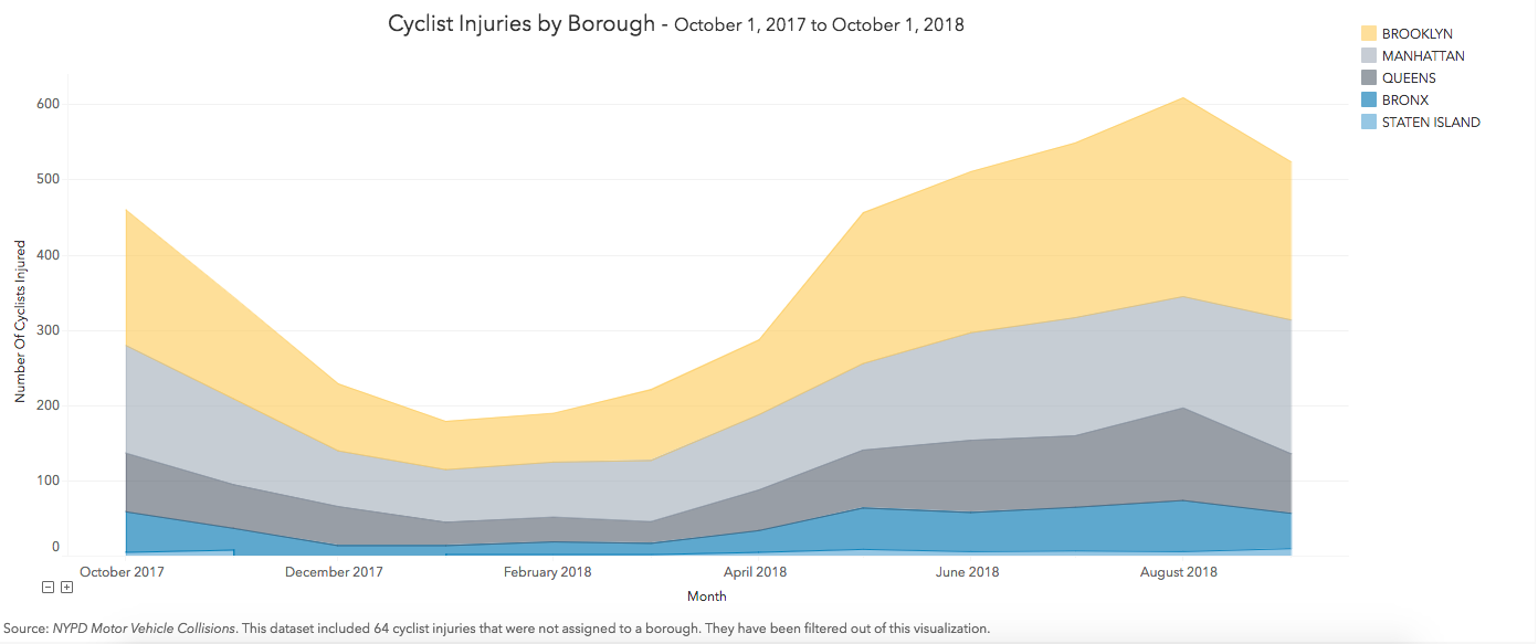
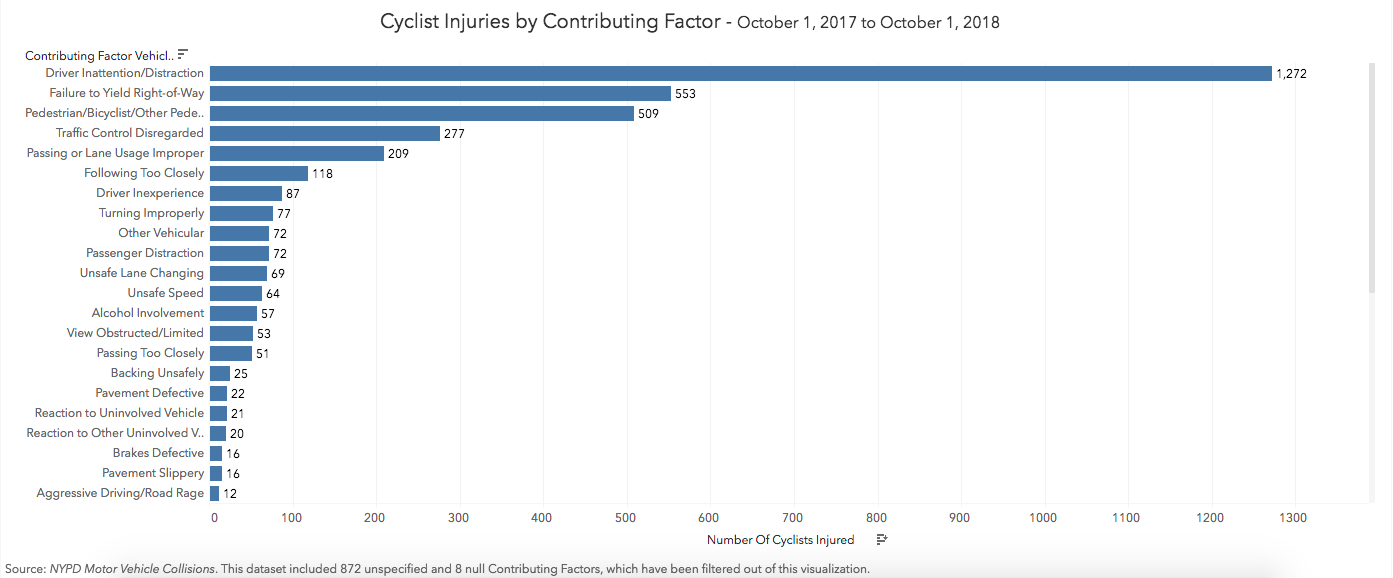
For the first visualization, I wanted to show cyclist injuries over time by borough, so I decided to use a stacked area chart filtered by each of the five boroughs in New York City with the 64 null values filtered out. One dimension of this dataset that I thought was important to show was to include why these crashes happened, and so I used a horizontal bar chart that categorizes contributing factors sorted by magnitude as my second visualization. I chose to go with a color palette that was color blind safe for both.
I had initially mapped out each bicycle crash onto a map of New York City using latitude/longitude coordinates, but then decided it would be better to focus on visualization techniques that didn’t include map coordinates for this lab. While being able to see where each injury occurred in the city and where they most frequently happened is important, I think I’m going to revisit mapping this dataset after our class goes over Carto, a much more powerful tool for mapping data.
Screen layouts in Tableau
After I was happy with how my visualizations looked, I added them to a dashboard in Tableau and then added a screen layout for mobile, tablet, and desktop views. Much like using media rules in a CSS stylesheet, these screen layouts automatically adjust how the visualizations look on a dashboard depending on the viewer’s screen size.
Results and Interpretations

In Figure 3, there was a downward trend in cyclist injuries from October 2017 until February 2018. Presumably as the outside temperatures started to warm up and more New Yorkers started riding their bikes again, the trend started to climb upward from February 2018 to August 2018, when the highest number of cyclists were injured.

In Figure 4, we can see that the majority of contributing factors for these crashes and subsequent injuries were because of driver distraction. The second-most common contributing factor was failing to yield right-of-way, and the third most common was pedestrian or cyclist error/confusion. The utmost interpretation here – perhaps unsurprisingly – is that distracted driving continues to be a major problem in the city. The good news is that cycling is still a relatively safe mode of transportation, with 450,000 trips being taken per day.
Reflections for the future
I hope to learn more tools to help automate filling in some of the blanks that datasets can come with. Although this data was relatively clean and well-compiled, there were quite a few blank cells or null values, particularly when it came to which borough these bicycle injuries from vehicle crashes occurred in and their contributing factors. I’d initially thought of using the latitude/longitude data using the Google Maps API to fill in the blanks for which borough each crash occurred in, but this came with restrictions and wouldn’t have been worth it. Ultimately, I manually filled in the empty borough column cells using locational data provided and plugging each into Google Maps. I then filtered out the other null values that didn’t have any apparent location, which yielded better results in the visualization. As it goes in our field, the bulk of the work is cleaning up and organizing the data.
Since creating these visualizations, I discovered that the New York Department of Transportation also releases data on bicycle crashes in their Bicycle Crash Data Report. In future work, it would be useful to compare similar datasets like these to see if there are any differences and to investigate why.
The post Distracted Drivers in NYC: Looking at Cyclist Injuries Due to Vehicle Collision from October 2017 – October 2018 appeared first on Information Visualization.