
Trends in Chemical Dependency Admissions in New York State from 2007-2017
October 8, 2018 - All
By Seth Crider
Data set from: NYS Office of Alcoholism and Substance Abuse Services (OASAS)
INTRODUCTION:
Finding steady ground for data-vis interests in public health was definitely a filter down process for me. Although my first attempts at locating data sheets which explored public health was ultimately futile in in the early stages, it propelled my thinking away from macro- sized hunks of generalization to more granular topics that could relate communities more efficiently with one another, and global expectations.
I went from exploring world, country, and state leading causes of death to a specific attraction to one causation rearing its head intermittently, often with apparent discrepancies in reporting and accuracy. Drug/alcohol usage is a social and mental dilemma, and unlike heart disease or cancer contains loaded moral/economical connotations that can be a bit murky for societies to navigate. In general what does it mean to be “dependent”, and what does it look like in my community?
Living within a huge metropolitan state like New York renders it almost impossible to not interact with the remnants of drug usage/trade whether it is of a first or second-hand nature. Within the structures of people, backgrounds, and age groups it seemed clear to me that chemical dependency is still an unfortunate certainty for the people of New York, and does not discriminate in its ruinous capacities.
Therefore I approached this data set with a yearning to find the exactitudes of chemical dependency and its effect on the populace around me.
Initial Questions:
-Who was seeking treatment?
-What is their program usage?
-Does general dependency fluctuate over time?
—-P.S.——-
It is important to note that this data is only counting for those who have actively sought help, or have been admitted to a program in the last decade. There are many more who are chemically dependent that are not represented by this study. However, I believe this is as good as it gets as far as a fair metric for general trends in chemical usage. This data has the potential to help increase the efficiency of response by the state, as well as dissolving myths that may surround the stereotype of a “drug user”.
INSPIRATION:
I looked at a number of charts regarding the treatment of public health issues and found them to be helpful in how they assigned visual tenants. In the end, I was more attracted to the drastic contrasts between similar (or in these examples — same) data sets.
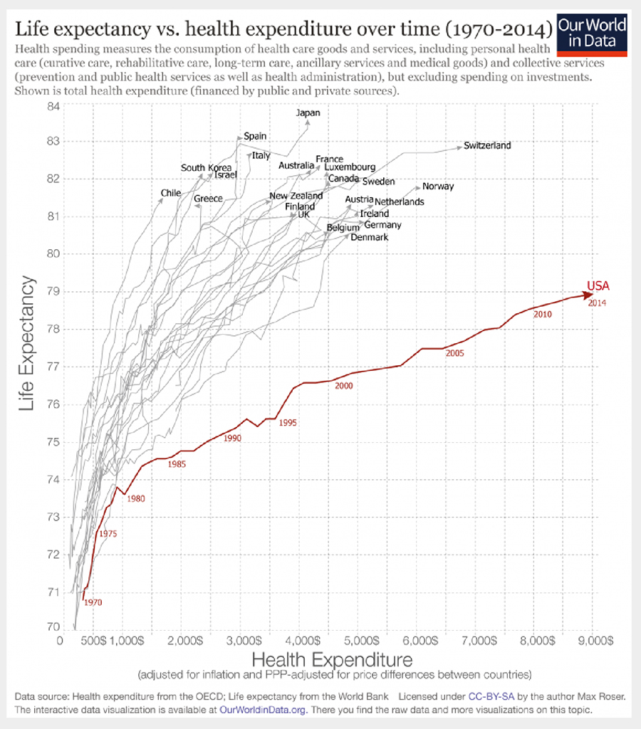
For example, in the two charts about health expenditure and life expectancy (shown below) I gleaned more knowledge about those entities with low life expectancy in the top graph, and gained more insight into how the U.S. compares in the bottom graph. Both mean something to me, and both are saying uniquely different things with the data.
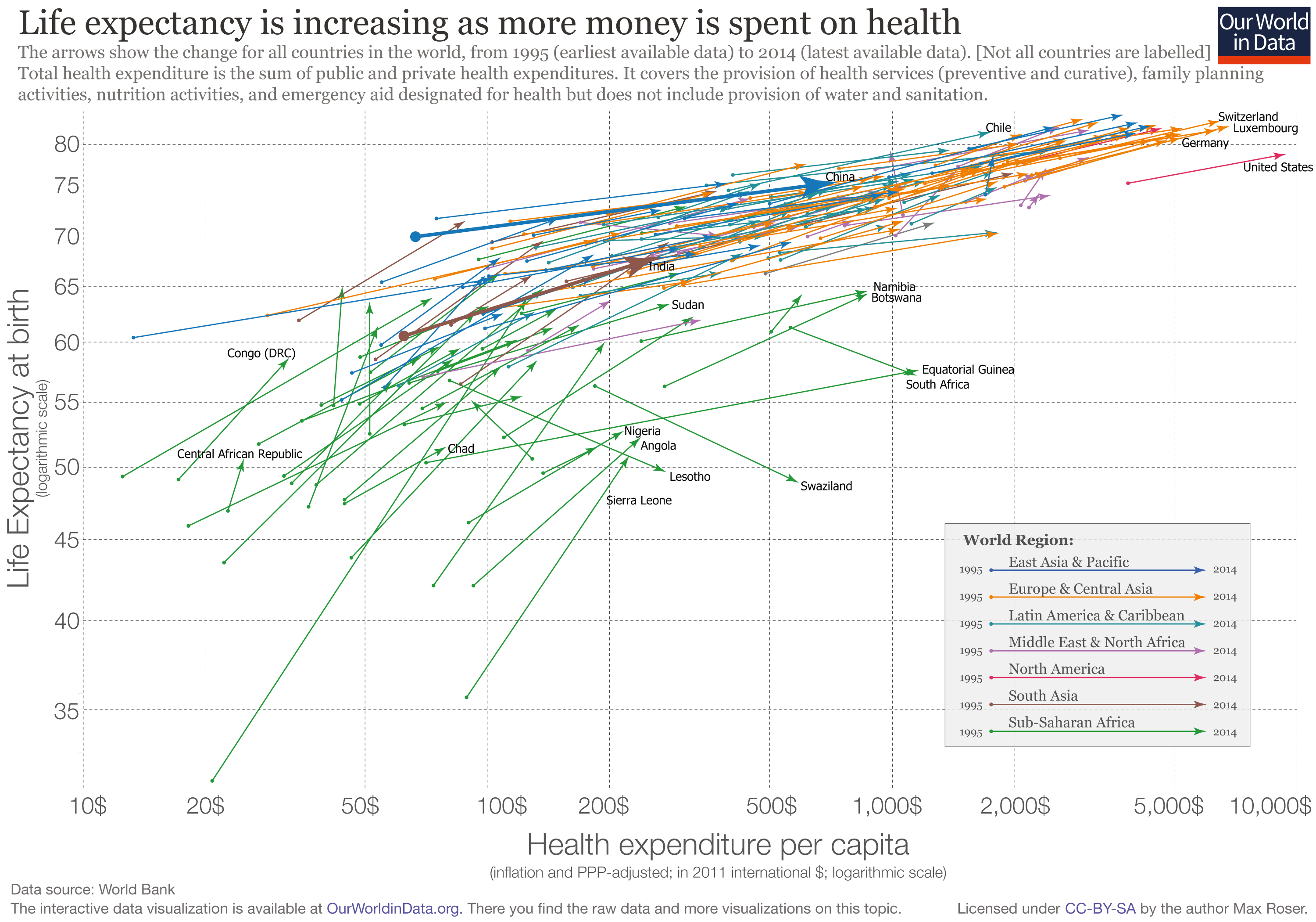
I like the top example because it doesn’t shy away from the larger picture and is more inclusive with its format and coloring (including what may be traditionally overlooked countries).
I like the bottom graph due to the fact it is very centric. Its about the U.S. and is not trying to hide its intentions. It is clear and concise with its limited red pop on grey graphings.
Both can be essential. My hope is by using similar tenants with larger picture chemical dependency I can eventually whittle away more concise points about its effect on groups, and programs.
MATERIALS:
For this visualization was my data set came from the NYS Office of Alcoholism and Substance Abuse Services (OASAS).
Titled “Chemical Dependence Treatment Program Admissions: Beginning 2007”
Columns in the data set:
- Year
- County of Program Location
- Program Category
- Service Type
- Age Group
- Primary Substance Group
- Admissions
Available https://data.ny.gov or direct link
Programs: OpenRefine and Tableau Public
METHODS:
I really wanted to look at this data from all different angles to find general trends and urgencies within it. Variables that I found most important were the Year, Program Category, Primary Substance, and Age Group. Those were great signifiers for finding trends of growth or decline within the classifications commonly used in Chemical Dependency research. From there I was able to make 6 charts within my Tableau Public story. They are all unique in the type of filter they approach the data set with. Different key questions can be answered with each graph. Time based line graphs, Bar graphs, Tree Maps, and heat map qualities all present different answers about demographics and concerns.
RESULTS:
For the interactive story visualizations click here
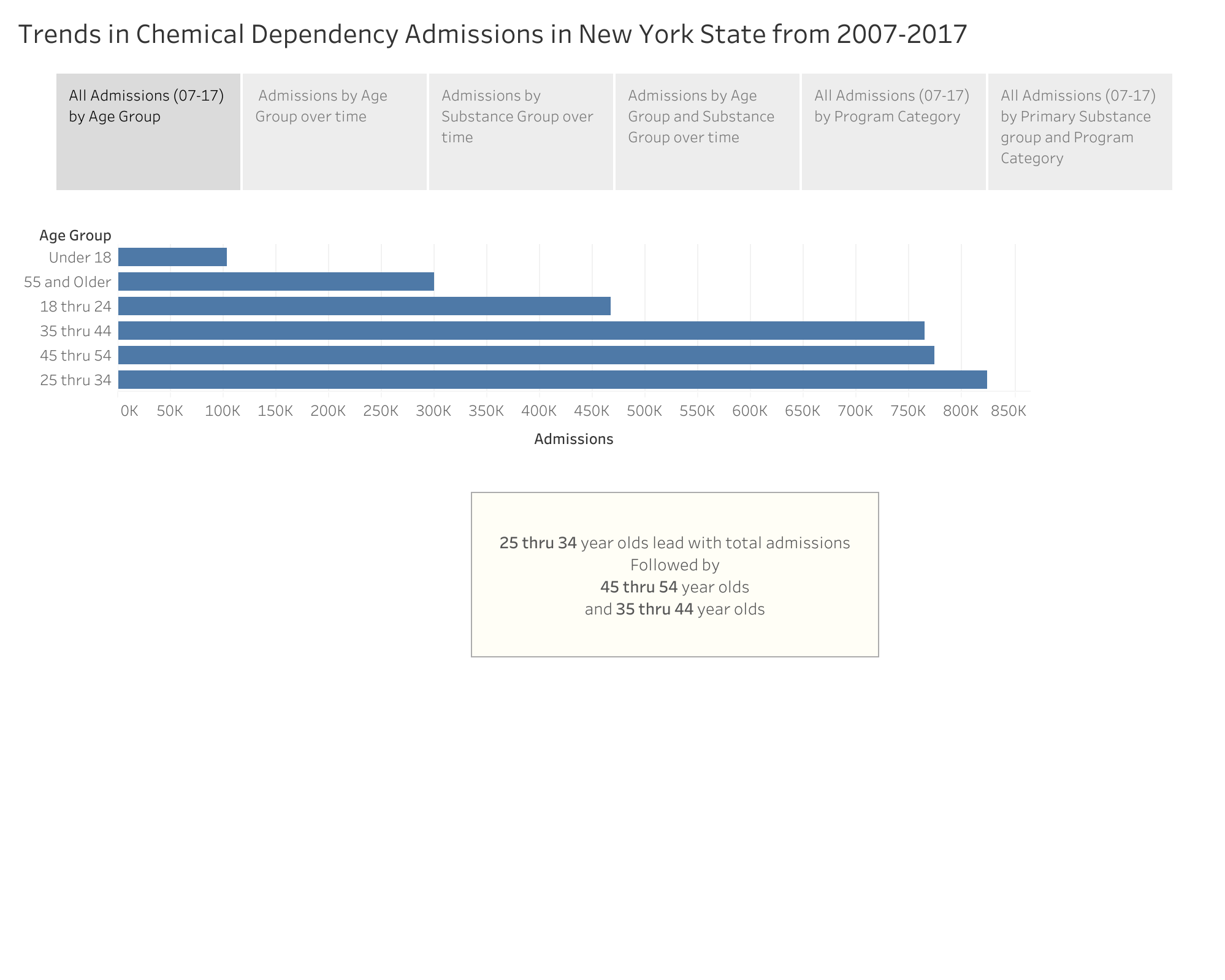
Which age groups are admitted most with chemical dependency issues?
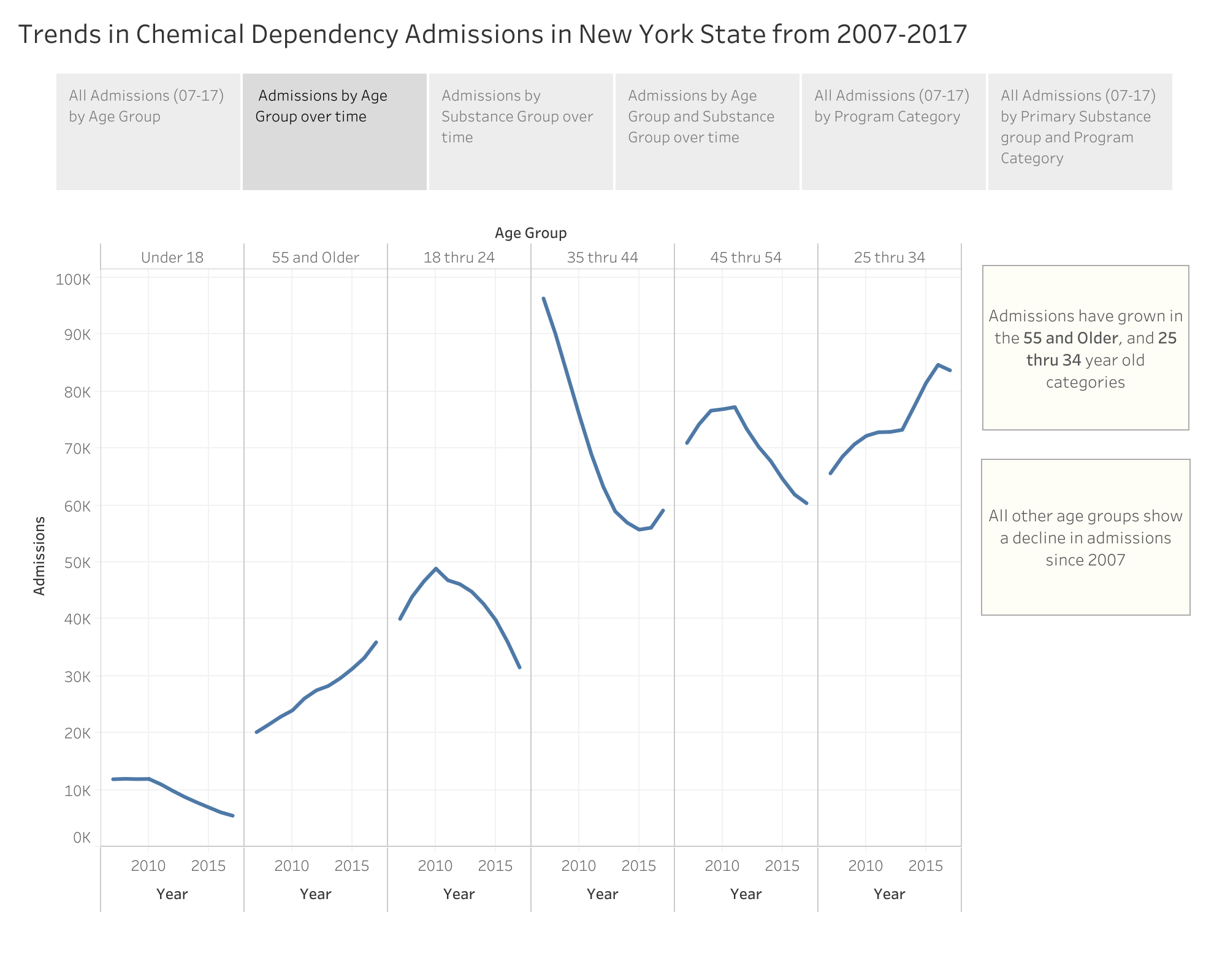
Which age groups have grown in admission since 2007?
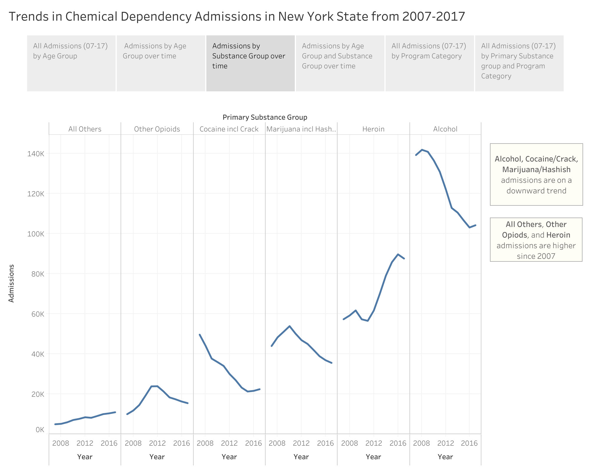
Which substances are gaining popularity and which are declining?
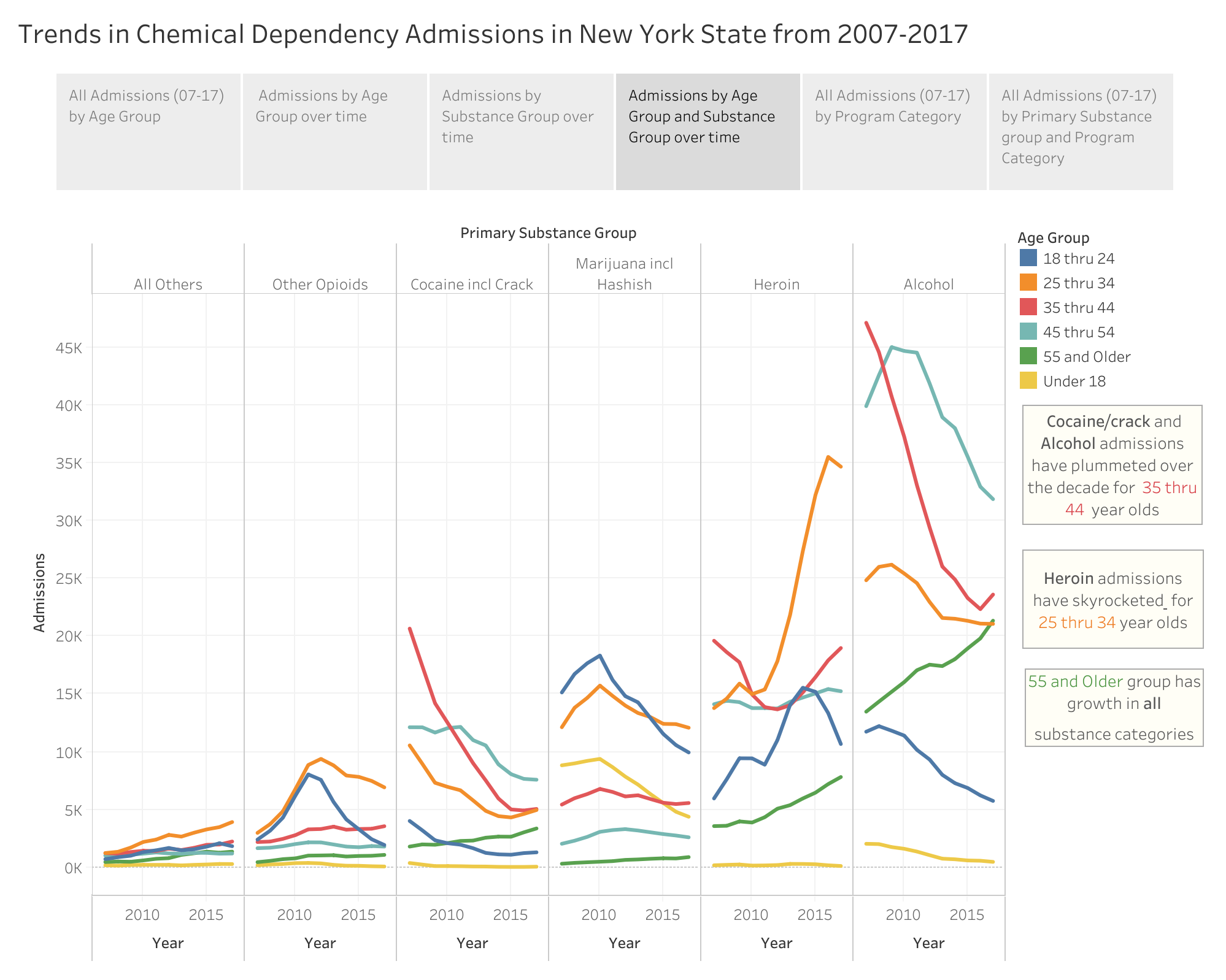
Which substances are declining, and which are growing among specific age groups?
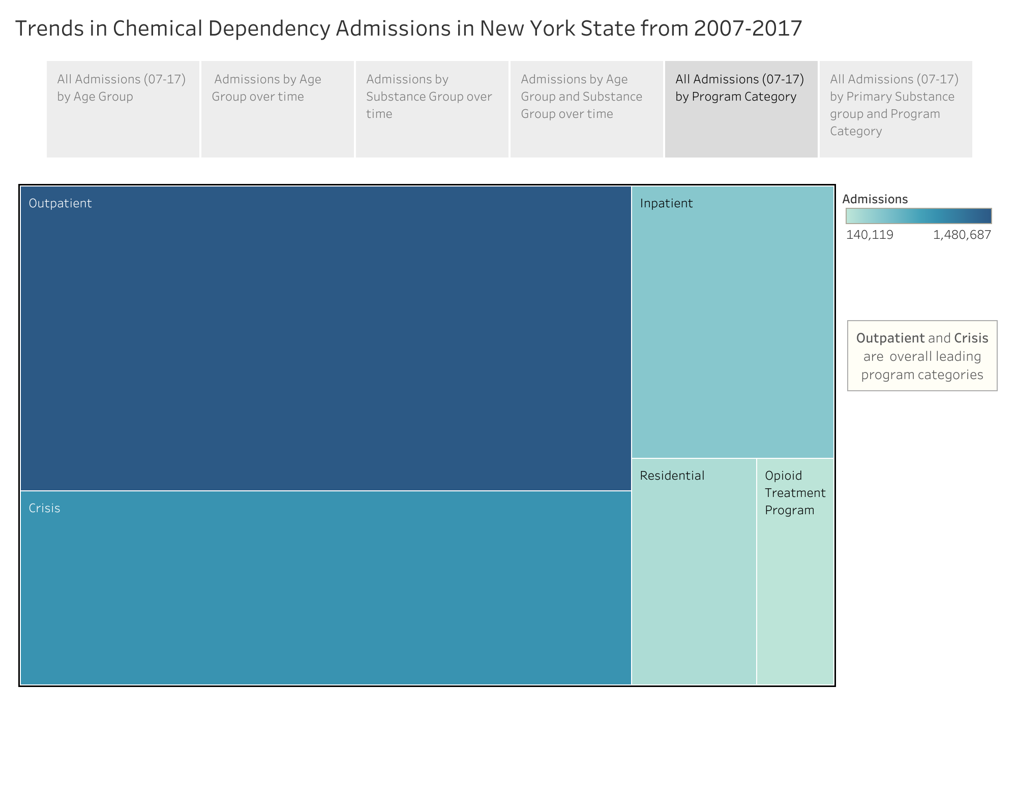
Which programs bear the most burden?
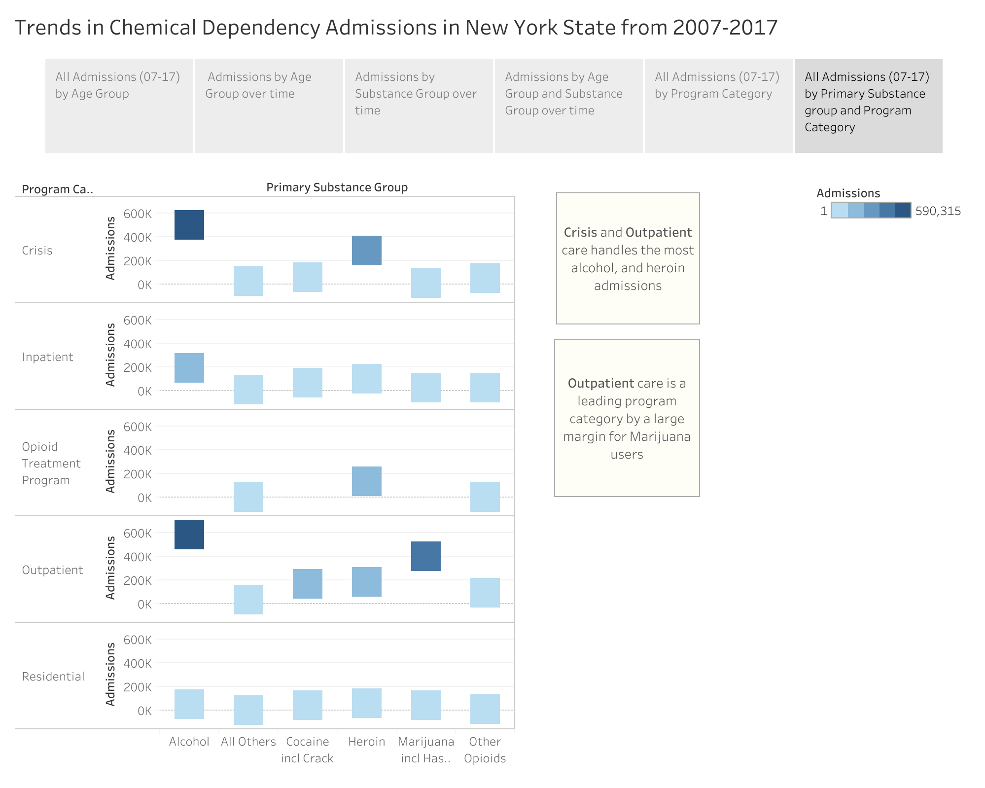
Do certain substance groups populate more among the programs?
REFLECTION:
—–Some observations——
In New York state:
- The 25 thru 34 year old age group is currently at a high risk for dangerous dependency growth. Not only are they the leader in total dependency admissions in the last ten years but have claimed Heroin as their most popular substance which seems to be growing alarmingly. If the trend continues there may be increased burden on crisis and outpatient centers. Programs should prepare accordingly.
- The 45 thru 54 year old age group are lessening their admissions as their most popular substance of choice (Alcohol) and their annual admissions decrease each year. Hopefully this means less people are succumbing to dependency, and not the latter which is less people are seeking help.
- The 55 and Older age group is growing annually in admissions as well as in each substance category. This shatters my own assumption that the elderly would be the least effected by chemical dependency. This could mean either there are more people with chemical dependency in each age category, or maybe those in this age group are more comfortable going to get help then they have been before? Only more data and time can correlate that cause.
Further exploration could be in surveys which are aimed at clarifying the gap between those who are being admitted and those persons not seeking admission with dependency problems. The comparison will likely yield more clarity on the overall picture of chemical dependency in New York State.
The post Trends in Chemical Dependency Admissions in New York State from 2007-2017 appeared first on Information Visualization.