Eat out – at your own risk?: Analyzing NYC restaurant health inspection results using Tableau Public
October 8, 2018 - All
INTRODUCTION
With approximately 20.5K restaurants in five boroughs, New Yorkers have a plethora of culinary choices to face on a day to day basis. Navigating this enormous number of options is difficult – especially when food safety practices may be all over the board. In an attempt to help customers quickly assess food safety, in July 2010, the Health Department in NYC began the practice of assigning letter grades to restaurants. This practice continues today, and the open data set of all health inspections is available to anyone via the NYC Open Data web portal. Using Tableau Public, I sought to perform an exploratory analysis of whether any interesting correlations exist between variables like cuisine description, inspection date, restaurant borough, grades, and violation type. Some of the questions I wanted to explore include:
- Is this health grade system working well? (e.g. are our restaurants getting better grades over time?)
- Do certain cuisines tend to receive higher grades?
- Which cuisines are most prevalent by borough?
- Are certain boroughs practicing better health and food safety?
- What are the top violation types that restaurants experience?
- Which profile of restaurants tend to close the most due to health violations?
The following lab report will review the methodology and results of this data analysis.
INSPIRATIONS
My first step before diving headfirst into the data was to survey analysis and visualizations that already exist. As opposed to recreating the wheel, I wanted to understand common questions that others attempted to answer, and review their visualization designs for inspiration. Two examples stood out:
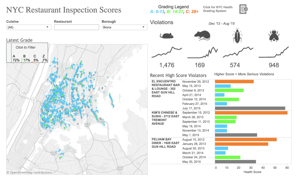
#1: NYC Restaurant Health Inspection Data – Tableau visualizations by Cody Crouch

One of the things that stood out to me the most in Cody’s dashboard is his use of filters to promote user interactivity with the data. He presents fields for cuisine, for restaurant, and for borough, and encourages users to manipulate the data to see different variables. While I think that the “Latest Grade” map is overly populated to show anything meaningful at first glance, I think that a filter by neighborhood could have gone far here to drill down another level. I also really like that he created his own subcategories of pest types within the violations data, surfacing numbers for mice, cockroaches, and more. This is something that I think a lot of people would like to know about – and I like that he took the liberty to create subcategories that are meaningful to him.
#2: NYC Restaurant Health Inspection Data – Visualizations and analysis by Alex Yuan Lin
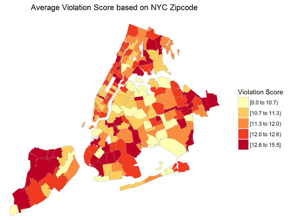
The sheer variety and level of exploration of the data that Alex Yuan Li does in this analysis is inspiring. He gave me a lot to chew on in terms of how to best surface the variables and questions that I sought to dive into. Some of the visualizations are certainly more effective than others, but I really like his choropleth of violation score by zip code, which is powerful (although I wish I could interact with it, or at least hover over a zip code to identify its name/number).
I also really like seeing the progression of his analysis and viz designs, as it gave me the inspiration to try a lot of different viz setups to see what “stuck” or showed interesting findings. You’ll see that I certainly took this to heart in my own analysis.
MATERIALS
- Tableau Public: a free data visualization software that enables multiple kinds of visualizations, dashboard creation, publishing to the web, or embedding into webpages.
- OpenRefine (formerly Google Refine): a free and open source tool that helps users to explore, clean and transform large sets of data.
- DOHMH NYC Restaurant Health Inspection Results: the dataset used for this analysis, the New York City Department of Health and Mental Hygiene’s data around “restaurant inspection, violation, grade, and adjudication information.”
- DOHMH NYC Restaurant Health Inspection Results – Data Dictionary
- “What to Expect When You’re Inspected” online booklet, published by DOHMH
METHODS
The development of this project spanned several steps:
- Dataset Selection
With so much free data available to budding analysts, selecting a dataset to work with was difficult. NYC’s Open Data portal makes it easy to review different types of data and see what each dataset includes from a field / dimension standpoint. This makes it easier for analysts to understand what they might be looking at when they open a dataset, and drew me to choose a dataset on NYC Open Data’s portal. Since I was familiar with restaurant grades already, I thought it would be interesting to explore them in depth.
A simple download of the dataset, as well as of the data dictionary, took no time at all.
- Design Inspirations
As discussed above, before diving into the data in depth, I then searched for other viz designs with the same or similar datasets, in order to get a sense of the breadth of questions that might be answered by the data, and the most compelling types of visualizations.
- Data Cleaning
Before I could work with the data in Tableau, I needed to open it in OpenRefine to understand its state of cleanliness. Were there blank fields? Similar categories that might lend themselves to being merged?
I noticed almost immediately that OpenRefine experienced some issues manipulating the data, with freezing and long lag times while filtering or transforming elements. I figured out how to allocate more memory to OpenRefine on my Mac, and also removed some columns to make it easier for the system to work with. To do this, I relied heavily on the data dictionary to determine what each column’s data represented, so that it could be removed with confidence. To this end, I removed the following columns: CAMIS (the DOHMH’s unique identifier for the restaurant), Building, Street, Phone, Zipcode, and Record Date. Knowing that my primary target fields to answer my research questions were still there, I felt comfortable removing geolocation data since the Borough column was still there. I also felt that doing a viz of information by zip code would be overwhelming and not as effective as showing information by borough, or by neighborhood, should that be possible.
Besides removing these columns, I also did the following transformations:
- Standardized columns by transforming all dates to Date fields and the Score column to numbers
- Removed any entries with a missing borough
- Changed Cafes/Coffee/Tea to Cafes, since some odd characters were showing in the original name
- Merged Cuisine description categories using judgment calls – this got a little tricky, and I felt I was walking a tight line. However, by merging similar cuisines, this would help from a visualization standpoint, since too many cuisines would confuse things. The following combinations were created: “Bakeries” + “Cafes” -> “Cafes”; “Pizza/Italian” -> renamed “Pizza” because a brief investigation proved that this category was mainly comprised of pizza shops; “Chicken”, “Hamburgers” -> merged and renamed to “Fast Food” because most chicken and hamburger places proved to be fast food restaurants; “Ice Cream”, “Gelato”, “Yogurt”, and “Ices” merged and renamed to “Ice Cream”; “Bottled beverages” renamed to “Bars” based on investigation; “Chinese/Japanese” renamed to “Asian” since a blurry line was already inherent in the current label and separate categories for “Chinese” and “Japanese” existed on their own; “Donuts” were merged into “Cafes”. Sidenote: as the cuisine description merging occurred, it became increasingly apparent that some data issues exist – that no amount of cleaning can help with. If there isn’t a standard cuisine description list that an inspector can use, it can easily become a messy situation, as we can see here.
- A look at the distribution of the Inspection Date fields showed that it was heavily distributed towards 12-31-2014 and onwards, although there were some left-trailing entries, making me think that most data began to be added to this public dataset around December 2014/January 2015. Only 1566 matching records occurred before 12/31/14, so these were deleted as they were determined to be outliers.
- If a violation was cited, but the violation code was blank, I realized that this would not help inform the analysis, and so 41 rows were deleted.
- I merged similar Inspection Types and then split it into two columns as two datasets were placed into one column – one with the category of Inspection Type, and one as a subcategory of Inspection Subtype. This was done using the Key Collision / metaphone 3 method, and split using “/” as the separator while removing trailing whitespace.
- Other formatting issues like random quotations or spaces
- Data Visualization
As you can see, a lot of work goes into refining the dataset before we even ever get to the visualization stage of things. Once I had polished up the dataset to a satisfactory level (because it always feels like more can be done), I opened Tableau Public and began to explore the data to understand the shape of it, any trends that emerged, and more. My process was very free-flowing, finding multiple dimensions of interest, and then applying them to a visualization in order to find correlations (if any). 14 total sheets of visualizations were created in this effort – with one viz often leading to the next in terms of the questions raised. Eventually, as a narrative emerged, along with interesting findings, I whittled these 14 sheets down to 4 that I felt most showed some compelling findings. These were placed into a Dashboard, which can be viewed here.
The last note here is that on the dashboard, one of the vizzes reviews the top violation codes across all restaurants by instance. In order to translate these code numbers into meaning, I looked up the code numbers and created a translation table in the Dashboard to help users understand the findings better. These were found in an online brochure from June 2016 called “What to Expect When You’re Inspected”, released by the NYC DOHMH team.
FINDINGS
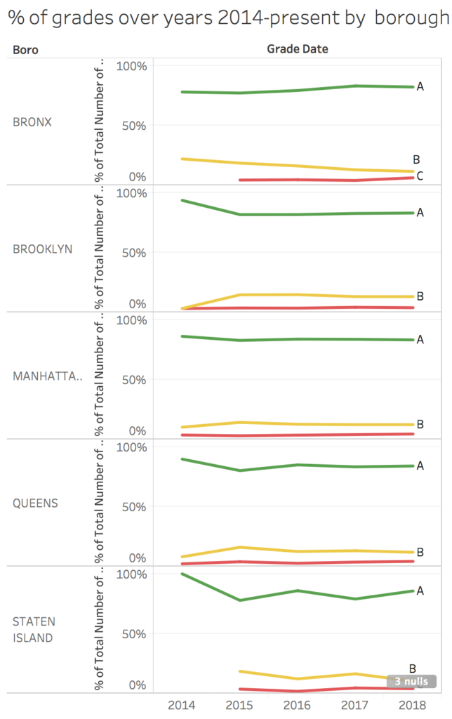
Overall, a review of grade assignments over the years of 2014-2018 showcase a story of successful compliance. The grading system is working, and working well, with A grades consistently remaining at levels above at least 72% in all boroughs. While one would hope that this number would be even higher, or trail higher as the years go on within the program, that is not the case. Grades B and C hold steady at their relative percentages per borough at ~12% and ~3% respectively. The above chart did not make it into the final dashboard, as similar data can be viewed in the Grade Breakdown by Cuisine bar chart through toggling the year data, but is helpful nonetheless.
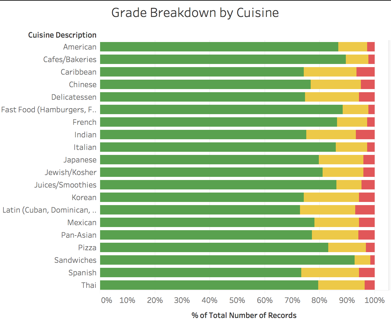
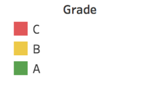
Looking at the Grade Breakdown by Cuisine, we can see that at least 72-74% of each cuisine description receives A’s, and so there does not appear to be any correlation between cuisine description and grade. However, the Cuisine descriptions of “Sandwiches,” “Fast Food,” and “Cafes/Bakeries” get the most A’s relative to other cuisine descriptions. This viz only contains the top 20 cuisines by count, to make the data easier to review.
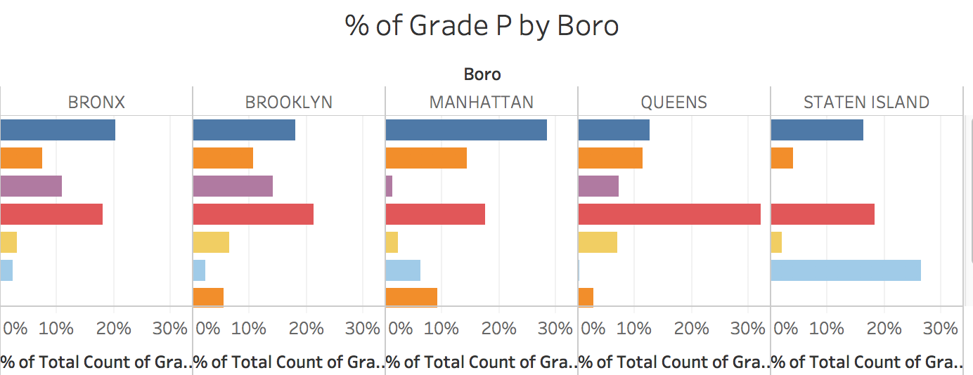
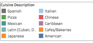
The % of Grade P by Boro viz details the % of Grade P ratings in each borough for the top 10 cuisine descriptions. I chose to show only the top 10 of each cuisine description to ensure a more effective viz. Grade P is given to a restaurant when it has “grade pending” status after re-opening after a prior closing due to a health code violation. Because no restaurant closing data was otherwise available, I used this Grade P data to analyze the boroughs and cuisines with the most restaurant closings per borough. The data shows that the Bronx, Manhattan, and Brooklyn all have similar distributions of Grade P ratings across cuisine descriptions. American, Chinese, and Cafes/Bakeries tend to be the top three closure types in these three boroughs. However, in Queens and Staten Island, the distribution of the top three closure types change. In Queens, the #1 cuisine description with Grade P rating is Chinese (32%) vs American (12.54%). And in Staten Island, pizzerias take the (unfortunate) crown with 26% of all Grade P ratings.
Now, one may hypothesize, as I did, that these Grade P figures may be a factor of the cuisine description distribution in each borough (e.g. Staten Island has more pizzerias relative to its borough than in Manhattan), rather than a correlation between cuisine description and restaurant closings. To test this hypothesis, I created another viz called Cuisine description by Boro, which shows the percentage breakdown of Cuisine descriptions by borough.
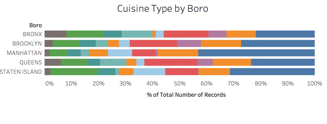
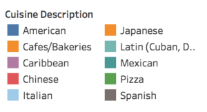
Reviewing this data, we can see that the American and Chinese food, while large segments of the Bronx, Brooklyn, and Manhattan distribution, are not necessarily the top two segments in each of these boroughs. This leads me to believe that the restaurant closings are not necessarily related to the number of restaurants of each Cuisine description in a borough.
Furthermore, the top offender in Queens, Chinese restaurants, is only 19.73% of the restaurants in Queens, and the top offender in Staten Island, pizzerias, are only 17.56% of the restaurants in Staten Island. This disproves the hypothesis around restaurant numbers and grade P correlation.
Lastly, I reviewed Violation Type to understand the top ten types of violations that restaurants experience. I thought this would be relevant in helping restaurant owners understand where they’re most likely to slip up. I created a tree-map chart of this data to show the relative breakdowns.
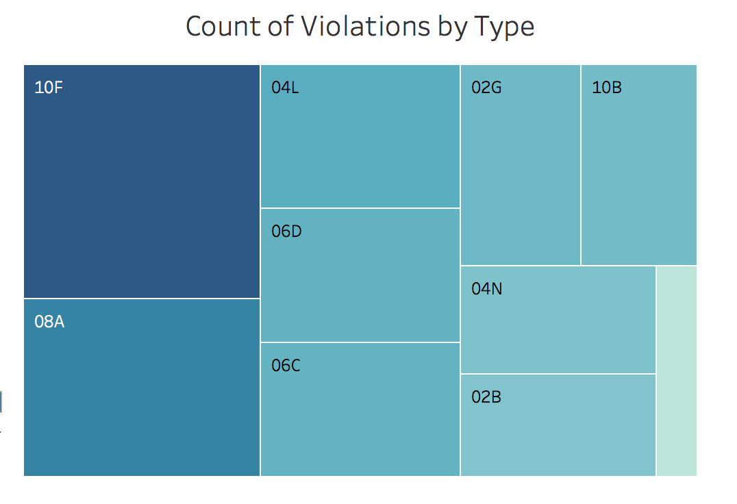
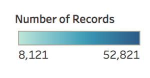
I also added a legend to translate the codes so that viewers would understand the code meanings. Analyzing this data, we can see that the top violation by far falls into the cleanliness category: 10F refers to a violation where a surface is not able to be thoroughly cleaned. Also interesting is that 2 of the top 10 violations are vermin related – a statistic which I thought would be much higher / or in high quantities. The other interesting thing to note here is that the top 10 violations occur around poor prevention methods: not safeguarding against pest entry; potential temperature issues; poor cleaning, etc. This shows that emphasizing prevention standards is just as important as removing pests from a restaurant.
FINAL REFLECTION
Overall, I felt that this Tableau exercise allowed me to dig into the restaurant health inspection data at a much greater level than if I were simply working in a spreadsheet. Visualizing the data allows us to see patterns (and outliers to those common patterns) much more easily – raising more new questions with each new viz. While I was tempted to venture into “snazzier” viz designs, I ultimately felt that bar charts often represented the message I was trying to convey in a more effective way, which is the ultimate goal. I also learned (and this is a hard lesson) that the data will only tell you what you ask it to tell you; there’s no forcing things to get a “better” story without introducing bias. While this analysis resulted in a story about compliance, and there were no mind-blowing surprises, it is the story that’s there, and it needs to be respected.
In the future, layering in a few other types of data might prove interesting. First, the restaurant opening / closing dates in order to compare those dates with inspection dates and grades. Second, taking zip code and translating it into neighborhoods, which is really how we think about NYC as New Yorkers. Third, getting a better understanding of where the cuisine description field originates. Is it self-declared by the restaurant? Assigned by the inspector? This would be interesting because there seems to be a lack of a controlled vocabulary here. Lastly, perhaps reviewing violation types relative to scores would be interesting as an exercise to see which violation types most impact a restaurant’s score.
The post Eat out – at your own risk?: Analyzing NYC restaurant health inspection results using Tableau Public appeared first on Information Visualization.