Visualizing NYC Transit: A History of NYC Subway Maps
September 14, 2018 - All
Introduction
Opened in 1904, the New York City subway is one of the world’s oldest and most complex transit systems. Designers and cartographers have publicly fought over how best to present the tangled network of underground and elevated lines (see The Great Subway Map War of 1978). Throughout the century, the subway map underwent various changes that reflect the trends in design and technology of each decade, from the progression of graphic design and the development of new typefaces (looking at you Helvetica). There’s a long history behind the subway map New Yorkers are so familiar with today, from the colors, to the juxtaposition of above-ground features, to the curvature (or lack thereof) of subway lines. Those changes are best shown through a visual timeline, allowing viewers to peruse and compare its evolution in a linear fashion.
Inspiration for the timeline came from viewing earlier map designs, when the subway operated under three separate companies with each company putting out individual maps. Then came the introduction of color-coding by subway route, and later the famously controversial 1972 map designed by Massimo Vignelli. Our current 2018 map is based on a 1979 design that was created in response to public outcry over Vignelli’s diagrammatic system map. The history itself is a complex web of designers, corporations, and public dispute. Seeing the big picture in a timeline can aid in mapping each design decision in tidy linear visualizations.

Materials
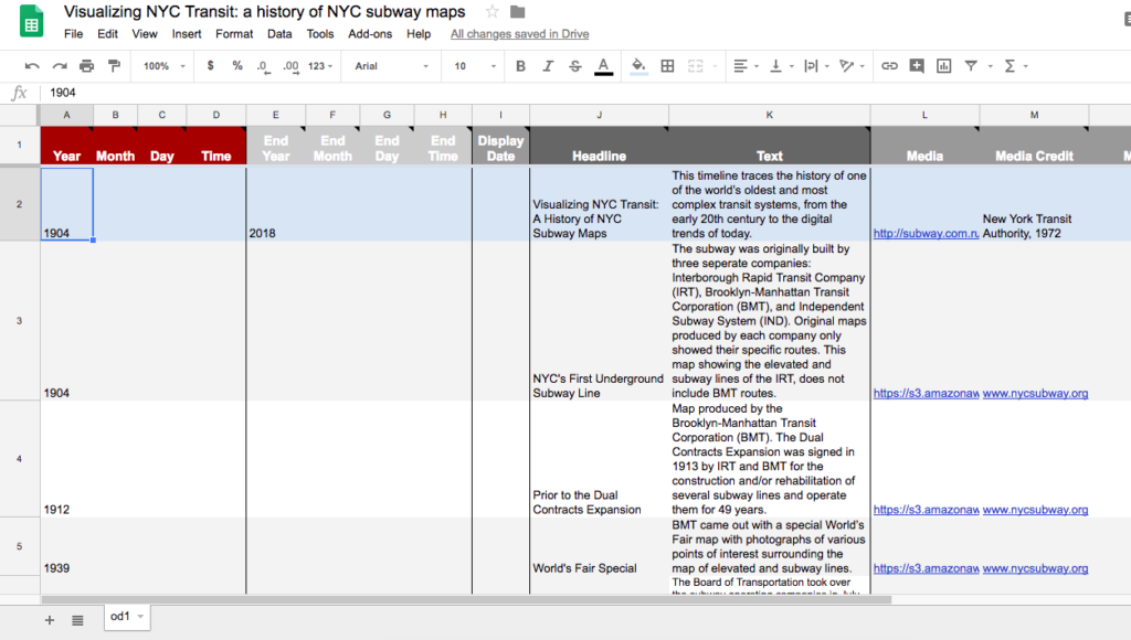
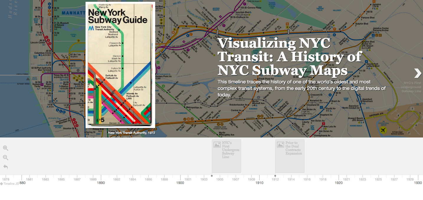
The timeline for this project was created with Knight Lab’s TimelineJS, an open-source program that allows anyone (with an internet connection) “to build visually rich, interactive timelines […] using nothing more than a Google spreadsheet. Data was compiled into a Google sheet, the free online version of Excel, which enabled customization of headlines, text, dates, media, and background colors. Information and relevant media were collected from online sources such as nycsubway.org, Wikipedia, and online articles pertaining to specific events.
References:
- Brooklyn Historical Society
- Gizmodo
- NYCSubway.org
- The New York Times
- Subway.com.ru
- Transit Maps
- The Verge
- Wikipedia
- YouTube
Methods
- Research – The first step involved an exploration of the history of NYC subway maps. This meant learning as much as I could about the topic through reading and scanning various sites and articles. Essentially opening up as many browser tabs as possible.
- Analysis – From the research I began jotting down anything that could prove useful, pulling quotes and snippets and saving various images. This is where I began to uncover key moments in the history of NYC’s subway maps and associating certain maps with names and corporations. Using images from sites like nycsubway.org, subway.com.ru, and transitmap.net I compared maps side-by-side noting key differences and varying design decisions.
- Classification – This step involved fitting all of the pieces together and gathering various themes/events into specific time periods. In keeping the timeline under 10 slides, this meant narrowing down the data selection to the most notable points in history. This stage defined the linear links between each iteration.
- Organization – After defining and deciding what to be included in the timeline, everything had to be organized within the spreadsheet. Each date with associated information and media was placed in chronological order. Each row was given a dark background to provide contrast to some of the lighter images/image backgrounds in order to present the information in a readable manner.
- Visualization – The timeline was created by copying and pasting the Google spreadsheet URL into TimelineJS’s Step 3 on their website. Step 4 provides users with the option to view their timelines before sharing the final product, which led to making several changes before finalization. TimelineJS generates a link to share the project, as well as an embed code to paste on a website.

Results and Interpretation
View the final Timeline here
View the final Google Sheet data here
This timeline presents nine subway maps that represent significant moments of change in design and technological currents. Maps provide us with stories of our culture and this timeline is meant to take viewers on a journey through the complex history of NYC’s transit system.
Reflections and Future Directions
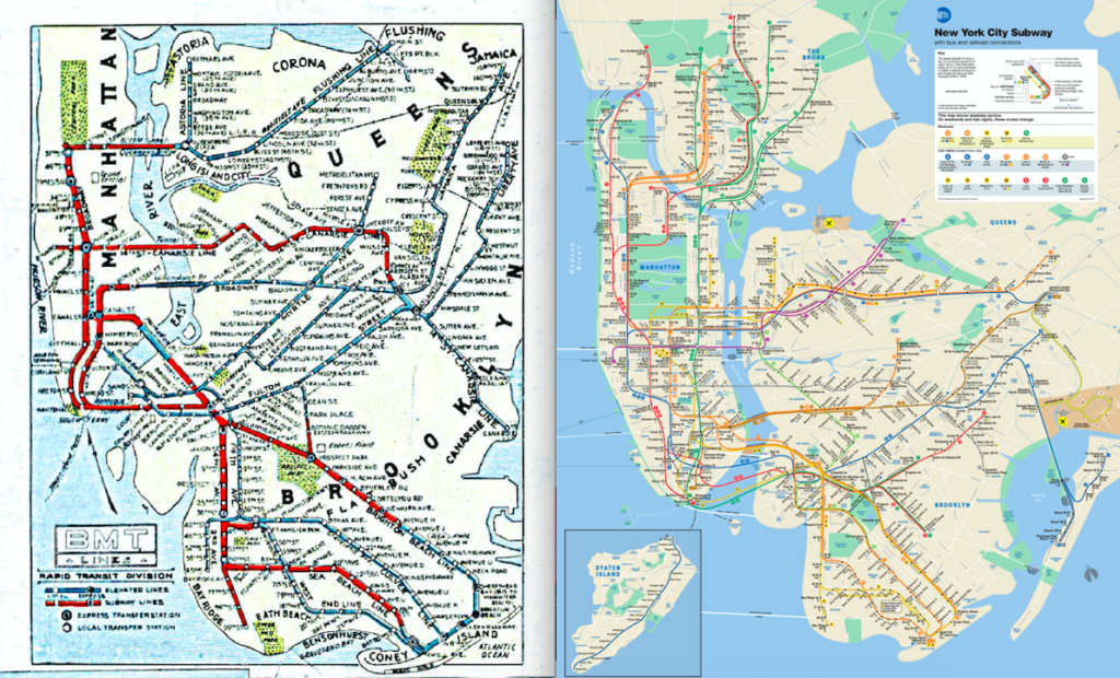
The research for this project started with an image of a 1924 NYC subway map. The older map is dramatically different from the one New Yorkers are familiar with today, being more difficult to read in its density and old typography, and only two colors for subway routes. While researching maps from various years, I was surprised by the scarcity of images from certain decades. Many of the image files presented on nycsubway.org’s Historical Maps archive are redrawn to depict service changes, not showing the official map of the time. One site in particular, subway.com.ru, has collected subway map covers displaying them visually across a single page, but only provides a few years worth of the actual maps. Because transit history is so rich in cultural movements and design trends, it is my hope for a more comprehensive source of information to be created.

The post Visualizing NYC Transit: A History of NYC Subway Maps appeared first on Information Visualization.
