
The Whitney Museum of American Art Audio Guide User Test
August 18, 2018 - All
Introduction
Our goal is an omni-channel approach that is user-centric, and impactful, while remaining faithful to our founding mission of letting artists lead the way.—Sofie Andersen, Director of Digital at the Whitney Museum of American Art
A major intersection in the Whitney experience is between Audio Guide content and the galleries as physically experienced. The Whitney’s Audio Guide is a stand out product, providing context for artworks through recorded primary sources (most often the artists themselves). Listeners are given a chance to gain a deeper understanding and connection to the many artists’ visions and personalities. A prototype for an updated Audio Guide is in development with the goal of connecting visitors to this rich content as best as possible.
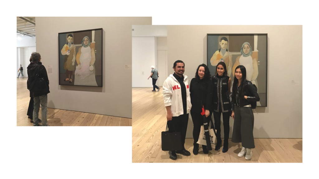
The user test described herein was designed and conducted by four School of Information graduate students from Pratt Institute as part of the spring’s Usability Theory and Practice course. To support the development of this prototype, the group worked in collaboration with the Digital team at the Whitney Museum. Participating Whitney visitors were the first to test and use the prototype, and their approaches to resolving specific tasks with it were observed, recorded, and analyzed. This post presents a summary of the key recommendations to enhance the visitor experience of the Audio Guide based on direct feedback from this group of participants.
This is cool, because now I can see images, and on [the regular Audio Guide], I could not see that…it’s really clear.— General feedback from study from a participant after completing Task 1
I liked that there’s two people talking, so it felt more like a conversation than the dryness of a normal lecture you often hear in Audio Guides.— General feedback from study from a participant after completing Task 1
Methodology
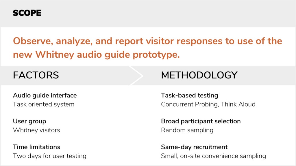
The purpose of this user test is to support the development of the Audio Guide prototype. The main goal to examine the performance and several features of the Audio Guide was made possible by observing, recording, and analyzing the approaches that participants took in performing the Task Scenarios (see Figure 1).
Once the participants completed their tasks and provided feedback, the information was analyzed to rate instances when participants relied on prior knowledge or more time to perform actions. These instances were accumulated by reviewing the observations, recorded conversations, surveys and participant feedback.
Preliminary Work and Considerations
Preparation for testing involved logistical planning (i.e. coordination with Whitney staff and research team members), anticipating visitors’ behaviors, the design of several Task Scenarios for willing participants to perform, and ethical considerations such as participant consent forms. Audio Guide use is site-specific, directing that the user testing to be conducted on-site. The participants’ interactions in comparison to the intended uses of the audio guide (as well as insights into potential improvements) were also determined to be best observed in person, and towards these ends, the study was developed in a task analysis model.
Insights into the general usability of the prototype did not require a targeted user profile, and time for testing was limited — these factors determined that the single qualification for participants was to be present at the Whitney at the time of testing. A script and speech for the Testers and Moderators to follow were created to maintain regularity between different iterations of testing.
A pilot test was performed to determine how effectively the tasks and questions in the study revealed visitor behaviors and preferences regarding the understandability of the Audio Guide prototype. The results of the pilot test informed the redrafting and refinement of the study into a final version for implementation.
User Testing and Tasks
The study was implemented on-site at the Whitney by two teams of two researchers each. Each pair consisted of a Tester and Moderator. A random sample of eight visitors was selected to participate. Participants had varying levels of familiarity with the Whitney’s current Audio Guide system — five of the eight were observed with the current Audio Guide at the time of intercept. Upon granting written consent to the study conditions, participants were given the Audio Guide prototype on an iPhone device.
Eight visitors were chosen to participate in the user test of the Audio Guide prototype. The test took place on the seventh floor of the Whitney Museum. One team consisting of a Tester and Moderator performed the user test on 4/19/2018 with four participants. The following day, the second team, also consisting of a Tester and Moderator duo, performed the user test with four participants. After participants signed a consent form, Testers followed the script to properly guide participants as they performed the tasks on an iPhone mobile device with iOS 11.3.1 from Apple Inc. Moderators used a mobile device to record audio feedback, noted important points during scenarios, and observed the interactions that the participants followed to complete tasks. Participants completed a post-test questionnaire created with Google Forms.
The Task Scenarios are described and presented in Figure 2 (Task Scenario 1) and Figure 3 (Task Scenario 2):
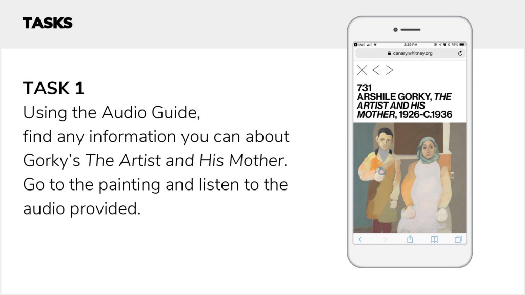
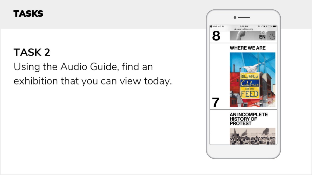
Participants were encouraged by Moderators to explain aloud their decisions and thoughts throughout task resolution. Specifically, the two common moderating techniques used are referred to as Concurrent Think Aloud (CTA) and Concurrent Probing (CP) (Nielsen, 1993). Once it was determined through visual observation that participants had completed a Task Scenario, they were prompted to both judge whether they had accomplished the task and to rate the difficulty experienced in completing it.
Participants were assured that their feedback is crucial, regardless of whether the tasks were successfully completed. Following the Task Scenarios, participants were asked a series of reflective questions to gather more critical feedback. Demographic questions were an optional follow-up to the reflective questions and concluded the study’s data collection.
Summary of Key Findings and Recommendations
The inspection and close analysis of the participants’ observed actions and feedback during and after the tasks illuminated some areas that can be modified to increase Audio Guide users’ satisfaction with the product.
The most prominent findings and recommendations are listed below:
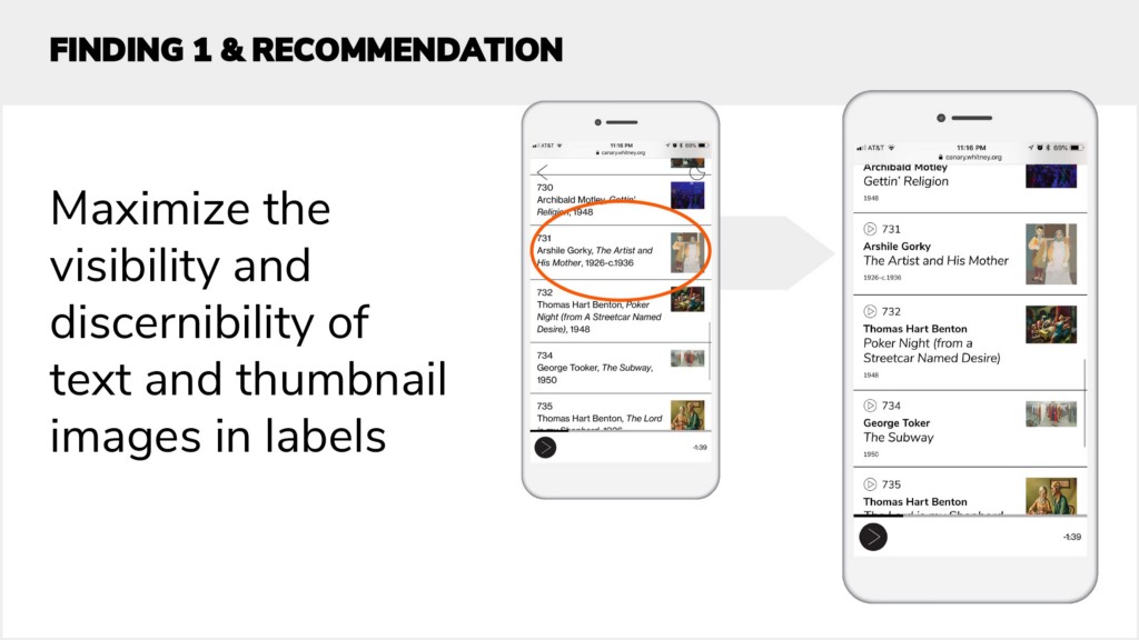
- Finding 1: Legibility of text causes participants to rely on artwork thumbnails.
- Recommendation 1: Move each artwork stop number, artist’s name, artwork title, and date created on their own lines to enhance legibility and create more space to increase the size of thumbnail images [visual design and information organization].
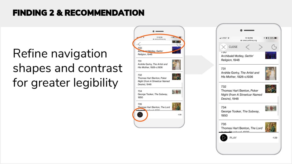
- Finding 2: Participants took time to learn and connect the symbols with the actions of the top navigation links and bottom level audio player.
- Recommendation 2: Refine shapes used in navigation and increase contrast to distinguish content [visual design and organization of navigation links].
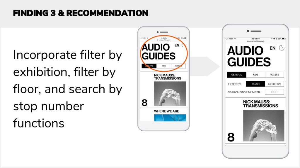
- Finding 3: Participants rely on prior knowledge of the exhibitions on display to find the correct link on the floors and exhibitions menu list.
- Recommendation 3: Incorporate filter by an exhibition, filter by floor, and search by stop number functions [content structure and information organization].
Participants revealed a high level of interest in the Audio Guide’s content. Some navigation links were expected to perform differently than their actual actions. Participants mainly relied on matching artwork thumbnails with artworks in the gallery to relate the correct stop number. They also relied on their memory to determine the current exhibitions.
The context is important, and so it helps me with that. Where a work is in that particular artist’s life is important to me.— Study participant in response to,
“Why do you use the current Audio Guide in the museum?”
Conclusion
The Whitney’s Audio Guide is another symbol of their excellent efforts to promote their culture, art content and critical thinking. Innovation has always been a hallmark of The Whitney Museum of American Art always, since its beginnings. It is dedicated to showcasing American art and provides a deeper understanding of artists’ visions. This is accomplished by offering an Audio Guide that offers a deeper connection between the visitors and the artworks.
Through the usability test process, we realized that the rigor and scope of the set test tasks may have created a lead to the users’ completion rates and ways of thinking. It is imperative that some of the findings and recommendations presented in this report be considered along with additional research methods. Further analysis is required by conducting different user-testing evaluations with the goal to deliver a seamless, digital experience. Due to the limitations of time and testing scope, and some of the general, technological and information bias that is sometimes encountered in user experience testing, further analysis is required by conducting different user-testing evaluations with the goal to deliver a seamless, digital experience.
Designing a reasonable task by scientific standards is the basis of the user experience test. Usability testing provides methodologies that made it suitable to recruit and test participants on-site. The entirety of the research process involved the team developing a comprehensive usability test for the Audio Guide, moderating the test, gathering feedback, finding and making comparisons in the test results, and complementing it with recommendations for the Whitney Museum. The solutions are only a few based on the visual design choices and the introduction of special functions to the Audio Guide. These recommendations may help to further support the participants’ desire to find specific content and search for particular artworks.
SOURCES & REFERENCES
About the Whitney. (n.d.). Retrieved April 20, 2018, from https://www.whitney.org/About
Affairs, A. S. (2013, October 09). Reporting Usability Test Results. Retrieved April 20, 2018, from https://www.usability.gov/how-to-and-tools/methods/reporting-usability-test-results.html
Andersen, S. (2018, March 6). Whitney Digital. Introducing Whitney Digital. Retrieved March 20, 2018, from http://medium.com/whitney-digital/introducing-whitney-digital-5c3626d0e74d
Dix, A. (2004). Task Analysis. In, Human-computer interaction. Harlow, England: Pearson/Prentice-Hall.
Doss, G. (2002). Designing Effective Web Navigation. Center for Applied Information Technology.
Dumas, J. S., & Loring, B. A. (2008). Moderating usability tests: Principles and practices for interacting. Elsevier.
Lynch, P. J., & Horton, S. (n.d.). Web Style Guide, Third edition. Retrieved April 20, 2018, from http://webstyleguide.com/wsg3/3-information-architecture/index.html
Nielsen, J. (1993). Usability engineering. Boston: Academic Press.
Nielsen, J. (1995, January 1). Severity Ratings for Usability Problems: Article by Jakob Nielsen. Retrieved April 20, 2018, from https://www.nngroup.com/articles/how-to-rate-the-severity-of-usability-problems/
Odden, L. (2017, April 14). What is Content? Learn from 40 Definitions. Retrieved April 20, 2018, from http://www.toprankblog.com/2013/03/what-is-content/
What is Visual Design? (n.d.). Retrieved April 20, 2018, from https://www.interaction-design.org/literature/topics/visual-design
AUTHORS
Isabella Deocariza
MS Information Experience Design candidate
Pratt Institute, School of Information
Medium: https://medium.com/@isa.deo
Armando Garcia
MS Information Experience Design candidate
Pratt Institute, School of Information
Twitter: https://twitter.com/armgardesign
Medium: https://medium.com/@arm.gar
Andreia Rodrigues Do Amaral
MS Museums and Digital Culture candidate
Pratt Institute, School of Information
Wanyi Wang
MS Data Analysis & Visualization candidate
Pratt Institute, School of Information
Medium: https://medium.com/@unicornvwang
The Whitney Museum of American Art Audio Guide User Test was originally published in Museums and Digital Culture – Pratt Institute on Medium, where people are continuing the conversation by highlighting and responding to this story.