Census Data: California Counties
July 10, 2018 - All
Introduction
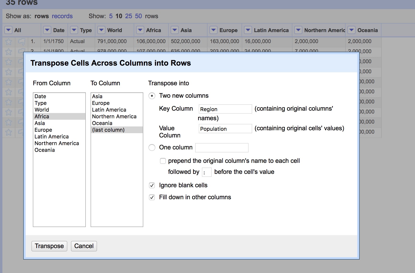
I was introduced to programs OpenRefine and Tableau for the first time this month. OpenRefine allows data to be cleaned up, organized and normalized with features like selecting all related cells or transposing data to be reformatted. Tableau allowed me to take clean data and create visualizations for it through various graphs and charts. For this lab, I selected a dataset from the census.gov site on California’s population by county and sex from 1970 through 2050 with projections starting 2010 on. I wanted to find more data on California but was concerned some datasets would fall short in quantity. I would find data on a topic I wanted to explore further but the format wouldn’t be viable or there would be a download restriction. The census site allowed me to search their subjects by type of file which made the search process significantly easier.

Materials
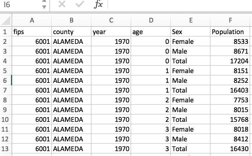
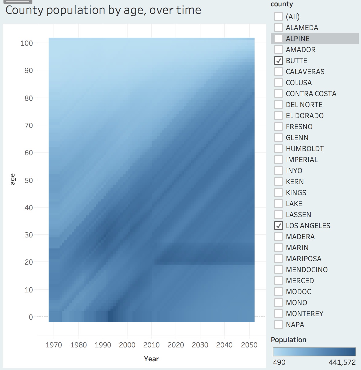
Through the census site, I downloaded a .csv which provided over 470,000 cells to work with. It was workable overall and just needed one column to be transposed. I kept the project data from 2010 through 2050 as well as the county code numbers (FIPS) with the thought that I can either filter them out or utilize them when cross comparing in Tableau. When inputting age, I grouped them in “bins” of 10 to make them more manageable in a visualization. For my dashboard, I included three charts. One line chart takes the four largest counties in California and the other line chart takes the four smallest counties, both compare county population over time by the following age groups: 20, 30 and 60. With 49 counties, it I selected the four smallest and largest counties as a way to make the data more manageable. The third visualization is a Lexis map, that gives the viewer the ability to select any and as many California counties as they would like to compare. In creating the Lexis map, I referenced Tableau’s help board and Professor Sula’s guide.

Findings
In chart 1, there was a sharp drop in Trinity County’s population in 2000/2001. Initially I considered the dotcom bubble burst and/or college aged individuals would leave for education or career reasons but Trinity county is the fourth least populated county in California surrounded by National forest, ranching and BLM land and I considered other, more viable events that would impact this area. For larger counties, like Los Angeles visible in chart 2, there was a slight decline in 2000 but was more or less stable. These differences were significantly more contrasted in the Lexis map and did a good job of depicting a young transient population in the larger countys’ like San Diego and L.A. most likely due to the amount of colleges, universities and career catalyst opportunities available. When a smaller county is selected on the Lexis map, like Solano County, the population increases at a steady pace over time and shows little movement or drastic change out of the area. When compared to Los Angeles county though, there is an influx of 20 – 30 year olds representing the education and industry accessible in L.A.

Reflections
When creating visualizations for another dashboard, I would like to select a dataset that is not as broad. This may provide clearer insight into a specific place, event etc… I’d also like to spend more time familiarizing myself with Tableau’s options. My initial approach to the Lexis map was searching for a filter specific to gradients or map layout. Instead, I needed to take the data points or anchors and expand their gradients in order for each point to kind of bleed into each other, creating this thermal effect. Some aspects in this program did not come across intuitively but seeing how many features it offers will be fun to explore further.
Tableau Link: https://public.tableau.com/views/CACountyCensus/Dashboard1?:embed=y&:display_count=yes
The post Census Data: California Counties appeared first on Information Visualization.