Chronophotography and the Power of Movement
July 1, 2018 - All
Introduction
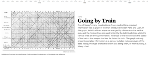
My Knight Lab Timeline was inspired by Eadweard Muybridge’s ‘small multiples’ and Étienne-Jules Marey’s Paris-Lyon train schedule and Chronophotographic Gun. These related visualization milestones appear on “An Interactive Timeline of the Most Iconic Infographics” (www.infowetrust.com/scroll/). Muybridge (1830-1904) and Marey (1830-1904) were contemporaries and contributed substantially to the field of photography through their technological inventions. The profession of each man—Muybridge was a photographer and Marey was a scientist—shaped the methods he employed. Both were interested in time-based phenomena and both saw photography as a tool of investigation. The question I address in my timeline is how Muybridge and Marey approached the way discrete moments in time can be presented. My timeline is designed to convey a narrative that shows that Muybridge uses ‘small multiples’ to represent the passage of time and that Marey compresses visual information into a concise laboratory style analysis. I then extend my examination by drawing connections between Muybridge’s and Marey’s methods and visual outputs and the works of visual artists similarly concerned with expressing time and movement. Specifically, I visualize the connections between (chrono)photopgraphy and Cubism and Futurism—two modern era artistic movements looking to express movement and speed on 2-D surfaces.

Materials and Procedures
Assembling the timeline entailed learning the brief history of the subject. In order to do so, I began with the early history of (chrono)photography on Wikipedia, read brief biographies of Muybridge and Marey (also from Wikipedia), and explored the photographic collections on Wikimedia Commons. I then delved more deeply into the subject matter by researching the daguerreotypes on the LOC Photography Collection Online and read a particularly helpful article by Stephen Mamber entitled “Marey, the Analytic, and the Digital.” Once I had oriented myself to the historical background, I assembled my dataset and kept it “tidy” during workflow. My primary data (the images) was drawn from a variety of places such as Wikimedia Commons, the Library of Congress, the University of Houston, and the Guggenheim Museum. After choosing each image, I entered dates, media, and media credit and double-checked each for accuracy. My text is a synthesis of the information I found during research as well as my previous training as an Art Historian. Once I had a full draft of my text, I copied (rather than cut) all of the descriptive information for each slide into a word document. This editing maneuver allowed me to visualize all the descriptive text of each slide in once place and synthetically connect it all together through editing. This helped with tightening the narrative.
Results and Findings
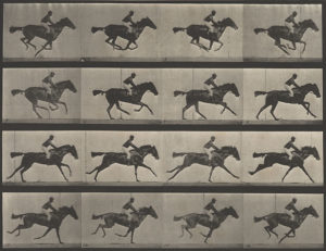
Using the timeline format, and through additional research, I was able to understand more fully why Muybridge and Marey were listed on the Interactive History of the Most Iconic Infographics. Muybridge’s ‘small multiples,’ as Edward Tufte and Stephen Few have pointed out, allow different potions of a dataset to be read separately and easily compared. In particular, Muybridge’s “Horse in Motion” (1886) presents discrete information regarding a horse’s gallop, including the moment it becomes fully airborne (see frame two below). Marey, on the other hand, captures moments of movement with a chronophotographic gun and layers them during processing. The manner in which each presented his data allows us to read the information as types of charts or graphs plotting continuous functions. Ultimately, both found ways to visualize time-based phenomena. Their works, in turn, influenced the modern artistic explorations of similar themes.

Photography collection, Harry Ransom Center.
Reflection & Future Directions
I was happy with the end project, however, I would have done a few things differently. During the design period, for example, I spent a great deal of time picking hex colors for slides that worked well, but eventually had to be cut for the sake of clarity throughout. Specifically, I made use of several colored backgrounds, which appeared to unconsciously weight certain items within the timeline, which gave them the false impression of being more important than they were. This, I think, was part of the learning curve and can be mediated with practice and a better understanding of the limits of the platform being used. For the future, I would have this timeline, or one on a different subject, positioned within a larger project. Knight Lab Timeline is an easy-to-use tool, but since it has limited customization, it may be best used in a supporting capacity, embedded in a website among other visualizations.
The post Chronophotography and the Power of Movement appeared first on Information Visualization.