The Networked Art Genome Project
May 9, 2018 - All
Introduction
This report explores categorical and hierarchical data from The Art Genome Project (“TAGP”), Artsy’s ongoing study into the characteristics and connections between artists and artworks, using Gephi, an open-source network analysis and visualization software. The goal of the resulting network visualization is to graphically represent abstract information hierarchies, providing a shared point of reference for internal stakeholders at Artsy. Research into the mental models of TAGP’s abstract hierarchy for typical users was conducted through an unmoderated card sort on a thematic subset of the genome using Optimal Workshop, a proprietary web-based platform that offers a suite of user testing tools. Recommendations for future iterations of this visualization based on this user research is included as well.
Background
As described in my previous posts “Visualizing Dynamic Hierarchies in The Art Genome Project” and “From Treemaps to Network Graphs: Further Visualizations of Hierarchical Relationships in The Art Genome Project,” Artsy’s mission is to make all the world’s art accessible to anyone with an internet connection. By partnering with the world’s leading art auctions, galleries, fairs, and museums, the site functions as a free and powerful resource for users interested in art collecting and education. At present, there are over 900,000+ works of art and design published on the platform by more than 100,000 artists and cultural makers.
The Art Genome Project is the classification system and technological framework that fuels Artsy. TAGP maps the characteristics, referred to as “genes” in-house, that connect artists, artworks, architecture, and design objects across time. There are currently over 1,300 genes of more than 40 types covering art-historical movements, subject matter, formal qualities, and more. Importantly, unlike tags, which are binary—something is either tagged “chair” or not—a gene is evaluated on a scale from 0-100 and then hand applied to an artist or artwork record by an expert contributor. While TAGP also uses tags to highlight specific iconography, motifs, and subject matter, dynamic genoming allows for greater nuance when capturing the conceptual and formal aspects of cultural heritage records.
TAGP is a semi-structured controlled vocabulary, however it is not in compliance with ISO 25964 or related standards (ISO, n.d.). Its information hierarchy is relatively flat, going two levels deep at most. To meet these standards and create a deep taxonomy that is truly user-friendly, visualizing its current structure and identify areas that are working and, conversely, need improvement to prioritize future iterations is of highest priority to the genome team.
Previous work in Tableau Public resulted in a unified dashboard that visualizes quantitative analytic data through line graphs, packed bubble charts, and treemaps, while hierarchical connectivity one level deep was visualized with Gephi. This project extends the latter visualization, attempting to not only add another level of hierarchy to the graph but also to incorporate user experience research, narrowing the scope of the visualization and iteratively improving on the design.
Methodology
Card Sorting
Card sorting is a user experience (UX) research technique in which users organize individual topics into groups according to criteria that make sense to them (Sherwin, 2018). This technique is noted for its usefulness in identifying issues with a product’s category structures, such as the information architecture on a website, by uncovering how users think about content. Open, unmoderated card sorting (versus closed or moderated) was selected due to its flexibility and speed—users can organize content into groups with an online tool on their own time and results are immediately available for analysis. Extensive in-person debriefing was used to gain qualitative insights into users’ rationale that might not have been discovered during the largely unmoderated session.
Of the 1,303 genes that comprise The Art Genome Project, 219 Content (e.g. “Landscapes,” “Portrait”) and Concept (e.g. “Political,” “Popular Culture”) genes were selected as a subset for card sorting. This is an exceptionally large number of cards to work with, however the eight users selected were all TAGP catalogers (“genomers”) and considered domain experts. This TAGP gene data subset was created by running SQL queries in Looker, a proprietary data analytics platform, against Artsy’s AWS Redshift data warehouse and exporting the results to a local CSV file. OptimalSort, a card sorting software by Optimal Workshop, was used to input the CSV file and configure the study.
Target Audience
The following user profile for the target audience of TAGP’s internal stakeholders and users is based on the demographics of past and present genomers:
- Gender identity: Any
- Age: 25-35
- Income: Any
- Education: Master’s degree or higher
- Web expertise: Expert
- Operating systems: Any
- Web browsers: Any
- Other requirements: Encyclopedic knowledge of art history (prehistoric-present), expert research skills, and experience cataloging artists and/or artworks in digital environment
Data Collection and Transformation
This dataset was created in an identical manner as the sample dataset for the card sort—SQL queries, Looker, and AWS Redshift. After querying all genes, types, and families, the results were exported to a local CSV file to be further transformed in OpenRefine, an open source desktop application for data wrangling. OpenRefine was used specifically for standardizing gene types and families, including merging certain redundant categories, in the interest of reducing the label lengths later in Gephi. However, a more granular dataset of genes, types, and families directly related to the card sort was kept relatively unedited for visualizing the user research.
Before importing the CSV data into Gephi, the cleaned data from OpenRefine was imported to Google Sheets to create node and edge tables. This included merging three distinct columns for “Gene Name,” “Gene Type,” and “Gene Family” into two for “Source” and “Target,” as well as adding another column for direction “Type” (i.e. directed or undirected).
Visualization Creation
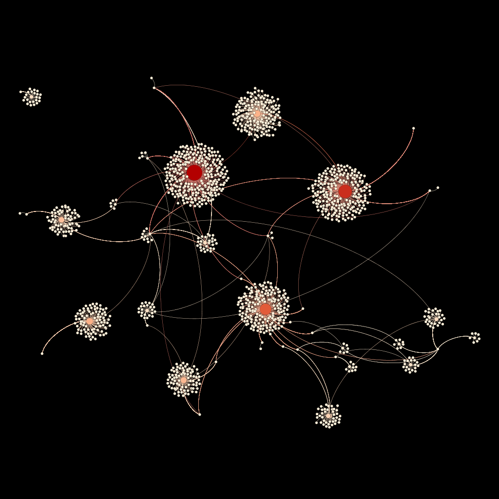
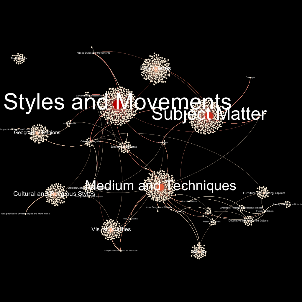
The CSV file of the genome data was imported into Gephi, resulting in a directed graph of 1,334 nodes and 2,405 edges. Gephi’s built-in ForceAtlas2 algorithm, a linear-attraction linear-repulsion model, was selected for the layout over ForceAtlas based on its improved performance for large networks. Tuning adjustments were made to calculate stronger gravity (g = 0.01) to attract nodes to the center and revent islands of gene clusters from drifting away. A warm color palette was chosen with automated gradient values calculated by Gephi based on node ranking by in-degree. Node size, label inclusion, and label font size were also determined by in-degree ranking. The same black background color was selected to make the paler nodes and edges stand out while keeping with the style established in previous visualizations. Since the Gephi desktop application does not offer inline frame features for web publishing, the visualization was exported as a PNG file for display.
Results
Card Sorting Analysis
Between the eight participants sorting 219 cards, a total of 210 unique categories were created. The smallest category of unique cards was a single gene, while the largest category was 42 genes. Participants created an average of 26 groups in a median time of one hour and 2 minutes, with 43.15 minutes as the lowest observed time and 161.15 minutes for the highest observed time. Five of the 8 participants completed their card sorts in New York, NY at Artsy HQ, with the remaining three finished their individual studies in North Adams, MA, Berkeley, CA, and New Delhi, India.
After manually standardizing similar gene categories, inter-rater reliability (IRR) was calculated to determine which mental models of TAGP’s hierarchy are shared between one or more raters with over 80% agreement (IRR > 0.8). For example, three participants had an IRR of 0.61 for a category loosely called “Performing the Self” which included the genes “Self as Subject,” “Personal Histories,” “Self-Portrait,” “Alter Egos and Avatars,” “Individual Portrait,” and “Diaristic.” While there were a number of standardized categories that exceeded IRR > 0.8, none of these had a number of participants who created similar categories within the high IRR standardized category greater than four (i.e. less than half of the participants would be in true agreement based on their sorting patterns). This means that either the ad hoc standardizations should be changed and/or additional card sort studies on these categories should be conducted. Still, any categories with an IRR > 0.8 were included in the revised visualization, regardless of the number of participants in agreement.
Detailed results of the card sort, including a standardization grid, similarity matrix, dendograms, and participant-centric analysis (PCA) can be viewed at https://www.optimalworkshop.com/optimalsort/tagp/content-concepts-2018/shared-results. Note that these study results are password protected—please email rachel@artsymail.com for access.
Visualizations

Figure 1. A network graph of The Art Genome Project.

Figure 2. The same network graph with labels.
Future Directions
Based on user research, the next design iteration in this project would be visualizing the “Subject Matter” gene cluster in further detail, styling and exporting it using the same methods, and then updating the node and edge tables with the results from the card study by adding deeper hierarchies for standardization categories with high IRR values.
Ideally, this same user research would be conducted through additional unmoderated card sorts for each gene family until the entire genome has been studied. These results could then be used to update node and edge tables, creating a series of iterative visualizations that better reflect the mental models of TAGP’s internal stakeholders and users. Once a shared model is established and visualized for these “back-end” users, the entire method could be repeated with a new target audience—the auctioneers, artists, art lovers, critics, dealers, educators, museum-goers, patrons, and students who visit the front-end of the site to discover, learn about, and collect art. If TAGP aims to be truly user-friendly, must be understandable to this audience in addition to the genomers who built it.
References
Sherwin, K. (2018, March 18). Card sorting: Uncovering users’ mental models for better information architecture. Retrieved from https://www.nngroup.com/articles/card-sorting-definition/
The post The Networked Art Genome Project appeared first on Information Visualization.