Peshawar Visualizin’ (An extension of the “Peshawar Scrapin’” CIA documents project)
May 4, 2018 - All
-
Introduction to the war
The Soviet-Afghan War of 1979-1989 is a topic that is given short shrift in the history curricula of US grade schools, and therefore in the public consciousness at large. In a way, that’s not surprising–much as our historical education is constructed as a succession of wars, this one did not involve American “boots on the ground,” no action from the beatified boys who soaked up fire and shrapnel from Gettysburg to Normandy to Hamburger Hill. We played a secret role in what was otherwise a war between Islamists and Communists–not the stuff of Ken Burns documentaries.
And yet this war set the stage for our Global War on Terror, a nearly two-decade foreign policy disaster that has metastasized from the quagmire of Afghanistan into dozens of countries around the world.
To the extent that the war is considered by the general public, it is mostly understood as follows:
- The Soviet Union invaded Afghanistan to prop up a failing Afghan Communist regime.
- Scrappy mujahideen rebels fought a brilliant guerilla war against the Soviets, benefiting from their superior understanding of Afghanistan’s harsh terrain.
- The CIA gave the mujahideen a decisive edge by providing funding and arms, particularly FIM-92 Stinger missiles to take down the dreaded Soviet helicopter gunships.
- The fruitless ten-year engagement contributed to the economic collapse of the USSR.
- The mujahideen we armed turned out to be the Taliban and Al Qaeda. Whoops! Lesson learned?
Most of that isn’t wrong, but the final bullet point elides the religious, ethnic, and ideological diversity of the mujahideen. While Osama Bin Laden, Ayman al-Zawahiri, Abdullah Azzam, Jalaluddin Haqqani, and Mullah Omar were all involved in the conflict in one way or another, they were peripheral, or in the case of Haqqani and Omar, subordinate to the fundamentalist mujahid Yunus Khalis.
My interest in the war started with the more moderate mujahid commander Ahmad Shah Massoud, and the dramatic, ominous end of his life. Massoud is venerated as a national hero in Afghanistan, named “The Lion of Panjshir” after the valley that was his birthplace and stronghold against Soviet attacks. In the west, his image somewhat resembles that of Saladin: a wise, fierce, and righteous military leader, Massoud strove for unity even in the face of repeated betrayals by fellow mujahideen. He was fluent in many languages, wrote poetry, and studied engineering in his youth.
Massoud warned the European Parliament and US President George W. Bush in the spring of 2001 that if Afghanistan’s fundamentalist elements and their Pakistani benefactors were not brought to heel, the west would suffer a major terrorist attack in the near future. He was assassinated in a suicide bombing on September 9th of that year. One wonders why this story is not told more often.
-
Telling the story (introduction to the project)
My exploration of this conflict led me to the CIA’s FOIA Electronic Reading Room, a public access point for searching documents the Agency has been obliged by FOIA requests to release (albeit in sanitized form). The site contains a wealth of interesting material, but the documents are poorly described and difficult to explore at length. Long story short, I decided to use Python to produce my own metadata. I scraped about 7,200 documents containing the word “Afghanistan” from 1979 to 1989, extracted the text with OCR, and tagged the documents with key people, organizations, places, and other topics mentioned therein. It was an interesting and challenging effort that served as a final project for two library school classes, but ultimately all I had to show was a Github repository and a big spreadsheet.
I’ve taken the opportunity this semester to produce some visualizations, which will hopefully lend some structure and clarity to the story the documents tell, and aid analysis of the CIA’s methods and thought process. Ultimately, I would like this to be a resource for both curious laypeople (like me) and bona-fide historians to conduct primary source research.
-
Working with my messy, DIY metadata
I produced my original spreadsheet of metadata in a hurry, running afoul of due dates and disregarding formal schema or authority files as a result. Loading the data into visualization software required a new pass at normalizing some of the subject terms I tagged. Subject fields in the original sheet are formatted as a list of terms, each followed by a parenthetical note of the number of times the term occurred in a given document, and separated by semicolons, like this:
Ahmad Shah Massoud (1); Gulbuddin Hekmatyar (1); Burhanuddin Rabbani (3)
I used OpenRefine to split multi-valued cells like this into rows, and separate out the parentheticals. Text faceting and reconciliation with Wikidata helped deal with some entities repeated with different names. This was particularly important when disentangling some similarly-named mujahideen factions.
Wikidata reconciliation and extraction of linked data properties was essential in normalizing some of my geographical terms. The original tags I used referred to provinces, districts, and cities in Afghanistan. I wanted to produce a map using just provinces. Wikidata made it possible to automatically identify where I had used provincial names. Where cities or administrative districts were named in lieu of provinces, I used the Wikidata property “located in the administrative territorial entity” to extract an “implied province” from many documents.
For each category of subject terms (again, that’s people, organizations, locations, and other terms), I used the text faceting feature to measure the number of documents in which each term occurred. This was the metric that produced my interactive dashboard of bar charts and my map of Afghanistan.
-
The map

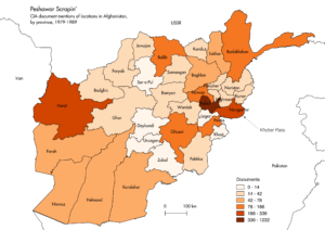
The most straightforward term-frequency visualization to produce (after getting data in order), was my map of Afghanistan’s provinces. I wanted to create a visualization of what locations the CIA talked about most, assuming some correlation between attention and covert action. It should go without saying that the CIA’s gaze itself (postcolonial gaze, a la Edward Said? Eye of Sauron?) is a detriment.
My limited GIS training equips me mainly to make choropleth maps with QGIS, so that’s what I set out to do. I elected to use a brownish-orange color ramp, the tones of which do double duty conveying the negative connotation of a high score and matching Afghanistan’s brownish terrain. Separating the provinces into six classes gave me the best result in terms of showing Kabul’s primacy, but also conveying the relatively high degree of attention paid to Herat and Nangarhar. My instinct is that Herat appears often in documents due to its proximity to the new Islamic Republic of Iran, a CIA bugaboo. Nangarhar, on the other hand, is closest to the Pakistani mujahid refuge of Peshawar, and the ever-important Khyber Pass. I elected to add an arrow indicating the Pass in order to show Nangarhar’s importance as a point of entry from Pakistan. As per cartographic best practices, I labeled this physical feature in italics to contrast with the non-italicized political feature labels. I used shapefiles from GADM.org and the WGS 84 UTM Zone 42N projection/coordinate reference system.
-
The Dashboard
When I set out to do my original scraping project, I was interested in seeing how the CIA chose its friends from among the mujahideen, if they did at all. How much did they consider the political, religious, and ethnic affiliations of the various factions? Did they let their Pakistani counterparts at Inter-Services Intelligence (ISI) control allocations of arms and funding? Did they think of Afghanistan’s future much, or were they fixated on ousting the Communist enemy at all costs? Questions like this remain relevant not for the casting of blame, but rather more as a reminder of our intelligence sector’s disregard for the nuances of its proxy wars.
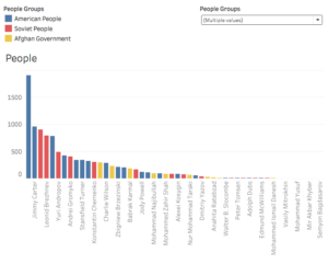
I’m not qualified to make judgements on this manner, but a simple, visual representation of how much the CIA wrote about certain subjects could help me and others quickly get a sense of their priorities. Using the same text faceting methods as I did for locations, I pulled the frequencies of people, organizations and other topics from my dataset. Tableau public made it easy to visualize each of these as a simple bar chart, but making them useful and eloquent required some additional categorization and formatting. Within each category, I grouped the subjects into groups that could be colored separately to aid quick visual perception of their differing prominence. A dashboard of the charts is available here.
In keeping with the exploratory spirit of my project, I opted to make my dashboard interactive. Experimenting with the results a bit gives weight to a couple of different theories.
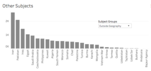
The ranking of Iran over key intelligence partner Pakistan reflects an unhealthy preoccupation with Iranian influence.
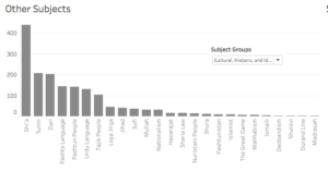
By the same token, Shi’a Islam far outranks other terms that inform the CIA’s understanding of Afghanistan’s culture. While Shi’a muslims are present (chiefly among the Hazara ethnic minority), the country is majority Sunni by a wide margin.
The CIA devoted more text to the Afghan government than to the mujahideen, both in terms of organizations and people.
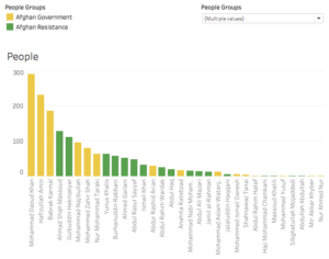
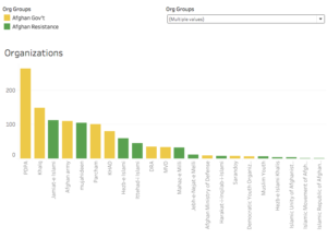
In the end, however, Americans and Soviets still get far more ink than any Afghan person or faction.
-
The network
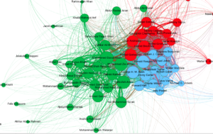
Having learned Gephi, it seemed a waste not to throw together a force-directed social network graph of people mentioned in these documents, building the network based on being mentioned together in the same document. I wrote another Python script to go through my metadata spreadsheet and write a separate adjacency table for import into Gephi. This was the least predictable visualization to me, and most resistant to interpretation. Setting aside manual classification of the people into factions, I let Gephi sort them into three modularity classes. It surprised me by rather consistently sorting out Soviet, American and Afghan/Pakistani people into groups. Beyond that, I think the arrangement has something to say about the way political power is represented in the text. The most important people are mentioned together again and again, so they cluster into the gravitational center of the graph. Heads of state are there, and all others orbit at distances according to their fame. Massoud, who resented Pakistani influence in Afghanistan and support for fundamentalists, might have something to say about the fact that President Zia snuggles up closest to both Reagan and Gorbachev.
-
UX testing and directions for future development
Regrettably, I did not get it together to test my visualizations on historians or foreign policy wonks, opting instead for the logistical ease of bugging family members–namely my wife, mother, and father. I conducted my testing casually, more as a conversation than rigorous collection of metrics.
Each participant required a different degree of walking through the context of the project. By and large, it was a lot of explaining in all three cases. The subject matter is specialized, and may be best presented in the context of a paper or other long-form medium. The bar charts were the most useful and engaging visualization, mainly for analysis of broad groups. Afghan people and organizations were largely unfamiliar, driving home the need for a narrative style of presentation to laypeople. Some kind of clickable biography or explanation may be useful going forward.
My mom pointed out the conspicuous absence of time-based visualizations (line charts, timelines) in this ten-year story. It’s a big hole, and probably the area that requires the most work. I don’t have a strong enough grasp yet of how CIA thinking shifted between 1979 and 1989, and I’d like to get a better handle on the specific watershed events in that time. A good place to start would be seeing whether the prominence of Iran as a topic waned after the 1979-1981 hostage crisis.
Most of all my testers wanted a clear, navigable connection between the visualizations and the documents–either a curated subset of the best documents for a topic, or all documents pertaining to the topic. Implementing this in a unified, effective manner will require some web development on my part, probably a full-fledged website and database dedicated to the project. It’s a step I’m very interested in taking, when time permits.
The post Peshawar Visualizin’ (An extension of the “Peshawar Scrapin’” CIA documents project) appeared first on Information Visualization.
